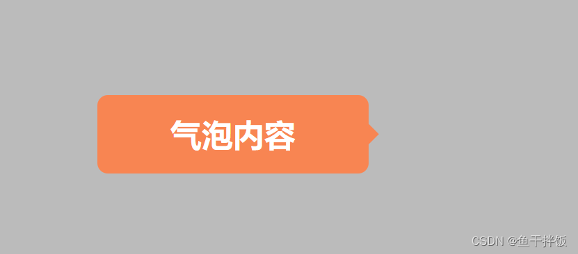
最终效果
一个带阴影效果的聊天气泡框

涉及知识点
-
伪元素
常见得伪元素:
1、::first-letter:指定一个元素第一个字母的样式
2、::first-line:设置元素中第一行文本的样式
3、::selection:匹配被用户选择的部分
4、::placeholder:匹配占位符的文本
5、::backdrop(处于试验阶段):用于改变全屏模式下的背景颜色
6、::before:在元素之前添加内容。
7、::after:在元素之后添加内容。
值得一提:伪元素一般使用双冒号(::)引用。 -
box-shadow
/* offset-x | offset-y | blur-radius | spread-radius | color */
box-shadow: 2px 2px 2px 1px rgba(0, 0, 0, 0.2);
x 方向偏移 y 方向偏移 模糊大小 阴影放大 颜色。
-
filter: drop-shadow()
drop-shadow(offset-x offset-y blur-radius color)与 box-shadow 效果类似,至少了
spread-radius。但各有所优势。今天的气泡框里面就可以体现出其优势。
具体实现
- 先来一个聊天框,一个 div 就足够了
<div class="bubble">气泡内容</div>
-
接下来,就是重点部分
我们通过为元素::after或者::before来实现箭头效果。
具体的层叠样式代码如下:.bubble { position: relative; width: 104px; height: 30px; line-height: 30px; background: rgba(255, 128, 71, 0.9); font-size: 12px; font-weight: 600; color: #ffffff; border-radius: 4px; right: -9px; bottom: -24px; text-align: center; } .bubble::after { position: absolute; content: ""; width: 8px; height: 8px; background: rgba(255, 128, 71, 0.9); margin-top: -4px; top: 50%; right: -8px; clip-path: polygon(0 0, 50% 50%, 0 100%); }
初版效果出来了
- 然后给整体加一个阴影效果
.bubble {


  box-shadow: 2px -2px 2px 0px #f00;
}
但是效果不尽人意,伪元素没有添加上阴影效果
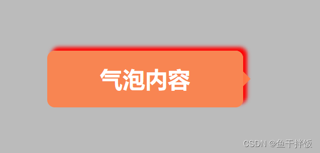
如果需要伪元素和 div 有相同的阴影效果只需把
box-shadow: 2px -2px 2px 0px #f00; 替换为filter: drop-shadow(2px -2px 2px 1px #f00);即可。
最终效果:
完整代码
<!DOCTYPE html>
<html lang="en">
  <head>
    <meta charset="UTF-8" />
    <meta http-equiv="X-UA-Compatible" content="IE=edge" />
    <meta name="viewport" content="width=device-width, initial-scale=1.0" />
    <title>Document</title>
    <style type="text/css">
      * {


        padding: 0;
        margin: 0;
      }
      #box {


        box-sizing: border-box;
        width: 100vw;
        height: 100vh;
        padding: 100px;
        background: #bbb;
      }
      .bubble {


        position: relative;
        width: 104px;
        height: 30px;
        line-height: 30px;
        background: rgba(255, 128, 71, 0.9);
        font-size: 12px;
        font-weight: 600;
        color: #ffffff;
        border-radius: 4px;
        right: -9px;
        bottom: -24px;
        text-align: center;
        filter: drop-shadow(2px -2px 2px 1px #f00);
        /* box-shadow: 2px -2px 2px 0px #f00; */
      }
      .bubble::after {


        position: absolute;
        content: "";
        width: 8px;
        height: 8px;
        background: rgba(255, 128, 71, 0.9);
        margin-top: -4px;
        top: 50%;
        right: -8px;
        clip-path: polygon(0 0, 50% 50%, 0 100%);
      }
    </style>
  </head>
  <body>
    <div id="box">
      <div class="bubble">气泡内容</div>
    </div>
  </body>
</html>
filter: drop-shadow 的具体用法可以参考MDN