前言:最近学习到了一种超级好看,超级高级的背景设计效果,迫不及待的分享出来了
适用情况:用图片做背景时,将弹框和背景融为一体
一、基础设计(之前的实现方法)
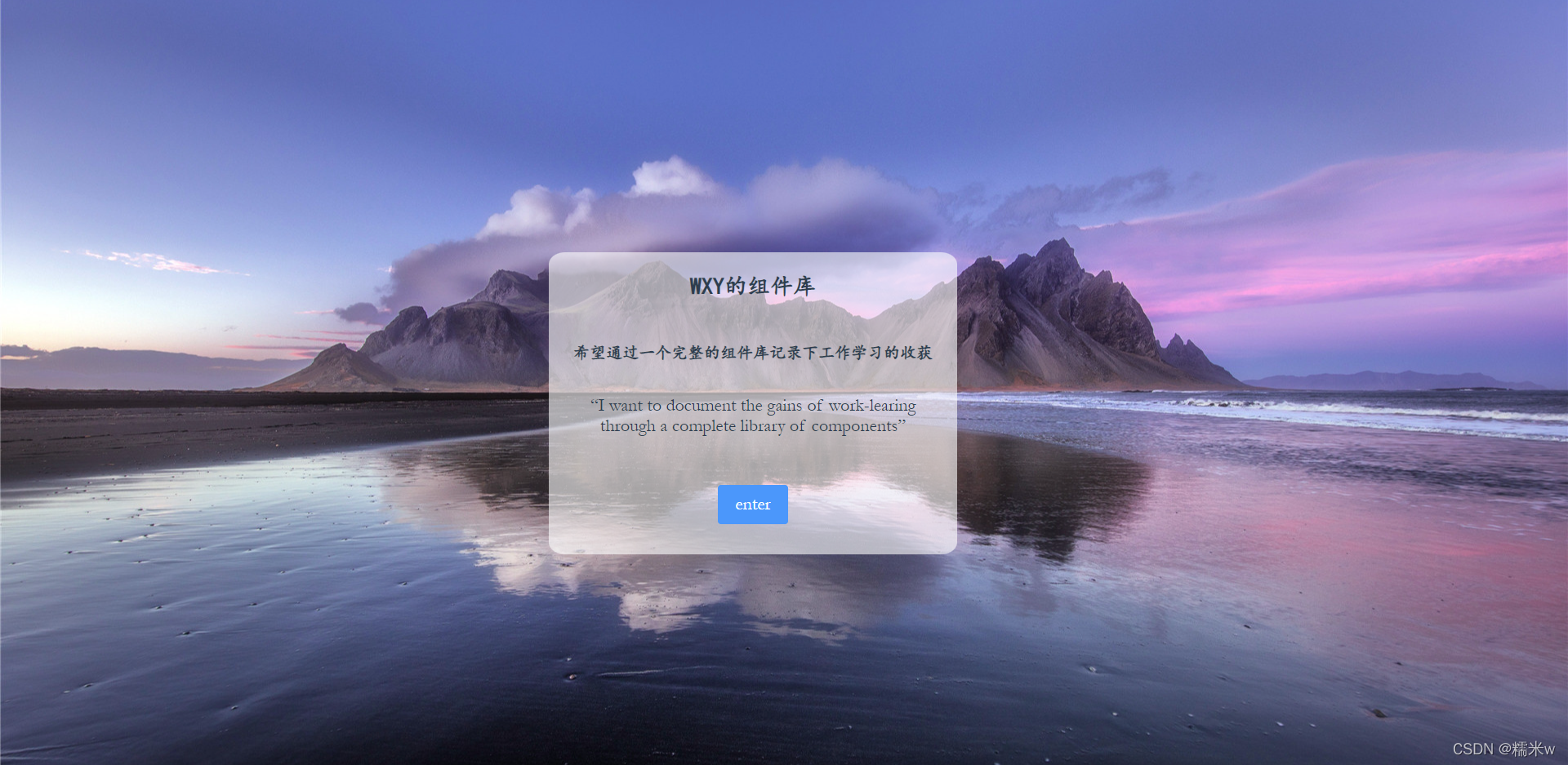
页面很简单,在外层的div定义background-image放入背景图
里层div定义弹框信息放入相关文字
html代码
<template>
  <div class="login-container" :style="{backgroundImage:`url(${loginBg})`}">
    <div class="login-main">

      <div class="normal-font title">WXY的组件库</div>
      <div class="normal-font content">希望通过一个完整的组件库记录下工作学习的收获</div>
      <div class="english-font content">“I want to document the gains of work-learing through a complete library of components”</div>
      <el-button type="primary" class="button english-font" @click="onEnter">enter</el-button>
    </div>
  </div>
</template>
css代码
.login-container {


  height: 100vh;
  background-repeat: no-repeat;
  background-color: #6b81ca;
}

.login-main {


  position: absolute;
  top: 33%;
  left: 35%;
  width: 35%;
  min-height: 370px;
  min-width: 350px;
  max-width: 500px;
  background: hsla(0, 0%, 100%, 0.6);
  border-radius: 4%;
  text-align: center;
}
-
外层是设计整个图片的平铺,而不是重复
-
内层设计了显示框的位置以及背景颜色等情况
可以看到弹框的内容是可以看到后面的背景情况的,这是因为
login-mian这个div的样式设置的是半透明的,就是为了达到和背景相呼应的效果,但是也是因为透出了一部分背景,所以感觉文字不是很清晰,整个页面显得很呆板。hsla– 定义带有透明度的背景颜色hsla(hue, saturation, lightness, alpha)
分别定义颜色、饱和度、亮度、不透明度
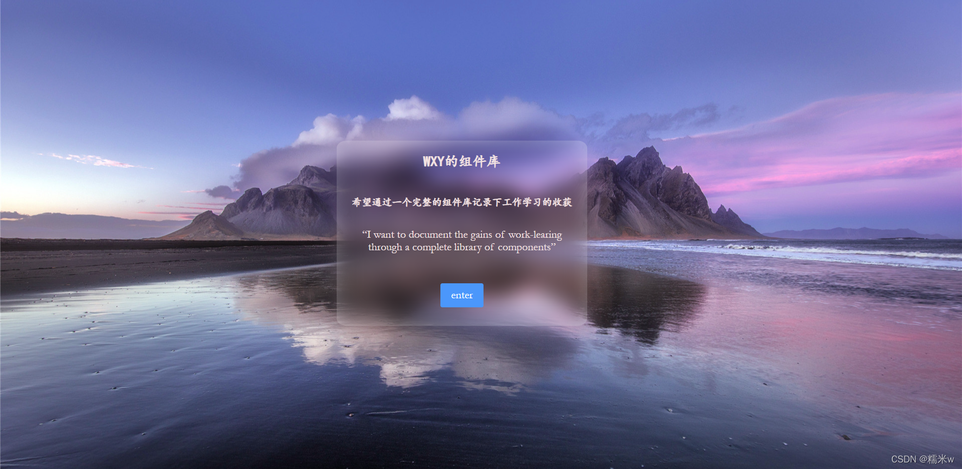
二、进阶设计
仿照苹果的背景设计,实现一种背景模糊的效果
实现原理
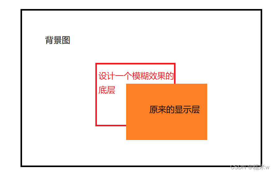
在原来的基础上,多了一个中间的模糊层,从而起到了毛玻璃的效果
CSS代码
.login-container,
.login-main-two::before {


  background: url('../assets/images/background.png') 0 / cover fixed;
  z-index: -1;
}
.login-main-two {


  z-index: 5;
  position: absolute;
  top: 30%;
  left: 35%;
  width: 500px;
  height: 370px;
  border-radius: 4%;
  text-align: center;
  background: hsla(0, 0%, 100%, 0.3);
  color: #f2e2e2;
}

.login-main-two::before {


  content: '';
  position: absolute;
  top: 0;
  right: 0;
  bottom: 0;
  left: 0;
  filter: blur(20px);
}
::before层就是实现的模糊层信息
背景图定义层需要同时写入外层因为是因为涉及到z轴定位的关系
当出现多种页面叠加的情况,就需要引入
z-index用来判断先后顺序,只对定位是absolute、relative、fixed有用
filter属性提供了一种模糊的效果,通常用于调整图像,背后和边框的渲染