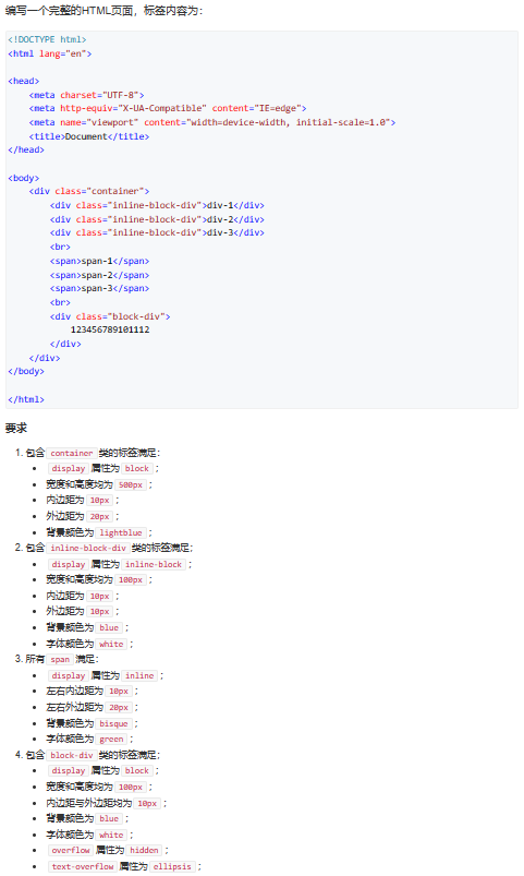
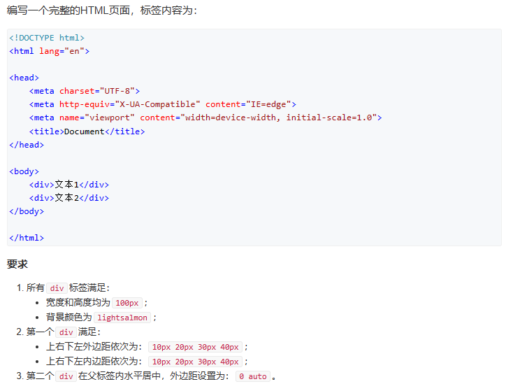
css 习题
style样式代码可以单独放在新的.css脚本中,也可以直接写在.html脚本里:
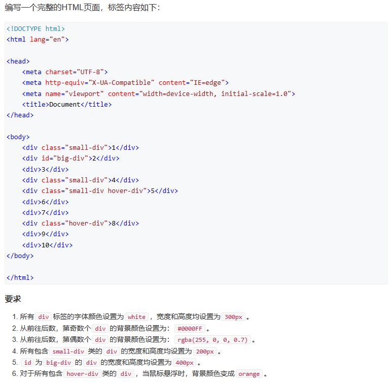
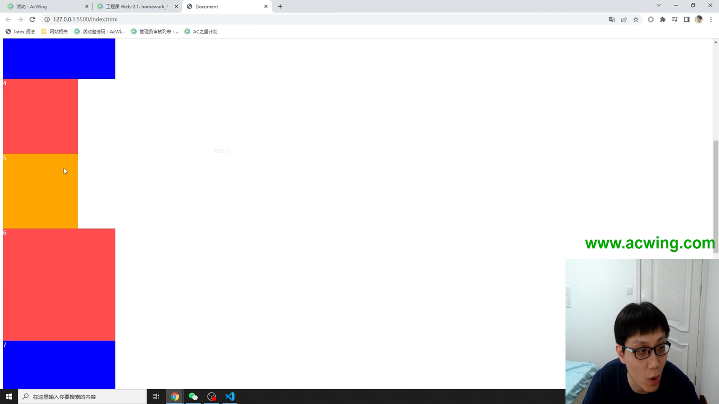
<!DOCTYPE html>
<html lang="en">

<head>
    <meta charset="UTF-8">
    <meta http-equiv="X-UA-Compatible" content="IE=edge">
    <meta name="viewport" content="width=device-width, initial-scale=1.0">
    <title>Document</title>
    <style>
        div {


            color: white;
            width: 300px;
            height: 300px;
        }

        div:nth-child(odd) {


            background-color: #0000ff;
        }

        div:nth-child(even) {


            background-color: rgba(255, 0, 0, 0.7);
        }

        .small-div {


            width: 200px;
            height: 200px;
        }

        #big-div {


            width: 400px;
            height: 400px;
        }

        .hover-div:hover {


            background-color: orange;
        }
    </style>
</head>

<body>
    <div class="small-div">1</div>
    <div id="big-div">2</div>
    <div>3</div>
    <div class="small-div">4</div>
    <div class="small-div hover-div">5</div>
    <div>6</div>
    <div>7</div>
    <div class="hover-div">8</div>
    <div>9</div>
    <div>10</div>
</body>

</html>
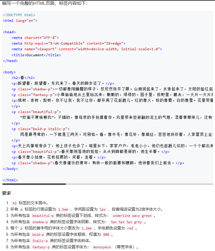
<!DOCTYPE html>
<html lang="en">
<head>
<meta charset="UTF-8">
<meta http-equiv="X-UA-Compatible" content="IE=edge">
<meta name="viewport" content="width=device-width, initial-scale=1.0">
<title>Document</title>
<style>
h2{
text-align: center;
}
p{
line-height: 1.5em;
letter-spacing: 1px;
text-indent: 2em;
}
.beautiful-p{
text-decoration: underline wavy green;
}
.shadow-p{
text-shadow: 5px 5px 5px grey;
}
p::first-letter{
font-size: 1.2em;
color: red;
}
.bold-p{
font-weight: 800;
}
.italic-p{
font-style: italic;
}
.fantasy-p{
font-family: monospace;
}
</style>
</head>
<body>
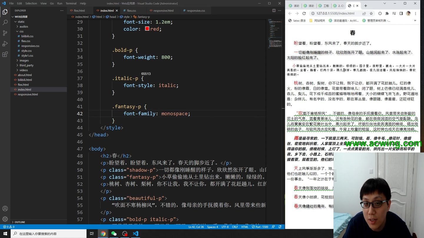
<h2>春</h2>
<p>盼望着,盼望着,东风来了,春天的脚步近了。</p>
<p class="shadow-p">一切都像刚睡醒的样子,欣欣然张开了眼。山朗润起来了,水涨起来了,太阳的脸红起来了。</p>
<p class="fantasy-p">小草偷偷地从土里钻出来,嫩嫩的,绿绿的。园子里,田野里,瞧去,一大片一大片满是的。坐着,躺着,打两个滚,踢几脚球,赛几趟跑,捉几回迷藏。风轻悄悄的,草软绵绵的。</p>
<p>桃树、杏树、梨树,你不让我,我不让你,都开满了花赶趟儿。红的像火,粉的像霞,白的像雪。花里带着甜味儿;闭了眼,树上仿佛已经满是桃儿、杏儿、梨儿。花下成千成百的蜜蜂嗡嗡地闹着,大小的蝴蝶飞来飞去。野花遍地是:杂样儿,有名字的,没名字的,散在草丛里,像眼睛,像星星,还眨呀眨的。
</p>
<p class="beautiful-p">
“吹面不寒杨柳风”,不错的,像母亲的手抚摸着你。风里带来些新翻的泥土的气息,混着青草味儿,还有各种花的香,都在微微润湿的空气里酝酿。鸟儿将窠巢安在繁花嫩叶当中,高兴起来了,呼朋引伴地卖弄清脆的喉咙,唱出宛转的曲子,与轻风流水应和着。牛背上牧童的短笛,这时候也成天在嘹亮地响。
</p>
<p class="bold-p italic-p">
雨是最寻常的,一下就是三两天。可别恼。看,像牛毛,像花针,像细丝,密密地斜织着,人家屋顶上全笼着一层薄烟。树叶子却绿得发亮,小草也青得逼你的眼。傍晚时候,上灯了,一点点黄晕的光,烘托出一片安静而和平的夜。乡下去,小路上,石桥边,有撑起伞慢慢走着的人;还有地里工作的农夫,披着蓑,戴着笠的。他们的草屋,稀稀疏疏的,在雨里静默着。
</p>
<p>天上风筝渐渐多了,地上孩子也多了。城里乡下,家家户户,老老小小,他们也赶趟儿似的,一个个都出来了。舒活舒活筋骨,抖擞抖擞精神,各做各的一份事去。“一年之计在于春”,刚起头儿,有的是工夫,有的是希望。</p>
<p class="beautiful-p">春天像刚落地的娃娃,从头到脚都是新的,他生长着。</p>
<p>春天像小姑娘,花枝招展的,笑着,走着。</p>
<p class="shadow-p">春天像健壮的青年,有铁一般的胳膊和腰脚,他领着我们上前去。</p>
</body>
</html>
<!DOCTYPE html>
<html lang="en">
<head>
<meta charset="UTF-8">
<meta http-equiv="X-UA-Compatible" content="IE=edge">
<meta name="viewport" content="width=device-width, initial-scale=1.0">
<title>Document</title>
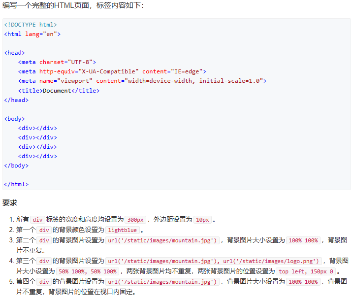
<style>
div {
width: 300px;
height: 300px;
margin: 10px;
}
div:nth-child(1) {
background-color: lightblue;
}
div:nth-child(2) {
background-image: url('/static/images/mountain.jpg');
background-size: 100% 100%;
background-repeat: no-repeat;
}
div:nth-child(3) {
background-image: url('/static/images/mountain.jpg'), url('/static/images/logo.png');
background-size: 50% 100%, 50% 100%;
background-repeat: no-repeat, no-repeat;
background-position: top left, 150px 0;
}
div:nth-child(4) {
background-image: url('/static/images/mountain.jpg');
background-size: 100% 100%;
background-repeat: no-repeat;
background-attachment: fixed;
}
</style>
</head>
<body>
<div></div>
<div></div>
<div></div>
<div></div>
</body>
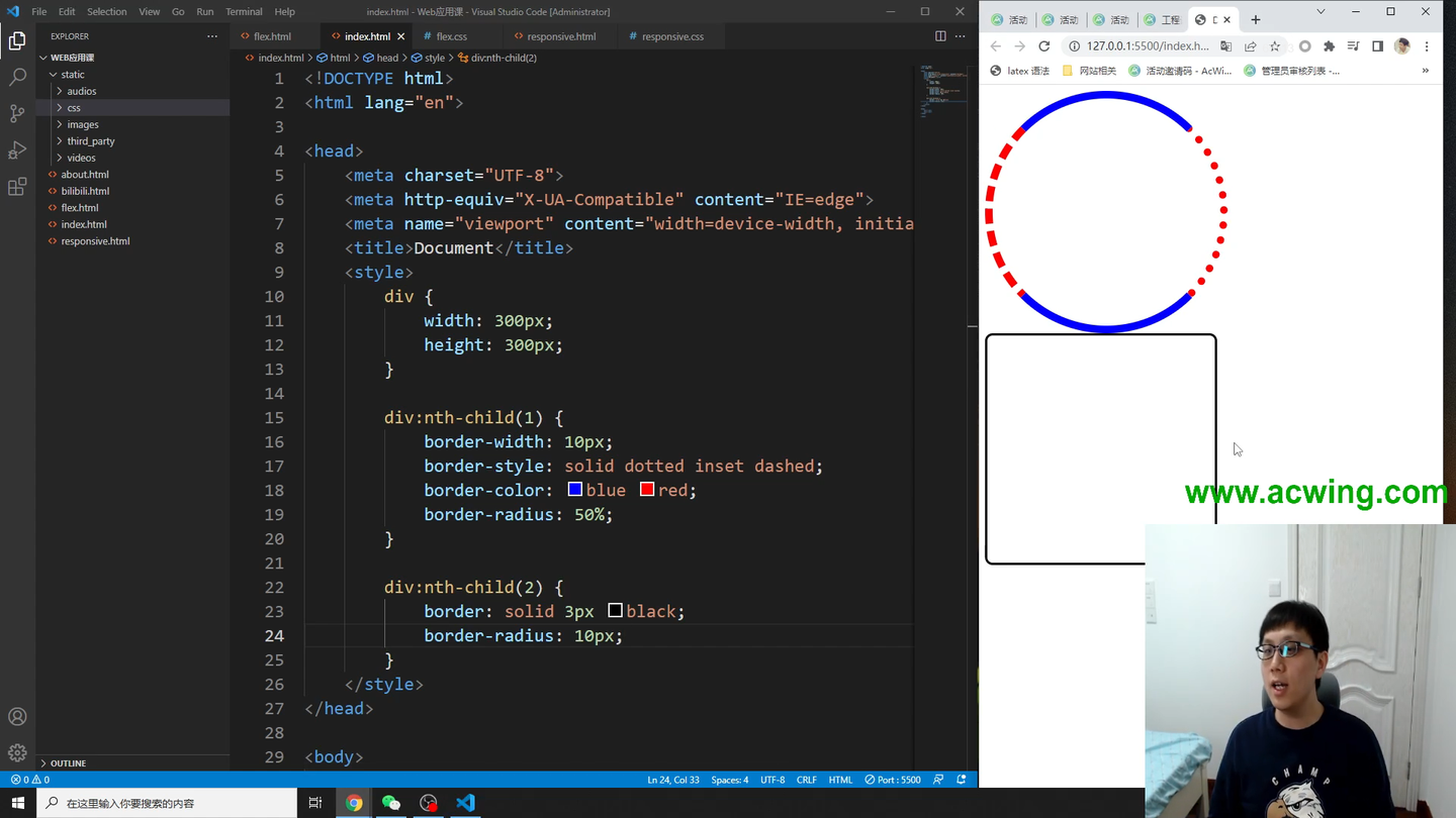
<!DOCTYPE html>
<html lang="en">

<head>
    <meta charset="UTF-8">
    <meta http-equiv="X-UA-Compatible" content="IE=edge">
    <meta name="viewport" content="width=device-width, initial-scale=1.0">
    <title>Document</title>
    <style>
        div{


            width: 300px;
            height: 300px;
        }
        div:nth-child(1){


            border-width: 10px;
            border-style: solid dotted inset dashed;
            border-color: blue red;
            border-radius: 50%;
        }
        div:nth-child(2){


            border: solid 3px black;
            border-radius: 10px;
        }
    </style>
</head>

<body>
    <div></div>
    <div></div>
</body>

</html>
<!DOCTYPE html>
<html lang="en">
<head>
<meta charset="UTF-8">
<meta http-equiv="X-UA-Compatible" content="IE=edge">
<meta name="viewport" content="width=device-width, initial-scale=1.0">
<title>Document</title>
<style>
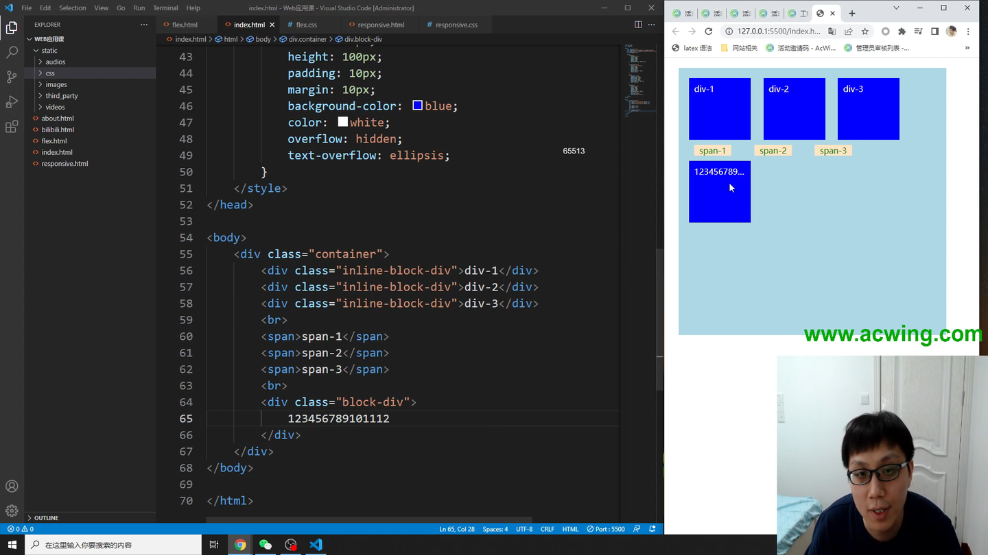
.container {
display: block;
width: 500px;
height: 500px;
padding: 10px;
margin: 20px;
background-color: lightblue;
}
.inline-block-div {
display: inline-block;
width: 100px;
height: 100px;
padding: 10px;
margin: 10px;
background-color: blue;
color: white;
}
span {
display: inlie;
padding: 0 10px 0 10px;
margin: 0 20px 0 20px;
background-color: bisque;
color: green;
}
.block-div {
display: block;
width: 100px;
height: 100px;
padding: 10px;
margin: 10px;
background-color: blue;
color: white;
overflow: hidden;
text-overflow: ellipsis;
}
</style>
</head>
<body>
<div class="container">
<div class="inline-block-div">div-1</div>
<div class="inline-block-div">div-2</div>
<div class="inline-block-div">div-3</div>
<br>
<span>span-1</span>
<span>span-2</span>
<span>span-3</span>
<br>
<div class="block-div"> 123456789101112 </div>
</div>
</body>
</html>
<!DOCTYPE html>
<html lang="en">
<head>
<meta charset="UTF-8">
<meta http-equiv="X-UA-Compatible" content="IE=edge">
<meta name="viewport" content="width=device-width, initial-scale=1.0">
<title>Document</title>
<style>
div{
width: 100px;
height: 100px;
background-color: lightsalmon;
}
div:nth-child(1){
margin: 10px 20px 30px 40px;
padding: 10px 20px 30px 40px;
}
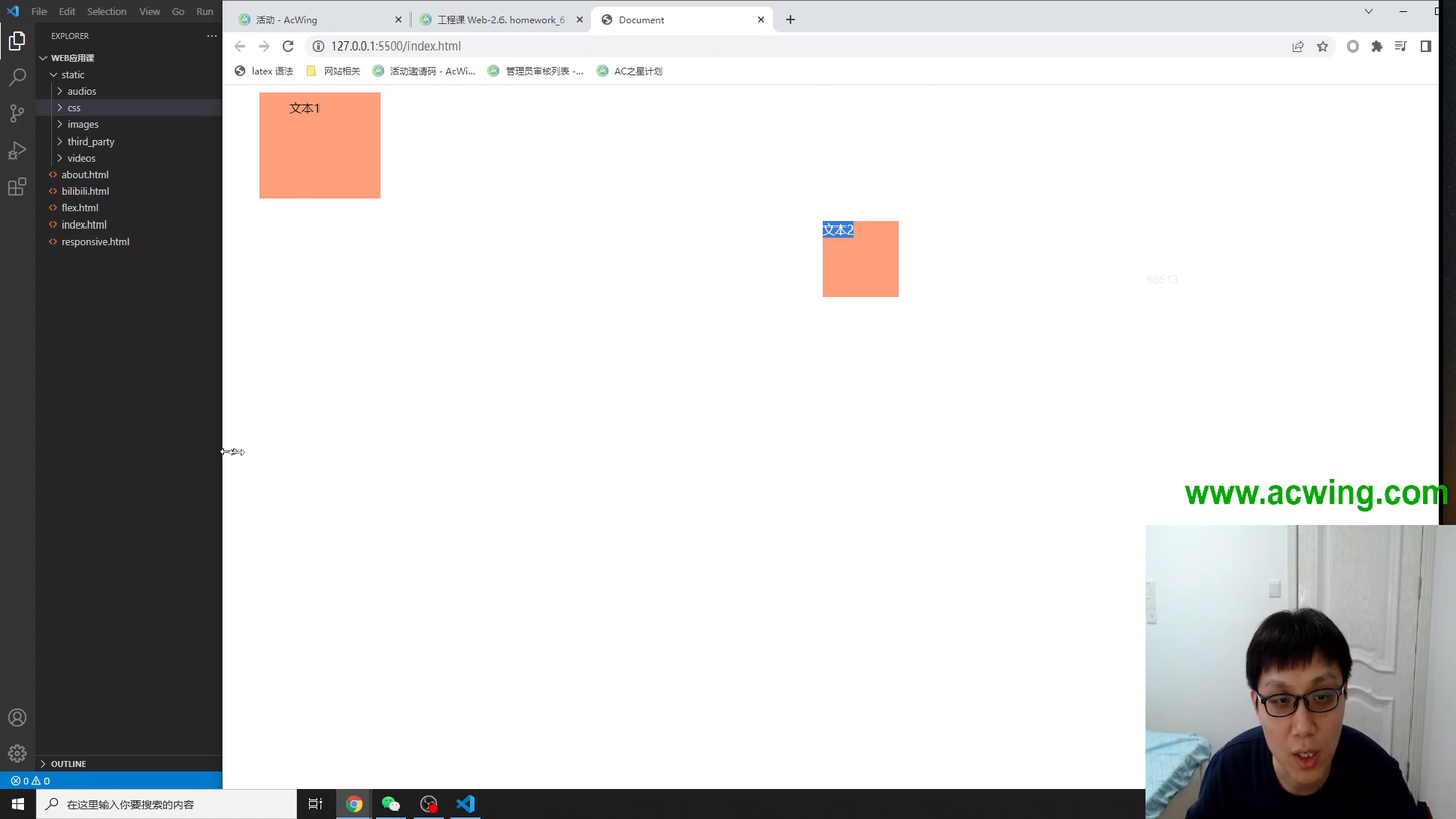
div:nth-child(2){
margin: 0 auto;
}
</style>
</head>
<body>
<div>文本1</div>
<div>文本2</div>
</body>
</html>
<!DOCTYPE html>
<html lang="en">
<head>
<meta charset="UTF-8">
<meta http-equiv="X-UA-Compatible" content="IE=edge">
<meta name="viewport" content="width=device-width, initial-scale=1.0">
<title>Document</title>
<style>
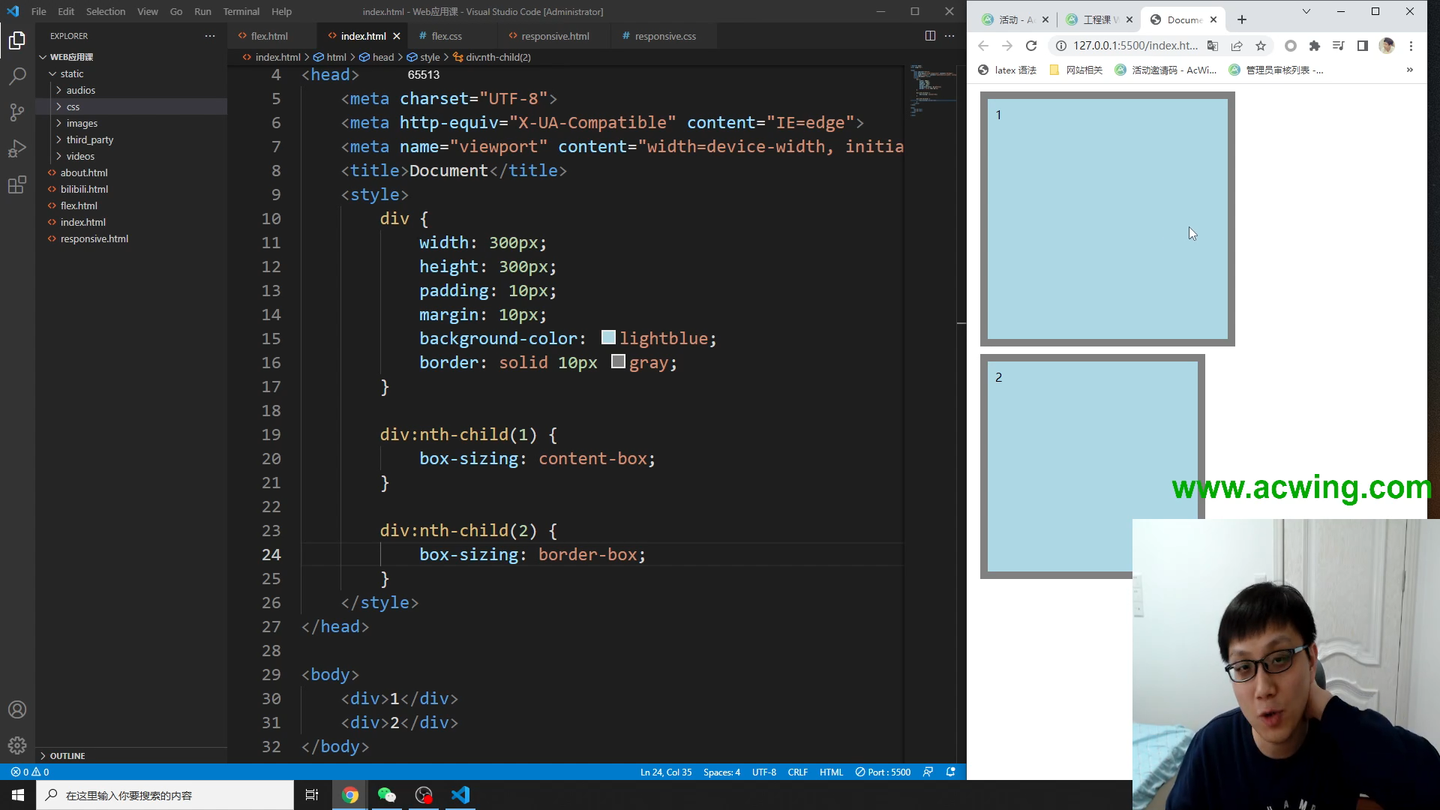
div {
width: 300px;
height: 300px;
padding: 10px;
margin: 10px;
background-color: lightblue;
border: solid 10px gray;
}
div:nth-child(1) {
box-sizing: content-box;
}
div:nth-child(2) {
box-sizing: border-box;
}
</style>
</head>
<body>
<div>1</div>
<div>2</div>
</body>
</html>
<!DOCTYPE html>
<html lang="en">
<head>
<meta charset="UTF-8">
<meta http-equiv="X-UA-Compatible" content="IE=edge">
<meta name="viewport" content="width=device-width, initial-scale=1.0">
<title>Document</title>
<style>
body {
height: 2000px;
margin: 0;
}
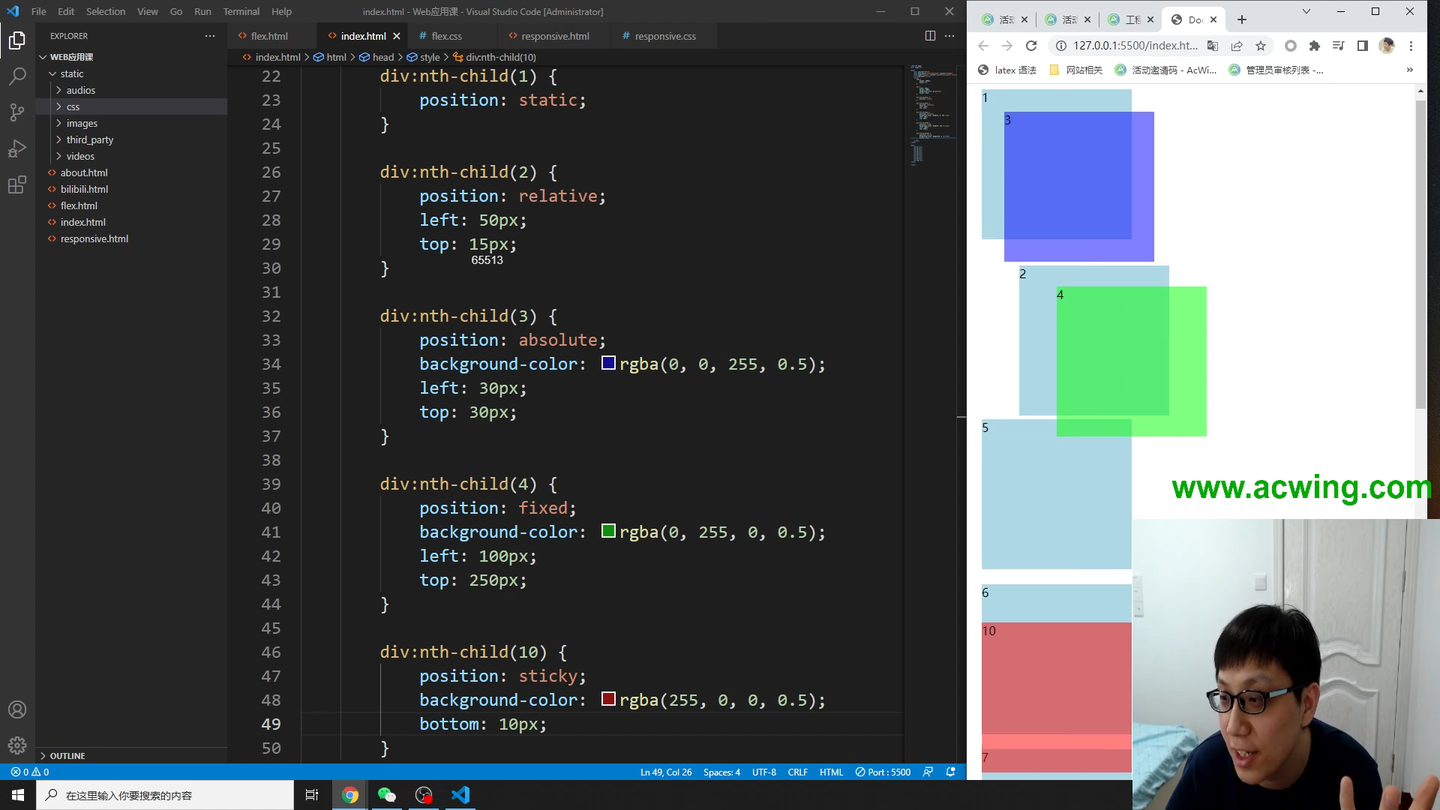
div {
width: 200px;
height: 200px;
background-color: lightblue;
margin: 20px;
}
div:nth-child(1) {
position: static;
}
div:nth-child(2) {
position: relative;
left: 50px;
top: 15px;
}
div:nth-child(3) {
position: absolute;
background-color: rgba(0, 0, 255, 0.5);
left: 30px;
top: 30px;
}
div:nth-child(4) {
position: fixed;
background-color: rgba(0, 255, 0, 0.5);
left: 100px;
top: 250px;
}
div:nth-child(10) {
position: sticky;
background-color: rgba(255, 0, 0, 0.5);
bottom: 10px;
}
</style>
</head>
<body>
<div>1</div>
<div>2</div>
<div>3</div>
<div>4</div>
<div>5</div>
<div>6</div>
<div>7</div>
<div>8</div>
<div>9</div>
<div>10</div>
</body>
</html>
<!DOCTYPE html>
<html lang="en">
<head>
<meta charset="UTF-8">
<meta http-equiv="X-UA-Compatible" content="IE=edge">
<meta name="viewport" content="width=device-width, initial-scale=1.0">
<title>Document</title>
<style>
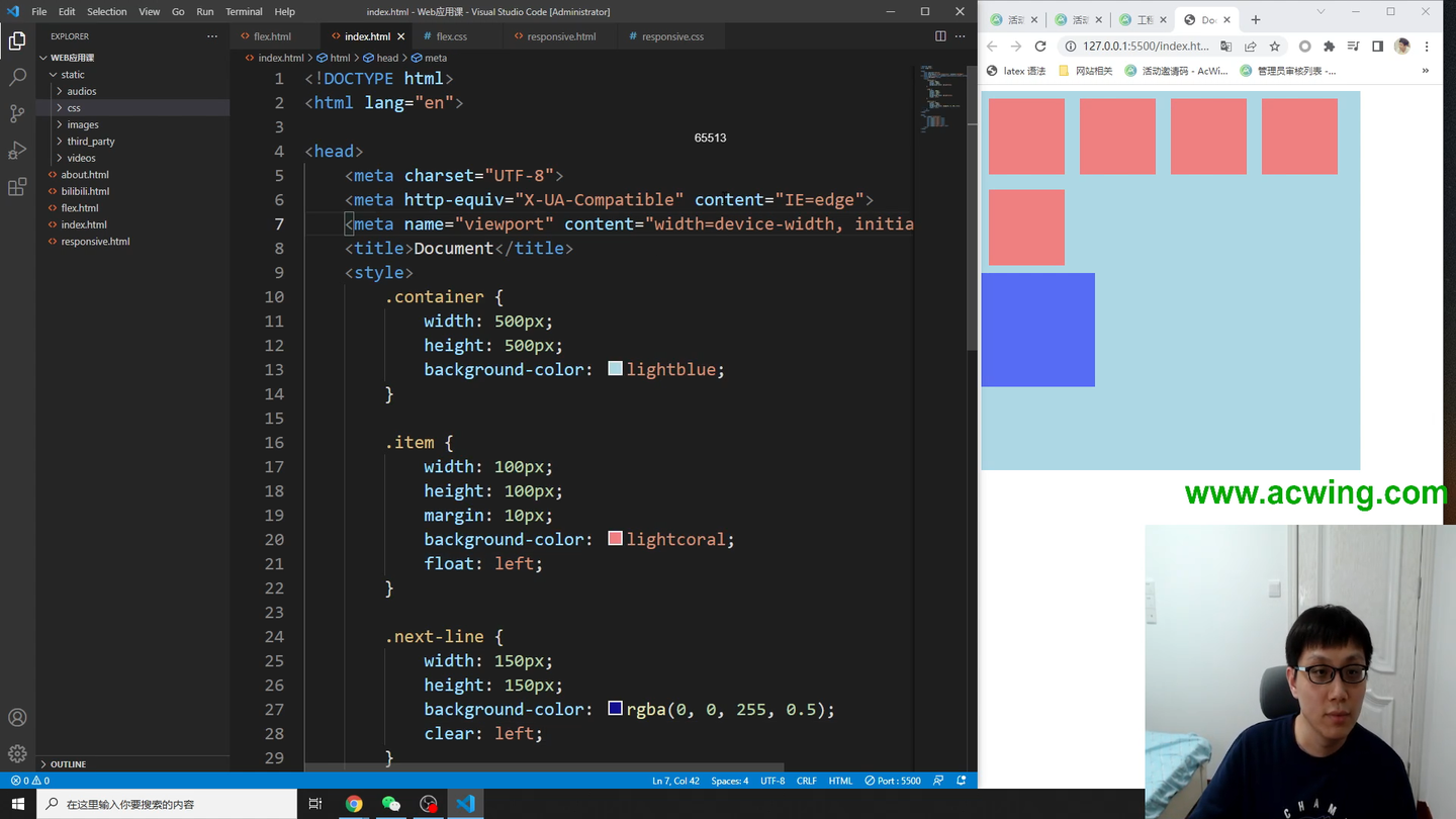
.container {
width: 500px;
height: 500px;
background-color: lightblue;
}
.item {
width: 100px;
height: 100px;
margin: 10px;
background-color: lightcoral;
float: left;
}
.next-line {
width: 150px;
height: 150px;
background-color: rgba(0, 0, 255, 0.5);
clear: left;
}
</style>
</head>
<body>
<div class="container">
<div class="item"></div>
<div class="item"></div>
<div class="item"></div>
<div class="item"></div>
<div class="item"></div>
<div class="next-line"></div>
</div>
</body>
</html>
<!DOCTYPE html>
<html lang="en">
<head>
<meta charset="UTF-8">
<meta http-equiv="X-UA-Compatible" content="IE=edge">
<meta name="viewport" content="width=device-width, initial-scale=1.0">
<title>Document</title>
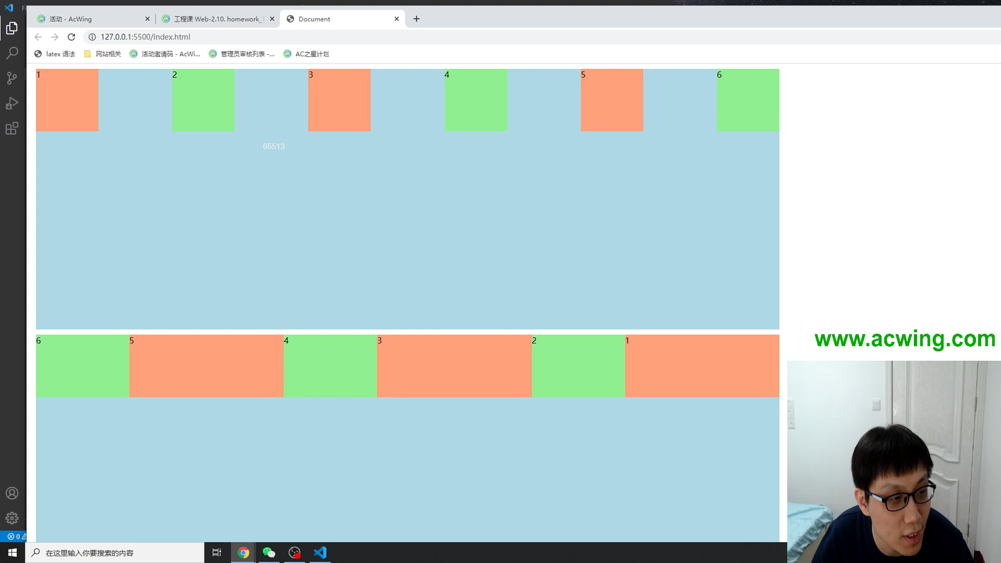
<style>
.container {
display: flex;
width: 50%;
height: 500px;
background-color: lightblue;
margin: 10px;
}
.container>div {
width: 120px;
height: 120px;
}
.container>div:nth-child(odd) {
background-color: lightsalmon;
}
.container>div:nth-child(even) {
background-color: lightgreen;
}
.container:nth-child(1) {
flex-wrap: wrap;
justify-content: space-between;
align-content: flex-start;
}
.container:nth-child(2) {
flex-direction: row-reverse;
flex-wrap: nowrap;
}
.container:nth-child(2)>div:nth-child(odd) {
flex-grow: 3;
flex-shrink: 3;
}
.container:nth-child(2)>div:nth-child(even) {
flex-grow: 1;
flex-shrink: 1;
}
</style>
</head>
<body>
<div class="container">
<div>1</div>
<div>2</div>
<div>3</div>
<div>4</div>
<div>5</div>
<div>6</div>
</div>
<div class="container">
<div>1</div>
<div>2</div>
<div>3</div>
<div>4</div>
<div>5</div>
<div>6</div>
</div>
</body>
</html>