纯css3实现穿越动画
<!DOCTYPE html>
<html lang="zh">
<head>
<meta charset="UTF-8">
<meta http-equiv="X-UA-Compatible" content="IE=edge">
<meta name="viewport" content="width=device-width, initial-scale=1.0">
<title>Document</title>
<style>
body {
width: 100vw;
background-color: black;
height: 100vh;
display: flex;
justify-content: center;
align-items: center;
}
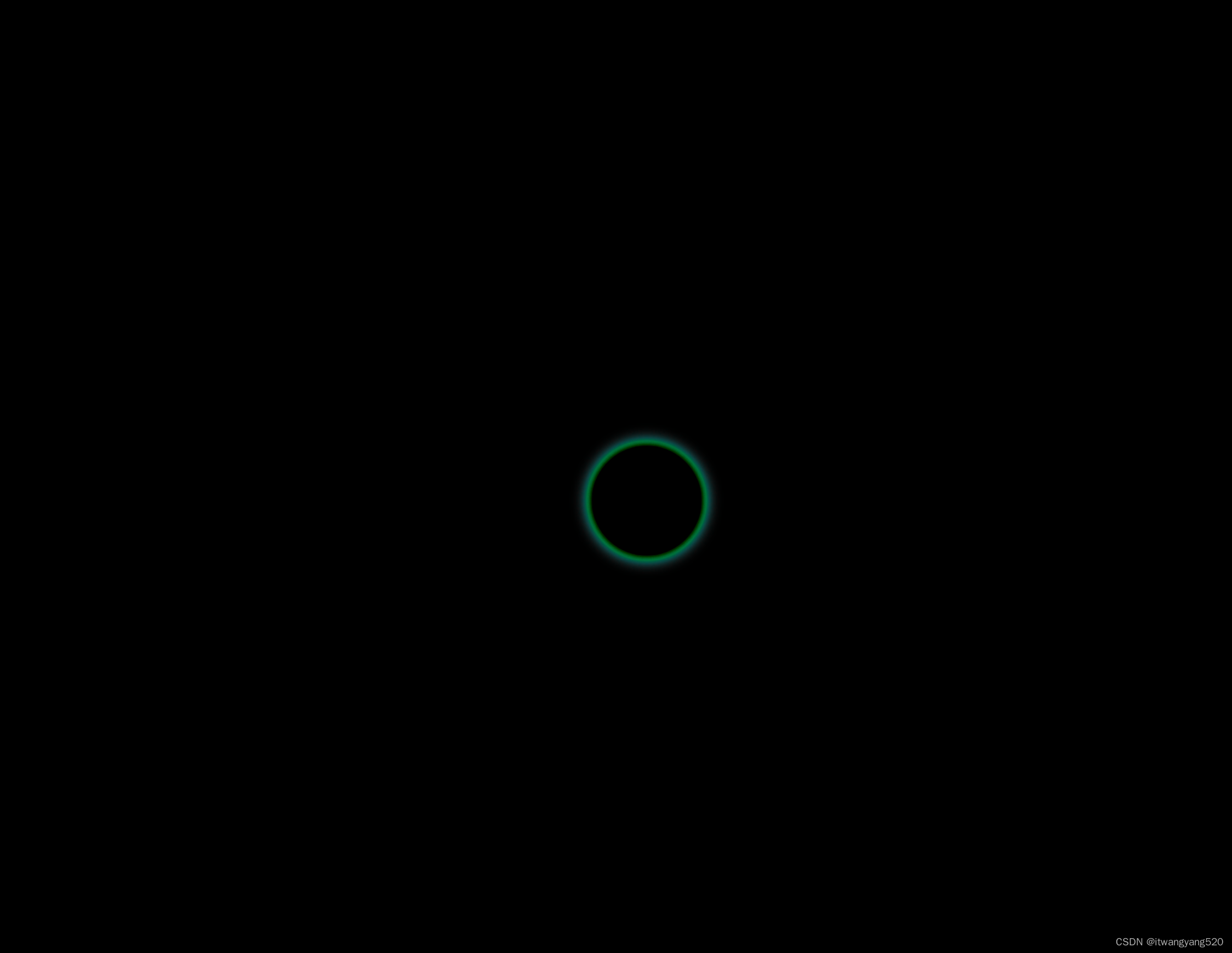
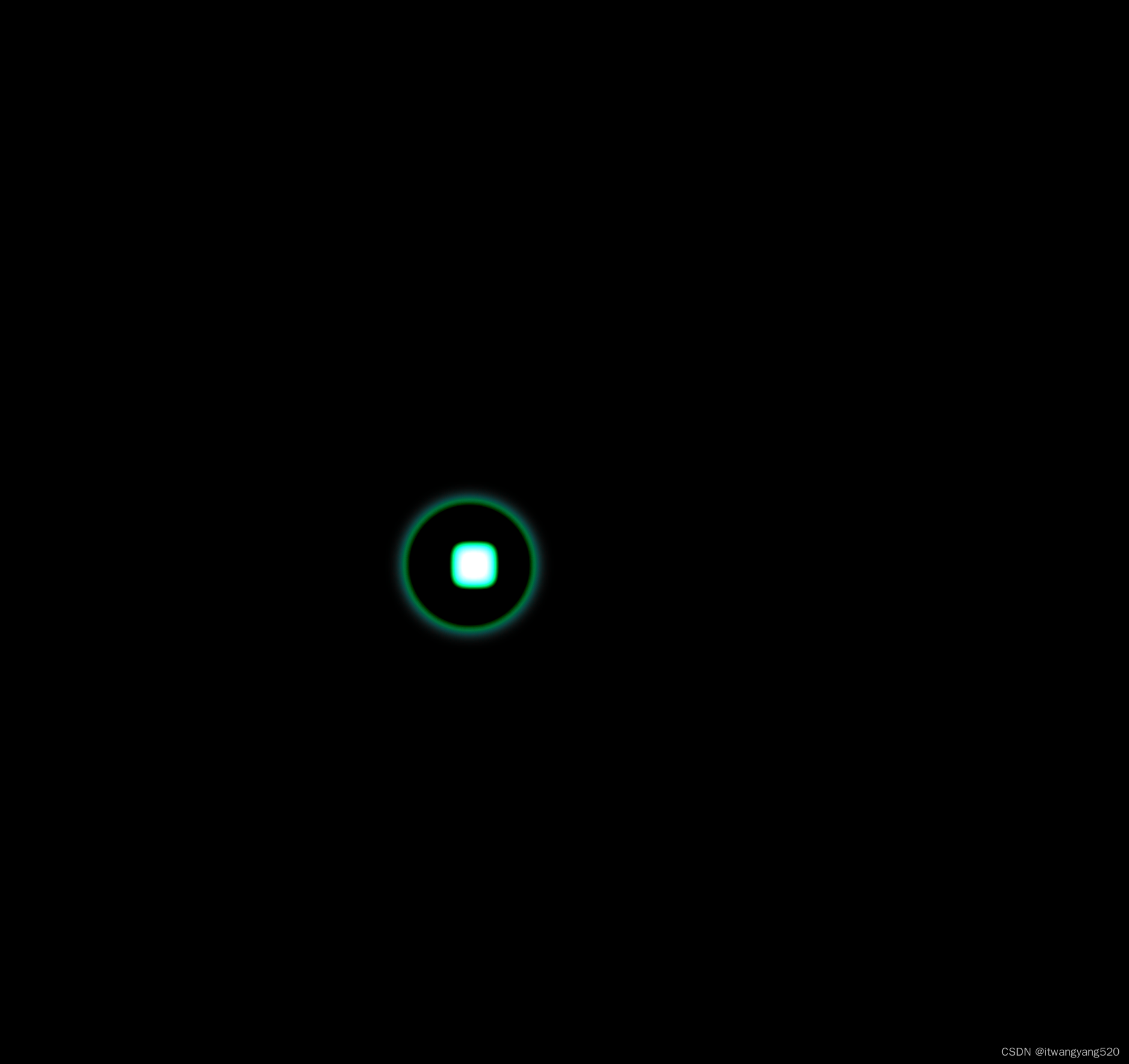
.container {
width: 100px;
height: 100px;
border: 4px solid aquamarine;
background-color: #222;
overflow: hidden;
border-radius: 50%;
font-size: 36px;
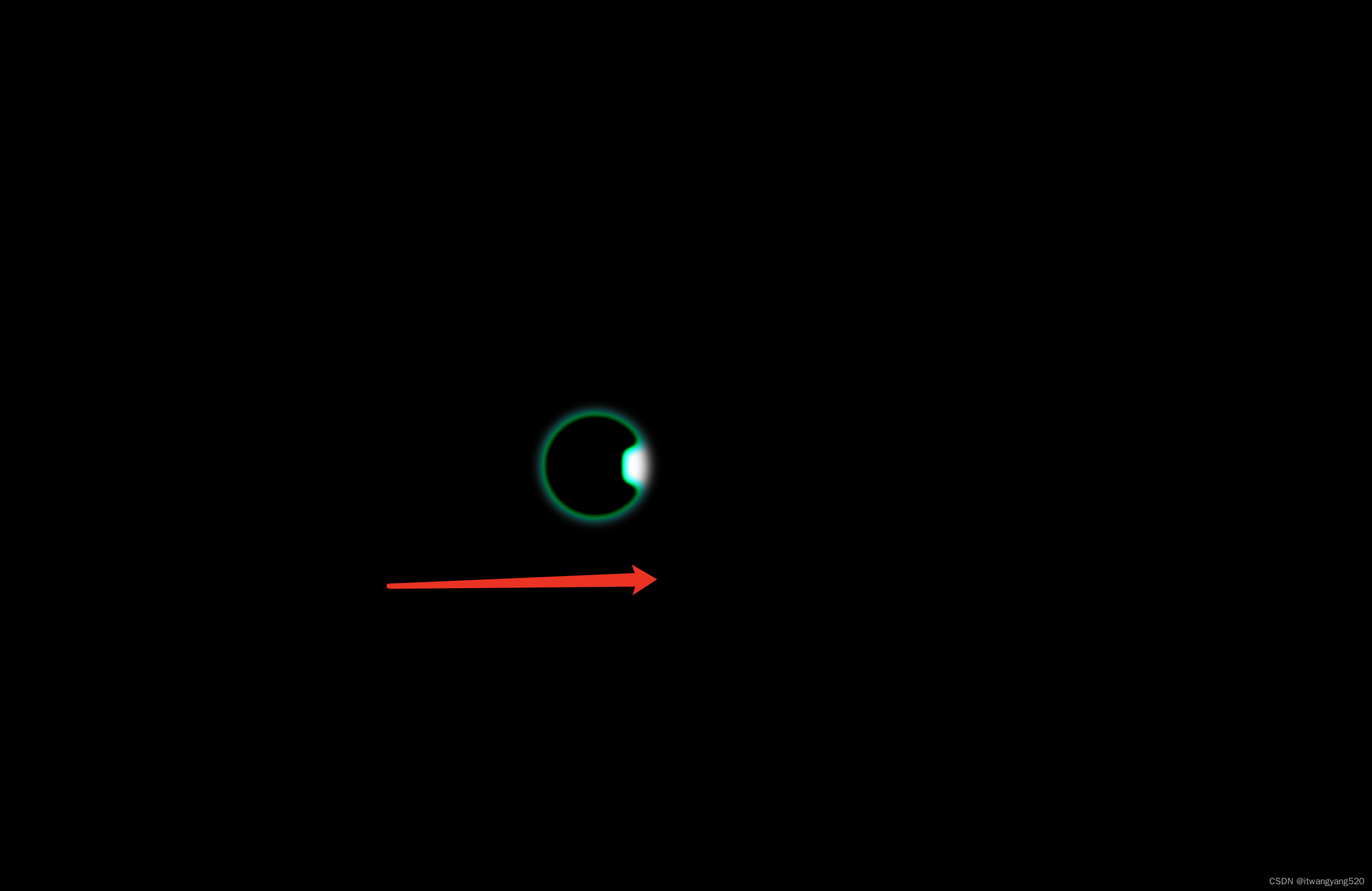
filter: blur(6px) contrast(6);
/* 主要靠这行代码 */
display: flex;
justify-content: center;
align-items: center;
}
.box {
width: 1em;
height: 1em;
transform: translate(0px, 0px);
background-color: aquamarine;
animation: move 2s linear infinite;
}
@keyframes move {
from {
transform: translateX(-100px);
}
to {
transform: translateX(100px);
}
}
</style>
</head>
<body>
<div class="container">
<div class="box"></div>
</div>
</body>
</html>