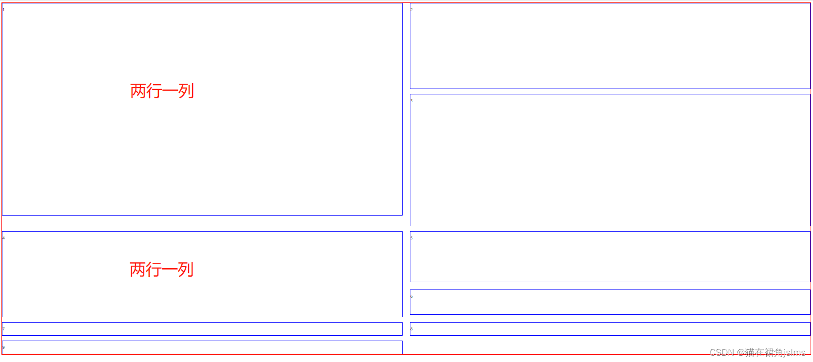
实现效果
具体代码
<!DOCTYPE html>
<html lang="en">
<head>
<meta charset="UTF-8">
<meta http-equiv="X-UA-Compatible" content="IE=edge">
<meta name="viewport" content="width=device-width, initial-scale=1.0">
<title>使用CSS Grid实现网格布局</title>
<style>
.box {
display: grid;
grid-template-columns: 1fr 1fr;
border: 1px solid red;
gap: 20px 30px;
grid-auto-flow: row dense;
}
.box div {
border: 1px solid blue;
}
.box1 {
height: 870px;
grid-row: 1 / span 2;
}
.box2 {
height: 350px;
}
.box3 {
height: 540px;
}
.box4 {
height: 350px;
grid-row: 3 / span 2;
grid-column: 1 / 2;
}
.box5 {
height: 205px;
align-self: start;
}
.box6 {
height: 100px;
align-self: start;
}
</style>
</head>
<body>
<div class="box">
<div class="box1"><p>1</p></div>
<div class="box2"><p>2</p></div>
<div class="box3"><p>3</p></div>
<div class="box4"><p>4</p></div>
<div class="box5"><p>5</p></div>
<div class="box6"><p>6</p></div>
<div class="box7"><p>7</p></div>
<div class="box8"><p>8</p></div>
<div class="box9"><p>9</p></div>
</div>
</body>
</html>
参考链接
阮一峰Grid教程