胶囊柱状图主要是通过给柱状图的柱子设置圆角来使其变成胶囊的形状
在itemStyle中设置barBorderRadius可以达到这个效果
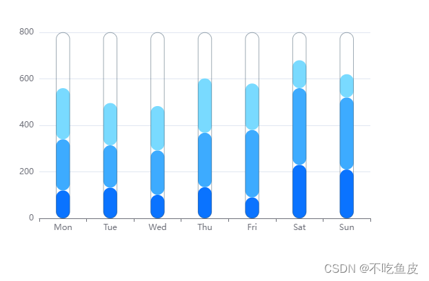
效果图
完整代码
<!DOCTYPE html>
<html lang="en">
<head>
    <meta charset="UTF-8">
    <meta http-equiv="X-UA-Compatible" content="IE=edge">
    <meta name="viewport" content="width=device-width, initial-scale=1.0">
    <title>Document</title>
    <!-- 步骤一:引入echarts.js -->
    <script src="../lib/echarts.min.js"></script>
</head>
<body>
    <!-- 步骤二:准备一个呈现图表的盒子 -->
    <div id="main" style="width:600px;height:400px"></div>
    <script>
        // 步骤三:初始化echarts实例对象
        // 参数,dom,决定图标最终呈现的位置
        var chartDom = document.getElementById('main');
        var myChart = echarts.init(chartDom);
        // var option;
        var large = 0.2;
        // 步骤四:准备配置项
        const data = [500, 500, 500, 500, 500, 800, 800]
        const lineData = [150, 230, 224, 218, 135, 147, 260]
        const max = data.concat(lineData)
            .reduce((pre, cur) => pre > cur ? pre : cur, 0)
        const color = []
        const option = {
            color,
            xAxis: [{
                type: 'category',
                data: ['Mon', 'Tue', 'Wed', 'Thu', 'Fri', 'Sat', 'Sun']
            }, {
                type: 'category',
                show: false,
                data: ['Mon', 'Tue', 'Wed', 'Thu', 'Fri', 'Sat', 'Sun']
            }],
            yAxis: {
                type: 'value',
                max: max
            },
            series: [
            {
                name: 'Email',
                data: [120, 132, 101, 134, 90, 230, 210],
                barWidth: 20,
                type: 'bar',
                stack: 'ad',
                itemStyle: {
                    normal: {
                        barBorderRadius: [20, 20, 20 ,20],
                        color: function(d) {
                            let a = 6 * 10
                            return `rgba(10,115,255)`
                        }
                    }
                }
            },
            {
                name: 'Union',
                data: [220, 182, 191, 234, 290, 330, 310],
                barWidth: 20,
                type: 'bar',
                stack: 'ad',
                itemStyle: {
                    normal: {
                        barBorderRadius: [20, 20, 20 ,20],
                        color: function(d) {
                            let a = 6 * 10
                            return `rgba(61,171,255)`
                        }
                    }
                }
            },
            {
                name: 'ADs',
                data: [220, 182, 191, 234, 200, 120, 100],
                barWidth: 20,
                type: 'bar',
                stack: 'ad',
                itemStyle: {
                    normal: {
                        barBorderRadius: [20, 20, 20 ,20],
                        color: function(d) {
                            let a = 6 * 10
                            return `rgba(121,218,255)`
                        }
                    }
                }
            },
            {
                xAxisIndex: 1,
                barWidth: 20,
                itemStyle: {
                    color: 'rgba(18, 18, 18, 0)',
                    borderWidth: 0.5,
                    borderColor: "rgba(60, 84, 103)",
                    barBorderRadius: [20, 20, 20 ,20],
                },
                data: data.map(() => max),
                type: 'bar'
            }]
        };

        // 步骤五:将配置项设置给echarts实例对象
        option && myChart.setOption(option);
    </script>
</body>
</html>