
作者:谭东
Echarts是百度公司开源的,这个大家应该都知道,和Echarts对标的国内的就是阿里的DataV了。
先看下Echarts的简介。
ECharts是一款基于JavaScript的数据可视化图表库,提供直观、生动、可交互、可个性化定制的数据可视化图表。ECharts最初由百度团队开源,并于2018年初捐赠给Apache基金会,成为ASF孵化级项目。2021年1月26日晚,Apache基金会官方宣布ECharts项目正式毕业。1月28日,ECharts 5线上发布会举行。
目前Echarts的官方文档都转移到了Apache Echarts项目中,ECharts官方文档。大家通过这个文档来学习也基本可以学会Echarts的基础用法,扩展用法建议通过实例模仿来一点点提高扩展能力。
Echarts一般用来做大数据展示、大屏数据展示、数据孪生等等场景,这些大家应该也都知道。
话不多说,先看看我做的一个简单的图标例子,如果你可以模仿我这个写出来了,那么后续各种图表的配置、炫酷的特效写法基本都会得心应手了。

(Echarts地图动画效果 )

(Echarts编写的页面整体效果图)
核心部分就是三个不同类型的数据图形化展示:Echarts地图、Echarts饼图、Echarts折线图。
我们从简单到容易讲解吧:Echarts饼图。先说公用的部分,也就是先在页面引入Echarts库,这里我是用原始的html页面来写的。
首先要在Html页面的<head></head>里引入echart的js库。
<script src="./js/echarts_5.3.0.js"></script>echarts这个库文件我是下载下到本地引入的。
接下来需要在<body></body>里写入一个div容器,这个div容器要有固定宽高尺寸,并且设置好id,这样才能挂载和渲染echarts到这个容器里进行展示。
<div class="chart3Div" id="chart3">

</div>
接下来在底部的<script></script>里面编写相关初始化配置代码。
<script type="text/javascript">

        // 基于准备好的dom,初始化echarts实例
        var myChart3 = echarts.init(document.getElementById('chart3'), 'dark');
        //核心配置项
        var option3 = {
            ... ...
        };

        // 使用刚指定的配置项和数据显示图表。
        myChart3.setOption(option3);
        //这段表示随着页面尺寸的变化,图表进行自适应尺寸变化
        window.onresize = function () {
            myChart3.resize();
        };

</script>
其中'dark'表示使用深色模式,如果不加最后的'dark'参数的话,默认使用正常的模式。
Echarts的各种定制化数据展示效果基本都是靠配置项灵活配置以及数据集的整理匹配展示。
首先我们看下图中Echarts饼图的实现配置。
    <script type="text/javascript">

        // 基于准备好的dom,初始化echarts实例
        var myChart3 = echarts.init(document.getElementById('chart3'), 'dark');

        // 指定图表的配置项和数据
        var option3 = {
            // 全局调色盘。
            color: [
                '#c23531',
                '#2f4554',
                '#61a0a8',
                '#d48265',
                '#91c7ae',
                '#749f83',
                '#ca8622',
                '#bda29a',
                '#6e7074',
                '#546570',
                '#c4ccd3'
            ],
            title: {

            },
            grid: {
                left: '5%',
                right: '8%',
                bottom: '1%',
                containLabel: true
            },
            tooltip: {},
            legend: {
                orient: 'horizontal',
                right: 10,
                top:10
            },
            xAxis: {
                type: 'value',
                axisLine: {
                    show: false
                },
                axisTick: {
                    show: false
                },
                splitLine: {show: false},
                axisLabel: {show: false},
            },
            yAxis: {
                type: 'category',
                data: ['本月', '本周','当日'],
                splitLine: {show: false},
                axisTick: 'none',
                axisLine: 'none',

            },
            series: [{
                name: '已处理',
                type: 'bar',
                // stack: 'y',
                data: [5, 20, 36],
                barWidth: 13,
                // 此系列自己的调色盘。
                color: [
                    '#dd6b66',
                    '#759aa0',
                    '#e69d87',
                    '#8dc1a9',
                    '#ea7e53',
                    '#eedd78',
                    '#73a373',
                    '#73b9bc',
                    '#7289ab',
                    '#91ca8c',
                    '#f49f42'
                ],
                // 普通样式。
                itemStyle: {
                    // 点的颜色。
                    color: '#dd6b66',
                    emphasis: {
                        barBorderRadius: 7
                    },
                    normal: {
                        barBorderRadius: 7,
                        color: '#eb2742',
                    }
                },
                z:1,
                label: {
                    normal: {
                        formatter: [
                            '{a|36\n}',
                            '{c|▼}'
                        ].join('\n'),
                        rich: {
                            a: {
                                'margin': '20 auto',
                                'width': '0',
                                'height': '0',
                                'border': '50 solid #eb2742',
                                'border-bottom': 'none',
                                'border-left-color': 'transparent',
                                'border-right-color': 'transparent',
                                lineHeight: 0,
                                fontSize: 16,
                            },
                            b:{
                                backgroundColor:{
                                    image: 'image/sanjiao.png'
                                },
                                height: 16,
                                lineHeight: 0,
                                fontSize: 16,
                            },
                            c:{
                                color: '#eb2742',
                                lineHeight: 0,
                                fontSize: 10,
                            },
                        },
                        align: 'middle',
                        // 修改 position 和 distance 的值试试
                        // 支持:'left', 'right', 'top', 'bottom', 'inside', 'insideTop', 'insideLeft', 'insideRight', 'insideBottom', 'insideTopLeft', 'insideTopRight', 'insideBottomLeft', 'insideBottomRight'
                        position: 'right',//标签的位置
                        offset: [-20, -20],
                        // distance: -6,
                        show: true,
                        padding: 2,
                        fontSize: 18,
                        color: '#eb2742',
                    }
                },
            },
            {
                name: '总数据',
                type: 'bar',
                // stack: 'y',
                barGap: '-100%',
                barWidth: 13,
                data: [15, 26, 39],
                z:0,
                // 此系列自己的调色盘。
                color: [
                    '#dd6b66',
                    '#759aa0',
                    '#e69d87',
                    '#8dc1a9',
                    '#ea7e53',
                    '#eedd78',
                    '#73a373',
                    '#73b9bc',
                    '#7289ab',
                    '#91ca8c',
                    '#f49f42'
                ],
                // 普通样式。
                itemStyle: {
                    // 点的颜色。
                    color: '#dd6b66',
                    emphasis: {
                        barBorderRadius: 7
                    },
                    normal: {
                        barBorderRadius: 7,
                        color: '#007aff',
                    }
                },
                label: {
                    normal: {
                        // 修改 position 和 distance 的值试试
                        // 支持:'left', 'right', 'top', 'bottom', 'inside', 'insideTop', 'insideLeft', 'insideRight', 'insideBottom', 'insideTopLeft', 'insideTopRight', 'insideBottomLeft', 'insideBottomRight'
                        position: 'right',
                        distance: 0,

                        show: true,
                        padding: 10,
                        fontSize: 18,
                        color: '#51b3ff'
                    }
                },
            }
        ]
        };

        // 使用刚指定的配置项和数据显示图表。
        myChart3.setOption(option3);
        window.onresize = function () {
            myChart3.resize();
        };

    </script>
最终效果如图:

看着可能简单,但是涉及到的东西还是挺多的,比较的全面。
接下来看下Echarts折线图的实现配置。
... ...
<div class="chart2Div" id="chart2"></div>
<div class="chart22Div" id="chart22"></div>
... ...
<script type="text/javascript">
// 基于准备好的dom,初始化echarts实例
var myChart2 = echarts.init(document.getElementById('chart2'), 'dark');
// 指定图表的配置项和数据
var option2 = {
// 全局调色盘。
color: ["#611cff","#e24244"],
title: {
text: ''
},
tooltip: {},
legend: {
orient: 'horizontal',
right: 10,
top:10,
data:['图例1','图例2'],
icon: "rect",
itemWidth: 16, // 设置宽度
itemHeight: 16, // 设置高度
itemGap: 20, // 设置间距
textStyle: {
//文字样式
color: "#5565b4",
fontSize: "18"
}
},
grid: {
left: '3%',
right: '4%',
bottom: '10%',
containLabel: true
},
xAxis: {
type: 'category',
data: ['4日', '5日', '6日','7日', '8日', '9日','10日'],
splitLine:{show: false},
axisLine: {
show: false
},
axisTick: {
alignWithLabel: true
},
axisLabel : {
formatter: '{value}',
textStyle: { //改变刻度字体样式
color: '#393f5c'
},
},
splitArea : {show : false},//保留网格区域,
boundaryGap: false //坐标轴两边留白
},
yAxis: {
type: 'value',
splitLine:{show: true},
axisLabel : {
formatter: '{value}',
textStyle: { //改变刻度字体样式
color: '#393f5c'
}
},
splitArea : {show : false},//保留网格区域
},
series: [
{
data: [12, 20, 15,0,0,0,0],
type: 'line',
smooth:true,
name: '图例1',
areaStyle:{
color:new echarts.graphic.LinearGradient(0, 0, 0, 1,[{
offset: 0, color: '#611cff' // 0% 处的颜色
}, {
offset: 0.2, color: '#611cff' // 100% 处的颜色
}, {
offset: 1, color: '#00000000' // 100% 处的颜色
}]
), //背景渐变色
},
z:1,
},
{
data: [6, 27, 18,0,0,0,0],
type: 'line',
smooth:true,
name: '图例2',
z:0,
areaStyle:{
color:new echarts.graphic.LinearGradient(0, 0, 0, 1,[{
offset: 0, color: '#e24244' // 0% 处的颜色
}, {
offset: 0.2, color: '#e24244' // 100% 处的颜色
}, {
offset: 1, color: '#00000000' // 100% 处的颜色
}]
), //背景渐变色
}
}
]
};
// 使用刚指定的配置项和数据显示图表。
myChart2.setOption(option2);
window.onresize = function () {
myChart2.resize();
};
// 基于准备好的dom,初始化echarts实例
var myChart22 = echarts.init(document.getElementById('chart22'), 'dark');
// 指定图表的配置项和数据
var option22 = {
// 全局调色盘。
color: ["#3bfdca","#4994cf"],
title: {
text: ''
},
// backgroundColor:'', //设置无背景色
tooltip: {},
legend: {
orient: 'horizontal',
// x:'center',
right:10,
top:10,
data:['图例3','图例4'],
icon: "rect",
itemWidth: 16, // 设置宽度
itemHeight: 16, // 设置高度
itemGap: 20, // 设置间距
textStyle: {
//文字样式
color: "#5565b4",
fontSize: "18"
}
},
grid: {
left: '3%',
right: '4%',
bottom: '10%',
containLabel: true
},
xAxis: {
type: 'category',
data: ['4日', '5日', '6日','7日', '8日', '9日','10日'],
splitLine:{show: false},
axisLine: {
show: false
},
axisLabel : {
formatter: '{value}',
textStyle: { //改变刻度字体样式
color: '#393f5c'
},
},
splitArea : {show : false},//保留网格区域,
boundaryGap: false, //坐标轴两边留白
axisTick: {
alignWithLabel: true
},
},
yAxis: {
type: 'value',
splitLine:{show: true},
axisLabel : {
formatter: '{value}',
textStyle: { //改变刻度字体样式
color: '#393f5c'
}
},
splitArea : {show : false},//保留网格区域
},
series: [
{
data: [2, 12, 5,0,0,0,0],
type: 'line',
smooth:true,
name: '图例3',
areaStyle:{
color:new echarts.graphic.LinearGradient(0, 0, 0, 1,[{
offset: 0, color: '#3bfdca' // 0% 处的颜色
}, {
offset: 0.2, color: '#3bfdca' // 100% 处的颜色
}, {
offset: 1, color: '#00000000' // 100% 处的颜色
}]
), //背景渐变色
},
z:1,
},
{
data: [6, 7, 8,0,0,0,0],
type: 'line',
smooth:true,
name: '图例4',
z:0,
areaStyle:{
color:new echarts.graphic.LinearGradient(0, 0, 0, 1,[{
offset: 0, color: '#4994cf' // 0% 处的颜色
}, {
offset: 0.2, color: '#4994cf' // 100% 处的颜色
}, {
offset: 1, color: '#00000000' // 100% 处的颜色
}]
), //背景渐变色
}
}
]
};
// 使用刚指定的配置项和数据显示图表。
myChart22.setOption(option22);
window.onresize = function () {
myChart22.resize();
};
</script>最终效果图如下:

是由两个Echarts折线图组成的。
最后看一个最复杂,也是最能提升Echarts技能的Echarts地图的实战配置。
... ...
<div class="zoneCenterDiv">
    <div id="main" class="chartDiv"></div>
    <div class="logo">
        <img src="https://www.jetbrains.com.cn/img/banners-home-page/annual-highlights-icon.svg">
     </div>
</div>
... ...
没错,那个右下角的图片,是div写的,叠加到Echarts区域的。
配置项完整代码如下:
<script type="text/javascript">
var geoCoordMap = {
'东城区':[116.418757,39.917544],
'西城区':[116.366794,39.915309],
'朝阳区':[116.486409,39.921489],
'丰台区':[116.286968,39.863642],
'石景山区':[116.195445,39.914601],
'海淀区':[116.310316,39.956074],
'门头沟区':[116.105381,39.937183],
'房山区':[116.139157,39.735535],
'通州区':[116.658603,39.902486],
'顺义区':[116.653525,40.128936],
'昌平区':[116.235906,40.218085],
'大兴区':[116.338033,39.728908],
'怀柔区':[116.637122,40.324272],
'平谷区':[117.112335,40.144783],
'密云区':[116.843352,40.377362],
'延庆区':[115.985006,40.465325]
};
var geoGpsMap = {
'1': [115.985006,40.465325],//延庆区
'2': [116.418757,39.917544],//东城区
'3': [116.658603,39.902486],//通州区
'4': [116.235906,40.218085],//昌平区
'5': [116.843352,40.377362],//密云区
'6': [116.310316,39.956074],//海淀区
};
var numData=[
{ name: '东城区', value: 5881.84 },
{ name: '西城区', value: 4918.26 },
{ name: '朝阳区', value: 5524.26 },
{ name: '丰台区', value: 5881.84 },
{ name: '石景山区', value: 2190.9 },
{ name: '海淀区', value: 4518.97 },
{ name: '门头沟区', value: 3765.78 },
{ name: '房山区', value: 2227.92 },
{ name: '通州区', value: 4178.01 },
{ name: '顺义区', value: 4404.49 },
{ name: '昌平区', value: 6992.6 },
{ name: '大兴区', value: 2180.98 },
{ name: '怀柔区', value: 1547.48 },
{ name: '平谷区', value: 40689.64 },
{ name: '密云区', value: 31686.1 },
{ name: '延庆区', value: 2007.34 },
];
const geoCoordLineMap = {
西城区: [116.366794,39.915309],
东城区: [116.418757,39.917544],
};
var data={
西城区: Math.round(Math.random()*1000),
东城区: Math.round(Math.random()*1000),
}
// 保存引导线末端的坐标
var linesEndCoords={
西城区:[geoCoordLineMap['西城区'][0]+1,geoCoordLineMap['西城区'][1]],
东城区:[geoCoordLineMap['东城区'][0]+1,geoCoordLineMap['东城区'][1]-0.1],
}
var mapData = [
[],
[],
[],
[],
[],
[]
];
mapData[0].push({
"name": '延庆区'
});
var convertData = function (data) {
var res = [];
for (var i = 0; i < data.length; i++) {
var geoCoord = geoCoordMap[data[i].name];
if (geoCoord) {
res.push({
name: data[i].name,
value: geoCoord.concat(data[i].value)
});
}
}
return res;
};
// lines引导线数据和坐标
function dataLines(province,data){
var res=[];
province.forEach(name=>{
res.push({
name:name,
value:data[name],
coords:[
geoCoordLineMap[name],
linesEndCoords[name]
],
})
})
return res;
}
function randomNum(minNum, maxNum) {
switch (arguments.length) {
case 1:
return parseInt(Math.random() * minNum + 1, 10);
break;
case 2:
return parseInt(Math.random() * (maxNum - minNum + 1) + minNum, 10);
break;
default:
return 0;
break;
}
}
var convertToLineData = function(data, gps) {
var res = [];
for (var i = 0; i < data.length; i++) {
var dataItem = data[i];
var fromCoord = geoCoordMap[dataItem.name];
var toCoord = gps;
// var toCoord = geoGps[Math.random()*3];
if (fromCoord && toCoord) {
res.push([{
coord: fromCoord,
}, {
coord: toCoord,
}]);
}
}
return res;
};
$.getJSON('./data/city.json', function(geoJson) {
echarts.registerMap('city', {geoJSON: geoJson});
var myChart = echarts.init(document.getElementById('main'), 'dark');
// 指定图表的配置项和数据
var option = {
geo: [{
map: 'city',
roam: true,//平移或缩放
zoom: 1.2,
label: {
normal: {
show: true,
color: 'rgba(255, 255, 255, 0.5)',
formatter: function (params) {
return params.name =='西城区'||params.name =='东城区'?'':params.name;
}
},
emphasis: {
color: '#fff'
}
},
itemStyle: {
normal: {
areaColor: '#111a42',
borderWidth: 2,
borderColor: '#293676'
},
emphasis: {
show: true,
areaColor: '#070e2a',
label: {
show: true,
textStyle: {
color: '#fff'
}
}
}
},
regions: [
{
name: "通州区",
itemStyle: {
normal: {
opacity: 0.8, // 透明度
borderColor: "#293676", // 省份界线颜色
borderWidth: 2, // 省份界线的宽度
areaColor: '#293676', // 整个省份的颜色
},
},
}
] //对不同的区块进行着色
}],
backgroundColor:'',
// 全局调色盘。
color: [
'#c23531',
'#2f4554',
'#61a0a8',
'#d48265',
'#91c7ae',
'#749f83',
'#ca8622',
'#bda29a',
'#6e7074',
'#546570',
'#c4ccd3'
],
title: {
text: ''
},
tooltip: {},
legend: {
data: ['']
},
// visualMap: {
// min: 0,
// max: 2500,
// left: 'left',
// top: 'bottom',
// text: ['高','低'],
// calculable: true
// },
xAxis: {
show:false,
},
yAxis: {
show:false,
},
series: [
{
name: 'pm2.5',
type: 'scatter',
coordinateSystem: 'geo',
data: convertData(numData),
symbolSize: 5,
// symbolSize: function (val) {
// return val[2] / 1000;
// },
label: {
normal: {
formatter: '{b}',
position: 'right',
show: false
},
emphasis: {
show: true
}
},
itemStyle: {
normal: {
color: '#ddb926'
}
}
},
// {
// name: '人口密度',
// type: 'map',
// map: 'city',
// showLegendSymbol:false,
// roam: true,//平移或缩放
// zoom: 1.2,
// symbol: "http://498.bjsaiya.cn/img/logo.259f6506.png",
// symbolSize: 10,
// animation:true,
// animationDelay: function(idx) {
// // 越往后的数据延迟越大
// return idx * 1000;
// },
// label: {
// normal: {
// show: true,
// color: 'rgba(255, 255, 255, 0.5)',
// formatter: [
// '{a|{b}\n}',
// '{d|▼}'
// ].join('\n'),
// rich: {
// a: {
// 'margin': '20 auto',
// 'width': '0',
// 'height': '0',
// 'border': '50 solid #eb2742',
// 'border-bottom': 'none',
// 'border-left-color': 'transparent',
// 'border-right-color': 'transparent',
// lineHeight: 0,
// },
// b:{
// backgroundColor:{
// image: 'image/sanjiao.png'
// },
// height: 16,
// lineHeight: 0,
// fontSize: 16,
// },
// c:{
// color: '#eb2742',
// lineHeight: 0,
// fontSize: 10,
// },
// },
// },
// emphasis: {
// color: '#fff'
// }
// },
// itemStyle: {
// areaColor: '#226DA4',
// borderWidth: 2,
// borderColor: 'rgba(255, 255, 255, 0.5)'
// },
// regions: [
// {
// name: "通州区",
// itemStyle: {
// normal: {
// opacity: 0.8, // 透明度
// borderColor: "#fff", // 省份界线颜色
// borderWidth: 2, // 省份界线的宽度
// areaColor: '#0595ff', // 整个省份的颜色
// },
// },
// }
// ], //对不同的区块进行着色
// data: [
// { name: '延庆区', value: 20057.34 },
// { name: '怀柔区', value: 15477.48 },
// { name: '密云区', value: 31686.1 },
// { name: '昌平区', value: 6992.6 },
// { name: '顺义区', value: 44045.49 },
// { name: '平谷区', value: 40689.64 },
// { name: '门头沟区', value: 37659.78 },
// { name: '海淀区', value: 45180.97 },
// { name: '朝阳区', value: 55204.26 },
// { name: '石景山区', value: 21900.9 },
// { name: '西城区', value: 4918.26 },
// { name: '东城区', value: 5881.84 },
// { name: '丰台区', value: 5881.84 },
// { name: '通州区', value: 4178.01 },
// { name: '房山区', value: 2227.92 },
// { name: '大兴区', value: 2180.98 },
// ],
// },
{
name: 'Top 2',
type: 'effectScatter',
coordinateSystem: 'geo',
data: convertData(numData.sort(function (a, b) {
return b.value - a.value;
}).slice(0, 3)),
symbolSize: function (val) {
return val[2] / 1000;
},
showEffectOn: 'render',//emphasis
rippleEffect: {
brushType: 'fill',//stroke
scale: 2,
period: 3,
},
hoverAnimation: true,
label: {
normal: {
formatter: '{b}',
position: 'right',
show: false
}
},
itemStyle: {
normal: {
// color: '#344599',
color: 'rgba(47,63,139,0.5)',
shadowBlur: 10,
shadowColor: '#333'
}
},
zlevel: 1
},
{ // 含引导线的省份,用lines实现
type: 'lines',
symbol:'circle',
symbolSize:[6,4],
label:{
show:true,
formatter:' {b}',
color: '#ffffff',
},
lineStyle:{
type:'stroke',//dotted
width:1,
shadowBlur:3,
color:'#ffffff',
},
data:dataLines(['西城区','东城区'],data),
},
//地图线的动画效果
{
type: 'lines',
zlevel: 2,
effect: {
show: true,
period: 4, //箭头指向速度,值越小速度越快
trailLength: 0.02, //特效尾迹长度[0,1]值越大,尾迹越长重
symbol: 'arrow', //箭头图标,circle, rect, roundRect, triangle, diamond, pin, arrow
symbolSize: 3, //图标大小
},
lineStyle: {
normal: {
color: '#ddb926',
width: 0.1, //尾迹线条宽度
opacity: 0.5, //尾迹线条透明度
curveness: .3 //尾迹线条曲直度
}
},
data: convertToLineData(mapData[0], geoGpsMap[Math.ceil(Math.random() * 6)])
},
],
};
// 使用刚指定的配置项和数据显示图表。
myChart.setOption(option);
window.onresize = function () {
myChart.resize();
};
});
$.get('./data/city.json', function (geoJson) {
// console.log(geoJson);
});
</script>最终效果图如下:

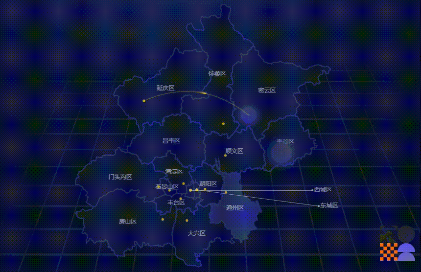
Echarts地图动画效果
涵盖了,地图geojson数据导入、geo配置、引导线配置、label雷达扩散动画效果、数据箭头流动效果等等。
其中地图geojson数据的生成地址:
或者使用OSM来生成。
先写这么多,完整版项目代码Github地址:https://github.com/jaychou2012/ECharts_level1