目录
一、 2D转换
- CSS3中具有颠覆性的特征之一,可以实现元素的位移,旋转,缩放等效果
- 移动:translate
- 旋转:rotate
- 缩放:scale
1. 二维坐标系
- x轴 水平向右
- y轴 垂直向下
2. 移动
transform:translate(x,y);
transform:translateX(n);
transform:translateY(n);
<style>
        div {


            width: 200px;
            height: 200px;
            background-color: pink;
            /* 移动盒子的位置: ①定位 ②盒子的外边距 ③2d转换移动 */
            transform: translate(20px, 20px);
        }
    </style>
- 定义转换中的移动,沿着x和y轴移动元素
- translate最大优点:不会影响到其他元素的位置
- translate中的百分比单位是相对于自身元素的translate:(50%,50%)
4. 对行内标签没有效果
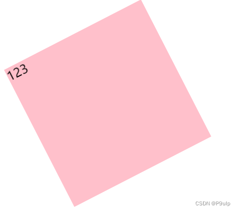
3. 旋转
transform:rotate
 <style>
        div {


            width: 200px;
            height: 200px;
            background-color: pink;
            margin: 200px auto;
            /* 旋转45° */
            transform: rotate(45deg);
        }
    </style>
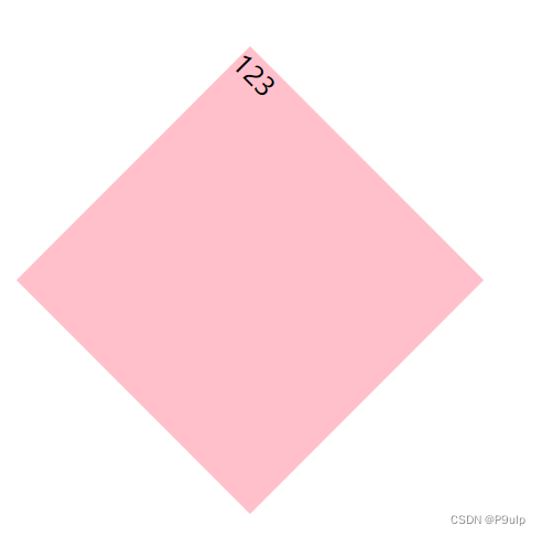
- rotate里面跟度数,单位是deg,比如45deg
- 角度为正时,顺时针
- 负时,逆时针
- 默认旋转的中心点时元素的中心点
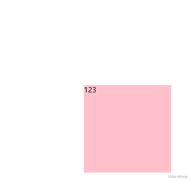
4. 中心点
transform-origin:x y;
 <style>
        div {


            width: 200px;
            height: 200px;
            background-color: pink;
            margin: 100px auto;
            /* 过度 */
            transition: all 1s;
            /* 设置中心点 */
            transform-origin: left bottom;
        }

        div:hover {


            /* 旋转360° */
            transform: rotate(360deg);
        }
    </style>
- xy之间要用空格隔开
- xy默认转换的中心点时元素的中心点(50% 50%)
- 还可以给xy设置像素或方位名词(top bottom left right center)
5. 缩放
控制元素大小
transform:scale(x,y)
- xy之间有逗号分开
- (1,1):宽和高都放大一倍,相对于没有放大
- (2,2):宽和高放大两倍
- (2):只写一个参数,第二个参数则和第一个参数一样
- (0.5,0.5):缩小
- 最大的优势:可以设置转换中心点缩放,默认以中心点缩放,而且不影响其他盒子
二、 动画
- CSS3中具有颠覆性的特征之一,可通过设置多个节点来精确控制一个或一组动画,常用来实现复杂的动画效果
- 相比较过渡,动画可以实现更多变化,更多控制,连续自动播放等效果
1. 动画的基本使用
- 先定义动画
@keyframes 动画名称{
    0%{
        width:100px;
    }
    100%{
        width:200px
    }
}
动画序列
- 0%是动画的开始,100%是动画的完成。
- 在keyframes中规定某项css样式,就能创建 由当前样式追歼改为新样式的动画效果
- 动画是是元素从一种样式逐渐变化为另一种样式的效果。您可以改变任意多的样式任意定多的次数
- 请用%来规定变化发生的时间,或用关键词from和to,等同于0%和100%
- 再使用动画
 /* 调用动画 */
            animation-name: 动画名称;
            /* 持续时间 */
            animation-duration: 持续时间;
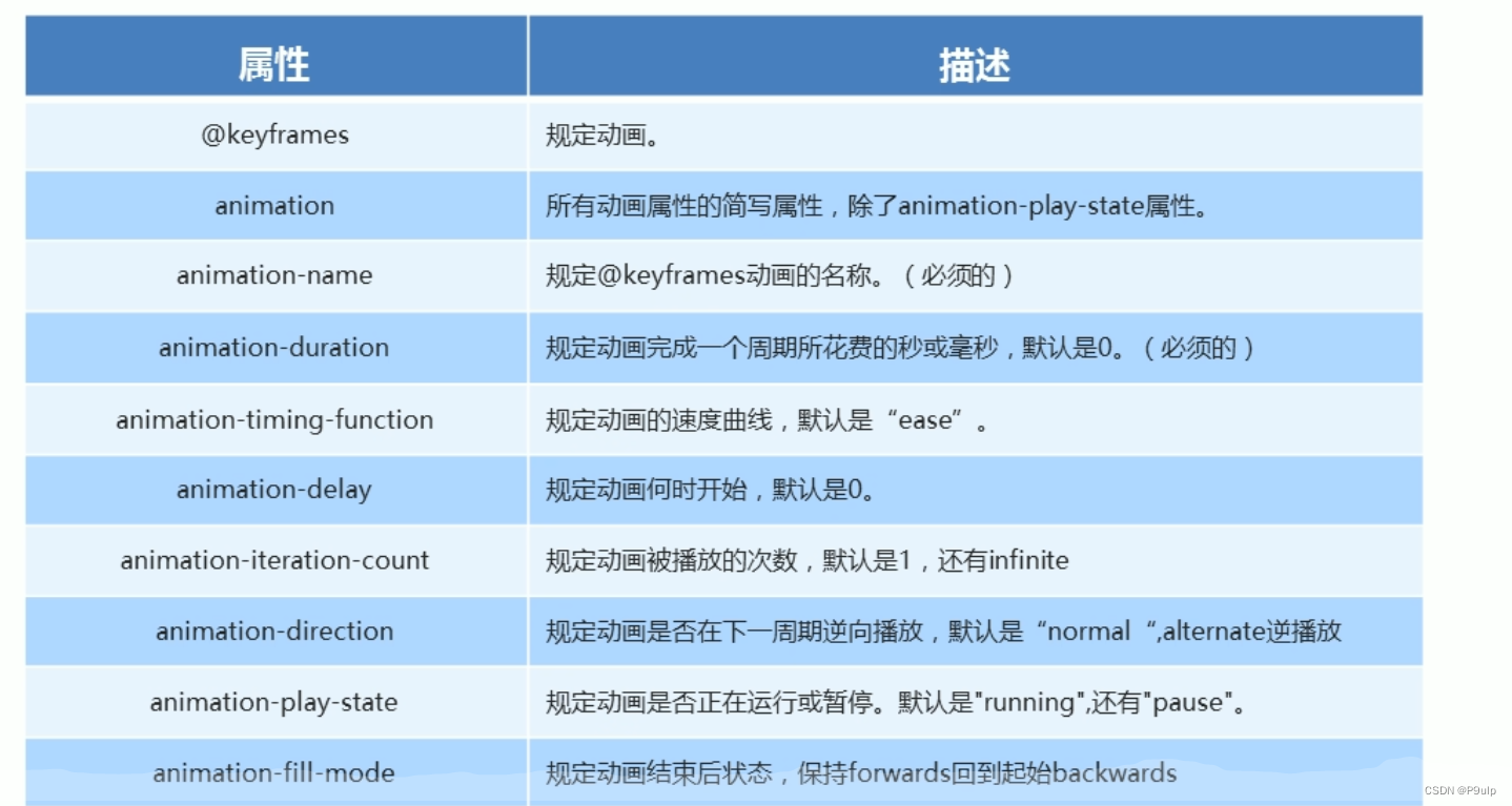
2.动画常见属性
三、 3D转换
特点
- 近大院小
- 物体后面遮挡不可见
1. 三维坐标系
- X:右正左负
- Y:下正上负
- Z:外正里负
2. 3D移动
在2D的基础上多加了一个Z轴方向
注意:
- translateZ沿着Z轴移动
- translateZ后面的单位我们一般跟px
- 简写:translate3d(x,y,z)
3. 3D透视
在2D平面产生近大远小视觉立体,但是只是效果二维的
- 如果想要在网页产生3D效果需要透视(理解成3D物体投影在2D平面内)
- 透视我们也称视距:视距是人的眼睛到屏幕的距离
- 距离视觉点越近的在电脑平面成像越大,反之越小
- 透视的单位是像素
透视写在被观察元素的父盒子上面的
d:视距,人的眼睛到屏幕的距离
z:z轴,物体距离屏幕的距离,z越大我们看到的物体越大
4. 3D旋转
比2D多个Z,其他差不多
旋转:左手准则
- 左手的手拇指指向X轴的正方向
- 其余手指的弯曲方向就是该元素沿着X轴旋转的方向
5. 3D呈现transform-style
- 控制子元素是否开启三维立体环境
- transform-style:flat子元素不开启3D立体空间 默认的
- transform-style:preserve-3d 元素开启3D立体空间
- 代码写给父级,但是影响的是子盒子
案例
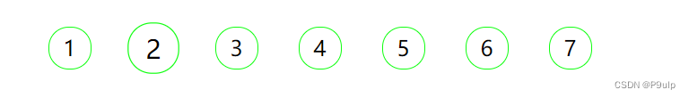
1. 分页按钮案例
<!DOCTYPE html>
<html lang="en">

<head>
    <meta charset="UTF-8">
    <meta http-equiv="X-UA-Compatible" content="IE=edge">
    <meta name="viewport" content="width=device-width, initial-scale=1.0">
    <title>Document</title>
    <style>
        li {


            list-style: none;
            float: left;
            width: 30px;
            height: 30px;
            border: 1px solid #1f1f;
            border-radius: 15px;
            text-align: center;
            line-height: 30px;
            margin: 15px;
            cursor: pointer;
            transition: all .4;
        }

        li:hover {


            transform: scale(1.2);
        }
    </style>
</head>

<body>
    <ul>
        <li>1</li>
        <li>2</li>
        <li>3</li>
        <li>4</li>
        <li>5</li>
        <li>6</li>
        <li>7</li>
    </ul>
</body>

</html>
两面反转的盒子
<!DOCTYPE html>
<html lang="en">

<head>
    <meta charset="UTF-8">
    <meta http-equiv="X-UA-Compatible" content="IE=edge">
    <meta name="viewport" content="width=device-width, initial-scale=1.0">
    <title>Document</title>
    <style>
        body {


            perspective: 350px;
        }

        .box {


            position: relative;
            height: 300px;
            width: 300px;
            margin: 100px auto;
            transition: all .6s;
            transform-style: preserve-3d;
        }

        .box:hover {


            transform: rotateY(180deg);
        }

        .front,
        .back {


            position: absolute;
            top: 0;
            left: 0;
            width: 100%;
            height: 100%;
            border-radius: 50%;
            font-size: 30px;
            color: aliceblue;
            text-align: center;
            line-height: 300px;

        }

        .front {


            background-color: pink;
            z-index: 1;
            backface-visibility: hidden;
        }

        .back {


            background-color: skyblue;
            transform: rotateY(180deg);
        }
    </style>
</head>

<body>
    <div class="box">
        <div class="front">你好呀</div>
        <div class="back">王浩文</div>
    </div>
</body>

</html>
奔跑的小熊
<!DOCTYPE html>
<html lang="en">

<head>
    <meta charset="UTF-8">
    <meta http-equiv="X-UA-Compatible" content="IE=edge">
    <meta name="viewport" content="width=device-width, initial-scale=1.0">
    <title>Document</title>
    <style>
        body {


            background-color: #ccc;
        }

        div {


            position: absolute;
            width: 200px;
            height: 100px;
            margin: 100px 0;
            background: url(y小熊.png) no-repeat;
            animation: bear 1s steps(8) infinite, move 3s forwards;
        }

        @keyframes bear {


            0% {


                background-position: 0 0;
            }

            100% {


                background-position: -1600px 0;
            }
        }

        @keyframes move {


            0% {


                left: 0;
            }

            100% {


                left: 50%;
                transform: translateX(-50%);
            }
        }
    </style>
</head>

<body>
    <div></div>
</body>

</html>
3D导航
<!DOCTYPE html>
<html lang="en">

<head>
    <meta charset="UTF-8">
    <meta http-equiv="X-UA-Compatible" content="IE=edge">
    <meta name="viewport" content="width=device-width, initial-scale=1.0">
    <title>3D导航</title>
    <style>
        * {


            margin: 0;
            padding: 0;
        }

        ul {


            margin: 100px;
        }

        ul li {


            float: left;
            width: 120px;
            height: 35px;
            list-style: none;
            perspective: 500px;
            margin-left: 10px;
        }

        .box {


            position: relative;
            width: 100%;
            height: 100%;
            transform-style: preserve-3d;
            transition: all .4s;
        }

        .box:hover {


            transform: rotateX(90deg);
        }

        .front,
        .back {


            position: absolute;
            left: 0;
            top: 0;
            width: 100%;
            height: 100%;

            text-align: center;
        }

        .front {


            background-color: pink;
            z-index: 1;
            transform: translateZ(17.5px)
        }

        .back {


            background-color: skyblue;
            transform: translateY(17.5px) rotateX(-90deg);

        }
    </style>
</head>

<body>
    <ul>
        <li>
            <div class="box">
                <div class="front">你好呀</div>
                <div class="back">HI</div>
            </div>
        </li>
        <li>
            <div class="box">
                <div class="front">你好呀</div>
                <div class="back">HI</div>
            </div>
        </li>
        <li>
            <div class="box">
                <div class="front">你好呀</div>
                <div class="back">HI</div>
            </div>
        </li>
        <li>
            <div class="box">
                <div class="front">你好呀</div>
                <div class="back">HI</div>
            </div>
        </li>
        <li>
            <div class="box">
                <div class="front">你好呀</div>
                <div class="back">HI</div>
            </div>
        </li>
        <li>
            <div class="box">
                <div class="front">你好呀</div>
                <div class="back">HI</div>
            </div>
        </li>

    </ul>
</body>

</html>
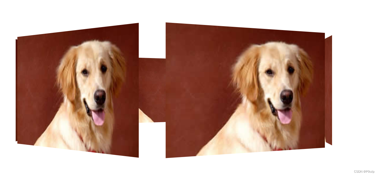
旋转木马
<!DOCTYPE html>
<html lang="en">

<head>
    <meta charset="UTF-8">
    <meta http-equiv="X-UA-Compatible" content="IE=edge">
    <meta name="viewport" content="width=device-width, initial-scale=1.0">
    <title>Document</title>
    <style>
        body {


            perspective: 1000px;
        }

        section {


            position: relative;
            width: 300px;
            height: 200px;
            margin: 150px auto;
            transform-style: preserve-3d;
            animation: rotate 10s linear infinite;

        }

        @keyframes rotate {


            0% {


                transform: rotateY(0);
            }

            100% {


                transform: rotateY(360deg);
            }
        }

        section div {


            position: absolute;
            top: 0;
            left: 0;
            width: 100%;
            height: 100%;
            background: url(dog.jpg) no-repeat;
        }

        section div:nth-child(1) {


            transform: translateZ(400px);
        }

        section div:nth-child(2) {


            transform: rotateY(60deg) translateZ(300px);
        }

        section div:nth-child(3) {


            transform: rotateY(120deg) translateZ(300px);
        }

        section div:nth-child(4) {


            transform: rotateY(180deg) translateZ(300px);
        }

        section div:nth-child(5) {


            transform: rotateY(240deg) translateZ(300px);
        }

        section div:nth-child(6) {


            transform: rotateY(300deg) translateZ(300px);
        }
    </style>
</head>

<body>
    <section>
        <div></div>
        <div></div>
        <div></div>
        <div></div>
        <div></div>
        <div></div>
    </section>
</body>

</html>