介绍
CSS3 的 Flex 弹性布局和 Grid 网格布局已经成为前端页面排版的主流选择。
本次挑战将使用这两种布局方式来画一只考拉。
准备
本题已经内置了初始代码,打开实验环境,目录结构如下:
├── styles.css
└── index.html
文件说明如下:
- styles.css 是页面样式文件。
- index.html 是页面布局结构。
你可以参考如下步骤访问项目:

- 选中 index.html 右键启动 Web Server 服务(Open with Live Server),让项目运行起来。
- 打开环境右侧的 Web 服务,就可以在浏览器中看到未完成的考拉。

目标
请根据 styles.css 文件中的提示和要求添加所需的 CSS 代码,完整地画出一只如下效果的考拉:
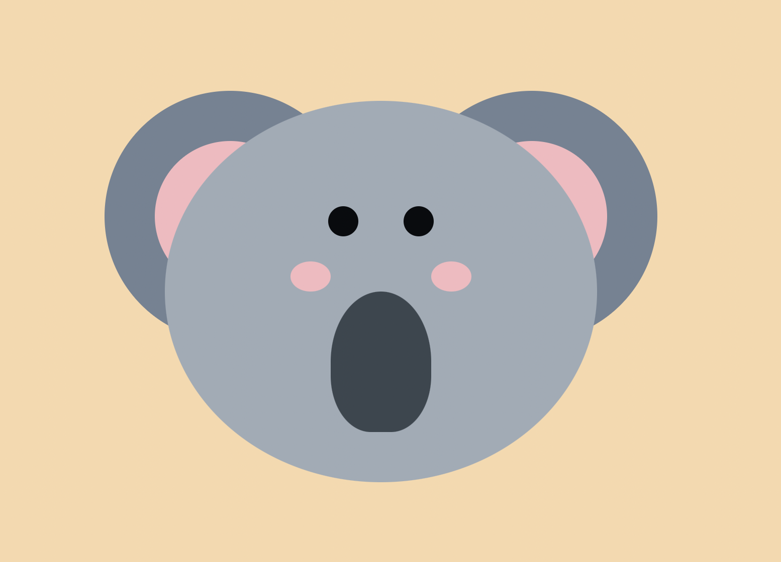
- 创造一个网格布局,6 个纵列(column):前后两列两等分(可用 fr 代表一份),中间 4 列均为
25px宽度;4 个横行(row):上下均为50px,中间两等分。 - 绘制眼睛:长为
30px,高为30px,颜色为#090b0e,圆角为50%,位置居中。 - 绘制鼻子:高为
100%,颜色为#3b464f,上方圆角为50%,下方圆角为40%,按照图示选取grid-area。 - 绘制腮红:长为
40px,高为30px,颜色为#f6b9bf,圆角为50%。
参考样例
考拉脸上各部位的位置请参考如下的网格图:
扫描二维码关注公众号,回复:
15559725 查看本文章


从此处开始我的笔记或者说解题思路:
首先需要知道什么是网格布局
学习哔哩哔哩视频:
【20分钟掌握grid网格布局】 https://www.bilibili.com/video/BV1pe4y1x7uQ/?share_source=copy_web&vd_source=5ebbd439caf3ae03f89f7df7b80ce01a
主要知识点:
grid-template-columns: 1fr 25px 25px 25px 25px 1fr 表示将盒子的面积分为六列,中间四列的宽度是25px,其余的平均分为两份。左一份右一份。
grid-template-rows:50px 1fr 1fr 50px 表示将盒子最左侧和最右侧分50px,其余的平均分两份,左右各一份。
grid-area:1/2/3/4 表示从第一行到第三行的,从第二列到第四列的区域
也可以写成grid-row:1/3; grid-column:2/4;
全部代码:
css代码:
html,
body {
  background: #f8d8ab;
  width: 100vw;
  height: 100vh;
  display: flex;
  justify-content: center;
  align-items: center;
}

.container {
  display: flex;
  flex-direction: column;
  align-items: center;
}

.ears {
  display: flex;
  justify-content: space-between;
  position: relative;
  top: 240px;
  width: 550px;
}

.ear {
  width: 250px;
  height: 250px;
  border-radius: 50%;
  background: #738394;
  display: flex;
  justify-content: center;
  align-items: center;
}

.inner {
  width: 150px;
  height: 150px;
  border-radius: 50%;
  background: #f6b9bf;
}

.face {
  z-index: 1;
  width: 430px;
  height: 380px;
  background: #a0abb6;
  border-radius: 50%;
  align-items: center;

  display: grid;
  grid-template-columns: 1fr 25px 25px 25px 25px 1fr;
  grid-template-rows: 50px 1fr 1fr 50px;
  /* 创造一个网格布局
  6 个纵列(column) --
    前后两列两等分 (可用 fr 代表一份),
    中间 4 列均为 25px 宽度
  4 个横行(row) --
    上下均为 50px,中间两等分
  */
}

.eye {
  height:30px;
  width: 30px;
  background-color: #090b0e;
  border-radius: 50%;
  justify-content: center;
  align-items: center;
  /*
    长为 30px
    高为 30px
    颜色为 #090b0e
    圆角为 50%
    位置居中
  */
}

.eye.left {
  /* 按照图示选取 grid-area */
  grid-row: 2/3;
  grid-column: 2/3;
}

.eye.right {
  /* 按照图示选取 grid-area */
  grid-column: 5/6;
  grid-row: 2/3;
}

.nose {
  height:100%;
  background-color: #3b464f;
  border-top-right-radius: 50%;
  border-top-left-radius: 50% ;
  border-bottom-left-radius: 40%;
  border-bottom-right-radius: 40%;
  grid-row: 3/4;
  grid-column: 2/6;
  /*
    高为 100%
    颜色为 #3b464f
    上方圆角为 50%
    下方圆角为 40%
    按照图示选取 grid-area
  */
}

.blush {
  width:40px;
  height:30px;
  background-color:#f6b9bf;
  border-radius: 50%;
  /*
    长为 40px
    高为 30px
    颜色为 #f6b9bf
    圆角为 50%
  */
}

.blush.left {
  grid-area: 2/1/3/2;
  align-self: end;
  justify-self: end;
  /* 按照图示选取 grid-area
      并调整位置
   */
}

.blush.right {
  grid-area: 2/6/3/7;
  align-self: end;
  justify-self: start;
  /* 按照图示选取 grid-area
    并调整位置
  */
}
index.html代码:
<!DOCTYPE html>
<html lang="en">
  <head>
    <meta charset="UTF-8" />
    <meta http-equiv="X-UA-Compatible" content="IE=edge" />
    <meta name="viewport" content="width=device-width, initial-scale=1.0" />
    <link rel="stylesheet" href="styles.css" />
    <title>CSS 考拉</title>
  </head>
  <body>
    <div class="container">
      <div class="ears">
        <div class="ear left">
          <div class="inner"></div>
        </div>
        <div class="ear right">
          <div class="inner"></div>
        </div>
      </div>

      <div class="face">
        <div class="eye left"></div>
        <div class="eye right"></div>
        <div class="blush left"></div>
        <div class="blush right"></div>
        <div class="nose"></div>
      </div>
    </div>
  </body>
</html>