Flex布局
1、元素纵向排列
display: flex;
flex-direction: column;
            <div style="width: 600px; height: 300px; background-color: aquamarine; display: block;">
                <div style="display: flex; flex-direction: column;">
                    <div style="background-color:aqua;">1</div>
                    <div style="background-color: antiquewhite;">2</div>
                </div>
            </div>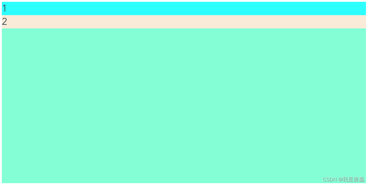
2、元素两端靠边,中间居中平均分配
应用场景:标题栏、左侧返加,中部标题名,右侧关闭按钮
display: flex;
justify-content: space-between;
            <div style="width: 600px; height: 300px; font-size: 20px; background-color: aquamarine; display: block; ">
                <div style="display: flex; justify-content: space-between;">
                    <div style="background-color:aqua;">1</div>
                    <div style="background-color:beige;">3</div>
                    <div style="background-color:beige;">4</div>
                    <div style="background-color:beige;">5</div>
                    <div style="background-color: bisque;">2</div>
                </div>
            </div>
3、顶部和底部靠边,中间部分平均分配
display: flex;
flex-direction: column;
justify-content: space-between;
应用场景:弹出层的模拟窗体布局,上部标题,中部内容,下部工具栏(确定、取消)

            <div style="width: 600px; height: 300px; font-size: 20px; background-color: aquamarine; display: block; ">
                <div style="display: flex; flex-direction: column;justify-content: space-between;height: 100%;">
                    <div style="background-color:aqua;">1</div>
                    <div style="background-color:beige;">3</div>
                    <div style="background-color:beige;">4</div>
                    <div style="background-color: bisque;">2</div>
                </div>
            </div>
4、水平居中
display: flex;
justify-content: center;
            <div style="width: 600px; height: 300px; font-size: 20px; background-color: aquamarine; display: block; ">
                <div style="display: flex; justify-content: center;">
                    <div style="background-color:aqua;">1</div>
                </div>
            </div>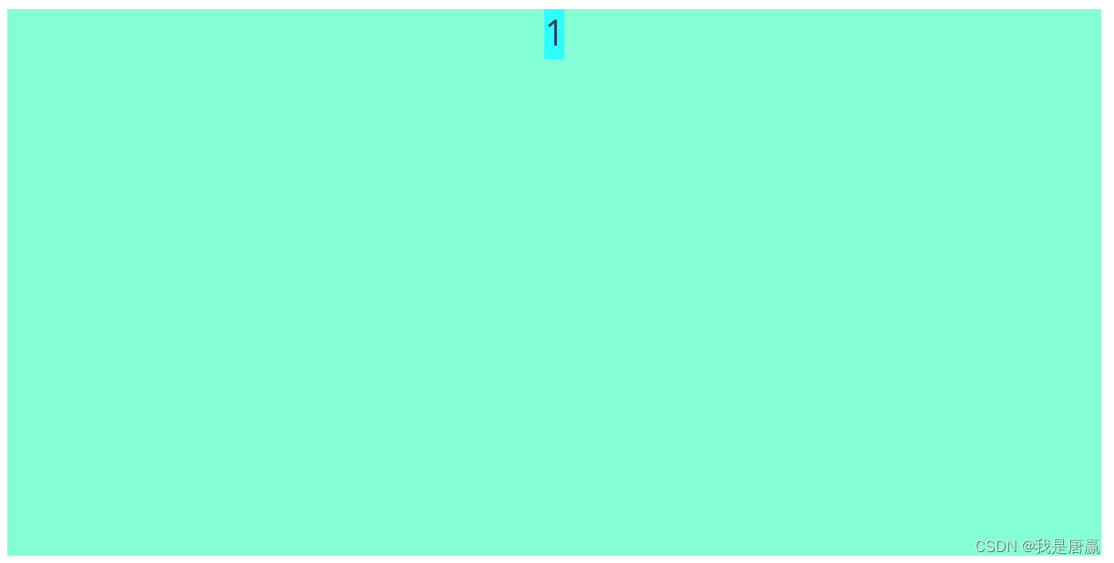
5、垂直居中
display: flex;
align-items: center;
            <div style="width: 600px; height: 300px; font-size: 20px; background-color: aquamarine; display: block; ">
                <div style="display: flex; align-items: center;height: 100%;">
                    <div style="background-color:aqua;">1</div>
                </div>
            </div>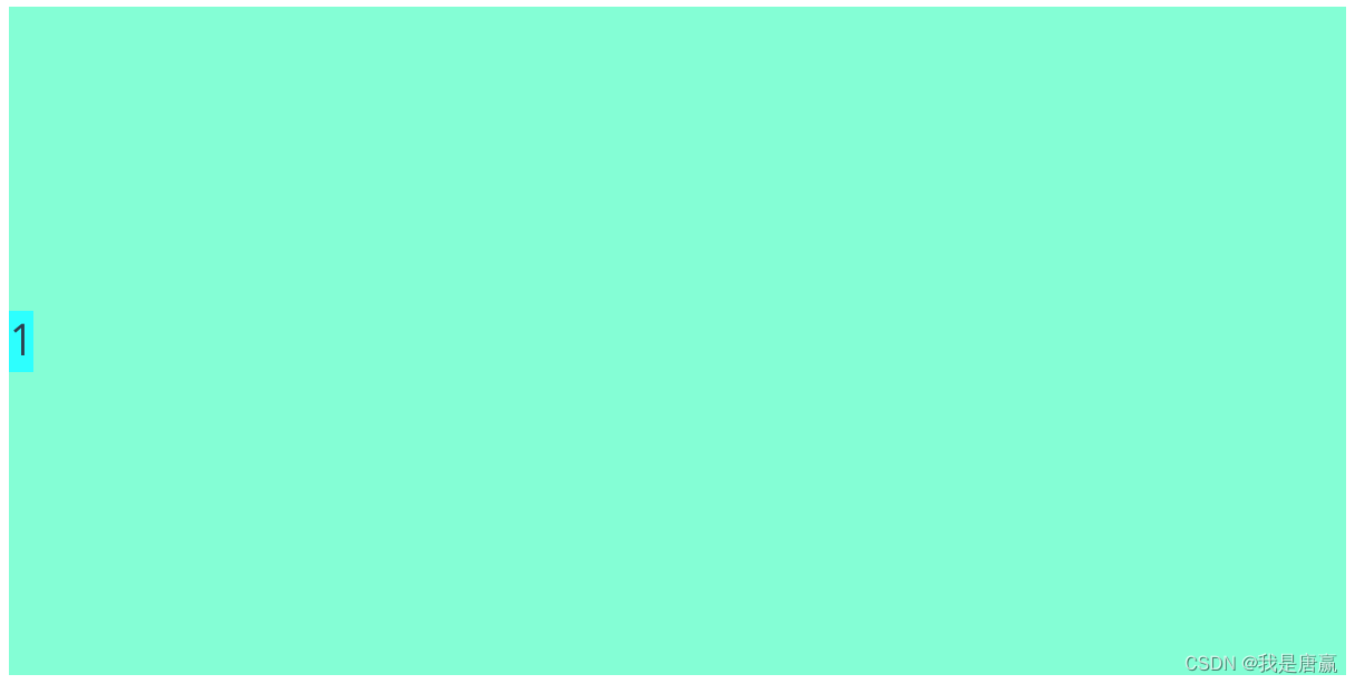
6、允许换行
display: flex;
flex-wrap: wrap;
            <div style="width: 600px; height: 300px; font-size: 20px; background-color: aquamarine; display: block; ">
                <div style="display: flex; flex-wrap: wrap;">
                    <div style="background-color:aqua;">1233333333333333333333333</div>
                    <div style="background-color:red;">12333333333333333333333</div>
                    <div style="background-color:burlywood;">12333333333333333333333</div>
                </div>
            </div>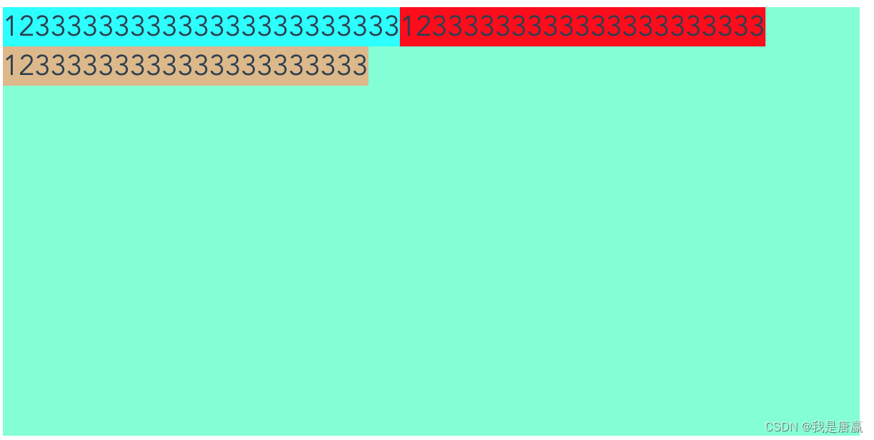
position定位
1、固定位fixed,相对于浏览器位置
position: fixed;
left:20px;
right: 20px;
top:20px;
bottom: 20px;
            <div style="position: fixed; left:20px;right: 20px;top:20px;bottom: 20px; background-color: bisque;z-index: 9999; ">
            </div>
2、绝对定位,相对于父窗体的位置
position: absolute;
left:20px;
right: 20px;
top:20px;
bottom: 20px;
            <div style="position: fixed; left:20px;right: 20px;top:20px;bottom: 20px; background-color: bisque;z-index: 999; ">
              <div style="position: absolute; left:20px;right: 20px;top:20px;bottom: 20px; background-color:brown;z-index: 1000; ">
              </div>
            </div>
3.relative相对定位,文档流保留空间
position: relative;
left:20px;
top:20px;
其他
1、遮罩层
background-color: rgba(0,0,0,0.4);
position: fixed;
top: 0;
bottom: 0;
left: 0;
right: 0;
z-index: 9999;
2、控制文字不能选择
-webkit-touch-callout: none;
-webkit-user-select: none;
-moz-user-select: none;
-ms-user-select: none;
user-select: none;
3、光标经过改变样式
:hover
            <div style="background-color: bisque;width: 600px; height: 300px;display: flex;flex-direction: column; display: none; ">
                    <div  style="position: relative; top: 20px; left: 20px; width: 50px; height: 50px; background-color:aquamarine; ">1 </div>
                    <div style=" width: 100px; height: 100px; background-color:brown; ">2 </div>
            </div>
.xxx {
width: 100px;
height: 30px;
display: block;
background-color: aquamarine;
}
.xxx:hover {
background-color: red;
}
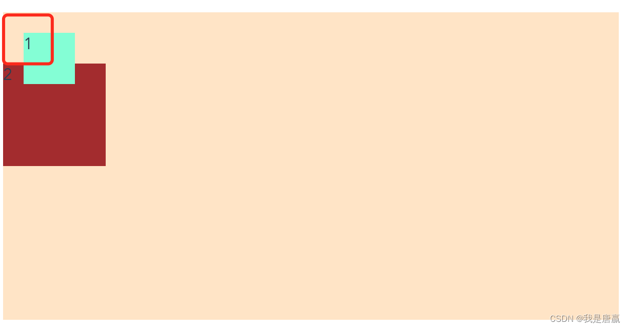
4、使盒子总大小不变,不随内边距变化而变化
box-sizing: border-box;
            <div style="display: flex; width: 600px; height: 300px; font-size: 20px; background-color: aquamarine; ">
                 <div style="width: 33.3%;background-color:beige;padding-left: 50px;box-sizing: border-box;">1</div>
                 <div style="width: 33.3%;background-color:skyblue;padding-left: 50px;">2</div>
                 <div style="width: 33.3%;background-color:bisque;padding-left: 50px;">3</div>
            </div>
5、超出显示省略号
overflow:hidden;
text-overflow:ellipsis;
            <div style="display: flex; width: 200px; height: 200px; font-size: 20px; background-color: aquamarine;  ">
                 <div style="overflow:hidden;text-overflow:ellipsis;">1233333333333333333333333333333333333333333</div>
            </div>
6、显示固定行数,超出的不显示
display: -webkit-box;
-webkit-line-clamp: 2;
-webkit-box-orient: vertical;
text-overflow:ellipsis;
overflow:hidden;
            <div style="display: flex; flex-direction: column;width: 200px; height: 200px; font-size: 20px; background-color: aquamarine;  ">
                 <div style="width: 100%; display:-webkit-box;-webkit-line-clamp: 2;-webkit-box-orient: vertical;text-overflow:ellipsis;overflow:hidden;">
                 我是一个菜鸟我是一个菜鸟我是一个菜鸟我是一个菜鸟我是一个菜鸟
                </div>
            </div>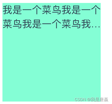
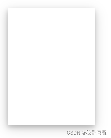
7、书本效果
box-shadow: 0 4px 8px 0 rgba(0, 0, 0, 0.2), 0 6px 20px 0 rgba(0, 0, 0, 0.19);