<template>
    <view class="comment-box">
        <block v-for="(item,index) in list" :key="index">
            <view class="flex">
                <image :src="item.user_image" mode="aspectFill" class="br50p" style="width: 70rpx;height: 70rpx;">
                </image>
                <view class="ml10 flex flex-direction-column ">
                    <view class="fs28 c333">{

    {

    item.user_name ||''}}</view>
                    <view class="fs24 c999 ">{

    {

    item.comment_time || ''}}</view>
                </view>
            </view>
            <view class="flex flex-direction-column">
                <div class="w500 mt15 fs26 c333">
                    {

    {

    item.context || ''}}
                </div>
                <div class="flex flex-wrap   mt15">
                    <block v-for="(img,imgIndex) in item.images" :key="imgIndex">
                        <image @tap="$utils.previewImage(img.url,item.images.map(m=>m.url))" :src="img.url"
                            mode="aspectFill"
                            :class="item.images.length<=1?'big-img':item.images.length<=2?'mid-img':'small-img'" :style="{


                                width:screenWidthHeight(item.images)+'px',
                                height:screenWidthHeight(item.images)+'px',
                            }">
                        </image>
                    </block>
                </div>
            </view>
            <view class="hr" v-if="index!=list.length-1">

            </view>
        </block>
    </view>
</template>

<script>
    export default {


        props: {


            list: {


                type: Array,
                default: () => {


                    return []
                }
            }
        },

        data() {


            return {


                // 视图宽度
                screenWidth: 0,
                // 视图高度
                screenHeight: 0
            }
        },
        mounted() {


            this.screenWidth = uni.getSystemInfoSync().screenWidth;
            this.screenHeight = uni.getSystemInfoSync().screenHeight;
        },
        methods: {


            // 自动计算宽高
            screenWidthHeight(arr) {


                if (arr.length === 1) {


                    return this.screenWidth / 1 - 30;
                } else if (arr.length === 2) {


                    return this.screenWidth / 2 - 40;
                } else {


                    return this.screenWidth / 3 - 30;
                }
            }
        }
    }
</script>

<style lang="scss" scoped>
    .small-img {


        margin-right: 5px;
        margin-bottom: 5px;
        border-radius: 8px;
        border: 1px solid #f1f1f1;

        &:last-child {


            margin-right: 0;
        }
    }

    .big-img {


        margin-right: 5px;
        margin-bottom: 5px;
        border-radius: 8px;
        border: 1px solid #f1f1f1;

        &:last-child {


            margin-right: 0;
        }
    }

    .mid-img {


        margin-right: 10px;
        margin-bottom: 5px;
        border-radius: 8px;
        border: 1px solid #f1f1f1;

        &:last-child {


            margin-right: 0;
        }
    }


    .hr {


        width: 100%;
        height: 2rpx;
        background-color: #ececec;
        margin: 20rpx 0;
    }
</style>
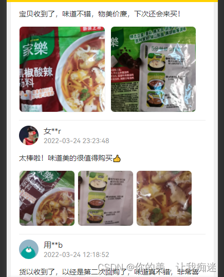
效果图: