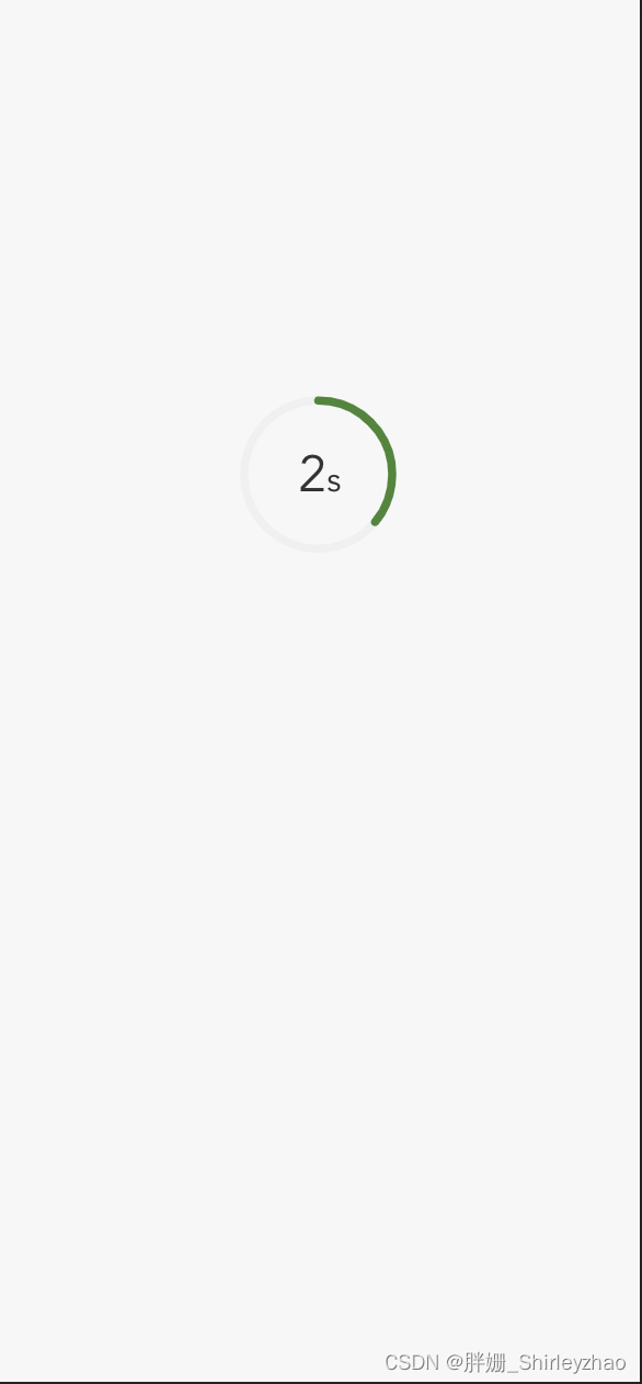
最终效果:
1、创建card.vue 子组件
<template>
<div class="ring-container-wrap">
  <div class="ring-box">
  <svg class="ring-container" :style="`width: ${size}; height: ${size}`">
      <circle :cx="cx" :cy="cx" :r="r"
              :stroke="backgroundColor"
              :stroke-width="width"
              stroke-linecap="round"
              fill="none"></circle>
      <circle :cx="cx" :cy="cx" :r="r"
              class="ring"
              :stroke-width="width"
              :stroke="color"
              :stroke-dasharray="`${circum}`"
              stroke-linecap="round"
              fill="none">
      <animate attributeName="stroke-dashoffset"
                :from="circum"
                :to="endCircum"
                :dur="originCountDown"/>
      </circle>
      <text :x="cx+5" :y="cx+10" text-anchor="end"
            :font-size="fontSize + 5"
            :fill="fontColor">
          {

   { countDown }}
      </text>
      <text :x="cx+5" :y="cx+10" text-anchor="start"
            :font-size="fontSize - 5"
            :fill="fontColor">
          s
      </text>
  </svg>

  </div>
</div>
</template>

<script>
    export default {
        name: "CircleLoad",
        data(){
            return{
                endCircum:0,
                countDown:this.originCountDown,
            }
        },
        computed: {
            cx() { // 中心点位置
                return this.size / 2
            },
            r() { // 半径
                return this.size / 2 - this.width
            },
            circum() {
                return parseInt(this.r * Math.PI * 2)
            }
        },
        props: {
            fontSize: {
                type: Number,
                default: 26
            },
            size: {
                type: Number,
                default: 100
            },
            width: {
                type: Number,
                default: 5
            },
            backgroundColor: {
                type: String,
                default: '#f0f0f0'
            },
            color: {
                type: String,
                default: '#448732'
            },
            fontColor:{
                type: String,
                default: '#333'
            },
            originCountDown:{
                type: Number,
                default: 15
            }
        },
        mounted(){
            this.interval = setInterval(() => {
                let diff = '1';
                this.countDown -= diff;
                if (this.countDown <= 0) {
                    clearInterval(this.interval)
                    this.$emit('circleDown')
                }
            }, 1000)
        }
    }
</script>

<style lang="scss">

.ring-container-wrap{
  position: relative;
  width: 100%;
  height: 100%;
  // background: rgba(0,0,0,0.3);
  .ring-box{
    position: absolute;
    top: 35%;
    left: 50%;
    transform: translate(-50%, -50%);
  }
}
.ring-container {
    .ring {
        transform: rotate(-90deg);
        transform-origin: 50% 50%;
    }
}
</style>
2、父组件引用
<circleEle :originCountDown="3" @circleDown="circleDown"/>