一、前言
今天也继续分享一下使用R语言绘制云雨图,这个图形的绘制在基于R 语言绘制柱状图教程混合整理教程中也有提及,如果感兴趣可以自己看一下。

二、绘图
导入相关的包
library(ggplot2)
#devtools::install_github("GuangchuangYu/gglayer")
library(gglayer)

###'@提供geom_flat_violin()函数
# install.packages("remotes")
# remotes::install_github("kholsteen/geneRal")
library(geneRal)
数据就使用上期的数据即可,如不知道,请看R语言精美图形绘制系列 | 箱线图绘制。
导入数据
y <- read.csv("inputdata.csv",headr = T)

#计算每个分组的平均值
y.mean <- aggregate(.~Var1,y,mean)
m <- y.mean$value
names(m) <- y.mean$Var1
#按平均值给分组排序,便于画图
y$Var1 <- factor(y$Var1, levels=names(sort(m)))
绘图
- 基础图形
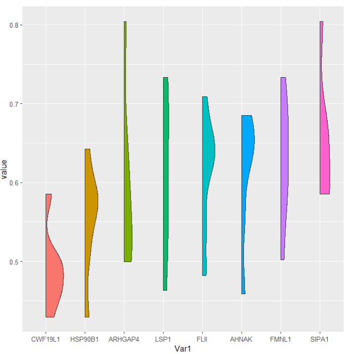
ggplot(y, aes(Var1, value, fill = Var1))+
  geom_flat_violin()+
  theme(legend.position = "none")
2. 其他类型
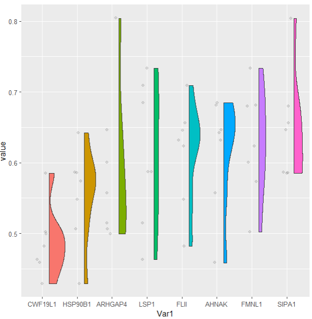
ggplot(y, aes(Var1, value, fill = Var1))+
  geom_flat_violin(position = position_nudge(x = .2, y = 0))+
  geom_jitter(alpha = 0.1, width = 0.15) +
  theme(legend.position = "none")
3. 你需的类型
ggplot(y, aes(Var1, value, fill = Var1)) +
  #scale_fill_brewer(palette="Set2") + #配色
  guides(fill=FALSE) +
  geom_flat_violin(position=position_nudge(x=.2)) +

  #分散不重叠的点图
  #geom_jitter(aes(color=Var1), width=.15) + guides(color=FALSE) +
  #堆叠的点图
  geom_dotplot(binaxis="y", stackdir="down", dotsize=.35) +

  geom_boxplot(width=.1, position=position_nudge(x=.1)) +
  geom_hline(aes(yintercept=0.75), linetype="dashed") + #画一条虚线

  coord_flip() + # x、y坐标轴互换
  xlab("") + ylab("") +
  theme(axis.text.x = element_text(family = "Arial", size = 16, face = "bold"),
        axis.text.y = element_text(family = "Arial", size = 16, face = "bold")) +
  theme_bw() +
  theme(panel.border=element_rect(size=1)) #边框粗细

参考:
- https://verytoolz.com/blog/664564561c/
- https://zhuanlan.zhihu.com/p/384928683
- https://blog.csdn.net/weixin_42655515/article/details/111167105
往期文章:
1. 最全WGCNA教程(替换数据即可出全部结果与图形)
2. 精美图形绘制教程
3. 转录组分析教程
- 1.课程介绍
- 2.第一章 Linux基础
- 3.第一章 生信软件安装
- 4.第二章 转录组数据的下载
- 5.第三章 参考基因组序列和注释文件的下载
- 6.转录组上游分析教程 | 第四章 数据过滤
- 7.第四章 Hisat2进行数据比对
- 8.第四章 Bowtie2进行数据比对
- 9.第四章 BWA进行数据比对
- 10.第四章 Tophat2比对
- 11.第五章 无参考基因组的转录组分析
- 12.第六章 转录本定量分析
小杜的生信筆記,主要发表或收录生物信息学的教程,以及基于R的分析和可视化(包括数据分析,图形绘制等);分享感兴趣的文献和学习资料!!