import matplotlib
import pandas as pd
import numpy as np
import os
import matplotlib.pyplot as plt
from matplotlib.font_manager import FontProperties
font=FontProperties(fname='/System/Library/Fonts/Supplemental/Arial Unicode.ttf',size=10)
from openpyxl.drawing.image import Image
from datetime import date,timedelta
today=date.today().strftime('%Y%m%d')
print(today)
downpath='/Users/kangyongqing/Downloads/'
filepath='/Users/kangyongqing/Documents/kangyq/202306/续费目标修正/续费率跟盯/'
fenzu='分组续费率20230728.xlsx'
dt=pd.read_excel(filepath+fenzu,sheet_name='每周续费',index_col=0)
#导入数据并设置第一列为索引
dt1=dt.loc[~dt.index.isin(['总计']),~dt.columns.isin(['总计'])]
#取不包含总计的行列
dt1=pd.DataFrame(dt1)
print(dt1)
labels=dt1.index
# x=dt1.index
y=dt1.values.T
y0=y[0]
y1=y[1]
y2=y[2]
y3=y[3]
y4=y[4]
x=np.arange(len(labels)) #标签位置
width=0.05 #柱状图的宽度,可以根据自己的需求和审美来改
print(x)
print(y[0])
fig,ax=plt.subplots(figsize=(12,8))
rects=ax.bar(x-width*2,y0,width)
rects1=ax.bar(x-width+0.01,y1,width)
rects2=ax.bar(x+0.02,y2,width)
rects3=ax.bar(x+width+0.03,y3,width)
rects4=ax.bar(x+width*2+0.04,y4,width)
#为Y轴、标题和x轴添加一些文本
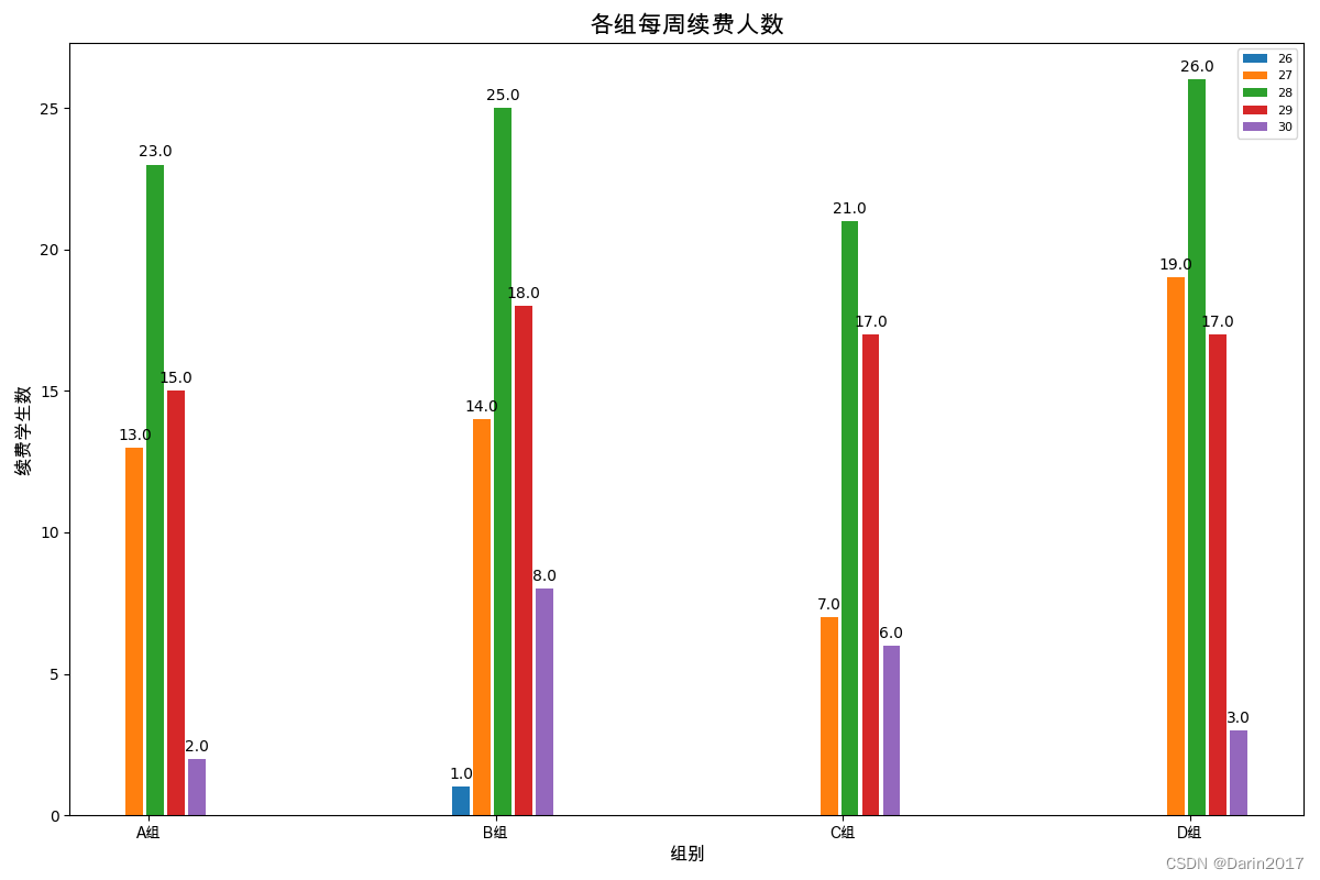
ax.set_ylabel('续费学生数',fontsize=12,fontproperties=font)
ax.set_xlabel('组别',fontsize=12,fontproperties=font)
ax.set_title('各组每周续费人数',fontsize=16,fontproperties=font)
ax.set_xticks(x,fontproperties=font)
ax.set_xticklabels(labels,fontproperties=font)
ax.legend(dt1.columns,fontsize=8)
def autolabel(rect):
"""z在*rect*中的每个柱状条上方添加一个文本标签,显示其高度"""
for rec in rect:
height=rec.get_height()
ax.annotate('{}'.format(height),
xy=(rec.get_x()+rec.get_width()/2,height),
xytext=(0,3),#3点垂直偏移
textcoords="offset points",
ha='center',va='bottom')
autolabel(rects)
autolabel(rects1)
autolabel(rects2)
autolabel(rects3)
autolabel(rects4)
fig.tight_layout()
# plt.show()
plt.savefig(filepath+'每周续费'+today+'.png')知识点:
- 读取excel透视表数据,去除“总计”行列
- plt.subplots设计图布(默认是一张)
- 分配位置作图
- 添加一些列标签,并显示中文