本文采用的都是ant design vue
场景:
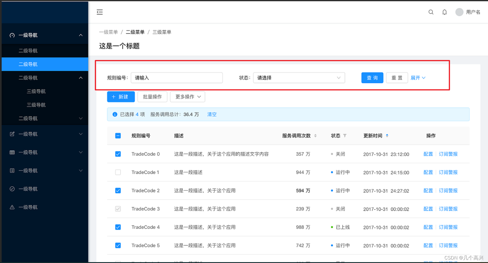
在后台管理系统中,想实现一个这样的布局
方法一
使用a-row布局,这是ant中的栅格布局,使用gutter将一行分为24份,在使用md sm等规定具体每个a-form-item占的份数,实现一行布局

    <!-- 查询区域 -->
    <div class="table-page-search-wrapper">
      <!-- 搜索区域 -->
      <a-form layout="inline"
              @keyup.enter.native="searchQuery">
        <a-row :gutter="24">
          <a-col :md="6"
                 :sm="24">
            <a-form-item :label="$t('m.spacename')">
              <a-input :placeholder="$t('m.spanceInput')"
                       style="width:80%"
                       v-model="queryParam.reasonKey"></a-input>
            </a-form-item>
          </a-col>
          <a-col :md="6"
                 :sm="24">
            <a-form-item :label="$t('m.alertType')">
              <a-select showSearch
                        optionFilterProp="title"
                        style="width:80%;"
                        :placeholder="$t('m.alertType')"
                        v-model="queryParam.type">
                <a-select-option v-for="info in warnTypeList"
                                 :key="info.type"
                                 :title="info.name">
                  {

   { info.name }}
                </a-select-option>
              </a-select>
            </a-form-item>
          </a-col>
          <a-col :md="6"
                 :sm="24">
            <a-form-item :label="$t('m.time')">
              <a-locale-provider :locale="locale">
                <a-range-picker style="margin-bottom:10px"
                                :format="dateFormat"
                                v-model="searchTime" /><br>
              </a-locale-provider>
            </a-form-item>
          </a-col>
          <span style="float: left;overflow: hidden;"
                class="table-page-search-submitButtons">
            <a-col :md="6"
                   :sm="24">
              <a-button type="primary"
                        @click="searchQuery">{

   { $t('m.Query') }}</a-button>
              <a-button style="margin-left: 8px"
                        @click="searchReset">{

   { $t('m.reset') }}</a-button>
            </a-col>
          </span>
        </a-row>
      </a-form>
    </div>
效果图:
画面很大时显得分散:

画面很小时根据sm等属性切换布局:

方法二:
使用form 的inline属性,参考代码:
    <a-form layout="inline">
      <a-form-item :label="$t('m.spacename')">
        <a-input v-model="locationName" :placeholder="$t('m.spanceInput')"></a-input>
      </a-form-item>
      <a-form-item>
        <a-button>{

   {$t('m.Query')}}</a-button>
      </a-form-item>
      <a-form-item>
        <a-button>{

   {$t('m.Reset')}}</a-button>
      </a-form-item>
      <a-form-item>
        <a-button>{

   {$t('m.Reset')}}</a-button>
      </a-form-item>
      <a-form-item>
        <a-button>{

   {$t('m.Reset')}}</a-button>
      </a-form-item>
      <a-form-item>
        <a-button>{

   {$t('m.Reset')}}</a-button>
      </a-form-item>
      <a-form-item>
        <a-button>{

   {$t('m.Reset')}}</a-button>
      </a-form-item>
      <a-form-item>
        <a-button>{

   {$t('m.Reset')}}</a-button>
      </a-form-item>
      <a-form-item>
        <a-button>{

   {$t('m.Reset')}}</a-button>
      </a-form-item>
      <a-form-item>
        <a-button>{

   {$t('m.Reset')}}</a-button>
      </a-form-item>
      <a-form-item>
        <a-button>{

   {$t('m.Reset')}}</a-button>
      </a-form-item>
      <a-form-item>
        <a-button>{

   {$t('m.Reset')}}</a-button>
      </a-form-item>
      <a-form-item>
        <a-button>{

   {$t('m.Reset')}}</a-button>
      </a-form-item>
      <a-form-item>
        <a-button>{

   {$t('m.Reset')}}</a-button>
      </a-form-item>
      <a-form-item>
        <a-button>{

   {$t('m.Reset')}}</a-button>
      </a-form-item>
      <a-form-item>
        <a-button>{

   {$t('m.Reset')}}</a-button>
      </a-form-item>
      <a-form-item>
        <a-button>{

   {$t('m.Reset')}}</a-button>
      </a-form-item>
      <a-form-item>
        <a-button>{

   {$t('m.Reset')}}</a-button>
      </a-form-item>
    </a-form>
效果图:
画面大时不分散

画面小时自动换行

区别:
第一种再放大时,布局会呈现按比例布局,不会自动换行,画面太小显得太分散,画面太大显得太挤。要想自动换行,或者在不同画面大小下展示不同的布局,需要通过md sm等属性分别设置。
第二种写法简单,专门适用form,会自动换行,更推荐!