本章内容主要是MPAndroidChart开源框架中的LineChart
api 'com.github.PhilJay:MPAndroidChart:v3.1.0'<com.github.mikephil.charting.charts.LineChart
android:id="@+id/lineChart"
android:layout_width="match_parent"
android:layout_height="330dp" />设置图表
设置图表内容与图表控件的上下左右间距用
setExtraTopOffset,setExtraBottomOffset,setExtraLeftOffset,setExtraRightOffset
开启图表内容滑动(缩放之后)
setTouchEnabled
设置图表绘制时长(图表内容比较多时可以酌情设置大一些,给数据处理一个缓冲时间)
animateX
设置XY轴一起放大(如果XY轴的内容相关性比较强,可以设置,如果两者内容比较独立,可设置各自缩放)
setPinchZoom
设置Y轴显示在哪边(左右)
getAxisLeft,getAxisRight //赋值为true则打开
设置线条说明(有多条曲线时可能需要对每个曲线做一个说明)
getLegend得到绘制的整个组件
getLegend().setForm //设置说明的图标样式(空,方形,圆形,线条)
getLegend().setVerticalAlignment //设置说明组件水平的位置
getLegend().setHorizontalAlignment // //设置说明组件垂直的位置
以上两个可以确定位置(左上,右上,左下,右下,左中,右中,居中)
Legend.LegendVerticalAlignment.BOTTOM(TOP, CENTER, BOTTOM)Legend.LegendHorizontalAlignment.RIGHT(LEFT, CENTER, RIGHT)
getLegend().setOrientation //设置说明文字的显示方向(横竖)
getLegend().setXOffset //设置说明文字与X轴间距
getLegend().setYOffset //设置说明文字与Y轴间距
getLegend().setDrawInside //设置说明文字显示到图表内部还是外部
设置X轴getXAxis
getXAxis().setAxisMaximum //设置X轴的最大值
getXAxis().setAxisMinimum //设置X轴的最小值
getXAxis().setGranularity //设置X轴值的密度(放到最大之后每个值的差值)
getXAxis().setPosition //设置X轴的位置(TOP, BOTTOM, BOTH_SIDED, TOP_INSIDE, BOTTOM_INSIDE)
getXAxis().setDrawGridLines //是否绘制X轴的网格线(网格线垂直于X轴,平行于Y轴)
getXAxis().setAxisLineColor //设置X轴线条的颜色
getXAxis().setLabelCount(7, false) //设置X轴最多显示几个刻度值,缩放都不会影响显示的个数(后面的bool值控制是否强制显示这么多个数,true滑动时会有刻度和线条中的数据对不齐的可能,false时会有显示的刻度个数小于设置值的可能,比如设置为7,可能只能显示6个)
getXAxis().setDrawAxisLine //是否绘制X轴
getXAxis().setValueFormatter //设置显示在X轴上的刻度(如果要显示星期,X轴的数据为1,2,3...,7,显示出来的数据为星期1,2,3,...7)
设置Y轴getAxisLeft或者getAxisRight
getAxisLeft().enableGridDashedLine //设置网格线(虚线)
getAxisLeft().setDrawGridLines //开启网格线,这里如果不开,则虚线使能开关无效
getAxisLeft().setGranularityEnabled //设置Y轴固定间隔
设置高亮文字弹窗
markerView.setChartView(lineChart) //MarkerView初始化时传入弹窗布局
setMarker(markerView)
val tfLight = context.resources.getFont(自定义文字样式)
lineChart?.apply {
    //X轴在底部,与chart底部的距离(如果需要底部文字对图标进行说明,则可能会用到该值)
    //extraBottomOffset = if (isLegend) 50f else 20f
    extraBottomOffset = 20f
    extraTopOffset = if (isLegend) 30f else 0f
    //是否开启触摸监听
    setTouchEnabled(isLegend)
    dragDecelerationFrictionCoef = 0.9f
    isDragEnabled = true
    //开启缩放功能
    setScaleEnabled(true)
    //绘制网格线的背景
    setDrawGridBackground(false)
    //setPinchZoom(true)
    //绘制动画的总时长
    animateX(500)
    //是否开启右边Y轴
    axisRight?.isEnabled = false
    //设置图标的标题
    setNoDataText("")
    //设置X轴底部文字和图标样式
    legend?.apply {
        //X轴底部对线条说明的样式(方形,或者圆形等)
        form = Legend.LegendForm.CIRCLE
        //X轴底部文字说明的样式
        typeface = tfLight
        textSize = 11f
        textColor = Color.WHITE
        //X轴底部文字说明的位置(横向和竖向)
        verticalAlignment = Legend.LegendVerticalAlignment.BOTTOM
        horizontalAlignment = Legend.LegendHorizontalAlignment.RIGHT
        //底部文字说明的方向
        orientation = Legend.LegendOrientation.HORIZONTAL
        //底部文字说明与X轴的间距
        yOffset = 10f
        //是否开启X轴说明
        //isEnabled = isLegend
        isEnabled = false
        //是否绘制在图标内部
        setDrawInside(true)
    }
    xAxis?.apply {
        //X轴文字样式
        typeface = tfLight
        textSize = 11f
        textColor = Color.parseColor("#FF5E668A")
        //X轴最大值和最小值
        axisMaximum = System.currentTimeMillis() / DAY_MILLS + 3f
        axisMinimum = System.currentTimeMillis() / DAY_MILLS - 3f
        //X轴每个值的差值(缩放时可以体现出来)
        granularity = 1f
        //X轴的位置
        position = XAxis.XAxisPosition.BOTTOM
        //是否绘制X轴的网格线(垂直于X轴)
        setDrawGridLines(false)
        //X轴的颜色
        axisLineColor = Color.parseColor("#FFD8E5FA")
        //X轴的宽度
        axisLineWidth = 2f
        //设置X轴显示固定条目,放大缩小都显示这个数
        setLabelCount(7, false)
        //是否绘制X轴
        setDrawAxisLine(!isLegend)
        //X轴每个刻度对应的值(展示的值和设置的值不同)
        valueFormatter = object : ValueFormatter() {
            override fun getFormattedValue(value: Float): String {
                return SimpleDateFormat(
                    "MM.dd",
                    Locale.getDefault()
                ).format(Date(value.toLong() * DAY_MILLS))
            }
        }
    }
    axisLeft?.apply {
        //左侧Y轴文字样式
        typeface = tfLight
        textColor = Color.parseColor("#FF5E668A")
        //左侧Y轴的最大值和最小值
        axisMaximum = if (type == 0) 210f else 150f
        axisMinimum = 30f
        //绘制网格线(样式虚线)
        enableGridDashedLine(15f, 8f, 0f)
        gridColor = Color.parseColor("#4F9FB1FF")
        gridLineWidth = 1f
        axisLineColor = Color.parseColor("#FFD8E5FA")
        axisLineWidth = 2f
        setDrawGridLines(isLegend)
        setDrawAxisLine(!isLegend) //绘制左边Y轴是否显示
        setDrawZeroLine(false) //是否开启0线
        isGranularityEnabled = true
    }
    //设置选中时的文字提示
    val markerView = eMarkerView(context, R.layout.view_chart_mark)
    markerView.chartView = lineChart
    marker = markerView
    //拦截事件,防止有父布局中有其他滑动事件,引起滑动冲突
    setOnTouchListener { _, event ->
        parent.requestDisallowInterceptTouchEvent(true)
        onTouchEvent(event)
    }
}
设置X轴Y轴的说明
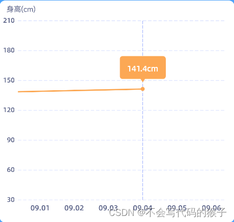
比如身高(cm)这样的说明
val description = Description()
description.text = desText
description.textSize = 11f
description.textColor = Color.parseColor("#FF5E668A")
description.textAlign = Paint.Align.LEFT
description.setPosition(30f, 50f) //设置某一个轴的单位
lineChart?.description = description
setPosition就是设置显示说明文字位置,需要自己根据图表控件的大小,获取到相对的坐标点
这里的坐标点,需要转换成以图表控件为坐标体系的坐标值,否则可能显示不出来
设置数据
getViewPortHandler().setMaximumScaleX //设置X轴最大缩放倍数
getViewPortHandler().setMaximumScaleY //设置Y轴最大缩放倍数
zoom(maxOfx, 0f, 0f, 0f) //设置某个轴或者值的放大倍数
val values = ArrayList<Entry>()
list?.forEach {
    values.add(Entry(xValue, yValue))
}
lineChart?.apply {
    var maxOfx = 1f
    viewPortHandler.setMaximumScaleX(maxOfx)
    viewPortHandler.setMaximumScaleY(4f)
    zoom(maxOfx, 0f, 0f, 0f)
}
val dataSet = LineDataSet(values, chartDesText).apply {
    val valuePointColor =Color.parseColor("#FF00BCC6")
    color = valuePointColor  //线条的颜色
    setCircleColor(valuePointColor) //关键点的圆点颜色
    setDrawCircles(true)
    setDrawVerticalHighlightIndicator(true)   //点击的时候出现竖线
    setDrawHorizontalHighlightIndicator(false)   //点击的时候出现横线
    enableDashedHighlightLine(15f, 5f, 0f)
    //选中的高亮竖线颜色
    highLightColor = Color.parseColor(#FF00BCC6)
    lineWidth = 2f
    circleRadius = 3f
    fillAlpha = 65
    fillColor = ColorTemplate.getHoloBlue()
    setDrawCircleHole(false)
    isHighlightEnabled = true
}
val lineData = LineData(dataSet).apply {
    setDrawValues(false)  //是否绘制每个点的数值
    setValueTextColor(Color.WHITE)
    setValueTextSize(9f)
}
lineChart?.apply {
    data = lineData
    //移动标记点到坐标轴中间
    centerViewTo(values.last().x, values.last().y, YAxis.AxisDependency.LEFT)
    //选中某个点
    highlightValue(values.last().x, 0)
}
PS:
在有很多数据,并且放大到最大时,如果想要默认移动到某个值可以用
centerViewTo(values.last().x, values.last().y, YAxis.AxisDependency.LEFT)
选中某个点并高亮可以用
highlightValue(values.last().x, 0)