Matplotlib 是一个 Python 的 2D绘图库,它以各种硬拷贝格式和跨平台的交互式环境生成出版质量级别的图形 。
通过 Matplotlib,开发者可以仅需要几行代码,便可以生成绘图,直方图,功率谱,条形图,错误图,散点图等。

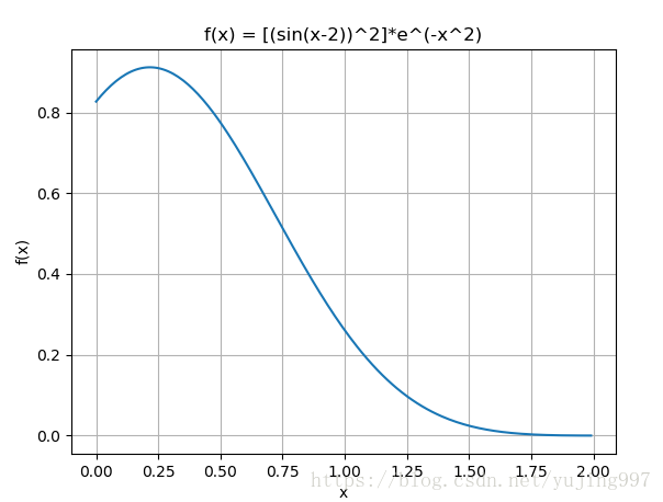
# 11.1 Plotting a function
import matplotlib
import matplotlib.pyplot as plt
import numpy as np
import math

# Data for plotting
x = np.arange(0.0, 2.0, 0.01)
y = (np.sin(x-2)**2)*(math.e**(-x**2))

# Note that using plt.subplots below is equivalent to using
# fig = plt.figure() and then ax = fig.add_subplot(111)
fig, ax = plt.subplots()
ax.plot(x, y)

ax.set(xlabel='x', ylabel='f(x)',
       title='f(x) = [(sin(x-2))^2]*e^(-x^2)')
ax.grid()

plt.show()
输出显示为:
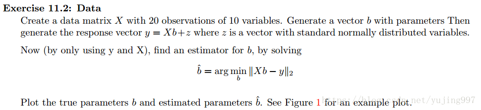
import numpy as np
import matplotlib.pyplot as plt
n = 20
m = 10
X = np.empty([n, m])
for i in range(n):
    row = np.random.normal(10, 1, m)
    X[i] = row

b = np.random.normal(5, 1, m)
z = np.random.normal(0, 1, n)

y = np.matmul(X, b) + z
print(y)

b_ = np.linalg.lstsq(X, y, rcond=None)[0]
print(b)
print(b_)

x = np.array([0, 1, 2, 3, 4, 5, 6, 7, 8, 9])

plt.plot(x, b, 'b', label='true data', markersize=10)
plt.plot(x, b_, 'r', label='estimated data', markersize=10)
plt.legend()
plt.show()
输出显示:

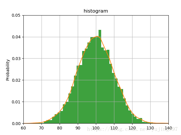
import numpy as np
from scipy import stats
import matplotlib.mlab as mlab
import matplotlib.pyplot as plt

z = 100+10*np.random.randn(10000)
n, bins, patches = plt.hist(z, 50, normed=1, facecolor='green', alpha=0.75)

plt.ylabel('Probability')
plt.title(r'histogram')
plt.axis([60, 140, 0, 0.05])
plt.grid(True)

kernel = stats.gaussian_kde(z)

xs = np.linspace(60, 140)
plt.plot(xs, kernel(xs))

plt.show()
输出显示: