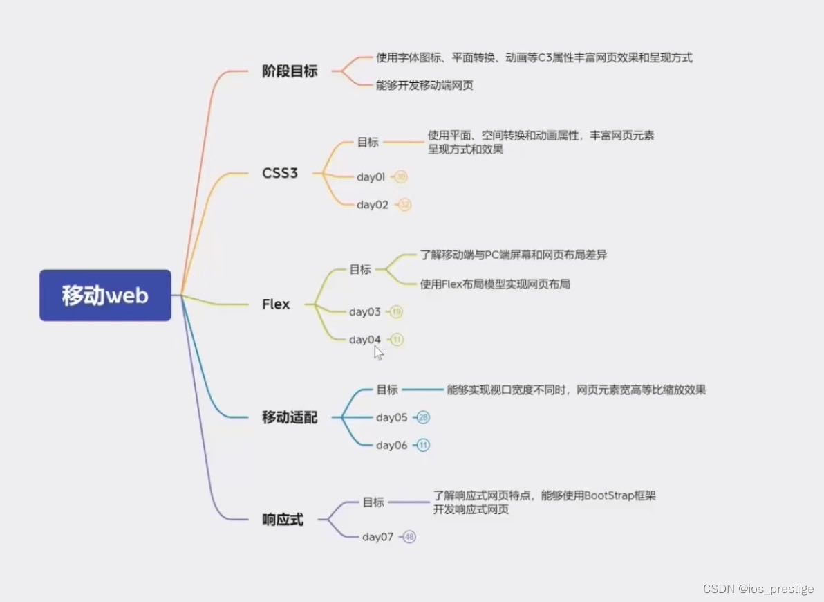
一、移动端特点
1.移动端和PC端网页不同点
1)PC端网页和移动端网页有什么不同?
a.PC屏幕大,网页固定版心
b.手机屏幕小,网页宽度多数为100%
2.谷歌模拟器
1)我们可以通过京东看一下,一般会有一个PC端的网页和移动端的网页,移动端的网页一般是m开头,俗称m站,就是一个类似于手机应用的网页,不过他和手机应用不同的点是,m站是需要通过浏览器输入网址来进行登陆的,而手机app之间下载就可以
2)可以查看一下京东的pc端网页

3)查看一下京东的m站的网页
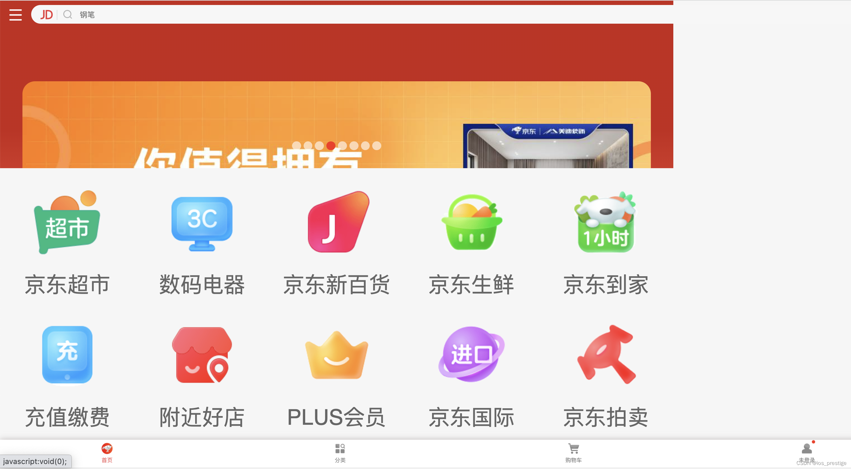
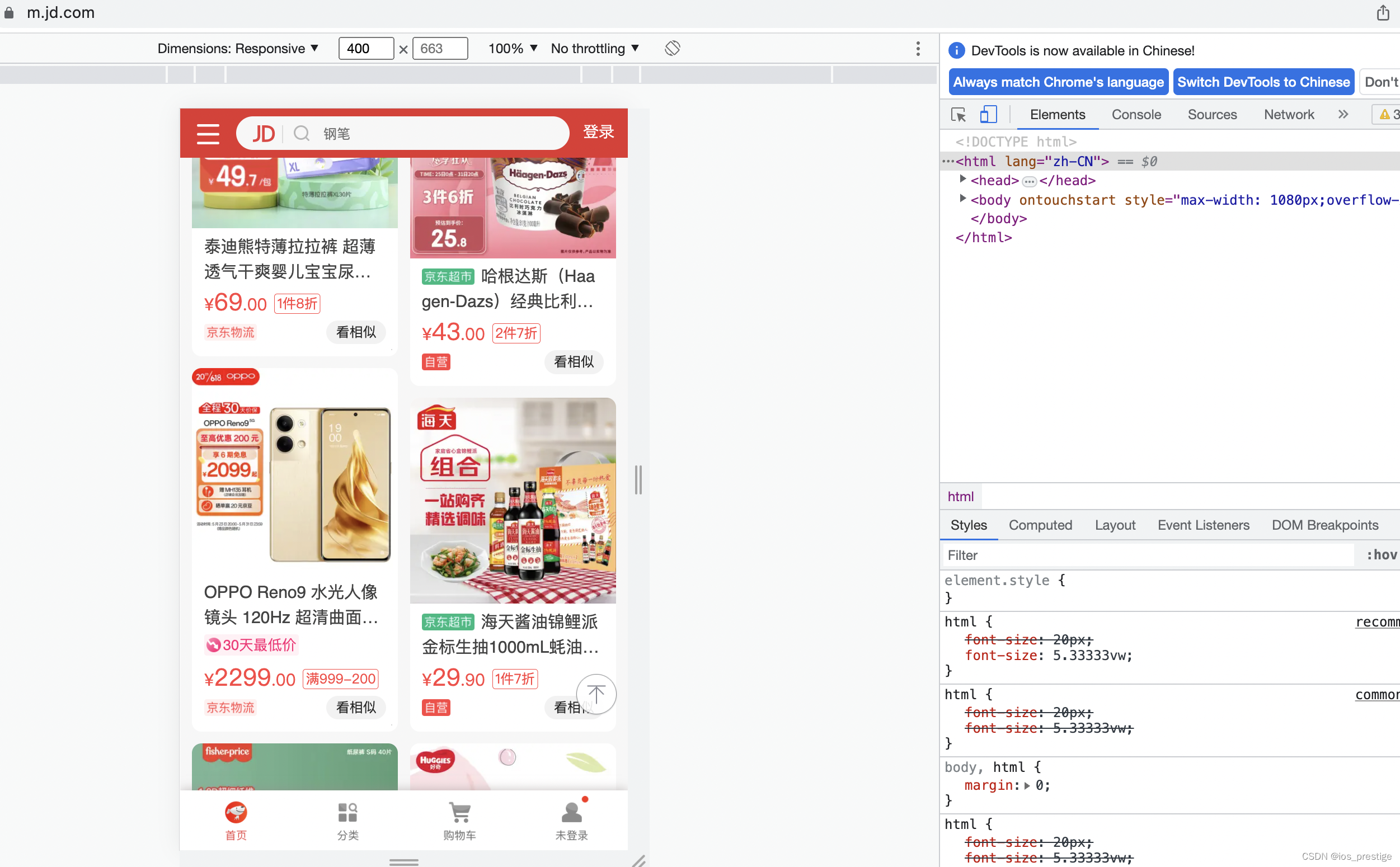
这个就类似于手机应用,但是是在页面进行显示,我们可以通过检查源代码的方式,然后通过下面的手机按钮,给调成手机模式
3.分辨率
1)目标:了解屏幕尺寸概念
2)屏幕尺寸
> 指的是屏幕对角线的长度,一般用英寸来度量
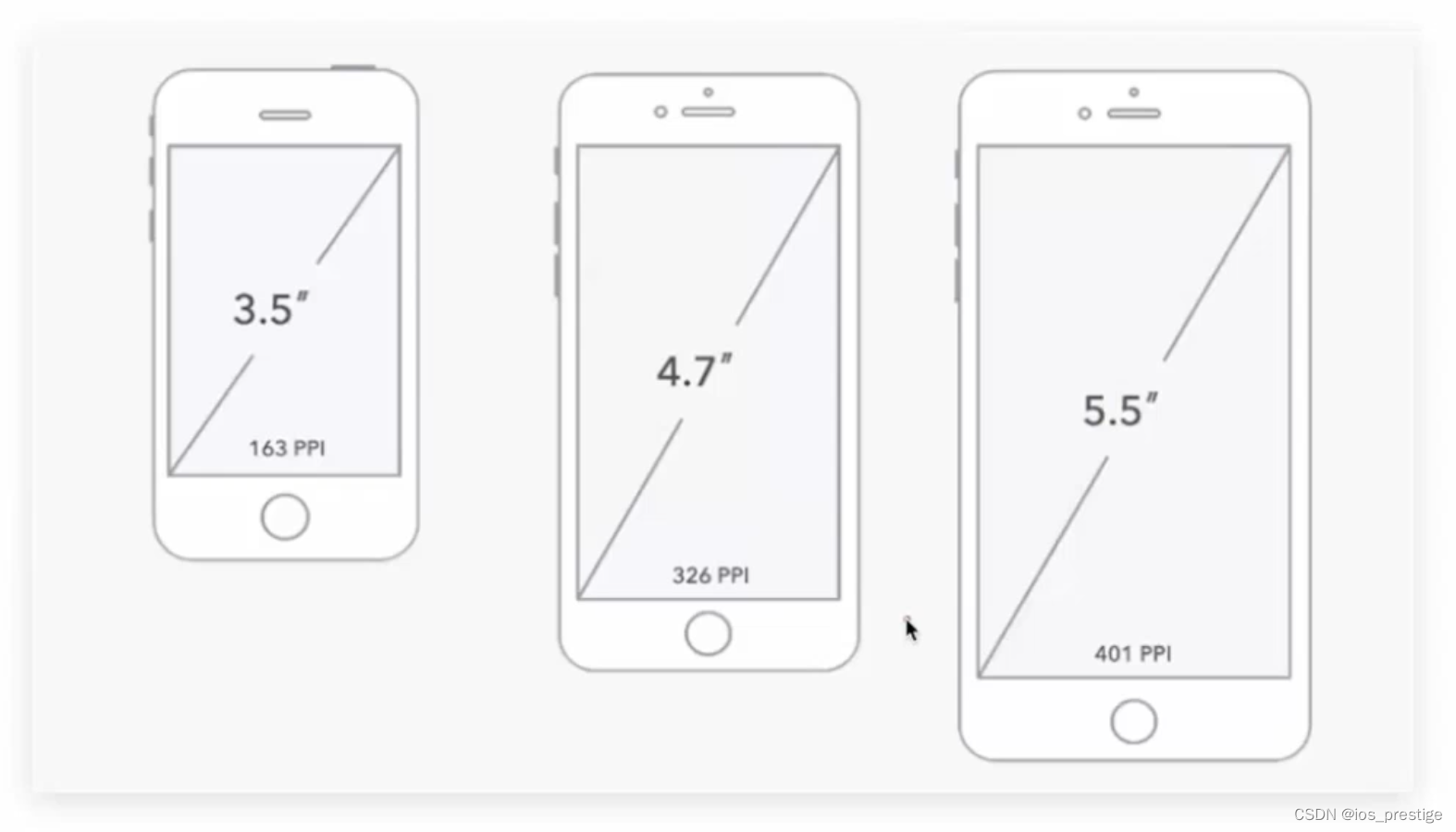
3)了解移动主流设备分辨率
PC分辨率
1920*1080
1366*768
......
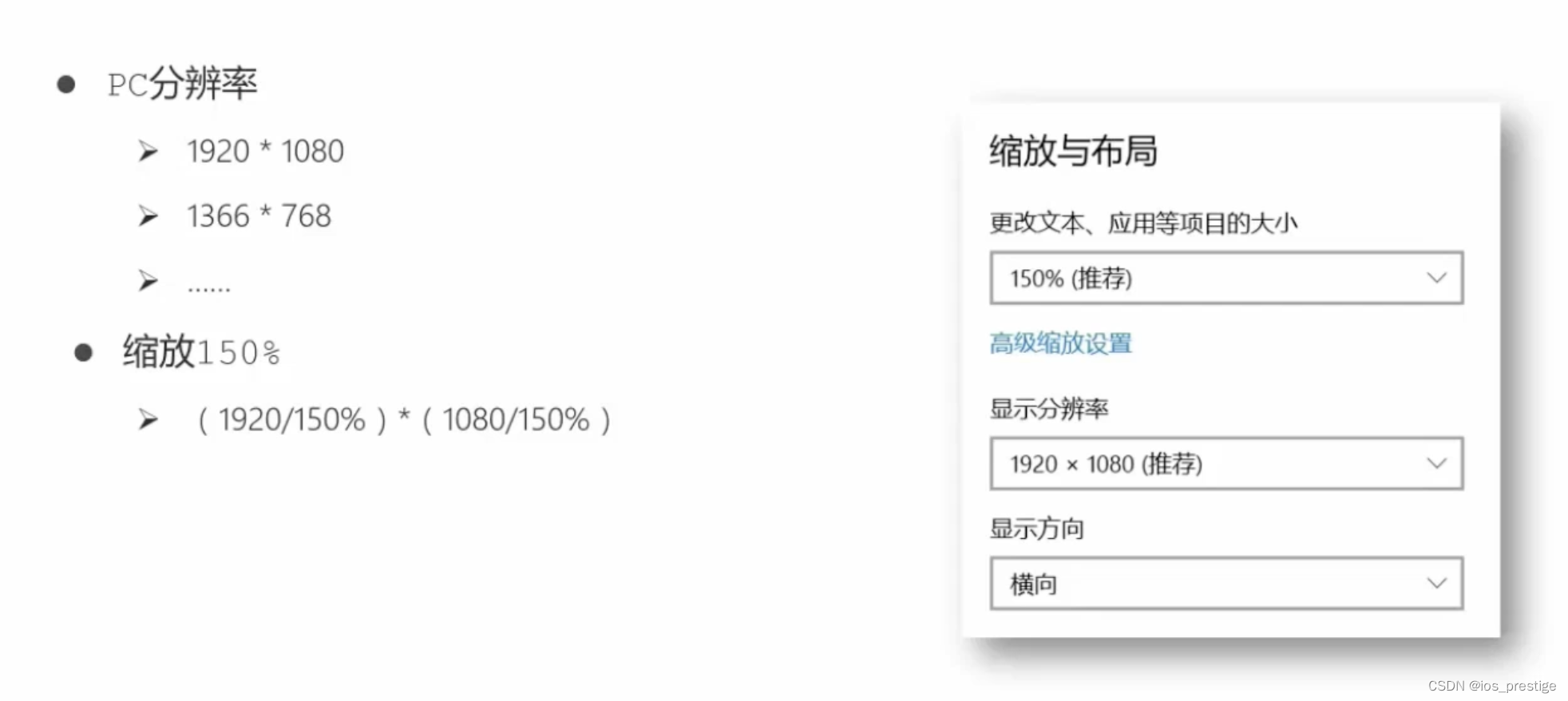
4)总结:
a.硬件分辨率(出厂设置)
b.缩放调节的分辨率(软件设置)
5)分辨率分类
a.物理分辨率是生产屏幕时就固定的,它是不可被改变的
b.逻辑分辨率是由软件(驱动)决定的
6)思考:制作网页参考物理分辨率还是逻辑分辨率
答:逻辑分辨率
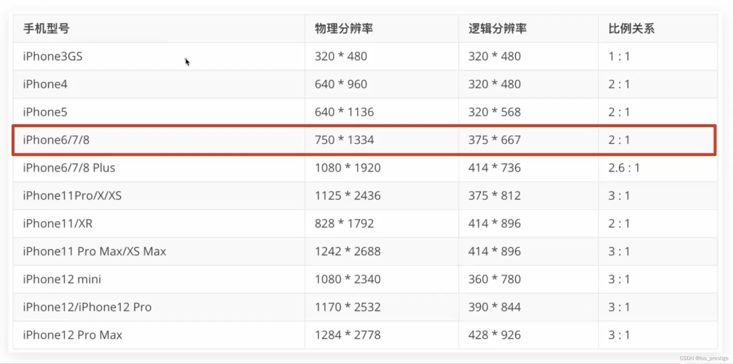
7)移动端主流设备分辨率
4.视口
1)目标:使用meta标签设置视口宽度,制作适配不同设备宽度的网页
2)手机屏幕尺寸都不同,网页宽度为100%
3)网页的宽度和逻辑分辨率尺寸相同
4)网页的宽度和设备宽度(分辨率)相同
解决办法:添加视口标签
<meta name="viewport" content="width=device-width, initial-scale=1.0">5.二倍图
1)目标:能够使用像素大厨软件测量二倍图中元素的尺寸
2)设计师给的是物理分辨率的图,二倍图
3)网站以二倍图居多,为了让图片更加的清晰
4)设计师给的是二倍图,是物理分辨率,但是我们书写的时候是根据逻辑分辨率来写
5)设计稿的时候要选择2x来进行设计
6)不管设计图给的是几倍,最终都转换成他的逻辑分辨率就可以
二、百分比布局
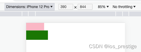
1)目标:能够使用百分比布局开发网页
2)百分比布局,也叫流式布局
3)效果:宽度自适应,高度固定
<!DOCTYPE html>
<html lang="en">
<head>
    <meta charset="UTF-8">
    <meta name="viewport" content="width=device-width, initial-scale=1.0">
    <title>Document</title>
    <style>
        * {
            margin: 0;
            padding: 0;
        }

        li {
            list-style: none;
        }

        .toolbar {
            /* 固定定位 */
            /* 定位的使用不一定要使用在一个标签添加到另一个标签的上面,如果没有其他标签,要让标签不按标准流显示,放到其他的位置,也可以使用定位 */
            position: fixed;
            bottom: 0;
            left: 0;
            /* 百分比布局,宽度自适应,高度固定 */
            width: 100%;
            height: 50px;
            background-color: pink;
            border: 1px solid #fff;

        }

        .toolbar li img {
            height: 100%;
        }

        .toolbar li {
            float: left;
            width: 20%;
            height: 50px;
        }
    </style>
</head>
<body>
    <div class="toolbar">
        <ul>

            <li><a href="#"><img src="images/index.png" alt=""></a></li>
            <li><a href="#"><img src="images/classify.png" alt=""></a></li>
            <li><a href="#"><img src="images/jd.png" alt=""></a></li>
            <li><a href="#"><img src="images/car.png" alt=""></a></li>
            <li><a href="#"><img src="images/login.png" alt=""></a></li>
        </ul>
    </div>
</body>
</html>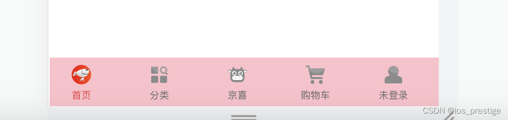
三、Flex布局
1.目标:能够使用Flex布局模型灵活、快速的开发网页
2.思考:
1)多个盒子横向排列使用什么属性
浮动
2)设置盒子间的间距使用什么属性
margin
3)需要注意什么问题?
浮动的盒子脱标
3.Flex的简单使用
设置为Flex的盒子是不会进行脱标的,即使是没有设置高度,也可以根据子级的内容给撑开
<!DOCTYPE html>
<html lang="en">
<head>
    <meta charset="UTF-8">
    <meta name="viewport" content="width=device-width, initial-scale=1.0">
    <title>Document</title>
    <style>
        * {
            margin: 0;
            padding: 0;
        }

        .box {
            /* 高度不写是0,宽度不写是浏览器的宽度 */
            /* flex布局不脱标 */
            display: flex;
            justify-content: space-between;
            width: 100%;
            /* height: 200px; */
            border: 1px solid #000;
        }

        .box div {
            /* float: left;
            margin: 10px; */
            width: 100px;
            height: 100px;
            background-color: pink;
        }
    </style>
</head>
<body>
    <div class="box">
        <div>1</div>
        <div>2</div>
        <div>3</div>
    </div>
</body>
</html>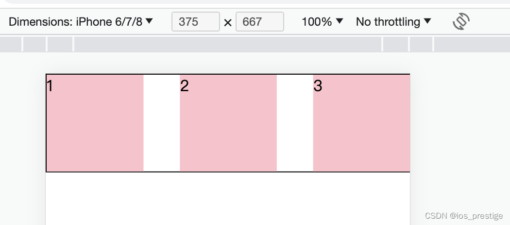
4.Flex布局/弹性布局 (必须是父子级,有父级弹性容器,子级是弹性盒子)
1)是一种浏览器提倡的布局模型
2)布局网页更简单、灵活
3)避免浮动脱标问题
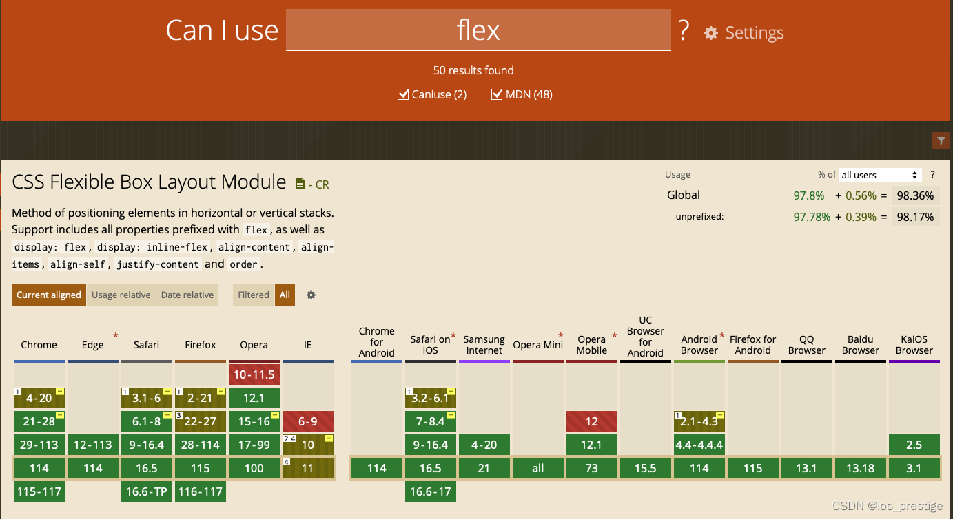
4)检查属性是否可以使用
Can I use... Support tables for HTML5, CSS3, etc
在上面的网站上可以查到一个属性在哪些浏览器上可以使用
5)作用
a.基于Flex精确灵活控制块级盒子的布局方式,避免浮动布局中脱离文档流现象发生
b.Flex布局非常适合结构化布局
6)设置方式
给父元素添加display:flex,子元素可以自动的挤压和拉伸
7)组成部分
弹性容器(父级)
弹性盒子(子级)
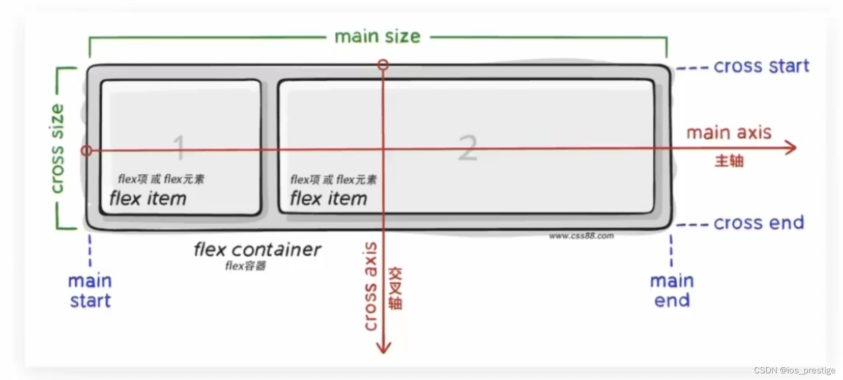
只需要给父级添加一个display:flex就可以实现横向一排排列
<!DOCTYPE html>
<html lang="en">
<head>
    <meta charset="UTF-8">
    <meta name="viewport" content="width=device-width, initial-scale=1.0">
    <title>Document</title>
    <style>
        * {
            margin: 0;
            padding: 0;
        }

        .box {
            /* 视觉效果:子级一行排列/子级水平排列 */
            /* 水平排列:默认主轴在水平,弹性盒子都是沿着主轴排列的 */
            display: flex;
            height: 200px;
            border: 1px solid #000;
        }

        .box div {
            width: 100px;
            height: 100px;
            background-color: pink;
        }

    </style>
</head>
<body>
    <div class="box">
        <div>1</div>
        <div>2</div>
        <div>3</div>
    </div>
</body>
</html>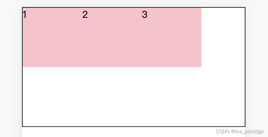
5.主轴对齐方式
1)目标:使用justify-content调节元素在主轴的对齐方式
2)思考:网页中,盒子之间有间距吗?
答:有
在Flex布局中,可以调节主轴或侧轴的对齐方式来设置盒子之间的间距
3)修改主轴对齐方式属性:justify-content
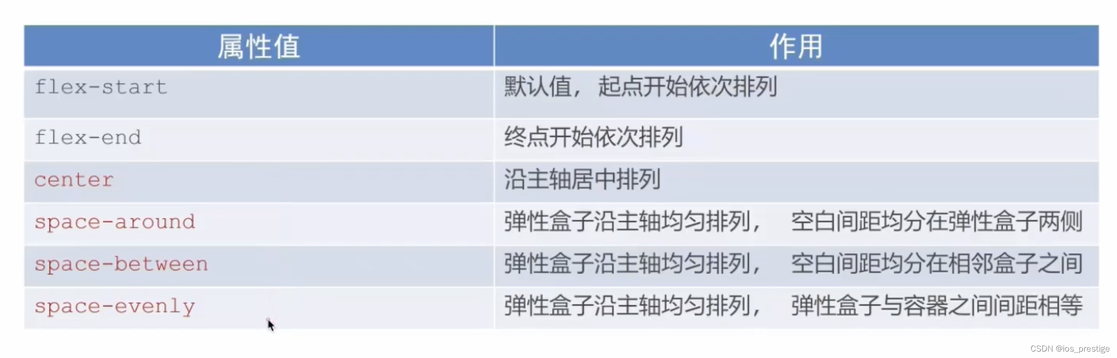
4)center的效果:实现的是盒子的容器
<!DOCTYPE html>
<html lang="en">
<head>
    <meta charset="UTF-8">
    <meta name="viewport" content="width=device-width, initial-scale=1.0">
    <title>Document</title>
    <style>
         .box {
            /* 视觉效果:子级一行排列/子级水平排列 */
            /* 水平排列:默认主轴在水平,弹性盒子都是沿着主轴排列的 */
            display: flex;
            /* 居中显示,弹性容器居中 */
            justify-content: center;
            height: 200px;
            border: 1px solid #000;
        }

        .box div {
            width: 100px;
            height: 100px;
            background-color: pink;
        }
    </style>
</head>
<body>
    <div class="box">
        <div>1</div>
        <div>2</div>
        <div>3</div>
    </div>
</body>
</html>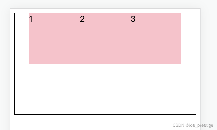
5)space-between实现的效果:间距在盒子中间显示
 /* 间距在弹性盒子之间 */
/* justify-content: space-between; */ 
6)space-evenly:所有的盒子的间距都相等
/* 所有地方的间距都相等 */
justify-content: space-evenly;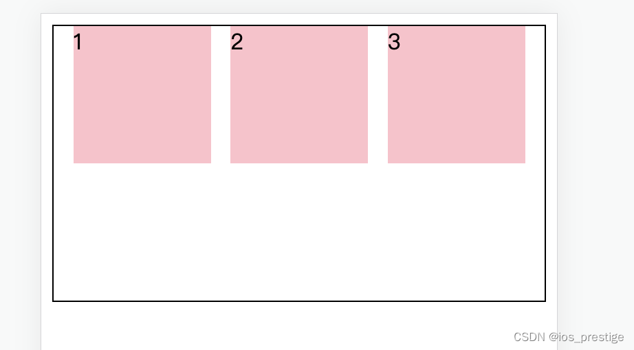
7)space-between:盒子的两侧添加边距
/* 中间的距离大,两边小,加在两侧,间距加在子级的两侧,实现的视觉效果子级之间的距离是父级两头距离的二倍 */
justify-content: space-around;
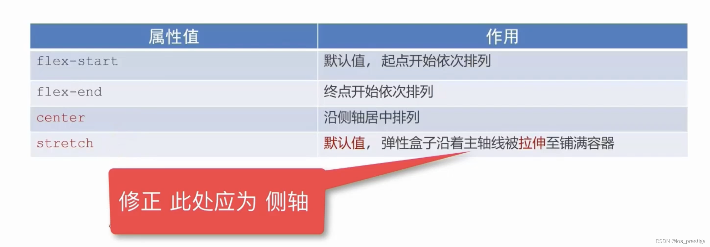
6.侧轴对齐方式
1)目标:使用align-items调节元素在侧轴的对齐方式
2)修改侧轴对齐方向属性
align-items(添加到弹性容器)
align-self:控制某个弹性盒子在侧轴的对齐方式(添加到弹性盒子)
<!DOCTYPE html>
<html lang="en">
<head>
    <meta charset="UTF-8">
    <meta name="viewport" content="width=device-width, initial-scale=1.0">
    <title>Document</title>
    <style>
          .box {
            display: flex;
            align-items: center;

            /* strech拉伸,默认值(子级盒子如果有高度就不拉伸,如果没有高度就会拉伸) */
            /* align-items: stretch; */
            height: 200px;
            border: 1px solid #000;
        }

        /* 如果子级没有宽度,那么宽度就是内容的宽度 */

        .box div {
            width: 100px;
            height: 100px;
            background-color: pink;
        }


    </style>
</head>
<body>
    <div class="box">
        <div>1</div>
        <div>2</div>
        <div>3</div>
    </div>
</body>
</html>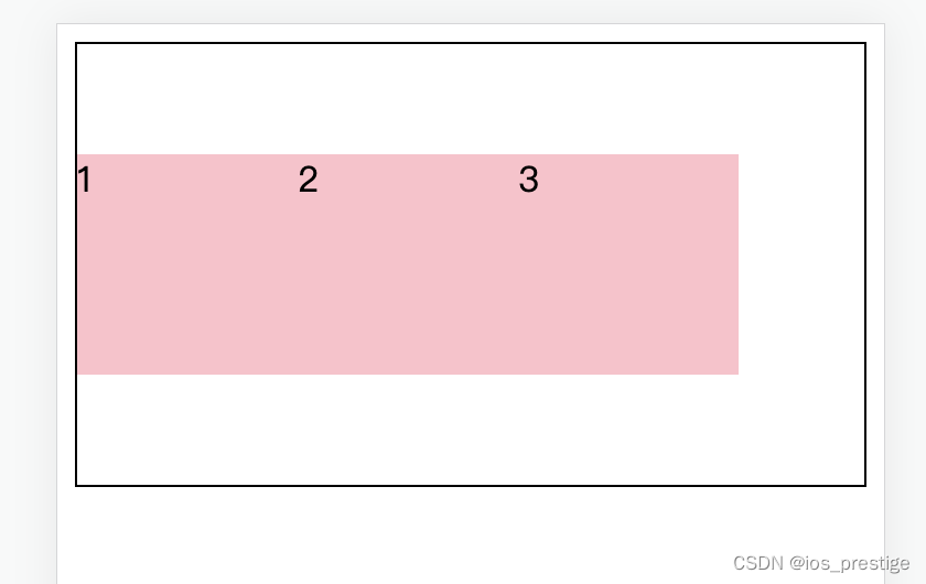
7.单独控制某个盒子侧轴对齐方式
<!DOCTYPE html>
<html lang="en">
<head>
    <meta charset="UTF-8">
    <meta name="viewport" content="width=device-width, initial-scale=1.0">
    <title>Document</title>
    <style>
          .box {
            display: flex;
            height: 200px;
            border: 1px solid #000;
        }

        /* 如果子级没有宽度,那么宽度就是内容的宽度 */

        .box div {
            width: 100px;
            height: 100px;
            background-color: pink;
        }

        /* 在flex布局中,如果没有加高度,那么这个盒子的本身高度就是父级的高度,如果子级给了高,或者不在是拉伸,就不是父级的高度 */
        /* 单独设置某个盒子的侧轴对齐方式 */
        .box div:nth-child(2) {
            align-self: center;
        }

    </style>
</head>
<body>
    <div class="box">
        <div>1</div>
        <div>2</div>
        <div>3</div>
    </div>
</body>
</html>
8.弹性盒子尺寸特点
1)如果没有使用弹性盒子来进行布局,那么没有写宽度,默认就是100%,也就是浏览器页面的宽度,没有写高度就是0
2)如果没有使用弹性盒子来进行布局,那么没有写高度,默认是0,需要设置来让盒子的高度为浏览器的高度
2)如果一个子级属性宽度或者高度写成了100%,那么他的高度或者是宽度就等于是父级的高度或者是宽度
3)如果使用了弹性盒子来进行布局,那么子级如果没有写高度或者是align-items的值是stretch,那么他的高度就是父级的高度,如果写了高度就是写的高度,如果没有写高度他的align-items是center的话那么就是他的内容的高度
4)如果使用了flex来进行布局,没有写宽度,那么盒子的宽度就是内容的宽度。
9.伸缩比
1)目标:使用flex属性修改弹性盒子伸缩比
2)属性:
flex:值
3)取值分类:
数值(整数)
4)只占用父盒子剩余尺寸
<!DOCTYPE html>
<html lang="en">
<head>
    <meta charset="UTF-8">
    <meta name="viewport" content="width=device-width, initial-scale=1.0">
    <title>Document</title>
    <style>
        /* * {
            box-sizing: border-box;
        } */
            .box {
            display: flex;
            /* align-items: center; */

            /* strech拉伸,默认值(子级盒子如果有高度就不拉伸,如果没有高度就会拉伸) */
            /* align-items: stretch; */
            height: 300px;
            border: 1px solid #000;
        }

        /* 如果子级没有宽度,那么宽度就是内容的宽度 */
        /* 整个盒子的宽为359,减去border2为357,357减去第一个盒子的宽度和边距90为267,267减去另外两个盒子的边距80,为187,187/(1+3)=46.75 46.75*3 = 140.25 */
        .box div {
            /* width: 100px; */
            height: 100px;
            margin: 0 20px;
            background-color: pink;
        }

        .box div:nth-child(1) {
            width: 50px;
        }

        .box div:nth-child(2) {
            flex: 1;
        }

        .box div:nth-child(3) {
            flex: 3;
        }
    </style>
</head>
<body>
    <div class="box">
        <div>1</div>
        <div>2</div>
        <div>3</div>
    </div>
</body>
</html>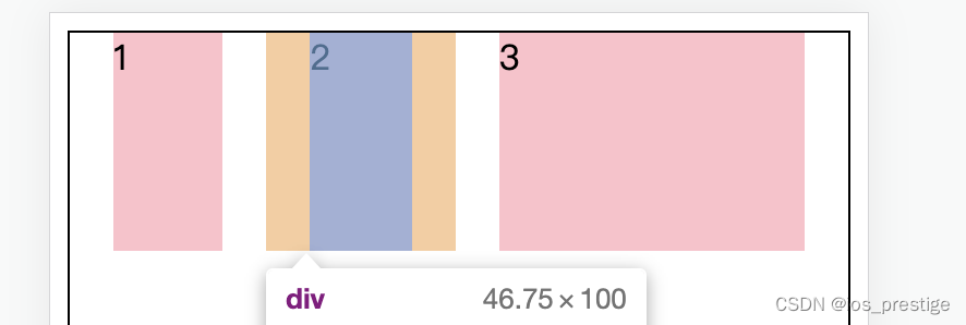
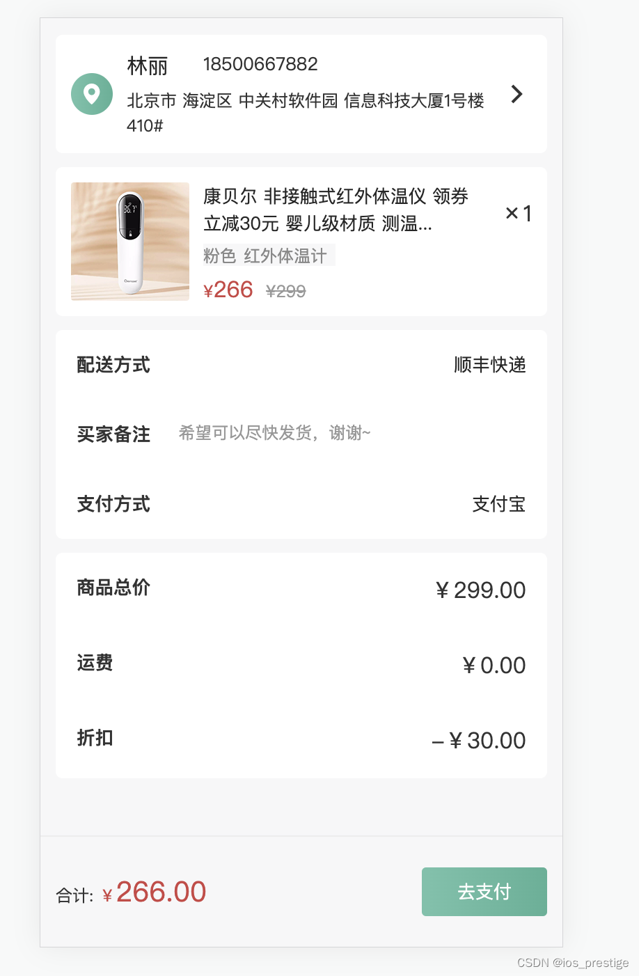
四、实战演练 --小兔仙订单页面
如果想要项目的资源或者源代码,私信我或者是底部评论
1.实现的效果
2.html代码
<!DOCTYPE html>
<html lang="en">
<head>
    <meta charset="UTF-8">
    <meta name="viewport" content="width=device-width, initial-scale=1.0">
    <title>确认订单</title>
    <link rel="stylesheet" href="lib/iconfont/iconfont.css">
    <link rel="stylesheet" href="css/base.css">
    <link rel="stylesheet" href="css/orders.css">

</head>
<body>
    <!-- 主体内容:滑动查看 -->
    <div class="main">
        <!-- 用户信息 -->
        <div class="pannel user_msg">
            <div class="location">
                <i class="iconfont icon-location"></i>
            </div>
            <div class="user">
               <div class="top">
                 <h5>林丽</h5><p>18500667882</p>
               </div>
               <div class="bottom">
                北京市  海淀区  中关村软件园   信息科技大厦1号楼410#
               </div>
            </div>
            <div class="more">
                <span class="iconfont icon-more"></span>
            </div>
        </div>
        <!-- 商品 -->
        <div class="pannel goods">
            <div class="pic">
                <a href="#"><img src="uploads/pic.png" alt=""></a>
            </div>
            <div class="info">
             <h5>康贝尔 非接触式红外体温仪 领券立减30元 婴儿级材质 测温...</h5>
               <p><span>粉色</span><span>红外体温计</span></p>
              <div class="price">
                <span class="red">¥<i>266</i></span>
                <span>¥299</span>
                </div>
            </div>
            <div class="count">
                <i class="iconfont icon-x"></i><span>1</span>
            </div>

        </div>
        <!-- 其他信息 -->
        <!-- <div class="pannel rest">

        </div> -->
        <section class="pannel rest">
            <div>
                <h5>配送方式</h5>
                <p>顺丰快递</p>
            </div>
            <div>
                <h5>买家备注</h5>
                <p>希望可以尽快发货,谢谢~</p>
            </div>
            <div>
                <h5>支付方式</h5>
                <p>支付宝</p>
            </div>
        </section>
        <section class="pannel sumprice">
            <div>
                <h5>商品总价</h5>
                <p>¥299.00</p>
            </div>
            <div>
                <h5>运费</h5>
                <p>¥0.00</p>
            </div>
            <div>
                <h5>折扣</h5>
                <p>-¥30.00</p>
            </div>
        </section>


    </div>
    <!-- 底部支付:固定定位 -->
    <!-- 固定定位会脱标 -->
    <div class="pay">
        <!-- 一定要选好大盒子一共先分为几个标签,设置大盒子的布局,然后再在大的盒子标签里面添加小的标签 -->
        <div class="left">
            <!-- 不要随便换行,会有空格 -->
            合计:
            <span class="red">¥<i>266.00</i></span>
        </div>
        <div class="right">
            <a href="#">去支付</a>
        </div>
    </div>
</body>
</html>
3.css代码
body {
    background-color: #f7f7f8;
}

/* 公共样式 */
.red {
    color: #cf4444;
}

.pannel {
    margin-bottom: 10px;
    background-color: #fff;
    border-radius: 5px;
}

/* 主体内容 */
.main {
    /* 80px为了内容不被底部区域盖住 */
    padding: 12px 11px 80px;
}

.user_msg {
    padding: 15px 0 15px 11px;
    display: flex;
    justify-content: space-between;
     height: 85px;
     align-items: center;
}

.user_msg .location {
    width: 30px;
    height: 30px;
    margin-right: 10px;
    background-image: linear-gradient(90deg,
    #6fc2aa 5%,
    #54b196 100%);
    border-radius: 50%;
    text-align: center;
    line-height: 30px;
    color: #fff;
}

.user_msg .more {
width: 44px;
height: 44px;
text-align: center;
line-height: 44px;
}

.user_msg .user {
    flex: 1;
}

.user_msg .user .top {
    display: flex;
}

.user_msg .user .top h5 {
    width: 55px;
    font-size: 15px;
    color: #262626;
    font-weight: 400;
}

.user_msg .user .top p {
    font-size: 13px;
    color: #333333;
}

.user_msg .user .bottom {
    margin-top: 5px;
    font-size: 12px;
}

/* 商品 */
.goods {
    display: flex;
    padding: 11px 0 11px 11px;
    justify-content: space-between;
    height: 107px;
}

.goods .pic {
    width: 85px;
    height: 85px;
    border-radius: 2px;
    margin-right: 10px;
}

.goods .count {
    width: 44px;
    height: 44px;

    text-align: center;
    line-height: 44px;
}


.goods .info {
    flex: 1;
    /* background-color: skyblue; */
}


.goods .info h5 {
   font-size: 13px;
   color: #262626;
   font-weight: 400;
}


.goods .info p {
    width: 95px;
    height: 16px;
    margin: 5px 0;
    background-color: #f7f7f8;
    font-size: 12px;
    color: #888;
}

.goods .info p span:first-child {
    margin-right: 5px;
}

.goods .info .price {
    font-size: 12px;
}

.goods .info .price i{
   font-size: 16px;
}

.goods .info .price span:last-child {
    margin-left: 5px;
    color: #999;
    text-decoration: line-through;
}

/* 其他信息区域 */
.rest {
    padding: 15px;
}
.rest div {
  display: flex;
  margin-bottom: 30px;
}

/* 找到第一个和第三个div设置主轴对齐方式 */
.rest div:nth-child(2n+1) {
    justify-content: space-between;
}

/* 第二行标题和p之间的距离 */
.rest div:nth-child(2) h5 {
    margin-right: 20px;
}

.rest p {
    font-size: 13px;
    color: #262626;
    font-weight: 400;
}

.rest div:nth-child(2) p {
    font-size: 12px;
    color: #989898;
}

.rest div:last-child {
   margin-bottom: 0px;
}

.sumprice {
    padding: 15px;
}

.sumprice div {
    display: flex;
    margin-bottom: 30px;
    justify-content: space-between;
}

.sumprice div:last-child {
    margin-bottom: 0;
}


/* 底部支付 */
.pay {
    position: fixed;
    left: 0;
    bottom: 0;
    display: flex;
    /* 主轴对齐方式 */
    justify-content: space-between;
    /* 侧轴对齐方式 */
    align-items: center;
    padding: 0 11px;
    width: 100%;
    height: 80px;
    /* background-color: pink; */
    border-top: 1px solid #ededed;
}


.pay .left {
    font-size: 12px;
}

.pay i {
    font-size: 20px;
}

.pay .right a {
    display: inline-block;
    width: 90px;
    height: 35px;
    border-radius: 3px;
    text-align: center;
    line-height: 35px;
    color: #fff;
    font-size: 13px;
    background-image: linear-gradient(90deg,
		#6fc2aa 5%,
		#54b196 100%);
}
五、主轴方向
1.目标:使用flex-direction改变元素排列方向
2.思考:Flex布局模型中,弹性盒子默认沿着哪个方向排列?
答:水平方向
3.思考:如何实现内容垂直排列?
4.主轴默认是水平方向,侧轴默认是垂直方向
5.修改主轴方向属性:flex-direction

<!DOCTYPE html>
<html lang="en">
<head>
    <meta charset="UTF-8">
    <meta name="viewport" content="width=device-width, initial-scale=1.0">
    <title>Document</title>
    <style>
        * {
            margin: 0;
            padding: 0;

        }

        li {
            list-style: none;
        }

        .box li {
            /* 1.先确定主轴方向,2.再选择对应的属性实现主轴或者是侧轴居中 */
            display: flex;
            /* 修改主轴的方向:列 */
            /* 侧轴就是水平方向 */
            flex-direction: column;
            /* 视觉效果:实现盒子水平居中 */
            align-items: center;
            /* 视觉效果:垂直居中 */
            /* justify-content: center; */
            width: 80px;
            height: 80px;
            border: 1px solid #ccc;
        }

        .box img {
            width: 32px;
            height: 32px;
        }
    </style>
</head>
<body>
    <div class="box">
        <ul>
            <li>
                <img src="media.png" alt="">
                <span>媒体</span>
            </li>
        </ul>
    </div>
</body>
</html>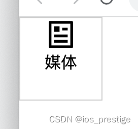
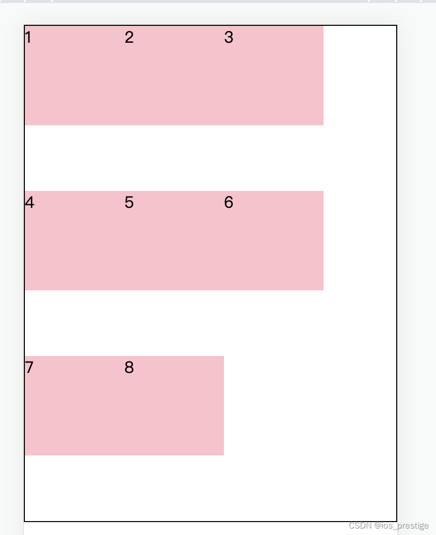
六、弹性盒子换行
1.目标:使用flex-wrap实现弹性盒子多行排列效果
2.思考:默认情况下,多个弹性盒子如何显示?
弹性盒子换行显示:flex-wrap:wrap;
3.注意点:
在前面如果使用浮动来写的话,如果给盒子设置了宽高,那么如果一行排不满的情况下会换行排,但在在弹性布局中,如果给盒子设置了宽高,当小盒子的宽度大于了大盒子的宽度的时候,他不会换行排,而是根据他的弹性,给每个盒子都自动压缩宽度
<!DOCTYPE html>
<html lang="en">
<head>
    <meta charset="UTF-8">
    <meta name="viewport" content="width=device-width, initial-scale=1.0">
    <title>Document</title>
    <style>
        * {
            margin: 0;
            padding: 0;
            box-sizing: border-box;
        }

        .box {
            display: flex;
            /* flex-wrap: wrap; */
            height: 500px;
            border: 1px solid #000;

        }

        .box div {
            width: 100px;
            height: 100px;
            background-color: pink;
        }
    </style>
</head>
<body>
    <div class="box">
        <div>1</div>
        <div>2</div>
        <div>3</div>
        <div>4</div>
        <div>5</div>
        <div>6</div>
        <div>7</div>
        <div>8</div>
    </div>
</body>
</html>
        .box {
            display: flex;
            flex-wrap: wrap;
            height: 500px;
            border: 1px solid #000;

        }
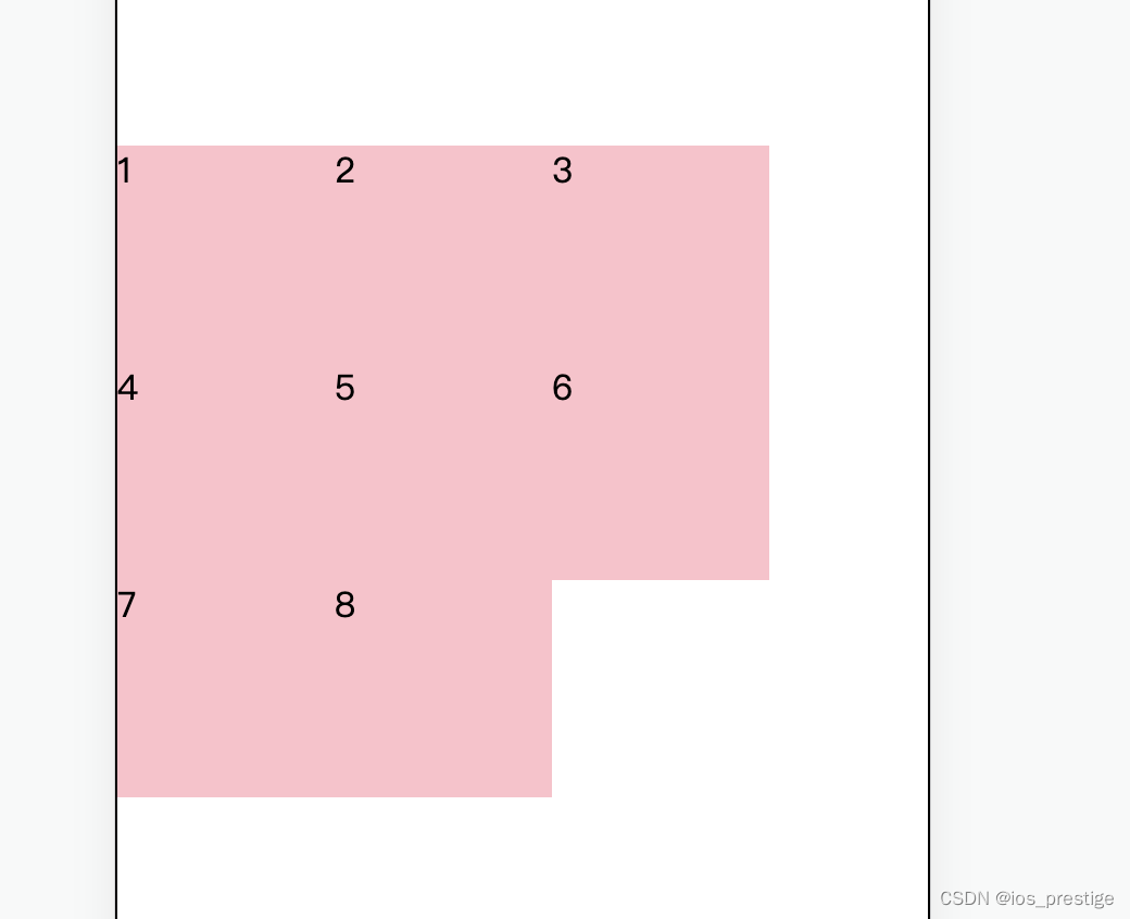
七、调整行对齐方式
1.进行了换行之后,会看到每一行之间是有间距的,这个是换行之后的行对齐方式,可以使用align-content属性来设置他的间距,取值基本与justify-content一样,但是没有evenly
        .box {
            display: flex;
            flex-wrap: wrap;
            /* 调节行对齐方式 */
            align-content: center;
            /* align-content: space-between; */
            height: 500px;
            border: 1px solid #000;

        }
八、PC端小兔仙项目
九、移动端适配
1.rem:目前多数企业在用的解决方案
2.vw/vh:未来的解决方案
3.rem:
媒体查询
flexible.js
1)目标:能够使用rem单位设置网页元素的尺寸
2)网页效果:
屏幕宽度不同,网页元素尺寸不同(等比例缩放)
3)rem单位
> 相对单位
> rem单位是相对于HTML标签的字号计算结果
> 1rem = 1HTML字号大小
使用rem之前需要将html设置字号
<!DOCTYPE html>
<html lang="en">
<head>
    <meta charset="UTF-8">
    <meta name="viewport" content="width=device-width, initial-scale=1.0">
    <title>Document</title>
    <style>

        * {
            margin: 0;
            padding: 0;
        }

        html {
            font-size: 20px;
        }

        /* 1rem=1html标签字号大小 */
        .box {
            width: 5rem;
            height: 3rem;
            background-color: pink;
        }
    </style>
</head>
<body>
    <div class="box"></div>
</body>
</html>
4)思考:
a.手机屏幕大小不同,分辨率不同,如何设置不同的HTML标签字号?
b.设备宽度不同,HTML标签字号设置多少合适?
5)媒体查询
a.目标:能够使用媒体查询设置差异化CSS样式
b.写法

<!DOCTYPE html>
<html lang="en">
<head>
    <meta charset="UTF-8">
    <meta name="viewport" content="width=device-width, initial-scale=1.0">
    <title>Document</title>
    <style>
        /* 使用媒体查询,根据不同的视口宽度,设置不同的根字号 */
        @media (width:375px) {
            html {
                font-size: 40px;
            }
        }

        @media (width:320px) {
            html {
                font-size:30px;
            }
        }
    </style>
</head>
<body>

</body>
</html>
6)根据不同的设备,HTML设置多少合适?
目前rem布局方案中,将网页等分为10份,HTML标签的字号为视口宽度的1/10
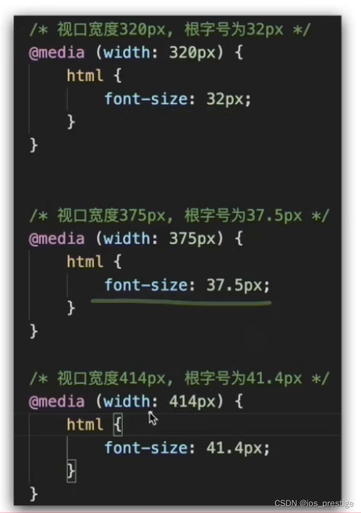
7)rem适配原理
a.目标:实现在不同宽度的设备中,网页元素尺寸等比缩放效果
b.rem单位尺寸
> 确定设计稿对应的设备的HTML标签字号
查看设计稿宽度----> 确定参考设备宽度(视口宽度)---->确定基准根字号(1/10视口宽度)
> rem单位的尺寸
rem单位尺寸 = px单位数值/基准根字号
<!DOCTYPE html>
<html lang="en">
<head>
    <meta charset="UTF-8">
    <meta name="viewport" content="width=device-width, initial-scale=1.0">
    <title>Document</title>
    <style>
        @media (width:320px) {
            html {
                font-size: 32px;
            }
        }

        @media (width:375px) {
            html {
                font-size: 37.5px;
            }
        }

        @media (width:414px) {
            html {
                font-size: 41.4px;
            }
        }

        .box {
            /* 68*29 */
            /* width:68px */
            /* 设计稿:375 HTML 37.5 68/37.5 */
            width: 1.813rem;
            height: 0.733rem;
            background-color: pink;
        }

    </style>
</head>
<body>
    <div class="box"></div>
</body>
</html>
8)flexible
a.目标:使用flexible.js实现不同的窗口适配
b.我们需要根据不同的视口宽度进行不同的媒体查询来设置字号大小,但是每个手机的宽度都不一样,如果自己写得写好多媒体查询,导入了flexible文件,就可以不用写媒体查询来进行适配
<!DOCTYPE html>
<html lang="en">
<head>
    <meta charset="UTF-8">
    <meta name="viewport" content="width=device-width, initial-scale=1.0">
    <title>Document</title>
    <style>
              .box {
            /* 68*29 */
            /* width:68px */
            /* 设计稿:375 HTML 37.5 68/37.5 */
            width: 1.813rem;
            height: 0.733rem;
            background-color: pink;
        }
    </style>
</head>
<body>
    <div class="box"></div>
    <script src="js/flexible.js"></script>
</body>
</html>
4.Less
1)目标:使用Less运算写法完成px单位到rem单位的转换
2)思考:在px单位转换到rem单位过程中,那项工作是最麻烦的?
答:除法运算
3)Less是一个CSS预处理器,Less文件的后缀是.less
4)扩充了CSS语言,使CSS具备一定的逻辑性,计算能力
5)注意:浏览器不识别Less代码,目前阶段,网页要引入对应的CSS文件
6)编译插件
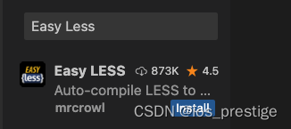
Easy Less:vscode插件
作用:less文件保存自动生成css文件
7)使用:
安装完成之后,我们只需要写.less文件,保存就会生成同名的.css文件
8)Less语法
目标:使用Less语法快速编译生成CSS代码
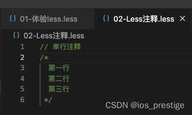
a.注释
> 单行注释://
mac的单行注释的快捷键:command+/
> 块注释:/* */
mac的多行注释的快捷键:option+shift+a
> 生成的css代码中单行注释是不显示的
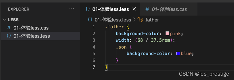
b.运算
> 加、减、乘直接书写计算表达式
> 除法需要添加小括号或.
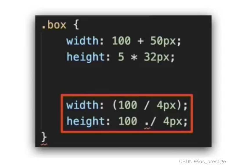
.box {
    width: 100 + 10px;
    width: 100 - 20px;
    width: 100 * 2px;

    // 除法
    width: (68 / 37.5rem);
    // height: 29 ./ 37.5rem;
}
.box {
width: 110px;
width: 80px;
width: 200px;
width: 1.81333333rem;
}
c.Less嵌套后代选择器
嵌套:
> 思考:书写CSS选择器时,如何避免样式冲突?
> 作用:快速生成后代选择器
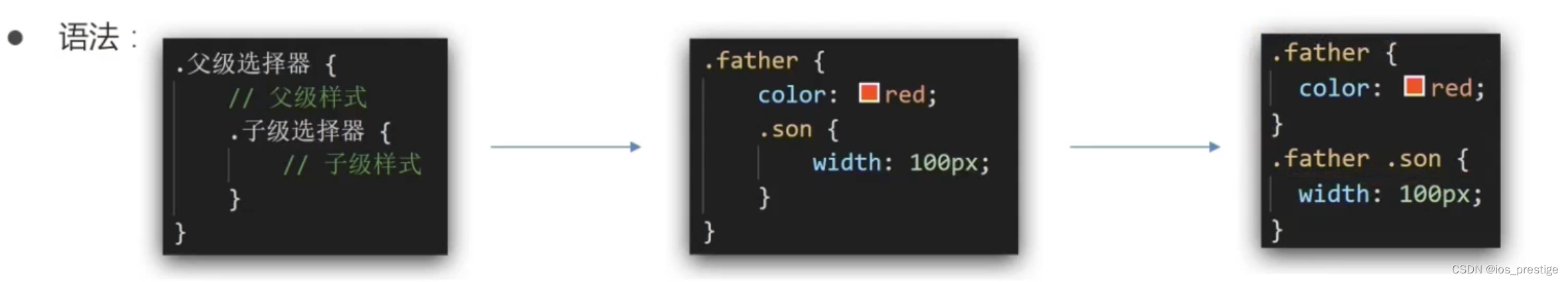
> 注意:
&不生成后代选择器,表示当前选择器,通常配合伪类或伪元素使用
.father {
    color: red;
    .son {
        width: 100px;
        &:hover {
            color: green;
        }
    }
}
.father {
color: red;
}
.father .son {
width: 100px;
}
.father .son:hover {
color: green;
}
d.使用Less变量设置属性值
思考:网页中,文字颜色基本都是统一的,如果网站改版,变换文字颜色,如何修改代码?

> 把颜色提前存储到一个容器,设置属性值为这个容器名
> 变量:存储数据,方便使用和修改
> 语法:定义变量:@变量名:值;
使用变量:CSS属性:@变量名
// 1.定义  2.使用
@color:pink;

.box {
    color: @color;
}

.father {
    color: @color;
}
.box {
color: pink;
}
.father {
color: pink;
}
e.能够使用Less导入语法引入其他Less文件
思考:开发网页时,网页如何引入公共样式
》开发网页的时候如果想要引入外部的样式,那么就需要link一下css样式,如果我们有基础的base的less,然后不想每一个都生成css文件,然后每一个都引入的话,我们可以直接在我们写的less文件中,导入base.less,这样直接就把base.less的css文件样式导入到了我们自己写的less文件中
》Less导入
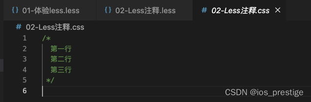
导入:@import"文件路径“
.less文件
@import './01-体验less.less';

// 如果是less文件导入,后缀可以省略掉less
@import './02-Less注释';
.css文件
.father {
  background-color: pink;
  width: 1.81333333rem;
}
.father .son {
  background-color: blue;
}
/*
   块注释
 */
/*
  第一行
  第二行
  第三行
 */
d.使用Less语法导出CSS文件
思考:目前,Less文件导出的CSS文件位置是哪里?
方法一:配置EasyLess插件,实现所有Less有相同的导出路径
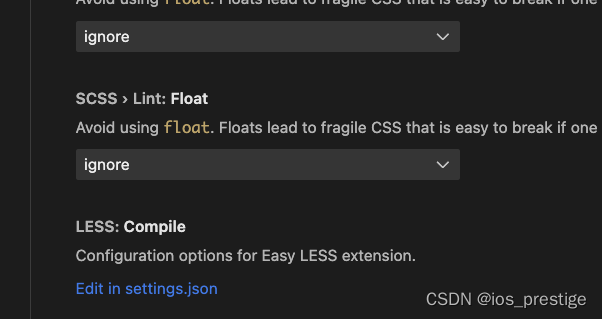
配置插件:设置---->搜索Easyless------>在setting.json中编辑----->添加代码(注意,必须是双引号)
点击左下角的设置图标选择settings
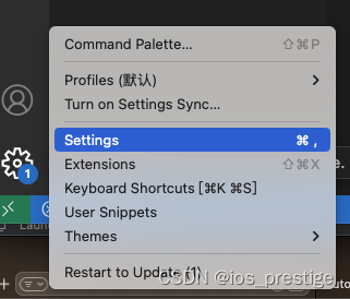
搜索Easy
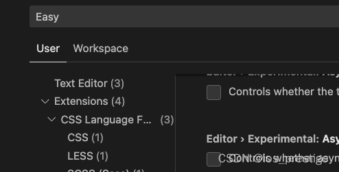
选择下面的Edit in settings.json
在json里面写要导出的css的路径,我们要在css文件夹中导入,如果有css文件夹就直接在css文件夹中生成,如果没有css文件夹,那么就会创建一个css文件夹
    "less.compile": {
        "out": "./css/"
    }
方法二:
在需要导出的less文件里面直接写// out:./abc/

上面的文件都是生成跟less同样的文件名,如果想要生成不同的文件名,那么就自己书写要生成的文件名
e.是否所有的文件都需要导出CSS文件?
禁止导出:在less文件第一行添加://out:false
不是所有的文件都需要导出css文件,比如我们的base.less文件,直接在自己的less文件引入就可以
// out:false
.box {
background-color: pink;
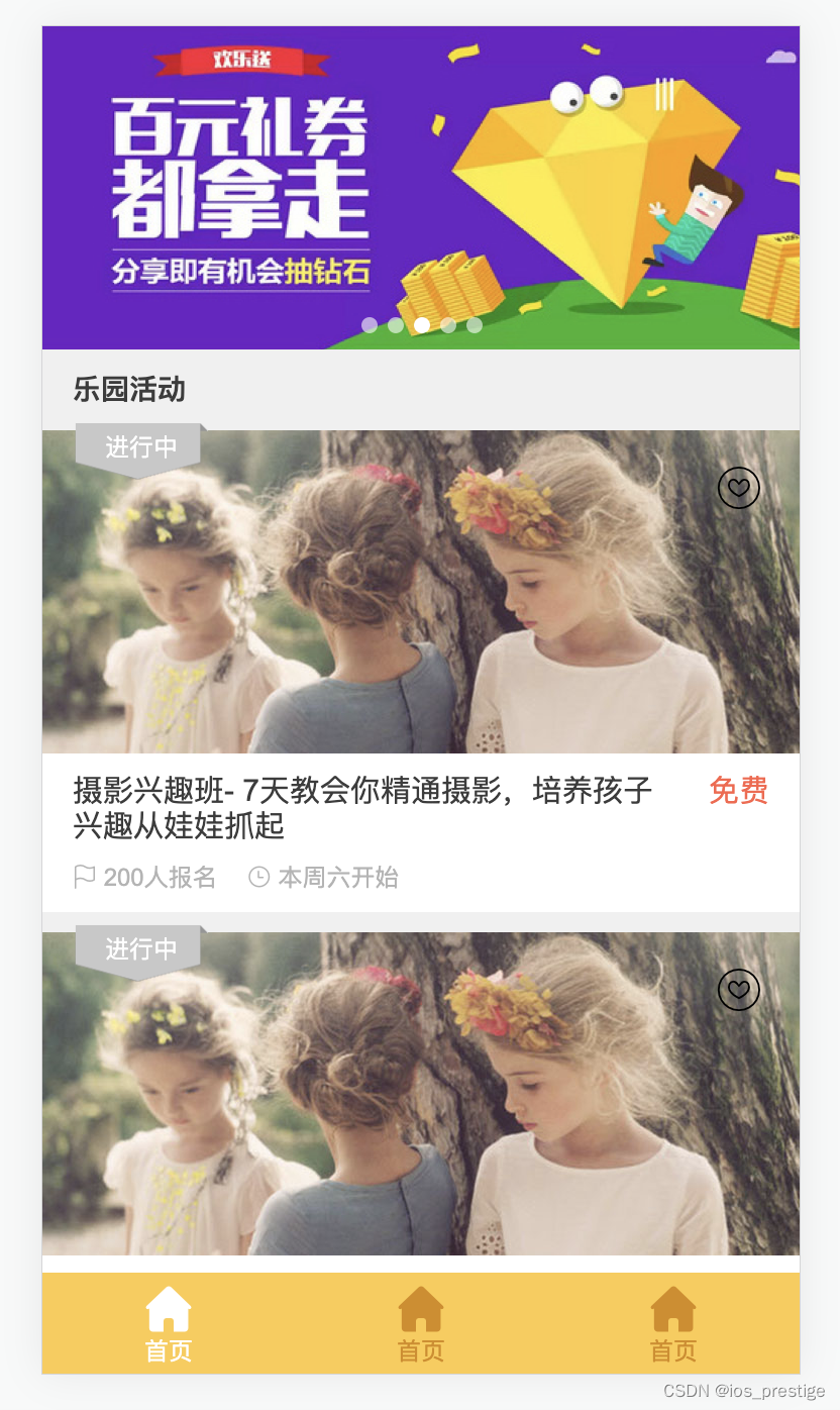
}十、项目实现-游乐园项目
如果想要这个项目的资源和源代码,私信我或者底部评论
1.实现的效果
2.html代码
<!DOCTYPE html>
<html lang="en">
<head>
    <meta charset="UTF-8">
    <meta name="viewport" content="width=device-width, initial-scale=1.0">
    <title>Document</title>
    <link rel="short cut icon" href="favicon.ico">
    <link rel="stylesheet" href="lib/iconfont/iconfont.css">
    <link rel="stylesheet" href="css/index.css">
</head>
<body>
   <!-- 主体内容 -->
   <div class="main">
    <!-- banner -->
    <div class="banner">
        <ul>
            <li><a href="#"><img src="./uploads/banner_1.png" alt=""></a></li>
        </ul>
    </div>
  <!-- 乐园活动标题 -->
    <div class="title">
        <h4>乐园活动</h4>
    </div>
   <!-- 活动 -->
   <!-- 内容多了可以自动滑动 -->
   <section class="item">
    <div class="pic">
        <a href="#"><img src="uploads/item_2.png" alt=""></a>
        <!-- 收藏图标 -->
        <i class="iconfont icon-shoucang1"></i>
        <!-- 活动状态 -->
        <div class="active off">进行中</div>
    </div>
    <div class="txt">
        <div class="top">
            <h5>摄影兴趣班- 7天教会你精通摄影,培养孩子兴趣从娃娃抓起</h5>
            <p>免费</p>
        </div>
        <div class="bottom">
            <p>
                <i class="iconfont icon-qizhi"></i>
                <span>200</span>人报名
            </p>
             <p>
                <i class="iconfont icon-shizhong"></i>
                <span>本周六</span>开始
            </p>
        </div>
    </div>
   </section>


   </div>

   <!-- 底部工具栏 -->
   <footer>
      <a href="#" class="current">
        <i class="iconfont icon-index-copy"></i>
        <p>首页</p>
      </a>
       <a href="#">
        <i class="iconfont icon-index-copy"></i>
        <p>首页</p>
      </a>
       <a href="#">
        <i class="iconfont icon-index-copy"></i>
        <p>首页</p>
      </a>
   </footer>

    <script src="js/flexible.js"></script>
</body>
</html>
3.less代码
@import './base.less';
@import './normalize.less';

// 设置根字号 变量,存储37.5
@rootSize: 37.5rem;

body {
    background-color: #F0F0F0;
}

// 主体内容
.main {
   padding-bottom: (50 / @rootSize);

   //banner
   .banner {
    height: (160 / @rootSize);
   }

   // 活动标题
   .title {
    height: (40 / @rootSize);
    line-height: (40 / @rootSize);
    padding-left: (15 / @rootSize);

    h4 {
        font-size:  (14 / @rootSize);
        color: #3c3c3c;
    }
   }

   //活动
   .item {
      margin-bottom: (10 / @rootSize);

    //图片区域
    .pic {
        position: relative;
        height: (160 / @rootSize);
        // 收藏图标
        i {
            position: absolute;
            top: (15 / @rootSize);
            right: (18 / @rootSize);
            font-size: (24 / @rootSize);

        }

        // 活动图标
        .active {
            position: absolute;
            left: (15 / @rootSize);
            top: (-4 / @rootSize);
            width: (68 / @rootSize);
            height: (29 / @rootSize);
            background-image: url(../images/status_active.png);
            background-size: contain;
            font-size: (12 / @rootSize);
            text-align: center;
            line-height: (25 / @rootSize);
            color: #fff;

            // 交集选择器 必须是active标签同时应用了off这个类
            &.off {
                 background-image: url(../images/status_default.png);
            }
        }

        // .off {
        //     //灰色图片
        // }
    }


    // 文字
    .txt {
        padding: (10 / @rootSize) (15 / @rootSize);
        background-color: #fff;

        .top {
            display: flex;
            justify-content: space-between;
            h5 {
                width: (290 / @rootSize);
                font-size: (15 / @rootSize);
                color: #3c3c3c;
                font-weight: normal;
            }

            p {
                font-size: (15 / @rootSize);
                color: #FE6249;
            }
        }

        .bottom {
            display: flex;
            margin-top: (10 / @rootSize);

            p {
                margin-right: (15 / @rootSize);
                font-size: (11 / @rootSize);

                i {
                    font-size: (11 / @rootSize);
                }
                color: #B4B4B4;
            }
        }
    }

   }


}

// 底部工具栏
// 定位脱标,不再是块级,得设置宽度
footer {
    position: fixed;
    bottom: 0;
    left: 0;
    display: flex;
    justify-content: space-around;
    align-items: center;
    width: 100%;
   height: (50 / @rootSize);
   background-color: #FECA49 ;
   text-align: center;
   a {
    color: #D78B09;
    font-size: (11 / @rootSize);

    .icon-index-copy {
    font-size: (24 / @rootSize);
   }

//    a.current
    &.current {
        color: #fff;
    }
   }

}
十一、vw / vh
1.目标:能够使用vw单位设置网页元素的尺寸
1)相对单位
2)相对视口的尺寸计算结果
3)vw:viewport width
1vw = 1/100视口宽度
4)vh:viewport height
1vh = 1/100视口高度
2.vw体验
vw和vh能够自动的根据屏幕的宽度和高度进行适配,自动进行适配,不用使用媒体查询根据不同的屏幕宽度进行计算,也不用导入flexible.js
1)vw体验
<!DOCTYPE html>
<html lang="en">
<head>
    <meta charset="UTF-8">
    <meta name="viewport" content="width=device-width, initial-scale=1.0">
    <title>Document</title>
    <style>

        /* 1. vw = 1/100视口宽度 */
        .box {
            width: 50vw;
            height: 34vw;
            background-color: pink;
        }

    </style>
</head>
<body>
    <div class="box"></div>
</body>
</html>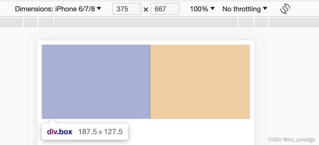
187.5 = 3.75*50
127.5 = 3.75 *34
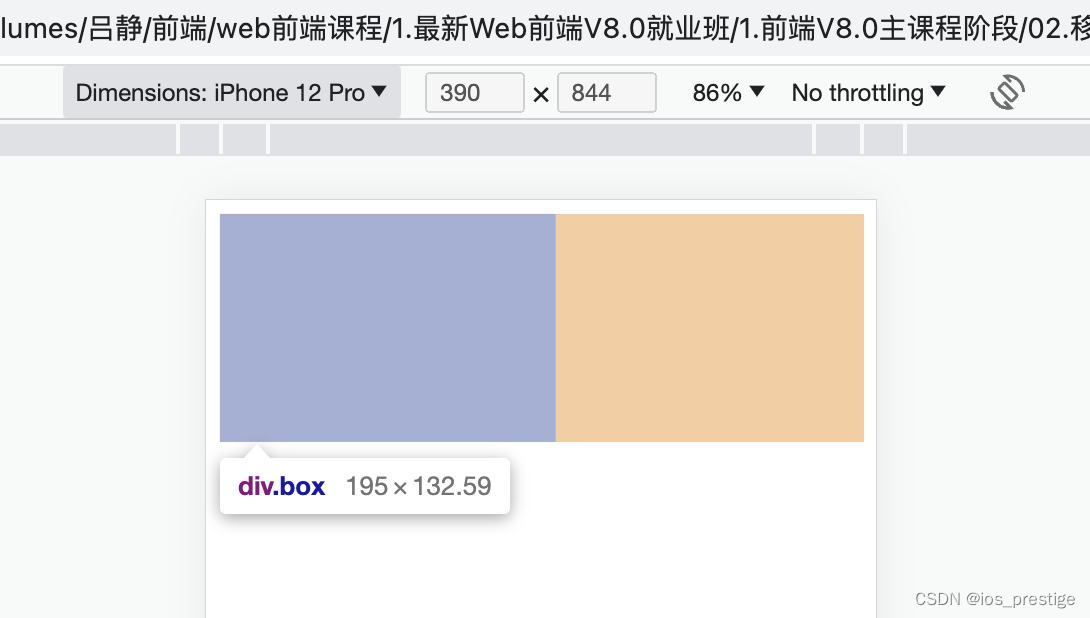
195 = 3.90 *50
132.59 = 3.90*34
3.vh体验
<!DOCTYPE html>
<html lang="en">
<head>
    <meta charset="UTF-8">
    <meta name="viewport" content="width=device-width, initial-scale=1.0">
    <title>Document</title>
    <style>
        /* 2.vh= 1/100视口高度 */
        .box {
            width: 50vh;
            height: 34vh;
            background-color: pink;
        }
    </style>
</head>
<body>
    <div class="box"></div>
</body>
</html>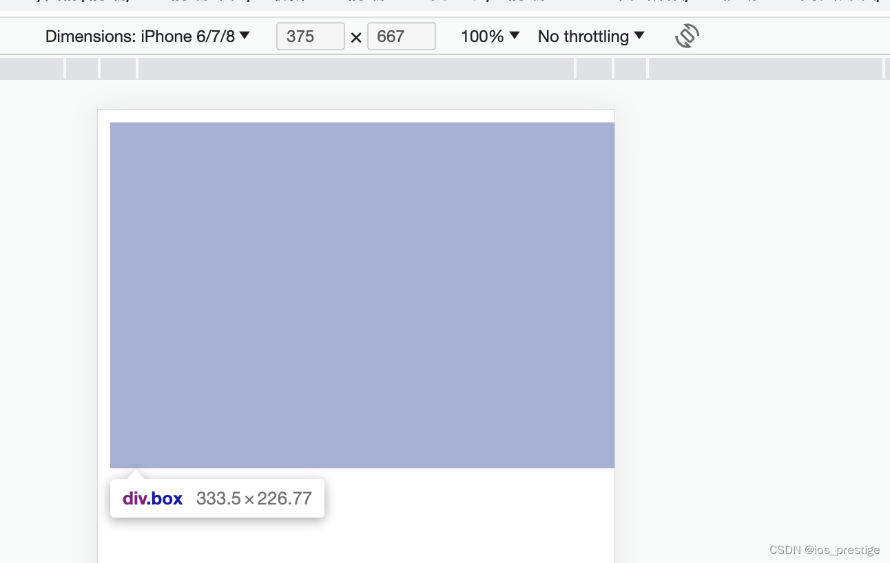

333.5 = 50 * 6.67
226.77 = 34 * 6.67
422 = 8.44 * 50
286.95 = 8.44 * 34
4.vw适配原理
1)目标:实现在不同宽度的设备中,网页元素尺寸等比缩放效果
2)vw单位尺寸
a.确定设计稿宽度------> 确定参考设备宽度(视口宽度)------> 确定wm尺寸(1/100视口宽度)
b.vw单位的尺寸 = px单位数值 / (1/100视口宽度)
// out:./
* {
    margin: 0;
    padding: 0;
}

.box {
    width: (68 / 3.75vw);
    height: (29 / 3.75vw);
    background-color: pink;
  }

  .box2 {
    width: (68 / 6.67vh);
    height: (29 / 6.67vh);
    background-color: green;
  }
全写vw可以,全写vh可以,但是不要一个写vw,一个写vh,而且使用vh和vw布局的时候不一定两个大小都一样
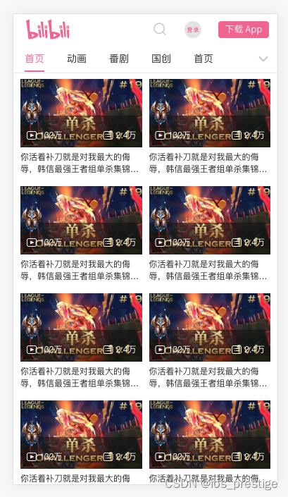
十二、项目实战-----使用vw完成B站首页
1.实现的效果
2.html代码
<!DOCTYPE html>
<html lang="en">
<head>
<meta charset="UTF-8">
<meta name="viewport" content="width=device-width, initial-scale=1.0">
<title>B站</title>
<link rel="stylesheet" href="fonts/iconfont.css">
<link rel="stylesheet" href="css/index.css">
</head>
<body>
<!-- 1。头部 -->
<header>
<div class="top">
<div class="left">
<a href="#">
<i class="iconfont Navbar_logo"></i>
</a>
</div>
<div class="right">
<!-- 在flex布局中,即使是行内标签,加宽加高也生效 -->
<a href="#">
<!-- 字体图标一般用i标签来进行包裹 -->
<i class="iconfont ic_search_tab"></i>
</a>
<a href="#" class="login"><img src="images/login.png" alt=""></a>
<a href="#" class="download"><img src="images/download.png" alt=""></a>
</div>
</div>
<div class="bottom">
<div class="tab">
<ul>
<li><a href="#" class="current">首页</a></li>
<li><a href="#">动画</a></li>
<li><a href="#">番剧</a></li>
<li><a href="#">国创</a></li>
<li><a href="#">首页</a></li>
</ul>
</div>
<div class="more">
<a href="#">
<i class="iconfont general_pulldown_s"></i>
</a>
</div>
</div>
</header>
<!-- tab栏:菜单的个数和内容的个数相等的 -->
<!-- 2.视频区域 -->
<!--视频区域布局 -->
<section class="video_content">
<!-- 一份视频,共计有5个菜单,应该有5份视频的div -->
<div class="video_list">
<a href="#">
<div class="pic">
<img src="images/1.jpg" alt="">
<div class="count">
<p>
<i class="iconfont icon_shipin_bofangshu"></i>
<span>132</span>万
</p>
<p>
<i class="iconfont icon_shipin_danmushu"></i>
<span>2.4</span>万
</p>
</div>
</div>
<div class="txt ellipsis-2">你活着补刀就是对我最大的侮辱,韩信最强王者组单杀集锦9455#</div>
</a>
</div>
</section>
<!-- 3.按钮固定 -->
</body>
</html>3.less代码
@import './base.less';

@vw:3.75vw;
@color:#fb7299;

// 头部固定
header {
    position: fixed;
    width: 100%;
    // width: 100vw;
    height: (84 / @vw);
    background-color: #fff;
    // 使下面的视频区域在头部的下面
    z-index: 1;

    // top
    .top {
        display: flex;
        justify-content: space-between;
        align-items: center;
        height: (44 / 3.75vw);
        // background-color: green;
        padding-left: (18 / @vw);
        padding-right: (12 / 3.75vw);

        .left {
           .iconfont {
            font-size: (28 / 3.75vw);
            color: @color;
           }
        }

        .right {
            display: flex;
            .iconfont {
                font-size: (22 / @vw);
                color: #ccc;
            }

            .login {
                width: (24 / @vw);
                height: (24 / @vw);
                margin-left: (24 / @vw);
            }

            .download {
                width: (72 / @vw);
                height: (24 / @vw);
                margin-left: (24 / @vw);
            }


        }
    }

    // 底部
    .bottom {
        display: flex;
        justify-content: space-between;
        height: (40 / @vw);
        border-bottom: (1 / @vw) solid #eee;

        .more {
            a {
                display: block;
                width: (40 / @vw);
                height: (40 / @vw);
                // background-color: pink;
                text-align: center;
                line-height: (40 / @vw);
                color: #ccc;
                .iconfont {
                    font-size: (22 / @vw);
                }
            }
        }
        //使用了flex布局,行内标签加宽加高也生效,但是下面的例子是给ul加了flex,
        // 所以li是加宽加高生效的,但是a加宽加高不生效,flex是直接给父级加才会生效,如果给爷爷加不生效
        .tab {
            ul {
                display: flex;
                li {
                    padding: 0 (16 / @vw);
                    line-height:(38 / @vw);
                    a {
                        display: block;
                        height: (38 / @vw);
                        font-size: (14 / @vw);
                        &.current {
                            color: @color;
                            border-bottom: 2px solid @color;
                        }
                    }
                }
            }
        }
    }
}

// 视频
.video_content {
    // margin-top: (84 / @vw);
    padding: (84 / @vw) (5 / @vw) 0;
    // padding: 0 (5 / @vw) ;

    .video_list {
        display: flex;
        // 弹性盒子换行
        flex-wrap: wrap;
        a {
            width: 50%;
            padding: (8 / @vw) (5 / @vw);
            // background-color: pink;
            font-size: (12 / @vw);

            .txt {
               margin-top: (5 / @vw);
            }
            .pic {
                position: relative;
                .count {
                    position: absolute;
                    left: 0;
                    bottom: 0;
                    width: 100%;
                    display: flex;
                    justify-content: space-between;

                    padding: (8 / @vw);
                    background-image: linear-gradient(to top,rgba(0,0,0,0.3));
                    color: #fff;
                    .iconfont {
                        // 图跟字居中
                        vertical-align: middle;
                    }
                }
            }
        }
    }
}