css弹出效果
html代码:
</head>
<body>
<div id="wrap">
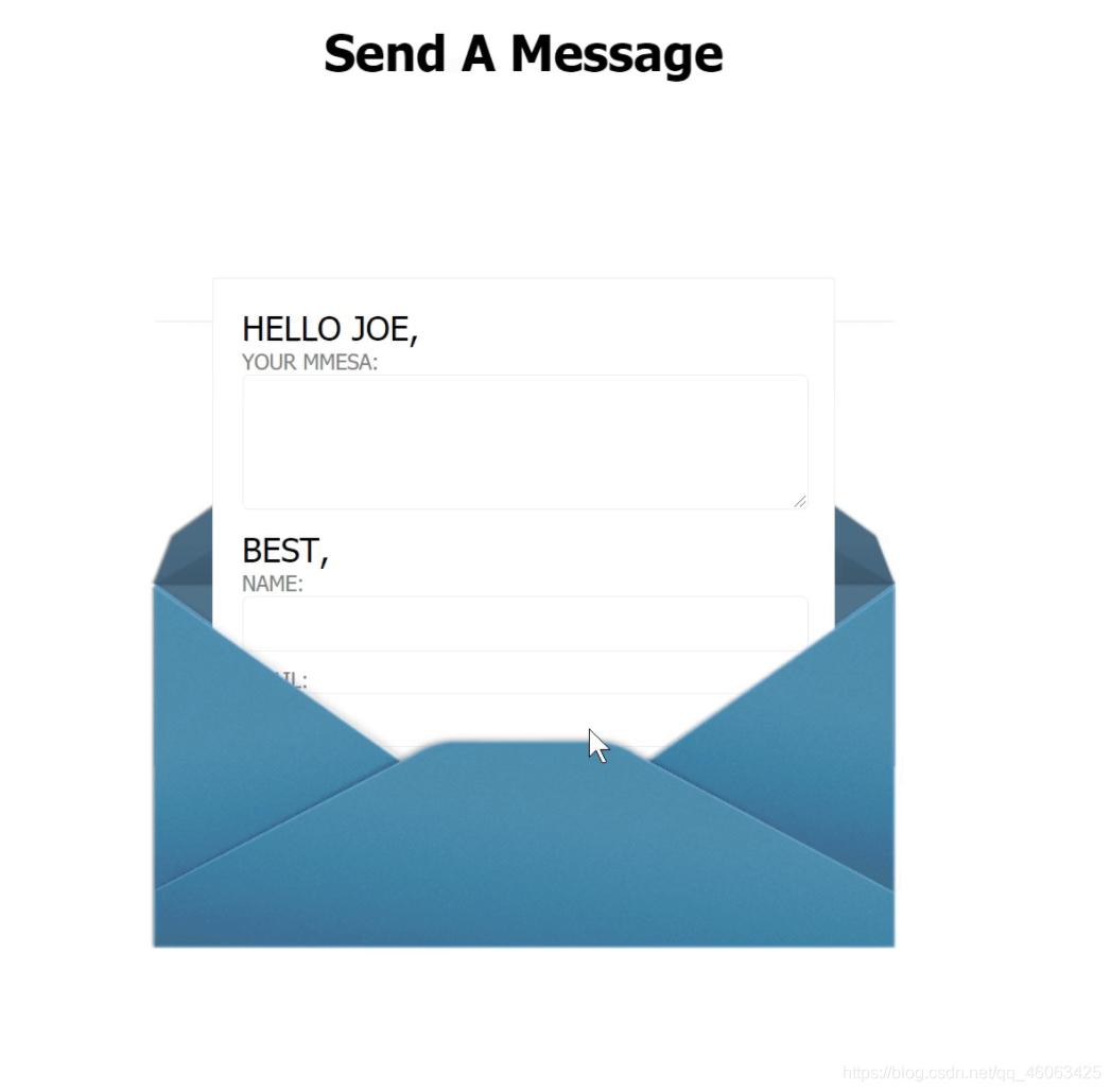
<h1>Send A Message</h1>
<br/><br/><br/>
<div id="form-wrap">
<form action="#">
<p>HELLO JOE,</p>
<label for='email'>Your Mmesa:</label>
<textarea id="message" name="message" value="Your Message" cols=""></textarea>
<p>BEST,</p>
<label for="name">Name:</label>
<input type="text" name="name" id="name" value="" />
<label for="email">Email:</label>
<input type="text" name="email" id="email" value="" />
<input type="submit" name="submit" id="" value="NOW, I SEND THANKS!" />
</form>
</div>
</div>
</body>
</html>
css代码:
body,div,h1,h2,form,fieldset,input,textarea,footer,p{


	margin: 0;
	padding: 0;
	border: 0;
	outline: none;
}
body{


	background-color: white;
	color:black;
	font-family: tahoma;
}
p{


	font-size:24px;
}
#wrap{


	width: 530px;
	margin: 20px auto  0;
	height: 1000px;
}
h1{


	margin-bottom: 20px;
	text-align: center;
	font-size: 35px;
	font-family: tahoma;
	color: black;
}
#form-wrap{


	overflow: hidden;
	height: 447px;
	position: relative;
	top: 0px;
	transition: all 1s ease-in-out .3s;
}
#form-wrap::before{


	content: "";
	position: absolute;
	bottom: 128px;
	left:0px;
	background: url(./img/before.png);
	width: 530px;
	height: 317px;
}
#form-wrap::after{


	content: "";
	position: absolute;
	bottom: 0px;
	left: 0;
	background:url(img/after.png);
	width: 530px;
	height: 259px;
}

#form-wrap:hover{


	height: 777px;
	top: -200px;

}
form{


	background-color: white;
	position: relative;
	top: 200px;
	overflow: hidden;
	height: 200px;
	width: 400px;
	margin: 0px auto;
	padding: 20px;
	border: 1px solid #EDEDED;

	transition: all 1s ease-in-out .3s;
}
#form-wrap:hover form{


	height: 500px;
}
label{


	margin: 11px 20px 0 0 ;
	font-size: 15px;
	color:gray;
	text-transform: uppercase;
}
input[type=text],textarea{


	font:14px normal uppercase arial,serif;
	color: dimgray;
	width: 380px;
	height: 37px;
	padding: 0px 10px;
	margin:0 0 10px 0;
	border: 1px solid #EDEDED;
	border-radius: 5px;
}
textarea{


	height: 80px;
	padding-top: 14px;

}
textarea:focus,input[type=text]:focus{


	background-color: white;
}
#form-wrap input[type="submit"]{


	position: relative;
	font-family: tahoma;
	font-size: 24px;
	color: gray;
	width: 100%;
	text-align: center;
	opacity: 0;
	background:none;
	cursor: pointer;
    //cursor,该变鼠标的样式
	border-radius: 3px;
	transition:  opacity 0.7s ease-in-out 0s;
}

#form-wrap:hover input[type=submit]{


	z-index: 1;
	opacity: 1;
	transition: opacity 0.5s ease-in-out 1.3s;
}