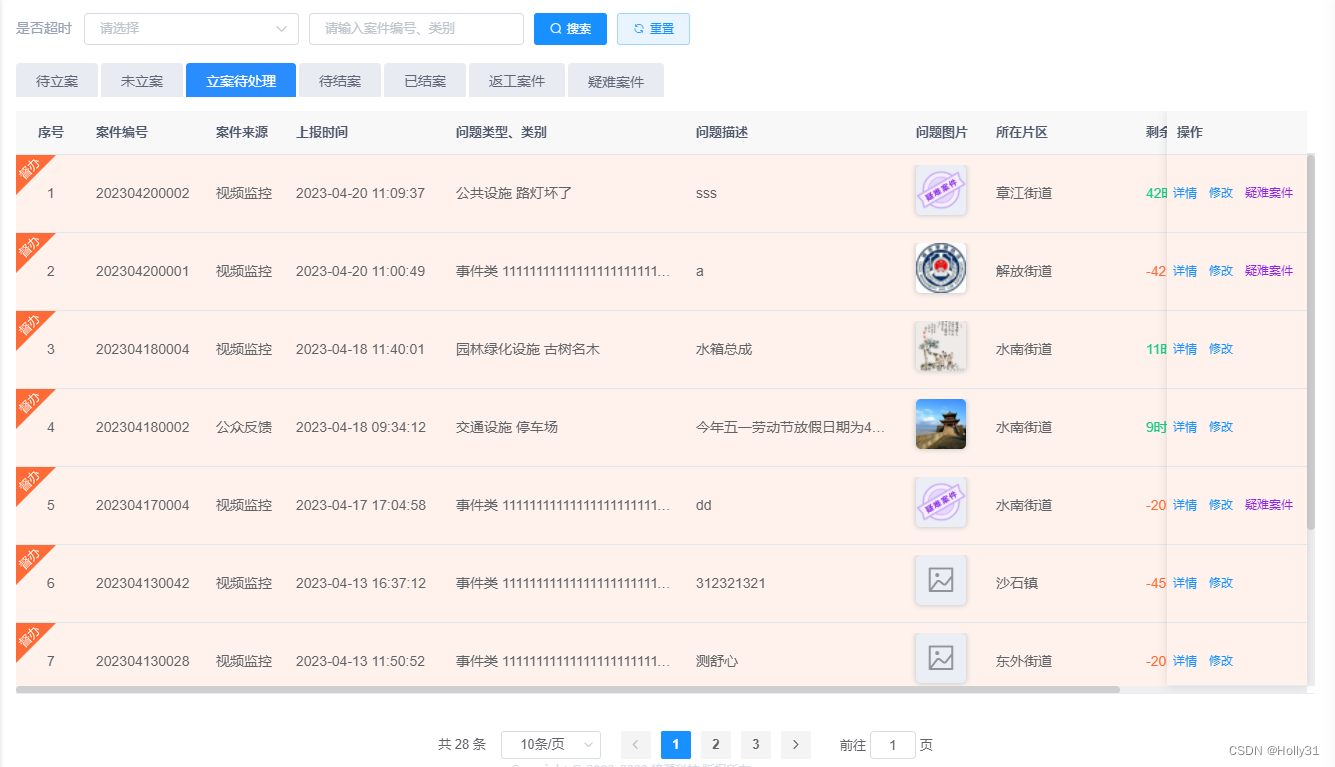
日常项目中,我们列表数据过多时,需要table内数据滚动,筛选条件在顶部,分页在窗口底部显示,无论数据怎么滚动,这两部分都在窗口可视区,便于操作。于是,自己封装了一个表单及分页组件
数据滚动同时,表单头部不被遮挡且可随时操作分页,右侧行操作按钮固定于没行的右侧不受影响;窗口大小调整,滚动条变动
参考效果如下:
组件:
<template>
  <div class="">
    <div class="table-wrap">
      <el-table
        :max-height="maxHeight"
        :row-class-name="tableRowClassName"
        ref="table"
        id="scrollContent"
        v-loading="loading"
        :data="listData"
        @selection-change="handleSelectionChange"
        key="001"
        :border="border"
        tooltip-effect="dark"
      >
        <!--  <el-table-column key="c1" type="selection" width="55" align="center" /> -->
        <el-table-column
          key="c1"
          label="序号"
          type="index"
          width="70"
          align="center"
        >
          <template slot-scope="scope">
            <span>{

   {
              queryParams.pageSize * (queryParams.pageNum - 1) +
              scope.$index +
              1
            }}</span>
          </template>
        </el-table-column>
        <slot name="col"></slot>
      </el-table>
    </div>
    <div class="page-wrap">
      <pagination
        v-show="queryParams.total > 0"
        :total="queryParams.total"
        :page.sync="queryParams.pageNum"
        :limit.sync="queryParams.pageSize"
        @pagination="handlePagination"
      />
    </div>
  </div>
</template>

<script>
import { calculateHeight } from "@/utils/calcHeight";
export default {
  props: {
    //是否显示table边框
    border:{
        type:Boolean,
        default:false
    },
    //是否显示序号
    showIndex: {
      type: Boolean,
      default: true,
    },
    //列表查询参数,包含分页信息
    queryParams: {
      type: Object,
      default: () => ({
        pageNum: 1,
        pageSize: 10,
        total:0,
      }),
    },
    //table数据
    listData: {
      type: Array,
      default: () => [],
    },
    //loading
    loading: {
      type: Boolean,
      default: false,
    },
  },
  components: {},
  data() {
    return {
        maxHeight: 200,
    };
  },
  watch: {
    listData: {
      handler(val) {
        this.handleResize();
      },
    },
  },
  created() {},
  mounted() {
   window.addEventListener("resize", this.handleResize);
  },
  beforeDestroy(){
     window.removeEventListener("resize",this.handleResize);
  },
  methods: {
    handleResize(){
      this.$nextTick(()=>{
        this.maxHeight = calculateHeight([],100);
      })
    },
    tableRowClassName({ row, rowIndex }) {
     if (row.isPoint == 1) {
        return "activebg";
      } else {
        return "";
      }
      this.$emit("tableRowClassNameAction", { row, rowIndex });
    },
    handleSelectionChange(selection) {
      this.$emit("tableRowClassNameAction", selection);
    },
    //分页切换
    handlePagination(){
        this.$emit('getList');
    },
  },
};
</script>
<style lang="scss" scoped>
</style>
计算table高度方法
export const caculateOtherHeight=function(cutClassNames=[]) {
let total = 0;
if( cutClassNames&& cutClassNames.length>0){
cutClassNames.forEach((className) => {
const h =document.getElementsByClassName(className)[0].offsetHeight || 0;
total = total + h;
});
}
return total;
}
//计算减后的实际高度
export const calculateHeight=function(cutClassNames=[],cutHeight=0) {
let otherHeight=caculateOtherHeight(cutClassNames);
const windowHeight = window.innerHeight; // 窗口高度
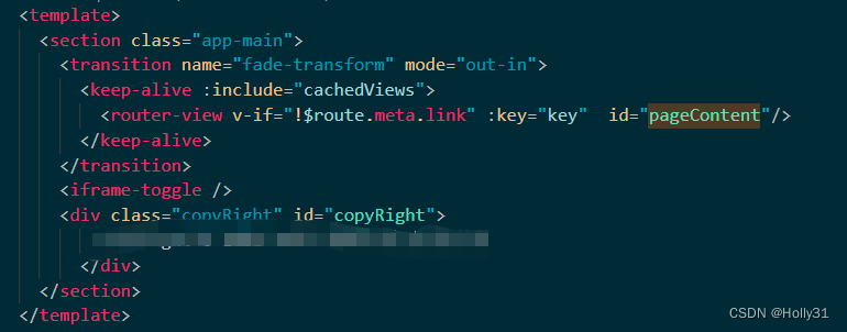
const top = document.getElementById("scrollContent").getBoundingClientRect().top;//滚动区域到顶部距离
const pageContent = document.getElementById("pageContent");
let bottomPx = window.getComputedStyle(pageContent).paddingBottom||0;
let bottomPxM=window.getComputedStyle(pageContent).marginBottom||0;
const bottom = Number(bottomPx.replace("px", "") || 0);
const bottomM=Number(bottomPxM.replace("px", "") || 0);
const total = top + bottom+bottomM + otherHeight;
const height = windowHeight - total-cutHeight;
return height;
}
export const handleWindowOnresize=function(){
window.onresize = () => {
return (() => {
calculateHeight();
})();
};
}
注意,在主内容区加id="pageContent"
滚动条样式(全局样式加入)
/ 滚动条样式
::-webkit-scrollbar {
  width: 6px;
  height: 6px;
}
::-webkit-scrollbar-track {
  background: rgb(239, 239, 239);
}
::-webkit-scrollbar-thumb {
  background: #cfcfcf;
  border-radius: 10px;
}

.el-table__body-wrapper::-webkit-scrollbar {
  width: 8px;
  height: 8px;
}

.el-table__body-wrapper, .el-scrollbar__wrap {
  &::-webkit-scrollbar {
    width: 8px;
    height: 8px;
  }
}
.el-timeline-item__node--normal{
  width: 28px;
  height: 28px;
  left: -9px;
  border:7px solid #fff
}
.tabs.el-tabs--card > .el-tabs__header .el-tabs__nav,
.tabs.el-tabs--card > .el-tabs__header .el-tabs__item,
.tabs.el-tabs--card > .el-tabs__header {
  border: none;
}
.tabs.el-tabs--card > .el-tabs__header .el-tabs__item {
  border-radius: 4px 4px 0 0;
  background: #e8ebf2;
  color: #5f6677;
  margin-right: 3px;
  height: 34px;
  line-height: 36px;
}
.tabs.el-tabs--card > .el-tabs__header .el-tabs__item.is-active {
  color: #fff;
  border: none;
  background: #2a8dff;
}
页面引入使用:
 <bl-table
      :listData="srcaseList"
      :queryParams="queryParams"
      :loading="loading"
      @getList="getList"
    >
      <template slot="col">
        <el-table-column label="节假日名称" align="left" prop="name" />
        <el-table-column label="开始时间" align="left" prop="name" />
        <el-table-column label="结束时间" align="left" prop="name" />
        <el-table-column label="假日类型" align="left" prop="name">
          <template slot-scope="scope"> </template>
        </el-table-column>
        <el-table-column label="备注" align="left" prop="name" />
        <el-table-column label="操作" align="left" prop="name" fixed="right">
          <template slot-scope="scope">
            <el-button type="primary" plain size="small" @click="handleEdit(scope.row)"
              >修改</el-button
            >
          </template>
        </el-table-column>
      </template>
    </bl-table>
扫描二维码关注公众号,回复:
17253678 查看本文章
