首先使用状态管理,我这是pinia,vuex也是一样的。这样样式就可以通过接口来修改了
import { defineStore } from 'pinia'

export const useSystem = defineStore('system', {
    state: () => ({
        theme: {
            // 深色系主题
            dark: {
                // 文字颜色
                '--text-color': '#ffffff',
                // tab文字颜色
                '--text-color-tab': '#ffffff',
                // tab文字选中颜色
                '--text-color-tab-active': '#000000',
                //tab背景颜色
                '--bg-color-tab': '#000000',
                // 背景颜色
                '--bg-color': '#000000',
                // 边框颜色
                '--border-color': '#0000004d',
            },
            // 浅色系主题
            light: {
                '--text-color': '#000000',
                '--text-color-tab': '#000000',
                '--text-color-tab-active': '#000000',
                '--bg-color-tab': '#ffffff',
                '--bg-color': '#ffffff',
                '--bg-color-tab': '#ffffff',
                '--border-color': '#0000004d',
            },
            // 当前主题
            isDark: false
        }
    }),
    getters: {
        // 主题色
        themeColor() {
            return this.theme.isDark ? this.theme.dark : this.theme.light
        }
    },
    actions: {
        //修改主题色
        changeTheme() {
            this.theme.isDark = !this.theme.isDark
        }
    }
})
然后页面直接使用
<template>
    <view class="tabbar" :style="system.themeColor">
        <view class="tabbar-left">
            <view v-for="(item, index) in tabList" :key="index" @click="go(item.url)" class="tabbar-item">
                <i class="iconfont" :class="[item.icon]"></i>
                <view class="text">{

   { item.text }}</view>
            </view>
        </view>
        <!-- #ifdef MP-WEIXIN -->
        <button class="tabbar-right" open-type="contact" bindcontact="handleContact" session-from="sessionFrom">
            <i class="iconfont icon-weixin"></i>
            <view class="text">咨询</view>
        </button>
        <!-- #endif -->
    </view>
</template>
<script setup>
import {useSystem} from "../../store/system"
const system = useSystem()
/*
 自定义底部菜单栏组件
*/
import { ref } from 'vue'
const tabList = ref([
    {
        icon: 'icon-xitongtuisong',
        text: '发现',
        url: '/pages/index/index'
    },
    {
        icon: 'icon-icon',
        text: '分类',
        url: '/pages/category/index'
    },
    {
        icon: 'icon-shouye',
        text: '客片',
        url: '/pages/album/index'
    },
    {
        icon: 'icon-shouye',
        text: '联系我们',
        url: '/pages/contact/index'
    }
])
const go = (url) => {
    uni.switchTab({
        url
    })
}
</script>
<style lang="scss" scoped>
button {
    all: unset;
}

button::before,
button::after {
    content: none;
}

.tabbar {
    position: fixed;
    left: 50%;
    transform: translateX(-50%);
    bottom: 32rpx;
    z-index: 9999;
    display: flex;
    align-items: center;
    height: 96rpx;
    width: 700rpx;
    font-size: 22rpx;
    color: var(--text-color-tab);

    .iconfont {
        font-size: 44rpx;
    }

    &-left {
        display: flex;
        align-items: center;
        flex: 1;
        background-color: var(--bg-color-tab);
        opacity: .8;
        height: 100%;
        justify-content: space-between;
        padding: 0 32rpx;
        border-radius: 48rpx;

    }

    &-right {
        margin-left: 32rpx;
        width: 160rpx;
        background-color: var(--bg-color-tab);
        opacity: .8;
        justify-content: center;
        align-items: center;
        display: flex;
        flex-direction: column;
        height: 100% !important;
        border-radius: 48rpx;
    }

    &-item {
        display: flex;
        flex-direction: column;
        justify-content: center;
        align-items: center;
    }
}
</style>
最重要的就是 直接 通过 style绑定样式就好了,看了很多版本,发现还是这样最方便,不管是内部样式还是外部样式,都可以直接使用css变量
然后小程序里面就是这样的
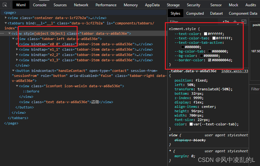
看了很多版本 ,就这个版本兼容多端
h5可以直接使用 document.documentElement.style.setProperty()设置样式,但是不兼容小程序