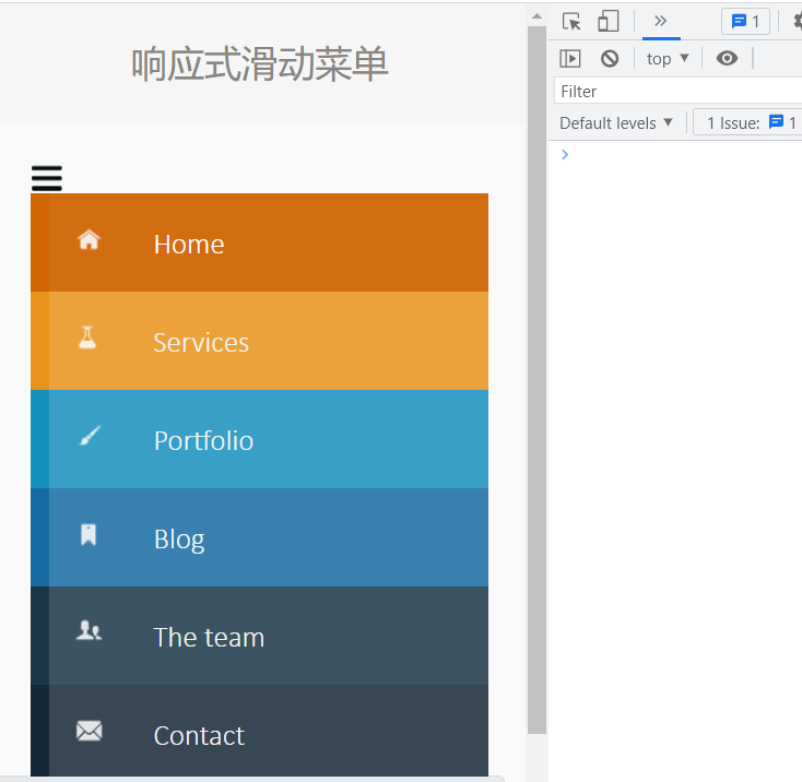
使用响应式布局设计页面——滑动菜单
效果展示
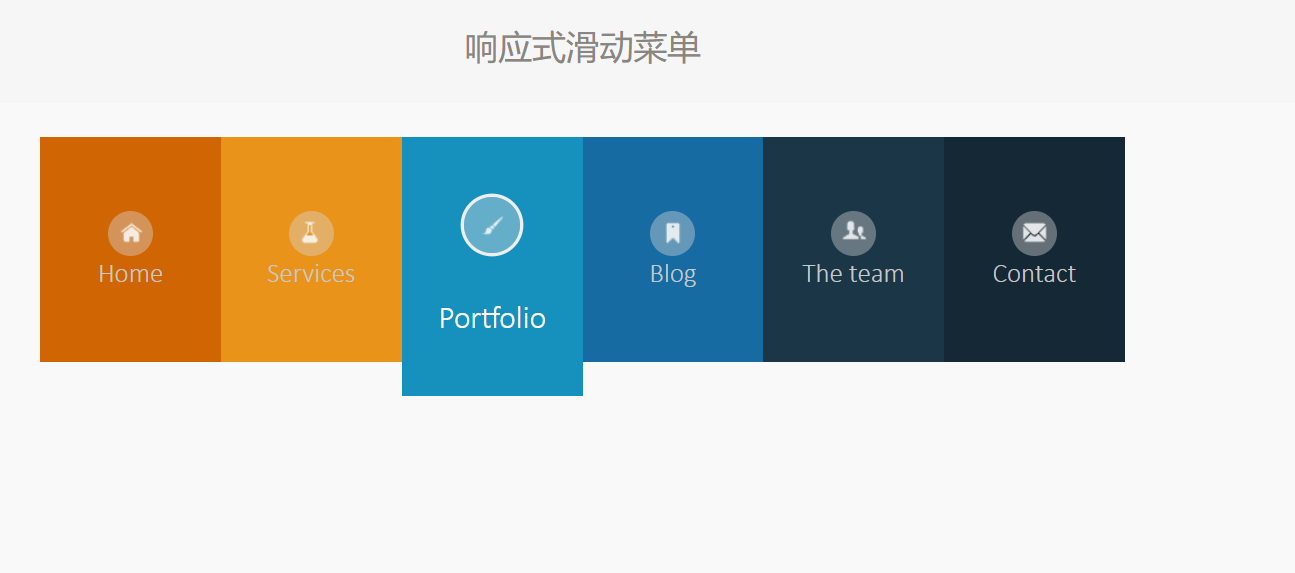
1)宽度大于800px时,图片周围有一圈阴影。鼠标移入时阴影由大变小最后为图上所示的样子,且每个菜单项的高度发生变化;
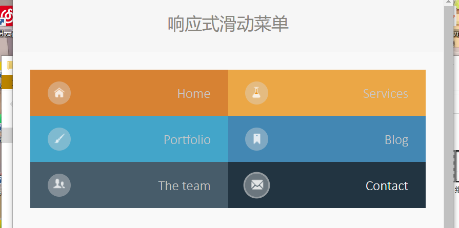
2)宽度为520px到799px之间,鼠标移入每个菜单的时候透明度增加;
3)宽度为520px到799px之间,鼠标移入每个菜单的时候透明度增加;
<!DOCTYPE html>
<html>
<head lang="en">
    <meta charset="UTF-8">
    <title>响应式滑动菜单</title>
    <link rel="stylesheet" type="text/css" href="css/default.css"/>
	<script src="./js/jquery-1.12.4.js"></script>
	<style>
		@media screen and (min-width:800px){


			.nav ul{


				display: flex;
				flex-wrap:wrap;
				align-items: flex-start;
			}
			.nav li{


				cursor: pointer;
				width: 16.6%;
				flex: 1 1 auto;
				text-align: center;
				display: flex;
				justify-content: center;
			}
			.nav ul li a{


				display: flex;
				height: 200px;
				align-items: center;
				justify-content: center;
				flex-direction: column;
				color: #c8c8c8;
			}
			.nav ul li:hover a{


				height: 230px;
				color: #fcfcfc;
				font-size: 28px;
			}
			.nav ul li:hover a span{


				margin: 20px 0;
			}
			.icon{


				width: 40px;
				height: 40px;
				line-height: 50px;
				background-color: rgb(218, 218,218,0.4);
				border-radius: 50%;
			}
			.nav ul li:hover a .icon{


				box-shadow:  0px 0px 0px 3px rgb(238, 238, 238);
				border-radius: 50%;
				width: 50px;
				height: 50px;
				line-height: 60px;
			}
		}
		@media screen and (min-width:520px) and (max-width:799px){


			.nav ul{


				display: flex;
				flex-wrap:wrap;
			}
			.nav li{


				/* cursor: pointer; */
				width: 50%;
				height: 80px;
				text-align: center;
				display: flex;
				justify-content: center;
			}
			.nav ul li a{


				display: flex;
				width: 100%;
				height: 100%;
				align-items: center;
				justify-content: space-between
				flex-direction: column;
				color: #c8c8c8;
				padding: 0 30px;
				background-color: rgb(245, 245, 245,0.2);
			}
			.nav ul li:hover a{


				color: #fcfcfc;
				background-color: rgb(245, 245, 245,0.06);
			}
			.icon{


				width: 40px;
				height: 40px;
				line-height: 50px;
				background-color: rgb(218, 218,218,0.4);
				border-radius: 50%;
			}
			.nav ul li:hover a .icon{


				box-shadow:  0px 0px 0px 3px rgb(223, 223, 223,0.6);
				border-radius: 50%;
			}
		}
		@media screen and (max-width:519px){


			#imgLogo{


				display: block;
			}
			#ulList{


				display: none;
			}
			.nav ul{


				display: flex;
				flex-wrap:wrap;
			}
			.nav li{


				cursor: pointer;
				width: 100%;
				height: 80px;
				text-align: center;
				display: flex;
				justify-content: center;
			}
			.nav ul li a{


				display: flex;
				width: 100%;
				height: 100%;
				align-items: center;
				color: #f3f3f3;
				margin-left: 15px;
				background-color: rgb(245, 245, 245,0.15);
			}
			.nav li a span{


				margin: 0 20px;
			}
			.nav li:hover a{


				color: #ffffff;
				background-color: rgb(245, 245, 245,0.06);
			}
		}

	</style>
</head>
<body>
<div class="container">
    <header>
        <h1>响应式滑动菜单</h1>
    </header>
    <div class="main clearfix">
        <nav id="menu" class="nav">
            <img id="imgLogo" src="images/1.png" alt=""/>
            <ul id="ulList">
                <li>
                    <a href="#">
                        <span class="icon">
                            <img src="images/2.png" alt=""/>
                        </span>
                        <span>Home</span>
                    </a>
                </li>
                <li>
                    <a href="#">
                        <span class="icon">
                            <img src="images/3.png" alt=""/>
                        </span>
                        <span>Services</span>
                    </a>
                </li>
                <li>
                    <a href="#">
                        <span class="icon">
                            <img src="images/4.png" alt=""/>
                        </span>
                        <span>Portfolio</span>
                    </a>
                </li>
                <li>
                    <a href="#">
                        <span class="icon">
                            <img src="images/5.png" alt=""/>
                        </span>
                        <span>Blog</span>
                    </a>
                </li>
                <li>
                    <a href="#">
                        <span class="icon">
                            <img src="images/6.png" alt=""/>
                        </span>
                        <span>The team</span>
                    </a>
                </li>
                <li>
                    <a href="#">
                        <span class="icon">
                            <img src="images/7.png" alt=""/>
                        </span>
                        <span>Contact</span>
                    </a>
                </li>
            </ul>
        </nav>
    </div>
</div>
<script src="js/jquery-1.12.4.js"></script>
<script>
    $('#imgLogo').click(function () {


        $('#ulList').toggle();
    })
</script>
</body>
</html>