一、当我们用Python matplot时作图时,一些数据需要以百分比显示,以更方便地对比模型的性能提升百分比。
二、借助matplotlib.ticker.FuncFormatter(),将坐标轴格式化。
例子:
# encoding=utf-8
import matplotlib.pyplot as plt
from matplotlib.ticker import FuncFormatter
plt.rcParams['font.family'] = ['Times New Roman']
plt.rcParams.update({'font.size': 8})
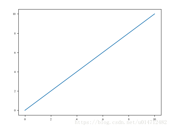
x = range(11)
y = range(11)
plt.plot(x, y)
plt.show()图形显示如下:
现在我们将横纵坐标变成百分比形式即,0%,20%,40%....代码如下:
# encoding=utf-8
import matplotlib.pyplot as plt
from matplotlib.ticker import FuncFormatter
plt.rcParams['font.family'] = ['Times New Roman']
plt.rcParams.update({'font.size': 8})
x = range(11)
y = range(11)
plt.plot(x, y)

def to_percent(temp, position):
    return '%1.0f'%(10*temp) + '%'
plt.gca().yaxis.set_major_formatter(FuncFormatter(to_percent))
plt.gca().xaxis.set_major_formatter(FuncFormatter(to_percent))

plt.show()
即增加了10~13的代码,执行结果如下:
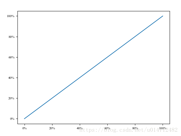
可见已经实现我们的需求。
重要代码
return '%1.0f'%(10*temp) + '%' #这句话指定了显示的格式。
更多格式化显示,可以查看matplotlib.ticker。
参考文献
1. http://sofasofa.io/forum_main_post.php?postid=1000816
2. http://www.zeuux.com/group/scipython/bbs/content/53419/
3. https://blog.csdn.net/pipisorry/article/details/37742423