前言:颜色渐变很好用,丰富了前端的色彩世界。边框的颜色用上渐变也很好看,但是当边框颜色渐变遇上border-radius时,问题就出现了。
一、问题伊始。
<body>
<style>
.content { width:300px; height:100px; border:5px solid; box-sizing:border-box;
border-image:-webkit-linear-gradient(left, red 0%, blue 30%, yellow 60%, green 90%) 5; }
</style>
<div class="content"></div>
</body>
这是个很好看的边框颜色渐变。
二、问题出现。
<body>
<style>
.content { width:300px; height:100px; border:5px solid; box-sizing:border-box;
border-image:-webkit-linear-gradient(left, red 0%, blue 30%, yellow 60%, green 90%) 5;
border-radius:5px; }
</style>
<div class="content"></div>
</body>
这时候发现,border-radius已经失效了。
三、解决问题。
<body>
<style>
.content { width:300px; height:100px; box-sizing:border-box; padding:5px; border-radius:5px;
background-image:-webkit-linear-gradient(left, red 0%, blue 30%, yellow 60%, green 90%);   }
.box { width:100%; height:100%; border-radius:5px; background:#fff; }
</style>
<div class="content">
	<div class="box"></div>
</div>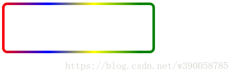
巧妙的通过padding来实现我们想要的“模拟边框”的效果。
这里要注意的是.box也要添加一个跟父级一样的border-radius。