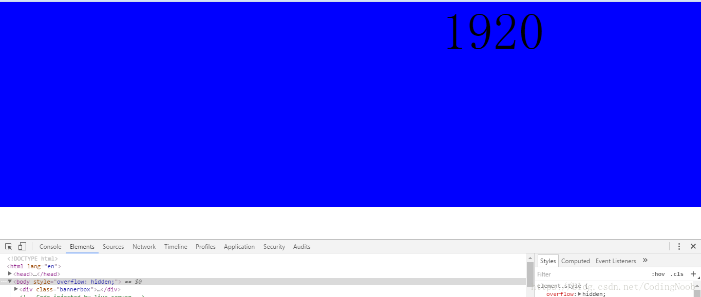
在项目开发过程中,很多时候会涉及到1920以上的大图滚动广告,但是1920在小的屏幕上不会居中显示的,因为小屏幕宽度达不到1920px。就如我自己的笔记本一样,只有1366的分辨率,如图所示。
但是我们又需要将大图片在各大屏幕上都可以水平居中显示,那应该怎么办呢?有人说可以通过js啊,这个是一种思路,现在还有一种更好的思路。
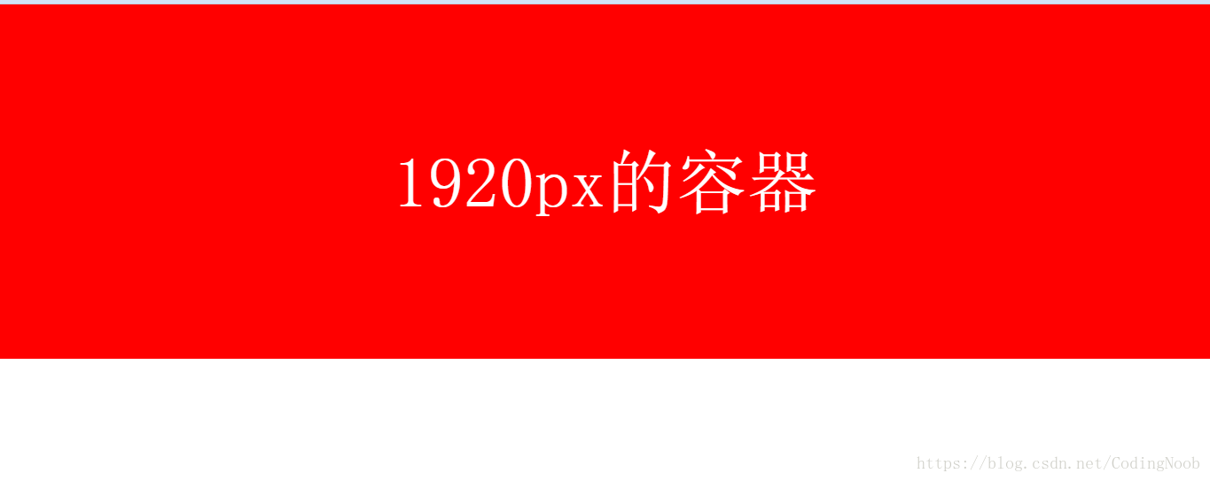
就是比较小的宽度(比如800px )的父元素作为容器,设置margin:0 auto,使其水平居中,然后再将1920的容器放置到里面去,设置margin-left属性使其相对父元素水平居中,所以父元素在任何屏幕下都可以水平居中,那么1920的元素再任何情况下也可以水平居中了。
效果如下:
代码如下:
<!DOCTYPE html>
<html lang="en">

<head>
    <meta charset="UTF-8">
    <meta name="viewport" content="width=device-width, initial-scale=1.0, user-scalable=no, minimum-scale=1.0, maximum-scale=1.0">
    <meta name="apple-mobile-web-app-capable" content="yes">
    <meta content="telephone=yes" name="format-detection" />
    <meta name="apple-mobile-web-app-status-bar-style" content="white">
    <meta name="x5-fullscreen" content="true">
    <meta name="apple-touch-fullscreen" content="yes">
    <title>大屏幕banner广告图水平居中的布局思路</title>
    <style>
        * {margin: 0;padding: 0;}
        .bannerbox{width:800px;height:400px;margin:0 auto;background:blue;font-size:100px;text-align: center;}
        .bannerbox .box{margin-left:-560px;/***=(1920-80)/2****/height:400px;width:1920px;background:Red;font-size:80px;color:#fff;text-align:center;line-height:400px;}
    </style>

</head>


<body style="overflow: hidden;">

    <div class="bannerbox">
        <div class="box">1920px的容器</div>
    </div>
</body>
</html>