让一个容器水平垂直居中有多种方法,下面介绍简单的几种:
方法一:position加margin
先上代码:
<!DOCTYPE HTML>
<html>
<head>
<meta http-equiv="Content-Type" content="text/html; charset=UTF-8">
<title>CSS——如何让一个容器水平垂直居中</title>
<style>
    .div1{
        width:400px;
        height:400px;
        position:relative;
        background:#eee;
    }
    .div2{
        width:200px;
        height:200px;
        position:absolute;
        background:#f00;
        margin:auto;
        left:0;
        right:0;
        top:0;
        bottom:0;
    }
</style>
</head>
<body>
    <div class="div1">
        <div class="div2"></div>
    <div>
</body>
</html>- 1
- 2
- 3
- 4
- 5
- 6
- 7
- 8
- 9
- 10
- 11
- 12
- 13
- 14
- 15
- 16
- 17
- 18
- 19
- 20
- 21
- 22
- 23
- 24
- 25
- 26
- 27
- 28
- 29
- 30
- 31
运行如下:
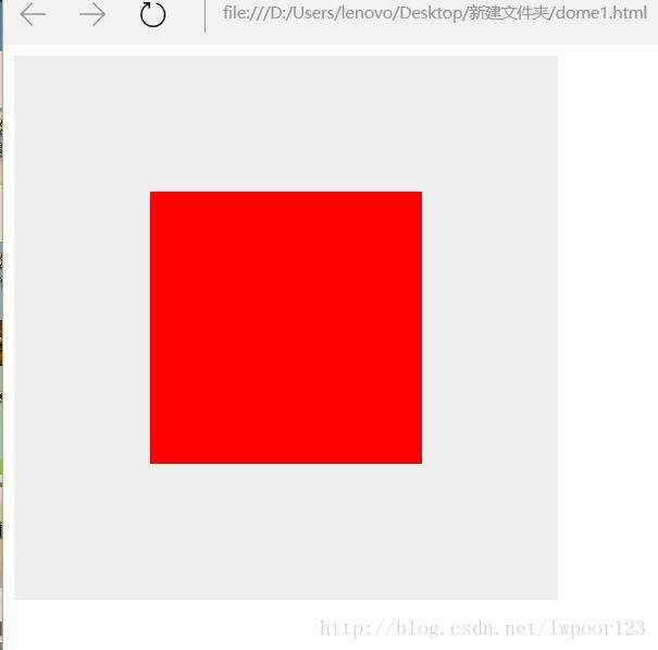
首先设置父容器布局方式为相对布局:
position:relative;其次设计子容器的布局方式为绝对布局:position:absolute;margin值设置为自适应:margin:auto;
.div1{
        width:400px;
        height:400px;
        position:relative;
        background:#eee;
    }
    .div2{
        width:200px;
        height:200px;
        position:absolute;
        background:#f00;
        margin:auto;
}- 1
- 2
- 3
- 4
- 5
- 6
- 7
- 8
- 9
- 10
- 11
- 12
- 13
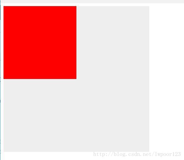
看似还没有任何变化,关键来了,当设置left:0;right:0;时容器会水平居中:
.div1{
        width:400px;
        height:400px;
        position:relative;
        background:#eee;
    }
    .div2{
        width:200px;
        height:200px;
        position:absolute;
        background:#f00;
        margin:auto;
        left:0;
        right:0;
}- 1
- 2
- 3
- 4
- 5
- 6
- 7
- 8
- 9
- 10
- 11
- 12
- 13
- 14
- 15
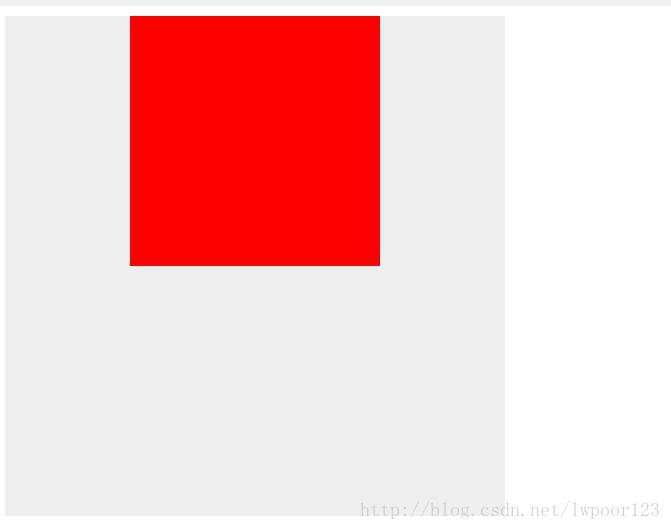
当设置left:0;right:0;top:0;bottom:0;容器自然就水平垂直居中了;
当知道容器高度时,还可以设置top:50%;margin-top:-100px;使其垂直居中;
.div1{
        width:400px;
        height:400px;
        position:relative;
        background:#eee;
    }
    .div2{
        width:200px;
        height:200px;
        position:absolute;
        background:#f00;
        left:50%;
        top:50%;
        margin-top:-100px;
        margin-left:-100px;
}- 1
- 2
- 3
- 4
- 5
- 6
- 7
- 8
- 9
- 10
- 11
- 12
- 13
- 14
- 15
- 16
因为当设置top:50%;时,子容器会向下偏移父容器高度的50%; 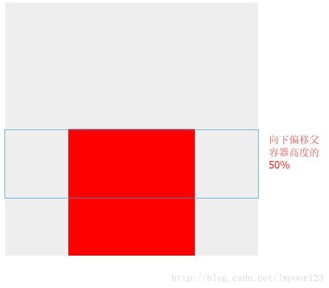
在设置margin-top:-100px;子容器向上偏移该容器高度的一半,正好垂直居中。
同理当设置left:50%;时,子容器会向右偏移父容器宽度的50%;
在设置margin-left:-100px;子容器向左偏移该容器宽度的一半,正好水平居中。
该方法适用于所有浏览器
方法二: diaplay:table-cell
<style>
    .div1{
         width: 200px;
        height: 200px;
        background: yellow;
        display: table-cell;
        vertical-align: middle;
        text-align: center;
    }
    .div2{
        display: inline-block;
        vertical-align: middle;
        width: 100px;
        height: 100px;
        background: green;
    }
</style>
</head>
<body>
    <div class="div1">
        <div class="div2"></div>
    <div>
</body>- 1
- 2
- 3
- 4
- 5
- 6
- 7
- 8
- 9
- 10
- 11
- 12
- 13
- 14
- 15
- 16
- 17
- 18
- 19
- 20
- 21
- 22
- 23
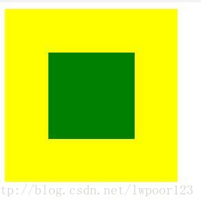
display: table-cell;让标签元素以表格单元格的形式呈现;
vertical-align: middle;让内容垂直居中(需在在表单元格中);
text-align: center;让内容水平居中;
display: inline-block;将对象呈递为内联对象,但是对象的内容作为块对象呈递;
方法三:position加 transform
<style>
    .div1{
        position: relative;
        background: yellow;
        width: 200px;
        height: 200px;
    }
    .div2{
        position: absolute;
        background: green;
        top:50%;
        left:50%;
        -webkit-transform:translate(-50%,-50%);     transform:translate(-50%,-50%);
        width: 100px;
        height: 100px;
    }
</style>
</head>
<body>
    <div class="div1">
        <div class="div2"></div>
    <div>
</body>- 1
- 2
- 3
- 4
- 5
- 6
- 7
- 8
- 9
- 10
- 11
- 12
- 13
- 14
- 15
- 16
- 17
- 18
- 19
- 20
- 21
- 22
- 23
首先设置top:50%;left:50%;让子容器向下、向右偏移父容器高宽的一半; 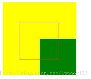
然后设置transform:translate(-50%,-50%);让子容器向X、Y轴左上偏移子容器的一半宽高,这样正好居中;
兼容性:ie9以下不支持 transform,手机端表现的比较好。
方法四:display:flex;弹性布局
<style>
    .div1{
        background: yellow;
        width: 200px;
        height: 200px;
        display: flex;
    }
    .div2{
        background: green;
        width: 100px;
        height: 100px;
        margin: auto;
    }
</style>
</head>
<body>
    <div class="div1">
        <div class="div2"></div>
    <div>
</body>- 1
- 2
- 3
- 4
- 5
- 6
- 7
- 8
- 9
- 10
- 11
- 12
- 13
- 14
- 15
- 16
- 17
- 18
- 19
- 20
display:flex;设置弹性布局;
也可以这样写:
.div1{
        background: yellow;
        width: 200px;
        height: 200px;
        display: flex;
        align-items: center;
        justify-content: center;
    }
    .div2{
        background: green;
        width: 100px;
        height: 100px;
}- 1
- 2
- 3
- 4
- 5
- 6
- 7
- 8
- 9
- 10
- 11
- 12
- 13
align-items: center;设置水平居中;
align-items: center; 设置垂直居中;
移动端首选
总结:
如果是移动端,使用display:flex;弹性布局会比较方便;
如果pc端,考虑浏览器兼容问题,可以使用position布局;
.div1{
        width:400px;
        height:400px;
        position:relative;
        background:#eee;
    }
    .div2{
        width:200px;
        height:200px;
        position:absolute;
        background:#f00;
        left:50%;
        top:50%;
        margin-top:-100px;
        margin-left:-100px;
}- 1
- 2
- 3
- 4
- 5
- 6
- 7
- 8
- 9
- 10
- 11
- 12
- 13
- 14
- 15
- 16
让一个容器水平垂直居中有多种方法,下面介绍简单的几种:
方法一:position加margin
先上代码:
<!DOCTYPE HTML>
<html>
<head>
<meta http-equiv="Content-Type" content="text/html; charset=UTF-8">
<title>CSS——如何让一个容器水平垂直居中</title>
<style>
    .div1{
        width:400px;
        height:400px;
        position:relative;
        background:#eee;
    }
    .div2{
        width:200px;
        height:200px;
        position:absolute;
        background:#f00;
        margin:auto;
        left:0;
        right:0;
        top:0;
        bottom:0;
    }
</style>
</head>
<body>
    <div class="div1">
        <div class="div2"></div>
    <div>
</body>
</html>- 1
- 2
- 3
- 4
- 5
- 6
- 7
- 8
- 9
- 10
- 11
- 12
- 13
- 14
- 15
- 16
- 17
- 18
- 19
- 20
- 21
- 22
- 23
- 24
- 25
- 26
- 27
- 28
- 29
- 30
- 31
运行如下:
首先设置父容器布局方式为相对布局:
position:relative;其次设计子容器的布局方式为绝对布局:position:absolute;margin值设置为自适应:margin:auto;
.div1{
        width:400px;
        height:400px;
        position:relative;
        background:#eee;
    }
    .div2{
        width:200px;
        height:200px;
        position:absolute;
        background:#f00;
        margin:auto;
}- 1
- 2
- 3
- 4
- 5
- 6
- 7
- 8
- 9
- 10
- 11
- 12
- 13
看似还没有任何变化,关键来了,当设置left:0;right:0;时容器会水平居中:
.div1{
        width:400px;
        height:400px;
        position:relative;
        background:#eee;
    }
    .div2{
        width:200px;
        height:200px;
        position:absolute;
        background:#f00;
        margin:auto;
        left:0;
        right:0;
}- 1
- 2
- 3
- 4
- 5
- 6
- 7
- 8
- 9
- 10
- 11
- 12
- 13
- 14
- 15
当设置left:0;right:0;top:0;bottom:0;容器自然就水平垂直居中了;
当知道容器高度时,还可以设置top:50%;margin-top:-100px;使其垂直居中;
.div1{
        width:400px;
        height:400px;
        position:relative;
        background:#eee;
    }
    .div2{
        width:200px;
        height:200px;
        position:absolute;
        background:#f00;
        left:50%;
        top:50%;
        margin-top:-100px;
        margin-left:-100px;
}- 1
- 2
- 3
- 4
- 5
- 6
- 7
- 8
- 9
- 10
- 11
- 12
- 13
- 14
- 15
- 16
因为当设置top:50%;时,子容器会向下偏移父容器高度的50%;
在设置margin-top:-100px;子容器向上偏移该容器高度的一半,正好垂直居中。
同理当设置left:50%;时,子容器会向右偏移父容器宽度的50%;
在设置margin-left:-100px;子容器向左偏移该容器宽度的一半,正好水平居中。
该方法适用于所有浏览器
方法二: diaplay:table-cell
<style>
    .div1{
         width: 200px;
        height: 200px;
        background: yellow;
        display: table-cell;
        vertical-align: middle;
        text-align: center;
    }
    .div2{
        display: inline-block;
        vertical-align: middle;
        width: 100px;
        height: 100px;
        background: green;
    }
</style>
</head>
<body>
    <div class="div1">
        <div class="div2"></div>
    <div>
</body>- 1
- 2
- 3
- 4
- 5
- 6
- 7
- 8
- 9
- 10
- 11
- 12
- 13
- 14
- 15
- 16
- 17
- 18
- 19
- 20
- 21
- 22
- 23
display: table-cell;让标签元素以表格单元格的形式呈现;
vertical-align: middle;让内容垂直居中(需在在表单元格中);
text-align: center;让内容水平居中;
display: inline-block;将对象呈递为内联对象,但是对象的内容作为块对象呈递;
方法三:position加 transform
<style>
    .div1{
        position: relative;
        background: yellow;
        width: 200px;
        height: 200px;
    }
    .div2{
        position: absolute;
        background: green;
        top:50%;
        left:50%;
        -webkit-transform:translate(-50%,-50%);     transform:translate(-50%,-50%);
        width: 100px;
        height: 100px;
    }
</style>
</head>
<body>
    <div class="div1">
        <div class="div2"></div>
    <div>
</body>- 1
- 2
- 3
- 4
- 5
- 6
- 7
- 8
- 9
- 10
- 11
- 12
- 13
- 14
- 15
- 16
- 17
- 18
- 19
- 20
- 21
- 22
- 23
首先设置top:50%;left:50%;让子容器向下、向右偏移父容器高宽的一半;
然后设置transform:translate(-50%,-50%);让子容器向X、Y轴左上偏移子容器的一半宽高,这样正好居中;
兼容性:ie9以下不支持 transform,手机端表现的比较好。
方法四:display:flex;弹性布局
<style>
    .div1{
        background: yellow;
        width: 200px;
        height: 200px;
        display: flex;
    }
    .div2{
        background: green;
        width: 100px;
        height: 100px;
        margin: auto;
    }
</style>
</head>
<body>
    <div class="div1">
        <div class="div2"></div>
    <div>
</body>- 1
- 2
- 3
- 4
- 5
- 6
- 7
- 8
- 9
- 10
- 11
- 12
- 13
- 14
- 15
- 16
- 17
- 18
- 19
- 20
display:flex;设置弹性布局;
也可以这样写:
.div1{
        background: yellow;
        width: 200px;
        height: 200px;
        display: flex;
        align-items: center;
        justify-content: center;
    }
    .div2{
        background: green;
        width: 100px;
        height: 100px;
}- 1
- 2
- 3
- 4
- 5
- 6
- 7
- 8
- 9
- 10
- 11
- 12
- 13
align-items: center;设置水平居中;
align-items: center; 设置垂直居中;
移动端首选
总结:
如果是移动端,使用display:flex;弹性布局会比较方便;
如果pc端,考虑浏览器兼容问题,可以使用position布局;
.div1{
        width:400px;
        height:400px;
        position:relative;
        background:#eee;
    }
    .div2{
        width:200px;
        height:200px;
        position:absolute;
        background:#f00;
        left:50%;
        top:50%;
        margin-top:-100px;
        margin-left:-100px;
}- 1
- 2
- 3
- 4
- 5
- 6
- 7
- 8
- 9
- 10
- 11
- 12
- 13
- 14
- 15
- 16