简单的2d, 3d基础属性
- 移动
html代码:
<!DOCTYPE html>
<html lang="en">
<head>
    <meta charset="UTF-8">
    <title>Title</title>

</head>
<body>

    <div>
        <ul>
            <li></li>
            <li></li>
            <li></li>
            <li></li>
        </ul>
    </div>
</body>
</html>
css代码:
<style>
     li{
		list-style: none;
		width: 160px;
		height: 240px;
		background-color: saddlebrown;
		margin-right: 20px;
		float: left;
		transition: transform 1s;
	}
	li:hover{
		transform: translate(0,20px);
		width: 180px;
		height: 260px;
	}
</style>
重点: transition属性以及transform属性值的运用!移动的属性值为 translate(x轴的像素,y轴的像素);
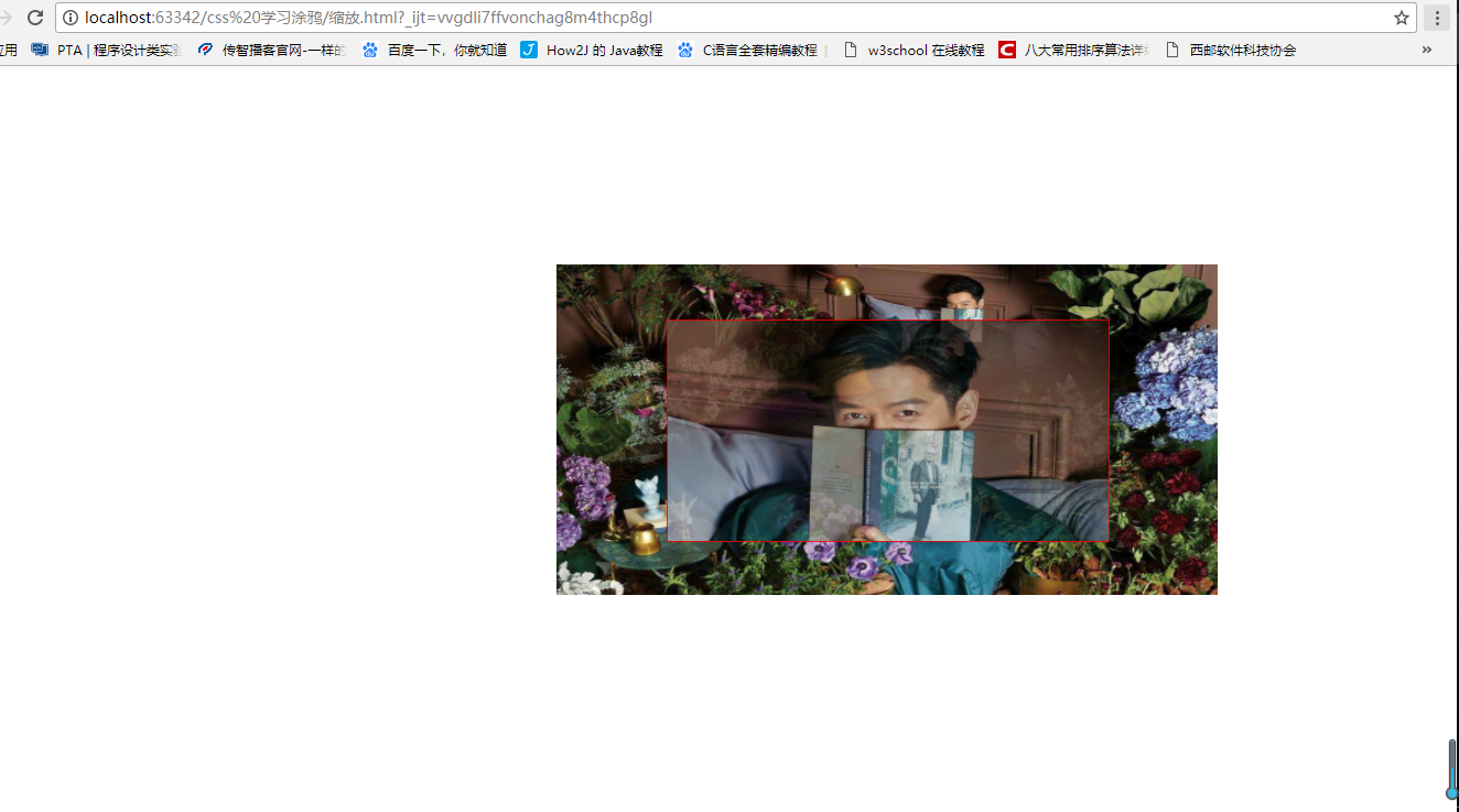
- 缩放
缩放函数 scale() 让元素根据中心原点对对象进行缩放,默认值为1
缩小:0.01~0.99
增大:大于1.01
<!DOCTYPE html>
<html lang="en">
<head>
    <meta charset="UTF-8">
    <title>scale()函数</title>
    <style type="text/css">

        div{
            width: 500px;
            height: 500px;
            margin: 30px auto;
            position: relative;
            background: url(img/timg (1).jpg) no-repeat center center;
            background-size: 100% 100%;
        }

        div img{
            position: absolute;
            top: 50%;
            left: 50%;
            margin-left: -35px;
            margin-top: -50px;
        }
        div img:nth-child(1){
            opacity: 0.8;
            z-index: 2;
            border: 1px solid red;
        }
        div img:nth-child(2){
            z-index: 1;
            transform: scale(1.5);
        }
    </style>
</head>
<body>

    <div>
        <img src="img/timg%20(1).jpg" alt=" " style="width: 400px;height: 200px;" />
        <img src="img/timg%20(3).jpg" alt=" " style="width: 400px;height: 200px;" />
    </div>
</body>
</html>
代码运行如下:
- 旋转
旋转既就是 transform 属性的属性值变为 rotate(旋转度); 例如45度的表达为 45deg;
代码如下:
<style>
        li{
            list-style: none;
            width: 160px;
            height: 240px;
            background-color: saddlebrown;
            margin-right: 20px;
            float: left;
            transition: transform 1s,width 1s,height 1s;
        }
        li:hover{
            transform: rotate(45deg);
            width: 180px;
            height: 260px;
        }
    </style>
还有一个函数skew()的作用是: 倾斜
还有
 <style>
        li{
            list-style: none;
            width: 160px;
            height: 240px;
            background-color: saddlebrown;
            margin-right: 20px;
            float: left;
            transition: transform 1s;
        }
        li:hover{
            transform: matrix(0.866,0.5,-0.5,0.866,0,0);
        }
</style>以上是变换矩阵matrix(),运用比较多。- 自定义动画
认识一个新属性: @keyframes 自定义名字(例如myself){};
然后再再其中添加 from{}【开头】 和 to{}【结尾】.
代码如下:
 @keyframes myself {
            from{
                background-color: #b60;
            }
            to{
                background-color: #fff;
            }
        }
        li:hover{
           animation: myself 1s;
        }
刚才讲诉的自定义动画,只有开头(from) 和 结尾(to) 的变化。但其实也可以把这个变化的过程分的更加详细,注重于变化的过程。下面演示一串代码:
   @keyframes myself {
            0%{
                background-color: #b60;
            }
            25%{
                background-color: #160;
            }
            75%{
                background-color: #1c3;
            }
            100%{
                background-color: #fff;
                transform: translate(500px,100px);
            }
        }
        li:hover{
           animation: myself 3s;
        }
其实还可以分得更加详细,全看个人意愿。
- Jquery 控制动画
运用javascript 来实现点击发生变化:
代码如下:
<!DOCTYPE html>
<html lang="en">
<head>
    <meta charset="UTF-8">
    <title>Title</title>
    <script src="http://www.51rgb.com/js/jquery.js"></script>
    <style>
        li{
            list-style: none;
            width: 160px;
            height: 240px;
            background-color: saddlebrown;
            margin-right: 20px;
            float: left;
            transition: transform 1s;
        }
        @keyframes myself {
            0%{
                background-color: #b60;
            }
            25%{
                background-color: #160;
            }
            75%{
                background-color: #1c3;
            }
            100%{
                background-color: #fff;
                transform: translate(500px,100px);
            }
        }
       .donghua{
           animation: myself 3s;
       }
    </style>
</head>
<body>

<div>
    <ul>
        <li></li>
        <li></li>
        <li></li>
        <li></li>
    </ul>

    <script>
        ${function(){
            ${"li"}.click(function () {
                var $x=$(this);
                var $y=$x.index();
                $x.addClass("donghua");
        })
        }
        }
    </script>
</div>
</body>
</html>
但至今我还没有运行成功,先将代码放在这里。等我运行出来再进行纠正。而且上面的代码只能点击一次。然后动画效果便没有了。接下来演示一段可以重复点击实现动画的效果。(以上错误纯属代码运用错误,阴影部分既就是代码错误地方,一下为改正代码:
<script>
        $(function(){
            $("li").click(function() {
                var $x = $(this);
                /*var $y = $x.index();*/
                $x.addClass("donghua");
            })
        })
</script>
接下来粘贴多次点击代码:
    <script>
        $(function(){
            $("li").click(function() {
                var $x = $(this);
               /*var $y = $x.index();*/
                $x.addClass("donghua");
                setTimeout(function () {
                    $x.removeClass("donghua")
                },3600)
            })
        })
    </script>
其实也就是<sctript></script>加了循环。
除此之外,还有另外一种写法:
 <script>
        $(function(){
            $("li").click(function() {
                var $x = $(this);
                var $y = $x.index();
                $("li").eq($y).addClass("donghua");
                setTimeout(function () {
                    $("li").eq($y).removeClass("donghua")
                },3600)
            })
        })
    </script>
前面讲的都是关于2D的一系列的特性,接下来讲诉3D的一些性质:
1.位移
3d中的属性添加:translateZ() 以及 translate3d();
translate3d();也就是 translateX(), translateY(), translateZ()的结合体,
translateZ(); 也就相当于 translate(0, 0 ,Z);
代码如下:
<!DOCTYPE html>
<html lang="en">
<head>
    <meta charset="UTF-8">
    <title>Translate3d()</title>
    <style type="text/css">
        .stage{
            width: 300px;
            height: 300px;
            float: left;
            margin: 15px;
            position: relative;
            background: url(img/timg (1).jpg) no-repeat center center;
            background-size: 100% 100%;

            perspective: 1200px;
        }
        .container{
            position: absolute;
            top: 50%;
            left: 50%;

            transform-style: preserve-3d;
        }
        .container img{
            position: absolute;
            margin-left: -35px;
            margin-top: -50px;
        }//水平垂直居中
        .container img:nth-child(1){
            z-index: 1;//层叠级别
            opacity: .6;//透明度
        }
        .s1 img:nth-child(2){
            z-index: 2;
            transform: translate3d(0, 0, 200px);
            /*transform: translateZ(200px);*/
        }
        .s2 img:nth-child(2)
        {
            z-index: 2;
            transform: translate3d(0, 0,-200px);
            /*transform: translateZ(-200px);*/
        }

   </style>
</head>
<body>

    <div class="stage s1">
        <div class="container">
            <img src="img/timg%20(1).jpg" alt=" " style="width: 400px; height: 200px;">
            <img src="img/timg%20(3).jpg" alt=" " style="width: 400px; height: 200px;">
        </div>
    </div>

    <div class="stage s2">
        <div class="container">
            <img src="img/timg%20(1).jpg" alt=" " style="width:140px; height: 200px;">
            <img src="img/timg%20(3).jpg" alt=" " style="width:140px;; height: 200px;">
        </div>
    </div>
</body>
</html>
2.缩放
3d中的属性添加:scaleZ() 以及 scale3d();
scale3d();也就是 scaleX(), scaleY(), scaleZ()的结合体,
scaleZ(); 也就相当于 scale(0, 0 ,Z);
代码如下:
      .s1 img:nth-child(2){
            z-index: 2;
            /*transform: translate3d(30px, 30px, 200px);*/
            /*transform: translateZ(200px);*/
            transform: scaleZ(5) rotateX(45deg);//大于1.01 增大

        }
        .s2 img:nth-child(2)
        {
            z-index: 2;
            /*transform: translate3d(30px, 30px,-200px);*/
            /*transform: translateZ(-200px);*/
            transform: scaleZ(.25) rotateX(45deg);//大于0.01 小于0.99
        }
3.旋转
3d中的属性添加:rotateZ() 以及 rotate3d();
rotate3d();也就是 rotateX(), rotateY(), rotateZ()的结合体,
rotateZ(); 也就相当于rotate(0, 0 ,Z);
代码如下:
<!DOCTYPE html>
<html lang="en">
<head>
    <meta charset="UTF-8">
    <title>CSS3 3D 旋转</title>
    <style type="text/css">

        .stage{
            width: 300px;
            height: 300px;
            float: left;
            margin: 15px;
            position: relative;
            background: url("img/test.jpg") no-repeat center center;
            background-size: 100% 100%;

            perspective: 1200px;
        }
        .container{
            position: absolute;
            top: 50%;
            left: 50%;
            transform: preserve-3d;
        }
        .container img{
            position: absolute;
            margin-top: -100px;
            margin-left: -70px;
        }
        .container:nth-child(1){
            z-index: 1;
            opacity: .6;
        }
        .s1 img:nth-child(2){
            z-index: 2;
            transform: rotateX(45deg);
        }
        .s2 img:nth-child(2){
            z-index: 2;
            transform: rotateY(45deg);
        }
        .s3 img:nth-child(2){
            z-index: 2;
            transform: rotateZ(45deg);
        }
        .s4 img:nth-child(2){
            z-index: 2;
            transform: rotate3d(.6, 1, .6, 45deg);
        }
    </style>
</head>
<body>

    <div class="stage s1">
        <div class="container">
            <img src="img/timg%20(1).jpg" alt=" " style="width:140px; height: 200px;">
            <img src="img/timg%20(3).jpg" alt=" " style="width:140px; height: 200px;">
        </div>
    </div>

    <div class="stage s2">
        <div class="container">
            <img src="img/timg%20(1).jpg" alt=" " style="width:140px; height: 200px;">
            <img src="img/timg%20(3).jpg" alt=" " style="width:140px;; height: 200px;">
        </div>
    </div>

    <div class="stage s3">
        <div class="container">
            <img src="img/timg%20(1).jpg" alt=" " style="width:140px; height: 200px;">
            <img src="img/timg%20(3).jpg" alt=" " style="width:140px; height: 200px;">
        </div>
    </div>

    <div class="stage s4">
        <div class="container">
            <img src="img/timg%20(1).jpg" alt=" " style="width:140px; height: 200px;">
            <img src="img/timg%20(3).jpg" alt=" " style="width:140px; height: 200px;">
        </div>
    </div>

</body>
</html>
注意:由于作者是新手小白,写的很简略,不易看懂,而且特别基础。读者慎入!!