<!DOCTYPE html>
<html>
<head>
<meta charset="utf-8">
<title>导航菜单</title>
<style type="text/css">
body{
background: #ebebeb;
}
.nav{
margin: 40px auto 0;
width: 560px;
height: 50px;
text-align:center;
background: #f65f57;
font:bold 0/50px Arial;
border-radius: 5px;
box-shadow:5px 5px 0 #cc1725;
}
.nav a{
display: inline-block;
transition: all 0.2s ease-in;
color: #fff;
text-decoration: none;
}
.nav a:hover{
transform: rotate(10deg);
}
.nav li{
text-shadow: 5px 5px 4px rgba(0,0,0,.5);
list-style: none outside none;
font-size: 13px;
display: inline-block;
padding: 0 16px;
position: relative;
}
.nav li:after{
content: "";
width: 2px;
height: 15px;
background: linear-gradient(to bottom,#dd2926,#a82724,#dd2926);
display: block;
top: 19px;
right: -3px;
position: absolute;
}
.nav li:last-child:after{
background: none;
}
</style>
</head>
<body>
<ul class="nav">
<li><a href="">Home</a></li>
<li><a href="">About Me</a></li>
<li><a href="">Portfolio</a></li>
<li><a href="">Blog</a></li>
<li><a href="">Resources</a></li>
<li><a href="">Contact Me</a></li>
</ul>
</body>
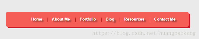
</html>其中用到了border-radius, box-shadow,transition,transform,text-shadow,linear-gradient以及伪元素的使用,是一个不错的练习,其中ul下的li之前一直使用浮动,今天试了下 display: inline-block;同样起到了效果,学到了东西。
页面效果图: