<!DOCTYPE html>
<html lang="en">
<head>
<meta charset="UTF-8">
<meta name="viewport" content="width=device-width, initial-scale=1.0,maximum-scale=1,minimum-scale=1,user-scalable=no">
<meta http-equiv="X-UA-Compatible" content="ie=edge">
<title>Document</title>
<style>
* {
margin: 0;
padding: 0;
box-sizing: border-box;
/* 随便写的,撑开盒子的高度 */
height: 200px;
}
/* @media screen and (width:640px) {
html {
font-size: 100px;
}
}
@media screen and (width:320px) {
html {
font-size: 50px;
}
} */
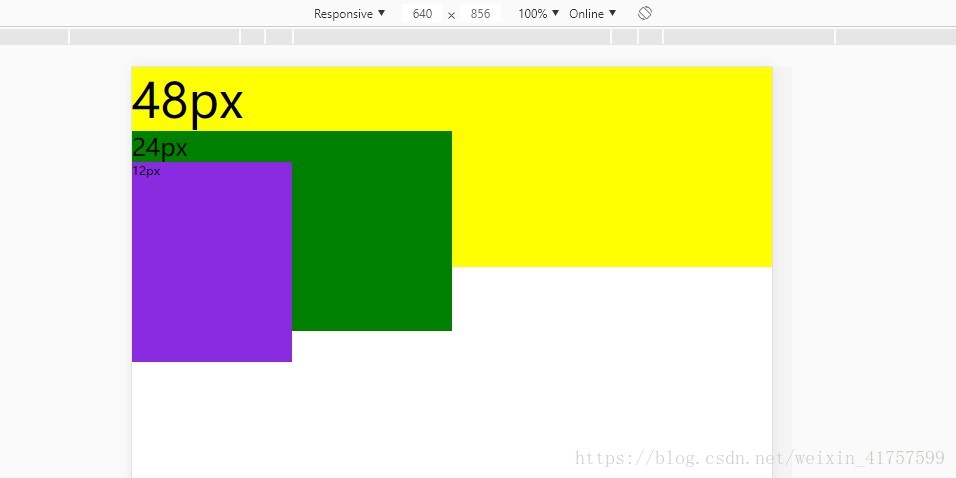
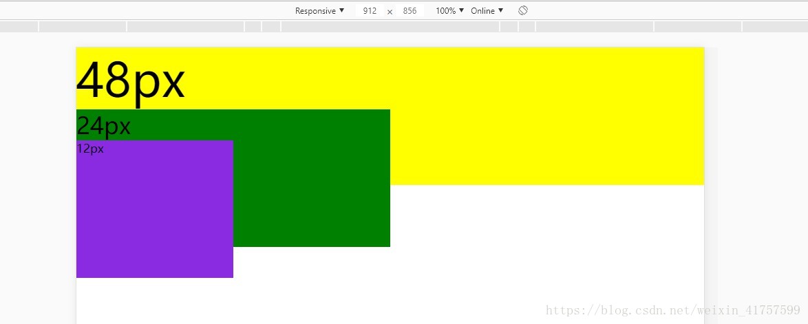
.lg {
background-color: yellow;
font-size: .48rem;
}
.md {
background-color: green;
width: 50%;
font-size: .24rem;
}
.sm {
background-color: blueviolet;
width: 50%;
font-size: .12rem
}
</style>
</head>
<body>
<div class="lg">48px
<div class="md">
24px
<div class="sm">
12px
</div>
</div>
</div>
</body>
</html>
<script>
// 设计稿的宽度 / 适配屏幕 = htm字体的大小(自己设置的100px) /实际字体大小
// 实际字体大小 = htm字体的大小(自己设置的100px)*适配的宽度 / 设计稿的宽度
// 验证以 适配器宽度为640 实际宽度(手动获取) 默认的html字体大小100px
// 首先,先调用一次函数
sizeWidth();
// 然后,在加载页面宽度的时候再调用一次
window.onresize = function () {
sizeWidth();
}
function sizeWidth() {
// 获取当前屏幕的宽度
var screenWidth = document.querySelector('html').offsetWidth;
// 基础值
var baseSz = 100;
// 设计稿的宽度
var pageWidth = 640;
// 套用公式
var fZ = baseSz * screenWidth/ pageWidth;
// 直接给元素赋值
document.querySelector("html").style.fontSize = fZ + "px";
}
</script>