关注finddreams,一起分享,一起进步:http://blog.csdn.net/finddreams/article/details/45502277
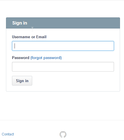
常常在网上登录的时候看到这样一个效果,就是当我们选择账号或者密码输入框时,它的背景会变成一种选中的状态,也就是输入框四周会有一种选中颜色的渐变效果。就如GitHub登录界面这样的效果:
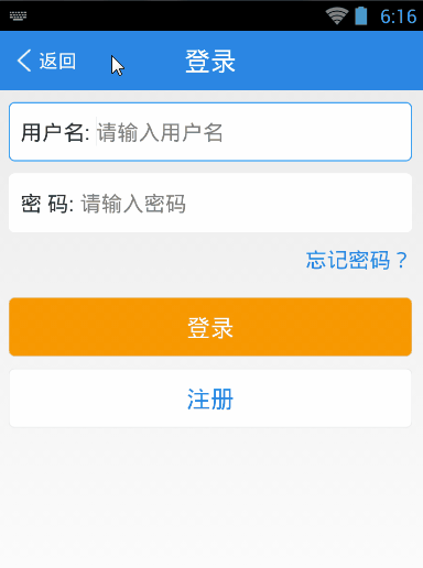
所以很多情况下我们也希望自己的APP也能有这样的效果,当点击账号和密码输入框时显示成选中的状态,这样的效果该怎么实现呢?如图:
其实要实现这样的效果,思路很简单,只需要建一个背景selector选择器,分别在不同的状态下配置不同的背景。
一、建一个bg_edittext_selector.xml背景选择器,具体代码如下:
<?xml version="1.0" encoding="utf-8"?>
<selector xmlns:android="http://schemas.android.com/apk/res/android">

    <item android:state_focused="true"><shape android:shape="rectangle">
            <gradient android:angle="270.0" android:endColor="#ffffffff" android:startColor="#ffffffff" />

            <stroke android:width="1dp" android:color="#2D9FF7" />

            <corners android:bottomLeftRadius="5.0dip" android:bottomRightRadius="5.0dip" android:topLeftRadius="5.0dip" android:topRightRadius="5.0dip" />
        </shape></item>
    <item><shape android:shape="rectangle">
            <gradient android:angle="270.0" android:endColor="#ffffffff" android:startColor="#ffffffff" />

            <stroke android:width="1dp" android:color="#ffffffff" />

            <corners android:bottomLeftRadius="5.0dip" android:bottomRightRadius="5.0dip" android:topLeftRadius="5.0dip" android:topRightRadius="5.0dip" />
        </shape></item>

</selector>
二、然后就是写布局文件,并把选择器设置成输入框的背景。代码:
 <LinearLayout
            android:id="@id/login_username_ll"
            android:layout_width="fill_parent"
            android:layout_height="50.0dip"
            android:layout_margin="10.0dip"
                android:addStatesFromChildren="true"
            android:background="@drawable/bg_edittext_selector"
            android:orientation="horizontal" >

            <TextView
                android:layout_width="wrap_content"
                android:layout_height="wrap_content"
                android:layout_gravity="center_vertical"
                android:layout_marginLeft="10.0dip"
                android:text="@string/username"
                android:textSize="18.0sp" />

            <com.finddreams.view.ClearEditText
                android:id="@id/login_account_et"
                android:gravity="center_vertical"
                android:background="@null"
                android:layout_width="0.0dip"
                android:layout_height="fill_parent"
                android:layout_weight="1.0"
                android:hint="@string/please_input_username" />
        </LinearLayout>

        <LinearLayout
            android:layout_width="fill_parent"
            android:layout_height="50.0dip"
            android:layout_marginLeft="10dip"
            android:layout_marginRight="10dip"
            android:addStatesFromChildren="true"
            android:background="@drawable/bg_edittext_selector"
            android:orientation="horizontal" >

            <TextView
                android:layout_width="wrap_content"
                android:layout_height="wrap_content"
                android:layout_gravity="center_vertical"
                android:layout_marginLeft="10.0dip"
                android:text="@string/password"
                android:textSize="18.0sp" />

            <com.finddreams.view.ClearEditText
                android:id="@id/login_password_cet"
                 android:gravity="center_vertical"
                android:background="@null"
                android:layout_width="0.0dip"
                android:layout_height="fill_parent"
                android:layout_weight="1.0"
                android:gravity="center_vertical"
                android:background="@null"
                android:hint="@string/please_input_password"
                android:inputType="textPassword" />
        </LinearLayout>
从代码中可以看出,我在布局上使用的是一个LinearLayout中包含两个子控件,水平的排列,一个是TextView,另一个则是带有清除功能的自定义控件ClearEditText。
为了实现这样选中效果,所以要把选择器bg_edittext_selector.xml做为父容器LinearLayout的背景。
但是这里有个小的细节需要注意一样,我们知道选择器有很多的状态,默认状态,选中,聚焦等等。那我们这里的父容器本身没有给它聚焦和选中的状态,我们只关心的是账号,密码这两个输入框是否被选中了,选中了则需要变成选中的背景。那怎么样做到子类控件的状态和父容器的状态相关联呢?
这里父容器控件LinearLayout有一个很好的属性 android:addStatesFromChildren=”true”,这个属性在谷歌官方Api中是这样描述的:

本人英语水平有限,只知道大概意思是说如果属性设置成true的话,ViewGroup的drawable状态就可以根据子类控件EditText或者Button的聚焦状态发生改变。这样它们看起来成了一个整体,父容器的状态跟随子控件的状态来变动。
最后,把ClearEditText的代码贴一下:
/**
 * @Description: 带删除按钮的输入框
 * @author http://blog.csdn.net/finddreams
 */
public class ClearEditText extends EditText implements OnFocusChangeListener,
        TextWatcher {
    /**
     * 删除按钮的引用,可以自定义图片
     */
    private Drawable mClearDrawable;
    public static int SIZE = 0;

    public ClearEditText(Context context) {
        this(context, null);
    }

    public ClearEditText(Context context, AttributeSet attrs) {
        // 这里构造方法也很重要,不加这个很多属性不能再XML里面定义
        this(context, attrs, android.R.attr.editTextStyle);
    }

    public ClearEditText(Context context, AttributeSet attrs, int defStyle) {
        super(context, attrs, defStyle);
        init();
    }

    private void init() {
        // 获取EditText的DrawableRight,假如没有设置我们就使用默认的图片
        mClearDrawable = getCompoundDrawables()[2];
        if (mClearDrawable == null) {
            mClearDrawable = getResources().getDrawable(
                    R.drawable.progresscancelbtn);

        }
        mClearDrawable.setBounds(0, 0, mClearDrawable.getIntrinsicWidth()
                + SIZE, mClearDrawable.getIntrinsicHeight() + SIZE);
        setClearIconVisible(false);
        setOnFocusChangeListener(this);
        addTextChangedListener(this);
        // setClickable(false);
    }

    /**
     * 因为我们不能直接给EditText设置点击事件,所以我们用记住我们按下的位置来模拟点击事件 当我们按下的位置 在 EditText的宽度 -
     * 图标到控件右边的间距 - 图标的宽度 和 EditText的宽度 - 图标到控件右边的间距之间我们就算点击了图标,竖直方向没有考虑
     */
    @Override
    public boolean onTouchEvent(MotionEvent event) {
        if (getCompoundDrawables()[2] != null) {
            if (event.getAction() == MotionEvent.ACTION_UP) {
                boolean touchable = event.getX() > (getWidth()
                        - getPaddingRight() - mClearDrawable
                            .getIntrinsicWidth())
                        && (event.getX() < ((getWidth() - getPaddingRight())));
                if (touchable) {
                    this.setText("");

                }
            }
        }

        return super.onTouchEvent(event);
    }

    /**
     * 当ClearEditText焦点发生变化的时候,判断里面字符串长度设置清除图标的显示与隐藏
     */
    @Override
    public void onFocusChange(View v, boolean hasFocus) {
        if (hasFocus) {
            setClearIconVisible(getText().length() > 0);
        } else {
            setClearIconVisible(false);
        }
    }

    /**
     * 设置清除图标的显示与隐藏,调用setCompoundDrawables为EditText绘制上去
     *
     * @param visible
     */
    protected void setClearIconVisible(boolean visible) {
        Drawable right = visible ? mClearDrawable : null;
        setCompoundDrawables(getCompoundDrawables()[0],
                getCompoundDrawables()[1], right, getCompoundDrawables()[3]);
    }

    /**
     * 当输入框里面内容发生变化的时候回调的方法
     */
    @Override
    public void onTextChanged(CharSequence s, int start, int count, int after) {
        setClearIconVisible(s.length() > 0);
    }

    @Override
    public void beforeTextChanged(CharSequence s, int start, int count,
            int after) {

    }

    @Override
    public void afterTextChanged(Editable s) {

    }

    /**
     * 设置晃动动画
     */
    public void setShakeAnimation() {
        this.setAnimation(shakeAnimation(5));
    }

    /**
     * 晃动动画
     *
     * @param counts
     *            1秒钟晃动多少下
     * @return
     */
    public static Animation shakeAnimation(int counts) {
        Animation translateAnimation = new TranslateAnimation(0, 10, 0, 0);
        translateAnimation.setInterpolator(new CycleInterpolator(counts));
        translateAnimation.setDuration(1000);
        return translateAnimation;
    }

}