d3.js是v4版本
目录
7、scaleSqrt - 创建一个指数为 0.5 的指数比例尺.
9、scaleIdentity - 创建一个定量的恒等比例尺.
10、scaleQuantile - 创建一个分位数比例尺.
11、scaleSequential - 创建一个顺序量表比例尺.
-
1、scaleTime -创建一个线性的时间比例尺.
应用场景:常用于折线图时间轴刻度
d3.scaleTime().domain([start1,end1]) // 定义域
.range([start2,end2])//值域
 // nice  nice可以规范输出
const xScale = d3
        .scaleTime()
        .domain([new Date(domain.xScale[0]), new Date(domain.xScale[23])]) // input
        .range([0, width]);
        // .nice(); // output

// ticks设置刻度值
// axisBottom x轴Bottom位置绘制坐标轴

g
        .append('g')
        .attr('class', 'x axis')
        .attr('transform', 'translate(0,' + height + ')')
        .call(d3.axisBottom(xScale).ticks(23))
        .attr('class', 'd3-line-axis'); // Create an axis component with d3.axisBottom
scaleUtc - 依据世界标准时间(UTC)来计算的
-
2、scaleLinear-创建一个定量的线性比例尺.
应用场景:数量统计图数量显示刻度
d3.scaleLinear().domain([start1,end1]) // 定义域
.range([start2,end2])//值域
   // me.getMaxyScale(yScaleDomain) 值域  可用d3.max获取
   const yScale = d3
        .scaleLinear()
        .domain([0, me.getMaxyScale(yScaleDomain)]) // input
        .range([height, 0]);
        // .nice(); // 规范数据输出 output

//axisLeft 坐标绘制y轴刻度
 g
        .append('g')
        .attr('class', 'y axis')
        .call(d3.axisLeft(yScale).ticks(4))
        .attr('class', 'd3-line-axis'); // Create an axis component with d3.axisLeft
也可设置发散的定义域和值域
var color = d3.scaleLinear()
    .domain([-1, 0, 1])
    .range(["red", "white", "green"]);


color(-0.5); // "rgb(255, 128, 128)"
color(+0.5); // "rgb(128, 192, 128)"

-
3、scaleOrdinal - 创建一个无序序数比例尺
应用场景:定义域和值域是不连续的,都是离散的。例如:一些柱状统计图
const scaleO = d3.scaleOrdinal().domain([1,2,3,4,5]) // 定义域
.range(["red", "blue", "green", "yellow", "black"])//值域 个数需一一对应
scaleO(1); //red
scaleO(3); //green
scaleO(5); //black
一一对应
注意:如果scaleO(6); // red 也可以正常输出,注意输入的数据是否正确
-
4、scaleBand - 创建一个有序序数比例尺
应用场景:定义域和值域是不连续的,都是离散的。例如:一些柱状统计图
const scaleB = d3.scaleBand().domain([1,2,3,4,5]) // 定义域
.range([0,100])//值域 这个参数和scaleOrdinal不同,是一个范围
scaleB(1) // 输出:0
scaleB(2) // 输出:20
scaleB(5) // 输出:80
// 100被平均分成5段,每段映射的值20
并非一一对应
-
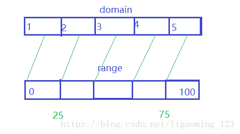
5、scaleQuantize - 创建一个量化比例尺
var scaleQ= d3.scaleQuantize()
    .domain([10, 100]) // 连续的
    .range([1, 2, 4]); // 离散的
scaleQ(20); // 1 10-40 scaleQ(50); // 2 40-70 scaleQ(80); // 4 70-100
-
6、scalePow - 创建一个定量的指数比例尺.
使用
y = m * x^k + b这个数学函数来表达domain和range之间的数学函数关系。指数k使用.exponent()来设定var scaleP= d3.scalePow().exponent(0.5).domain([0, 100]).range([0, 30]); scaleP(0); // returns 0 scaleP(50); // returns 21.21... scaleP(100); // returns 30
-
7、scaleSqrt - 创建一个指数为 0.5 的指数比例尺.
是一种scalePow的特殊形式(k=0.5)通常用于通过面积来表征圆(而不用半径)(当使用圆的大小来表达数据值的大小时,通常最佳实践是使用和数据等比例的面积而非半径来表达)
var scaleSq= d3.scaleSqrt()
  .domain([0, 100])
  .range([0, 30]);

scaleSq(0);   // returns 0
scaleSq(50);  // returns 21.21...
scaleSq(100); // returns 30

-
8、scaleLog - 创建一个对数比例尺.
使用数学对数函数(
y = m * log(x) + b)来映射domain和range.如果数据之间有指数关系的话,这个log比例尺最适合var scaleL= d3.scaleLog() .domain([10, 100000]) .range([0, 600]); scaleL(10); // returns 0 scaleL(100); // returns 150 scaleL(1000); // returns 300 scaleL(100000); // returns 600

-
9、scaleIdentity - 创建一个定量的恒等比例尺.
-
10、scaleQuantile - 创建一个分位数比例尺.
scaleQuantile将输入的连续性domain值映射为离散的值。domain是由数组来定义:var myData = [0, 5, 7, 10, 20, 30, 35, 40, 60, 62, 65, 70, 80, 90, 100]; var scaleQ= d3.scaleQuantile() .domain(myData) .range(['lightblue', 'orange', 'lightgreen']); scaleQ(0); // returns 'lightblue' scaleQ(20); // returns 'lightblue' scaleQ(30); // returns 'orange' scaleQ(65); // returns 'lightgreen'
-
11、scaleSequential - 创建一个顺序量表比例尺.
应用场景:用于将连续性的数据映射为由预定义或者定制的插值函数决定的range.(一个插值函数是一个接受0到1之间的数值而输出一个在两个数字,两个颜色值或者两个字符串之间的插值的函数)我们可以使用d3.interpolateRainbow来创建彩虹色系图
var scaleS= d3.scaleSequential()
  .domain([0, 100])
  .interpolator(d3.interpolateRainbow);

scaleS(0);   // returns 'rgb(110, 64, 170)'
scaleS(50);  // returns 'rgb(175, 240, 91)'
scaleS(100); // returns 'rgb(110, 64, 170)'
-
12、坐标轴定义及常用函数
d3.axisTop(scale)——创建一个top-axis,轴在水平方向绘制;
d3.axisBottom(scale)——创建一个bottom-axis,轴在水平方向绘制;
d3.axisRight(scale)——创建一个right-axis,轴在垂直方向绘制;
d3.axisLeft(scale)——创建一个left-axis,轴在垂直方向绘制;d3.max(array) ——获取最大值
d3.min(array)——获取最小值invert()与invertExtent() —— 通过range获取domain的值(只针对连续性比例尺有效)
let scale = d3.scaleLinear().domain([1,5]).range([0,100])
scale.invert(50) // 输出:3

let scale2 = d3.scaleQuantize().domain([0,10]).range(['small', 'big'])
scale2.invertExtent('small') // 输出:[0,5]
ticks(number) —— 设置显示几个刻度
d3.axisBottom(xScale).ticks(23)tickValues(array) —— 设置显示指定刻度
d3.axisBottom(xScale).tickValues([6, 7, 8, 9, 10])tickPadding(number) —— 设置刻度线和刻度文字之间的间隔,这个值默认为3
d3.axisBottom(xScale)
        .tickValues([6, 7, 8, 9, 10])
        .tickSize(5)
        .tickPadding(5)
        .tickFormat(d3.format("$0.1f"));
tickSize(number)、tickSizeInner(number)和tickSizeOuter(number) —— 设置坐标轴上的刻度线的长短,默认为6。
nice —— 设置刻度线成理想状态
d3
        .scaleTime()
        .domain([new Date(domain.xScale[0]), new Date(domain.xScale[23])]) // input
        .range([0, width]);
        // .nice(); // output
tickFormat —— 格式化格式
svg.append("g")
    .attr("class", "x axis")
    .attr("transform", "translate(0," + height + ")")
    .call(d3.axisBottom(xScale).ticks(23).tickFormat(d3.timeFormat("%I %p")))
	.attr('class', 'd3-line-axis'); // Create an axis component with d3.axisBottom
时间格式
%Y- for year boundaries, such as2011.%B- for month boundaries, such asFebruary.%b %d- for week boundaries, such asFeb 06.%a %d- for day boundaries, such asMon 07.%I %p- for hour boundaries, such as01 AM.%I:%M- for minute boundaries, such as01:23.:%S- for second boundaries, such as:45..%L- milliseconds for all other times, such as.012.
参考:https://www.cnblogs.com/kidsitcn/p/7182274.html
https://github.com/xswei/d3-scale/blob/master/README.md#continuous_interpolate
demo
<!DOCTYPE html>
<meta charset="utf-8">

<style type="text/css">
/* 13. Basic Styling with CSS */

/* Style the lines by removing the fill and applying a stroke */
.line {
    fill: none;
    stroke: #ffab00;
    stroke-width: 3;
}

/* Style the dots by assigning a fill and stroke */
.dot {
    fill: #ffab00;
    stroke: #fff;
}
.d3-line-axis path, .d3-line-axis line{
  stroke: blue;
}
.d3-line-axis text{
  font-family: sans-serif;
  font-size: 12px;
  fill: blue;
}

</style>
<!-- Body tag is where we will append our SVG and SVG objects-->
<body>
</body>

<!-- Load in the d3 library -->
<script src="https://d3js.org/d3.v4.min.js"></script>
<script>

// 2. Use the margin convention practice
var margin = {top: 50, right: 50, bottom: 50, left: 50}
  , width = window.innerWidth - margin.left - margin.right // Use the window's width
  , height = window.innerHeight - margin.top - margin.bottom; // Use the window's height

// The number of datapoints
var n = 25;
var curDate = new Date();
var preDate = new Date(curDate.getTime() - 24*60*60*1000); //前一天
var nextDate = new Date(curDate.getTime() + 24*60*60*1000); //后一天
// 5. X scale will use the index of our data
var xScale = d3.scaleTime()
    .domain([preDate, curDate]) // input
    .range([0, width])
	.nice(); // output

// 6. Y scale will use the randomly generate number
var yScale = d3.scaleLinear()
    .domain([0, 1]) // input
    .range([height, 0]); // output

// 7. d3's line generator
var line = d3.line()
    .x(function(d, i) {
		return xScale(new Date(d.x));
	}) // set the x values for the line generator
    .y(function(d) { return yScale(d.y); }) // set the y values for the line generator
    .curve(d3.curveMonotoneX) // apply smoothing to the line

// 8. An array of objects of length N. Each object has key -> value pair, the key being "y" and the value is a random number
var dataset = d3.range(n).map(function(d, i) {
	return {
		"x": new Date(curDate.getTime() - i*60*60*1000),
		"y": d3.randomUniform(1)()
	}
})

// 1. Add the SVG to the page and employ #2
var svg = d3.select("body").append("svg")
    .attr("width", width + margin.left + margin.right)
    .attr("height", height + margin.top + margin.bottom)
	.append("g")
    .attr("transform", "translate(" + margin.left + "," + margin.top + ")");

// 3. Call the x axis in a group tag
svg.append("g")
    .attr("class", "x axis")
    .attr("transform", "translate(0," + height + ")")
    .call(d3.axisBottom(xScale).ticks(24).tickFormat(d3.timeFormat("%I %p")))
	.attr('class', 'd3-line-axis'); // Create an axis component with d3.axisBottom

// 4. Call the y axis in a group tag
svg.append("g")
    .attr("class", "y axis")
    .call(d3.axisLeft(yScale).ticks(4))
	.attr('class', 'd3-line-axis'); // Create an axis component with d3.axisLeft

// 9. Append the path, bind the data, and call the line generator
svg.append("path")
    .datum(dataset) // 10. Binds data to the line
    .attr("class", "line") // Assign a class for styling
    .attr("d", line); // 11. Calls the line generator

// 12. Appends a circle for each datapoint
svg.selectAll(".dot")
    .data(dataset)
    .enter().append("circle") // Uses the enter().append() method
    .attr("class", "dot") // Assign a class for styling
    .attr("cx", function(d, i) { return xScale(i) })
    .attr("cy", function(d) { return yScale(d.y) })
    .attr("r", 5);

</script>