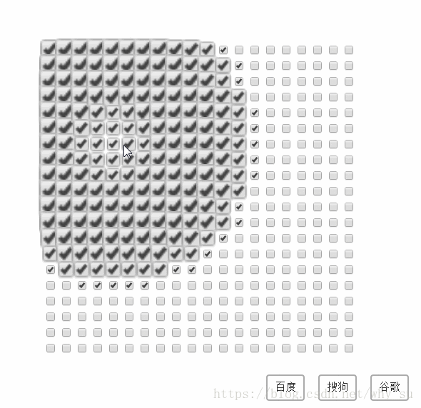
学习地址: https://github.com/hakimel/css/tree/master/checkwave
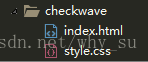
目录结构:
代码如下:
index.html
<!DOCTYPE html>
<html lang="en">
    <head>
        <meta charset="UTF-8">
        <title>CheckWave</title>
        <meta name="description" content="">
        <meta name="author" content="Su">
        <link rel="stylesheet" type="text/css" href="style.css">
    </head>
    <body>

        <div class="credits">
            <a href="https://www.baidu.com">百度</a>
            <a href="https://www.sogou.com/">搜狗</a>
            <a href="https://www.google.com/">谷歌</a>
        </div>

        <script>
            var SIZE_X = 20; // x轴个数
            var SIZE_Y = 20; // y轴个数
            var MARGIN = 30; // 间距
            //判断设备
            if(/iphone|android|ipad/ig.test(navigator.userAgent)){
               SIZE_X = 10;
               SIZE_X = 10;
               MARGIN = 22;
            }

            var wrapper = document.createElement("div");
            wrapper.className = "wrapper";
            wrapper.style.width = (SIZE_X * MARGIN) + 'px';
            wrapper.style.height = (SIZE_Y * MARGIN) + 'px';
            document.body.appendChild(wrapper);

            var entities = [];
            for(var x = 0; x < SIZE_X; x++ ){
               for(var y = 0; y < SIZE_Y; y++){
                  var el = document.createElement("input");
                  el.setAttribute("type","checkbox");
                  wrapper.appendChild(el);

                  //需要设置position为absolute, left和top属性才会生效
                  el.style.left = (x * MARGIN)+ "px";
                  el.style.top = (y * MARGIN) + "px";

                  var entity = {
                     element: el,
                     x: x * MARGIN,
                     y: y * MARGIN
                  }
                  el.addEventListener("change",this.toggle.bind(this, entity));
                  entities.push(entity);

               }
            }

            function toggle(targetEntity){
                //如果被选中,值为true,如果未被选中,值为false
                var checked = targetEntity.element.checked;
                //获取当前选中的复选框的位置:  例如 [targetEntity.x,targetEntity.y] 等于[22,22]
                entities.forEach(function(entity){
                    //遍历,通过勾股定理算出每一个复选框和 当前选中的复选框的“距离”
                    var dx = targetEntity.x - entity.x;
                    var dy = targetEntity.y - entity.y;
                    var distance = Math.sqrt(dx * dx + dy * dy);

                    //按距离从近到远,开始定时操作,Math.round()选取最近的整数
                    setTimeout(function(){
                        entity.element.checked = checked;

                        //二次演示动画
                        entity.element.className = "";
                        entity.element.offsetWidth;
                        entity.element.className = "grow";

                    },Math.round(distance * 1.8));
                })

            }

        </script>

        <style type="text/css">
            .credits {
               position: absolute;
               bottom: 25px;
               right: 20px;
               font-size: 15px;
               color: #fff;
            }
            .credits>* {
                vertical-align: middle;
                margin-left: 15px;
            }

            .credits a {
                color: #333;
                border: 2px solid #aaa;
                border-radius: 4px;
                text-decoration: none;
                padding: 8px 10px;
            }

            .credits a:hover {
               border-color: #666;
               color: #000;
            }
        </style>

    </body>
</html>
style.css
html,body {
  font-family: helvetica sans-serif;
}

.wrapper {
   position: absolute;
   top: 0;
   right: 0;
   bottom: 0;
   left: 0;
   margin: auto;
}

input {
  position: absolute;
}

input.grow {
   /*-webkit 是表示针对 safari,chrome 浏览器支持,-ms表示针对 IE 浏览器支持*/
   /*第一个参数:规定需要绑定到选择器的 keyframe 名称*/
   /*第二个参数:animation-duration 完成动画所需时间 */
   /*第三个参数:贝塞尔曲线 */
  -webkit-animation: grow 0.8s cubic-bezier(0.175, 0.885, 0.32, 1.275);
  -ms-animation:;
  animation: ;
}

/*百分比表示 进度, scale表示缩放*/
@-webkit-keyframes grow {
    0% { -webkit-transform: scale(1); }
    30% { -webkit-transform: scale(2.5);}
    100% { -webkit-transform: scale(1);}
}
@-ms-keyframes grow {
    0% { -ms-transform: scale(1); }
    30% { -ms-transform: scale(2.5); }
    100% { -ms-transform: scale(1); }
}
@keyframes name{
    0% {transform: scale(1);}
    30% {transform: scale(2.5);}
    100% {transform: scale(1);}
}