一、实验题目
中山大学智慧健康服务平台应用开发
第四周任务 基本的UI界面设计
二、实现内容
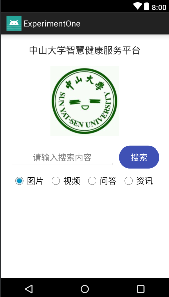
实现一个Android应用,界面呈现如图中的效果。

要求
- 该界面为应用启动后看到的第一个界面。
- 各控件的要求
- 标题字体大小20sp,与顶部距离20dp,居中;
- 图片与上下控件的间距均为20dp,居中;
- 输入框整体距左右屏幕各间距20dp,内容(包括提示内容)如图所示,内容字体大小18sp;
- 按钮与输入框间距10dp,文字大小18sp。按钮背景框左右边框与文字间距10dp,上下边框与文字间距5dp,圆角半径180dp,背景色为**#3F51B5**;
- 四个单选按钮整体居中,与输入框间距10dp,字体大小18sp,各个单选按钮之间间距10dp,默认选中的按钮为第一个。
使用的组件
TextView、EditText、ConstraintLayout、Button、ImageView、RadioGroup、RadioButton。
三、课堂实验结果
(1)实验截图
实验结果截图如下:
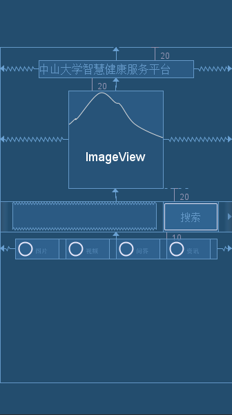
布局蓝图如下:
(2)实验步骤以及关键代码
我在实验过程中把整个UI界面分为四个层次,从上到下依次为标题,图片,搜索和四个按钮。按照这个顺序根据实验要求由上至下设计UI界面。
- 标题
<TextView
        android:id="@+id/title"
        android:layout_width="wrap_content"
        android:layout_height="wrap_content"
        android:text="@string/title"
        android:textSize="20sp"
        android:layout_marginTop="20dp"
        app:layout_constraintLeft_toLeftOf="parent"
        app:layout_constraintRight_toRightOf="parent"
        app:layout_constraintTop_toTopOf="parent" />
标题要居中且和顶端距离是20dp,通过layout_margin和layout_constraint定义,text中的title是string类型,我定义在string.xml里面,即中山大学智慧健康服务平台。
- 图片
<ImageView
        android:id="@+id/imageView"
        android:layout_width="wrap_content"
        android:layout_height="wrap_content"
        android:src="@mipmap/sysu"
        app:layout_constraintTop_toBottomOf="@id/title"
        android:layout_marginTop="20dp"
        app:layout_constraintLeft_toLeftOf="parent"
        app:layout_constraintRight_toRightOf="parent" />
注意在加写图片代码之前要先把图片添加到mipmap中,否则就会找不到图片。
代码和标题类似,设计好间距和位置即可。
- 搜索
<EditText
            android:id="@+id/search_text"
            android:layout_width="0dp"
            android:layout_height="wrap_content"
            android:layout_marginLeft="20dp"
            android:layout_marginStart="20dp"
            android:layout_weight="1"
            android:gravity="center"
            android:hint="@string/message"
            android:inputType="text"
            android:textSize="18sp"
            app:layout_constraintLeft_toLeftOf="parent" />

        <Button
            android:id="@+id/search_button"
            android:layout_width="wrap_content"
            android:layout_height="wrap_content"
            android:layout_marginEnd="20dp"
            android:layout_marginLeft="10dp"
            android:layout_marginRight="20dp"
            android:layout_marginStart="10dp"
            android:layout_weight="0.1"
            android:background="@drawable/shape"
            android:text="@string/search"
            android:textColor="#ffffff"
            android:textSize="18sp"
            app:layout_constraintLeft_toRightOf="@id/search_text"
            app:layout_constraintRight_toRightOf="parent" />
上面的EditText和Button用一个LinearLayout包起来,这样两部分就是一个整体了。注意在LinearLayout中要注明布局方式是horizontal,即水平布局。先确定整个块的位置,然后再定义内部元素的相对位置。另外,上面的message,search等都在xml文件中定义。
- 按钮
<RadioButton
            android:id="@+id/radio_button1"
            android:layout_width="wrap_content"
            android:layout_height="wrap_content"
            android:checked="true"
            android:text="图片"
            android:textSize="18sp"
            android:layout_marginRight="10dp"/>
四个RadioButton写在一个RadioGroup里面,上面是图片button的代码。这一部分注意horizontal布局以及button之间的位置关系。
(3)实验遇到的困难以及解决思路
开始设计搜索框和和搜索按钮时是分开写的,没有写在Linearlayout里面,这样的后果就是两个部分总是错位。如果刻意去设计距离间隔而不是用wrap_content,那么在不同的手机版本里就会有差别。最后使用线性布局解决了问题,这样设计布局有层次且不会出现错位的现象。
还有搜索按钮的大小问题也花了一点时间。如果我把长宽设为wrap_content,那么按钮的宽度明显小于图例的宽度。最后只有加上android:layout_weight="0.1"来强行要求宽度所占的比例,这样写也可以保证其他的距离符合题目要求。
四、实验思考及感想
第一次写Android studio的项目作业,有很多的Android的操作还明显不熟悉,因此花费了很多时间查找相关的函数和关键字。不过还好以前学过web课程,故很多内容都可以类比,而且第一次作业难度不大,从这些角度来说,这次的实验完成的还比较顺利。
实验过程会遇到很多的玄学问题,也有发现Android很多的设计让人很不爽。例如在text中直接写想输入的内容,它就会出现警告,提示我们要在xml文件中另外定义然后再引用。我觉得这样的设计就是反人类,开始我还按照要求来,后面就直接无视它的提示了。
总的来说这次实验过程感觉良好,希望可以对这门课程产生兴趣并学好这门课程。