版权声明:本文为博主原创文章,未经博主允许不得转载。 https://blog.csdn.net/baidu_35407267/article/details/82527822
Angular原生的拖拽布局,无其他依赖。
demo
http://angular-splitter.guguji5.top
依赖
- angular 5-6
- angular-cli
如何启动
github仓库:https://github.com/guguji5/angular-splitter
git clone https://github.com/guguji5/angular-splitter.git
cd angular-splitter
npm install
ng serve --open
文档
Component <tam-splitter>
| @Input | Type | Default | Details |
|---|---|---|---|
| direction | string | “horizontal” | Select split direction: “horizontal” or “vertical”. |
| splitterBarWidth | number | 8 | Gutters’s size (dragging elements) in pixels. |
| useTransition | boolean or number | false | Use transition when collapsing or expanding. when this param is a number, it will be a millisecond value set to the property ‘transition-duration’, should be between 100 and 1000 |
| type | string | ‘standard’ | it has two value(standard, macNotes), which controls the behavior of the drag, macNotes type will act like the notes on mac |
| @Output | Param | Details |
|---|---|---|
| sizeChange | {barNum: number, sizes: Array<number>} |
Emit when draging, return the index of bar and the sizes of panels |
Component <tam-splitter-panel>
| @Input | Type | Default | Details |
|---|---|---|---|
| size | number | null | Size of the panel in percent (value between 0 and 100).all panels sizes should be equal to 100 |
| max | number | null | Max size of the panel in percent (value between 0 and 100). |
| min | number | null | Min size of the panel in percent (value between 0 and 100). |
| visible | boolean | true | Allow to toggle panel visibility |
| @Output | Param | Details |
|---|---|---|
| collapsedChange | {collapsed:boolean, sizes: Array<number>, collapsedComponentSize: number} |
Emit when collapsed or expand, return the collapsed, the sizes of panels and the size of collapsed panel |
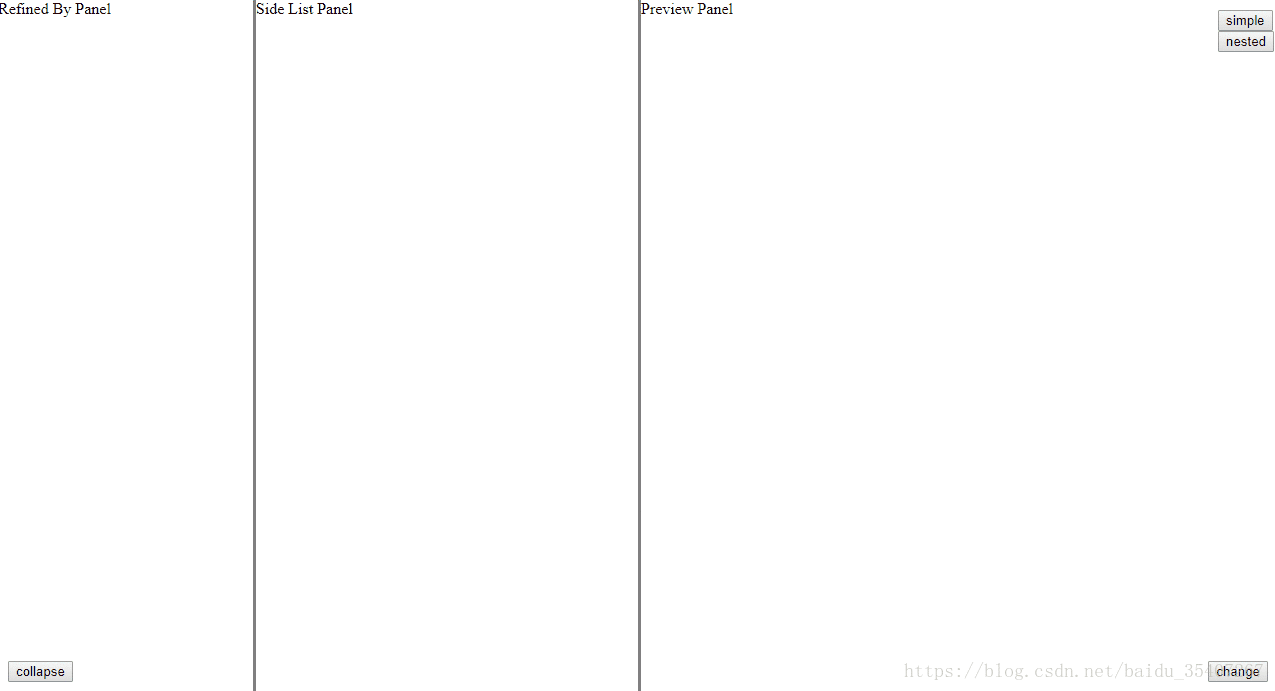
simple demo:
<tam-splitter splitterBarWidth=3 [direction]="horizontal" (sizeChange)="sizeChange($event)">
    <tam-splitter-panel [size]="20" [max]="30" [min]="10"
        [visible]=true (collapsedChange)="collapsedChange($event)">
        Refined By Panel
    </tam-splitter-panel>
    <tam-splitter-panel  [size]="30" [max]="50" [min]="20">
        Side List Panel
    </tam-splitter-panel>
    <tam-splitter-panel [size]="50" [max]="70" [min]="20">
        Preview Panel
    </tam-splitter-panel>
</tam-splitter>
nested demo:
<tam-splitter splitterBarWidth=3>
    <tam-splitter-panel [size]="20" [max]="30" [min]="10" (collapsedChange)="collapsedChange($event)">
        Refined By Panel
    </tam-splitter-panel>
    <tam-splitter-panel [size]="80">
        <tam-splitter splitterBarWidth=3 [direction]="'vertical'">
            <tam-splitter-panel [size]="30" [max]="40" [min]="20">
                Side List Panel
            </tam-splitter-panel>

            <tam-splitter-panel [size]="70" [max]="80" [min]="60">
                Preview Panel
            </tam-splitter-panel>
        </tam-splitter>
    </tam-splitter-panel>
</tam-splitter>
写在后面的话:
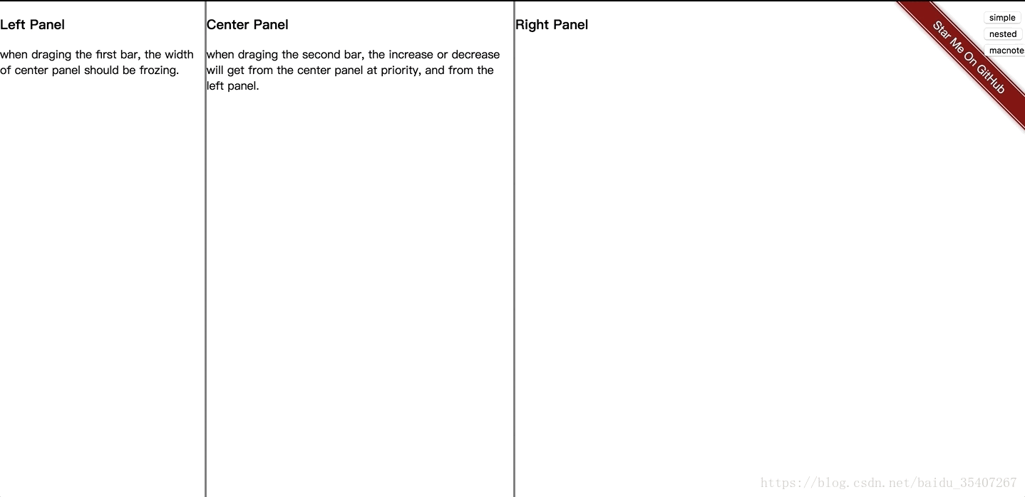
splitter的需求很明确,但是远不止这么简单,PM的需要是拖拽,并且每一个panel都要有最大最小值的限制,而且,因为第三个区域是展示内容区域,所以希望,拖拽第一个框的时候,增大的是第三个而不是第二个。基于以上需求,google到了两个控件,kendo-ui-splitter 和 angular-split,kendo虽然有一些sizechange和collapsechange方法,但是还是无法实现当拖拽的时候,人为的改变第三个的宽度。而第二个无法支持最大最小值。
基于以上背景,只好自己来实现这样一个功能。具体实现是参考angular-split,只是在计算位置的时候增加了最大值和最小值的边界,然后有在sizechange事件是暴露出来每一个panel的宽度,基于此来给每一个panel动态计算和赋值。
很流行的一个布局,如上图2,当一个panel达到最小宽度时,会从另一个panel获取宽度。outlook,mac上的备忘录都是采用了这种中间panel宽度固定,右边为主要展示区域的形式。简单更新以后新增了type属性,只要把type设为macNotes,就会实现这种行为。