方法一:
CSS兼容IE9(不使用CSS3)
 .box{
            width: 100%;
            height: 500px;
            box-sizing: border-box;
            border: 1px solid red;
        }
        .left{
            float: left;
            display: inline-block;
            width: 100px;
            height: 100%;
            box-sizing: border-box;
            border: 1px solid green;
            text-align: center;
        }
        .center{
            float: left;
            padding: 0 100px;
            margin: 0 -100px;
            width: 100%;
            height: 100%;
            box-sizing: border-box;
            border: 1px solid red;
            text-align: center;
        }
        .right{
            float: left;
            width: 100px;
            height: 100%;
            box-sizing: border-box;
            border: 1px solid green;
            text-align: center;
        }
主要是 .center 布局
   padding: 0 100px;
   margin: 0 -100px;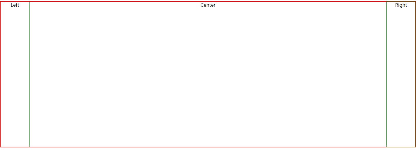
方法二:
使用CSS3的flex盒子模型布局
.box{
            width: 100%;
            height: 500px;
            box-sizing: border-box;
            border: 1px solid red;
            display: flex;
        }
        .left{
            width: 100px;
            height: 100%;
            box-sizing: border-box;
            border: 1px solid green;
        }
        .center{
            flex: 1;
            height: 100%;
            box-sizing: border-box;
            border: 1px solid green;
        }
        .right{
            width: 100px;
            height: 100%;
            box-sizing: border-box;
            border: 1px solid green;
        }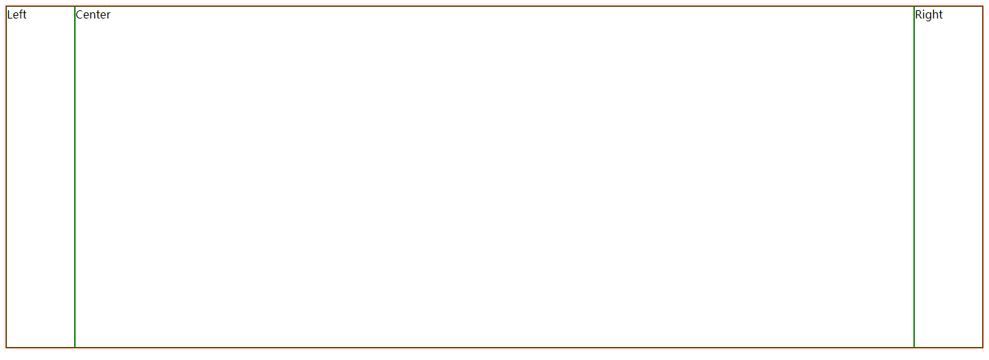
主要关键点: .box {display: flex;} .center{flex: 1;}
方法三:
扫描二维码关注公众号,回复:
3576159 查看本文章

使用CSS3的calc函数动态计算宽度
.left{
            float: left;
            width: 100px;
            height: 100%;
            box-sizing: border-box;
            border: 1px solid green;
        }
        .center{
            display: inline-block;
            width: calc(100% - 200px);
            height: 100%;
            box-sizing: border-box;
            border: 1px solid green;
        }
        .right{
            float: right;
            width: 100px;
            height: 100%;
            box-sizing: border-box;
            border: 1px solid green;
        }