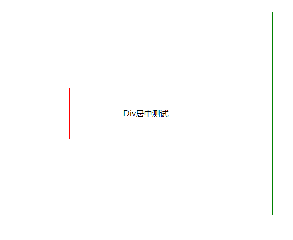
方式一:
直接根据高度和宽度配置,简单粗暴
.pdiv{
  width: 500px;
  height: 400px;
  margin: 100px auto;
  border: 1px solid green;

  position: relative;
}

.div{
  width: 300px;
  height: 100px;
  line-height: 100px;
  text-align: center;
  border: 1px solid red;

  position: absolute;
  top: 50%;
  left: 50%;
  margin: -50px 0 0 -150px;
}
方式二:
依据浏览器窗口进行绝对定位:fixed,CSS3
.pdiv{
  width: 500px;
  height: 400px;
  margin: 100px auto;
  border: 1px solid green;
  text-align: center;
  position: relative;
}

.div{
  margin: auto;
  width: 300px;
  height: 100px;
  line-height: 100px;
  text-align: center;
  border: 1px solid red;

  position: fixed;
  top: 50%;
  left: 50%;
  transform: translate(-50%, -50%);
}
方式三:
flex盒子模型
.pdiv{
  width: 500px;
  height: 400px;
  margin: 100px auto;
  border: 1px solid green;

  display: flex;
  align-content: center;
  justify-content: center;
}

.div{
  margin: auto;
  width: 300px;
  height: 100px;
  line-height: 100px;
  text-align: center;
  border: 1px solid red;
}
方式四:
绝对布局
.pdiv{
  width: 500px;
  height: 400px;
  margin: 100px auto;
  border: 1px solid green;

  text-align:center;
  position: relative;
}

.div{
  width: 300px;
  height: 100px;
  line-height: 100px;
  text-align: center;
  border: 1px solid red;

  position: absolute;
  top:0;left: 0;
  right: 0; bottom: 0;
  margin: auto;
}
方式五:
使用JS调整,在此不再阐述,可自行学习