版权声明:本文为博主原创文章,未经博主允许不得转载。 https://blog.csdn.net/weixin_39141044/article/details/80835132
一、浏览器CSS属性前缀
| 前缀 | 对应浏览器 |
|---|---|
| -webkit- | chrome |
| -moz- | FireFox |
| -ms- | IE |
| -o- | Opera |
二、CSS3圆角(border-radius)
CSS3中我们可以使用
- border-radius是下面四个属性的复合属性
- border-top-left-radius
- border-top-right-radius
- border-bottom-right-radius
- border-bottom-left-radius
给元素添加圆角边框。
语法
border-raduis: px | % | em | vw | rem
| 单位 | 说明 |
|---|---|
| px | 像素 |
| em | 以父节点的字体像素为1em来计算 |
| rem | 以根目录的字体为1em来计算 |
| % | %是相对于div的长和宽来说的,长方形设置为50%会是一个椭圆,正方形设置50%会是一个圆 |
多值
border-raduis可以有多少个值,每个值之间用空格隔开。
- 四个值:左上 右上 右下 左下
- 三个值:左上 右上左下(对角线) 右下
- 两个值:左上右下(对角线) 右上左下(对角线)
兼容
IE9+、FireFox4+、chrome、Safari5+、Opera
为了兼容各个浏览器建议使用前缀
<style>
    div{
        width: 300px;
        height: 300px;
        border: 1px solid #F00;
        margin: 30px auto;
        -webkit-border-radius: 20px 10px 60px;
           -moz-border-radius: 20px 10px 60px;
            -ms-border-radius: 20px 10px 60px;
             -o-border-radius: 20px 10px 60px;
                border-radius: 20px 10px 60px;
    }
</style>
案例
<!DOCTYPE html>
<html lang="en">
<head>
    <meta charset="UTF-8">
    <title>圆角</title>
    <style>
        div.alive{
            width: 600px;
            height: 300px;
            border: 2px solid #F00;
            margin: 30px auto;
            -webkit-border-radius: 50%;
               -moz-border-radius: 50%;
                -ms-border-radius: 50%;
                 -o-border-radius: 50%;
                    border-radius: 50%;
            font-size: 24px;
            font-weight: bold;
            text-align: center;
            line-height: 300px;
            position: relative;
        }
        div.alive::before,
        div.alive::after{
            content: "";
            display: block;
            position: absolute;
            border: 2px solid #F00;
            -webkit-border-radius: 50%;
               -moz-border-radius: 50%;
                -ms-border-radius: 50%;
                 -o-border-radius: 50%;
                    border-radius: 50%;
        }
        div.alive::before{
            bottom: -50px;
            right: 20px;
            width: 50px;
            height: 50px;
        }
        div.alive::after{
            bottom: -100px;
            right: 0px;
            width: 20px;
            height: 20px;
        }
    </style>
</head>
<body>
    <div class="alive">苟利国家生死以!我真的还想再活500年!</div>
</body>
</html>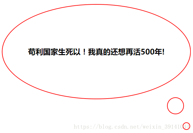
三、CSS3盒阴影(box-shadow)
box-shawow属性可以设置一个或多个下拉阴影的框
语法
box-shadow: h-shadow v-shadow blur spread color inset;| 值 | 说明 |
|---|---|
| h-shadow | 必需的。水平阴影的偏移位置。允许负值(正值:向右偏移,负值:向左偏移) |
| v-shadow | 必需的。垂直阴影的偏移位置。允许负值(正值:向下偏移,负值:向上偏移) |
| blur | 可选。边缘模糊距离(就是从透明到背景色的颜色过渡的距离) |
| spread | 可选。阴影的大小(默认(0 )的阴影大小就是元素本身的大小,设置该值会增大阴影) |
| color | 可选。阴影的颜色。在CSS颜色值寻找颜色值的完整列表 |
| inset | (值就为inset)可选。将阴影设置为盒内阴影。 |
兼容性
IE9+、FireFox4+、Chrome、Safari5+、Opera
扫描二维码关注公众号,回复:
3687500 查看本文章

案例1
</html>
<!DOCTYPE html>
<html>
<head>
<meta charset="utf-8">
    <title>伪元素</title>
    <style type="text/css">
        div{
            width: 500px;
            height: 300px;
            background-color: #F00;
            margin: 100px auto;
            box-shadow: 0 0 30px 30px #FFF inset;
            background: url(./img/timg2.jpg) no-repeat center center;
        }
    </style>
</head>
<body>
    <div>

    </div>
</body>
</html>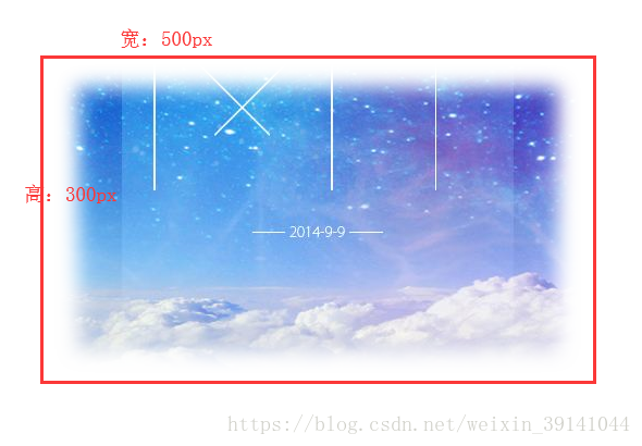
案例2
</html>
<!DOCTYPE html>
<html>
<head>
<meta charset="utf-8">
<title>伪元素</title>
<style type="text/css">
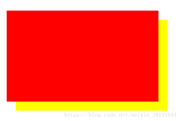
div{
width: 500px;
height: 300px;
background-color: #F00;
margin: 100px auto;
box-shadow: 30px 30px yellow;
}
</style>
</head>
<body>
<div>
</div>
</body>
</html>
四、CSS3边框图片(border-image)
语法
border-image:source slice width outset repeat;兼容
不兼容IE、FireFox、Chrome、Safari6+、Opera不兼容
| 属性 | 说明 |
|---|---|
| border-image-source:none|image; | |
| border-image-slice:number|%|fill | 指定图像的边界向内偏移 |
| border-image-width:number|%|auto | 指定图像边界的宽度 |
| border-image-outset:length|number | 指定边框外部绘制border-image-area的量 |
| border-image-repeat:stretch(默认值)|repeat|round|initial(默认)|inherit(继承) | 图像边界是否重复(repeated)、拉伸(stretched)、铺满(rounded) |