2018-10-15
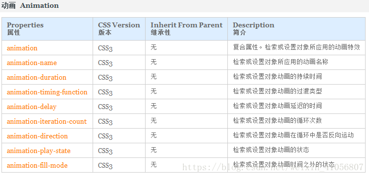
1.css3作用:①选择器②属性(动画效果)
- 学习选择器用法(先不考虑优先级问题)
//html代码均相同,更改css样式来观察不同效果
<!DOCTYPE html>
<html lang="en">
<head>
<meta charset="UTF-8">
<title>Title</title>
<!--css3 选择器,属性(动画)-->
<style type="text/css">
/*交集选择器*/
/*既是div又是类选择器*/
div.box{
width: 200px;
height: 200px;
border: 1px solid #2e2e2e;
float: left;
margin: 6px;
text-align: center;
line-height: 200px;
font-size: 2em;
}
</style>
</head>
<body>
<h2>css3选择器</h2>
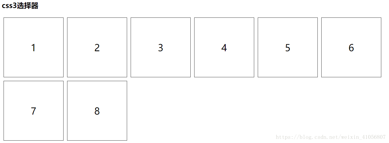
<div class="box">1</div>
<div class="box">2</div>
<div class="box">3</div>
<div class="box">4</div>
<div class="box">5</div>
<div class="box">6</div>
<div class="box">7</div>
<div class="box">8</div>
</body>
</html>
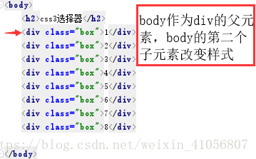
- 交集选择器——既是div又是类选择器
div.box是交集选择器(这里既是div标签选择器又是类选择器)
在原有的css样式上增加一个属性
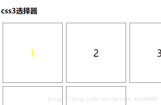
- 同个父元素,包括兄弟元素
        .box:nth-child(2){
            color: yellow;
        }
- class为box的最后一个子元素
.box:last-child{
            background-color: #28a4c9;
        }
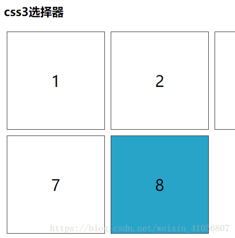
- 父元素偶数个,选择多个元素。偶数2n,奇数2n-1
//偶数
 .box:nth-child(2n){
            color: purple;
            font-weight: bold;
        }
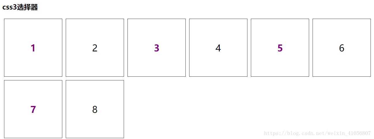
 .box:nth-child(2n-1){
            color: purple;
            font-weight: bold;
        }
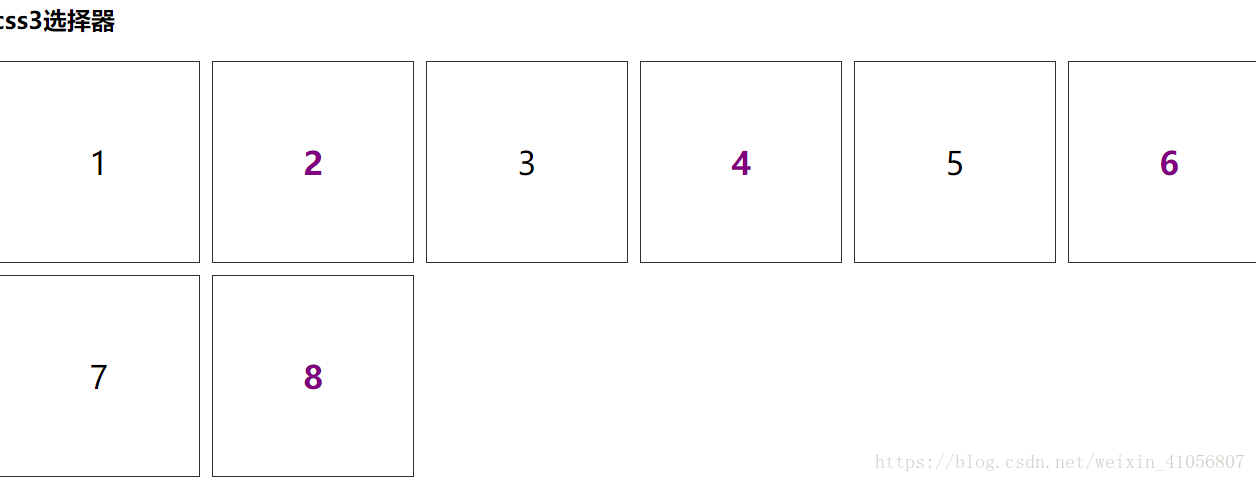
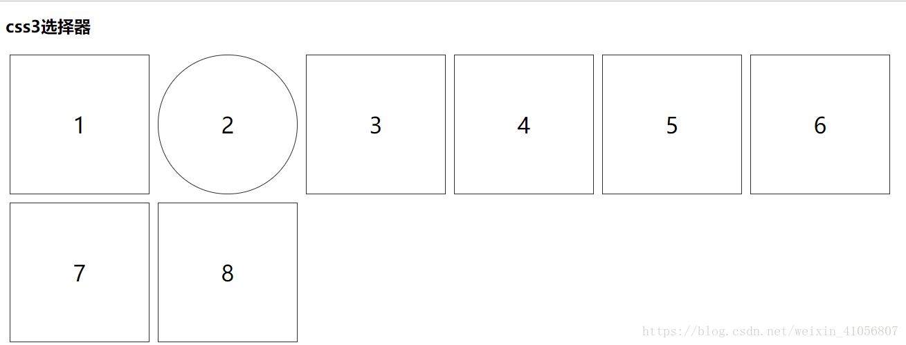
- 第几个元素变,div元素——nth-of-type(2)
.box:nth-of-type(2){
             border-radius: 100px ;
             /*border: 1px dotted #e9322d;*/
         }
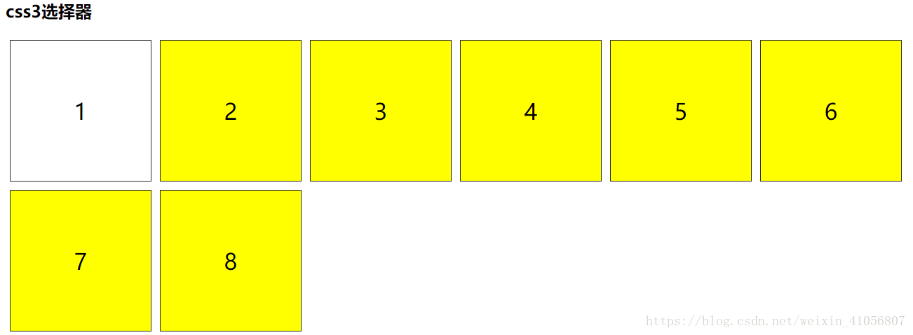
- box后的class为box内容样式 ——.box+.box
.box+.box{
            background-color: yellow;
        }

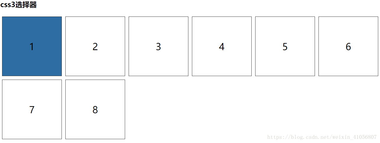
- h2后第一个——h2+.box
h2+.box{
            background-color: #2e6da4;
        }
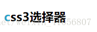
- h2:first-letter——h2第一个字母的样式(第一个文字也算第一个字母)
 h2:first-letter{
            color: #28a4c9;
        }
- after多用清浮。这里在.box后面添加图片
 .box:after{
            content: url("../image/2.4.jpg");
        }

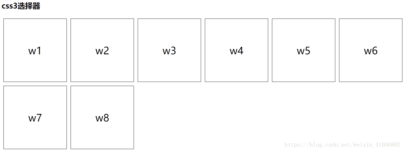
-before和after相对使用,在内容前加的文字
 .box:before{
            content:"w";
        }
- 有class属性的div——div[class]
 div[class]{
            color: #00A000;
        }

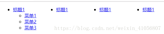
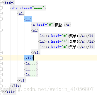
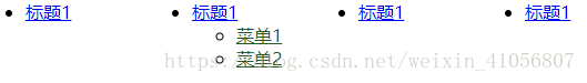
## 下拉菜单-二级菜单(ul-li)-
HTML部分
<body>
    <div class="menu">
        <ul>
            <li>
                <a href="#">标题1</a>
                <ul>
                    <li><a href="#">菜单1</a></li>
                    <li><a href="#">菜单2</a></li>
                    <li><a href="#">菜单3</a></li>
                </ul>
            </li>
            <li>
                <a href="#">标题1</a>
                <ul>
                    <li><a href="#">菜单1</a></li>
                    <li><a href="#">菜单2</a></li>
                </ul>
            </li>
            <li>
                <a href="#">标题1</a>
                <ul>
                    <li><a href="#">菜单1</a></li>
                    <li><a href="#">菜单2</a></li>
                </ul>
            </li>
            <li>
                <a href="#">标题1</a>
                <ul>
                    <li><a href="#">菜单1</a></li>
                    <li><a href="#">菜单2</a></li>
                </ul>
            </li>
        </ul>
    </div>
</body>
css样式:
   /*一级菜单下所有二级菜单隐藏*/
        /*下拉菜单*/
        .menu>ul>li{
            float: left;
            width: 150px;
        }
        .menu>ul ul{
            display: none;
        }
        .menu>ul>li:hover ul{
            display: block;
        }
现在写css样式
- 选中所以一级标题——子代选择器,.menu ul是后代选择器
.menu>ul>li>a{
            color: #00A000;
        }
- 选中所以二级标题-写法一
.menu ul ul a{
            color: #28a4c9;
        }

- 选中所以二级标题-写法二
.menu ul>li>ul a{
            color: yellow;
        }
- 选中所以二级标题-写法三
.menu li li a{
         color: #e9322d;
     }
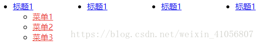
- 选中所以二级标题-写法四
 .menu li>ul>li>a{
         color: #28a4c9;
     }
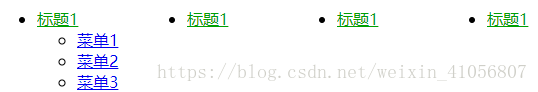
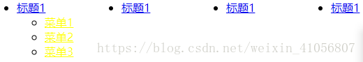
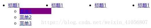
- 第一个二级菜单()
 .menu>ul>li>ul>li:nth-child(1){
            background-color: purple;
        }
- 对不同父元素下的子元素都是独立计数
 .menu ul ul li+li a{
            background-color: #2e2e2e;
        }

- 选中第二个 一个标题
.menu>ul>li:nth-child(2)>a{
            background-color: pink;
        }
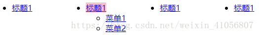
- 第二个 一级菜单下的第二个二级菜单
- 鼠标在一级菜单的时候 他的子a变色
2018-10-18 css3的transition(过度)和transform(变形),复习css的选择器
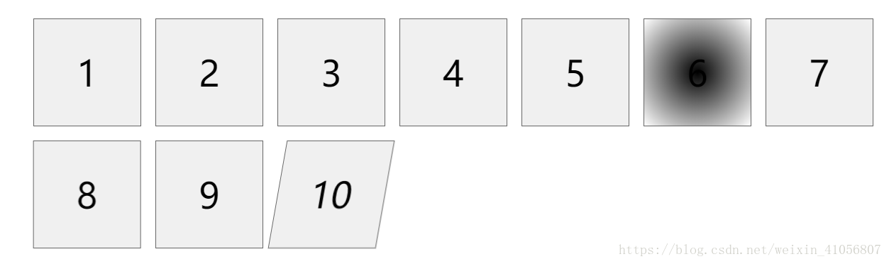
一.用10个列表项展示几种变换效果。并且了解每个选择器的意义
- 鼠标在tlist下第一个li—— .tlist>li:first-child:hover
- tlist的第二个li——.tlist>li:nth-of-type(2):hover
- tlist里的第三个li上—— .tlist>li:nth-child(3):hover
- tlist下第三个li的后面相连的第一个兄弟li——.tlist>li:nth-child(3)+li:hover
- tlist中li倒数第五个——所有子元素—— .tlist>li:nth-last-child(5)
- 只有li的子元素——.tlist>li:nth-last-child(4):hover
动画效果:
-
-过度,transition属性增加thml元素有css3属性变化,这两个变化的属性是数值,则以动画的方式呈现。 transition: all 2s;
-
border-radius: 值大于等于宽度一半,html元素为圆形;(参数上右下左每个值可以不同)
border-radius: 50%;
border-radius: 10px 70px 30px 5px; -
box-shadow:6px 6px 6px #030;
加阴影:box-shadow和text-shadow的四个属性值分别是(x偏移,y偏移, 阴影宽度 ,阴影颜色) -
text-shadow: 6px 6px 7px #c00;
-
background: lightgoldenrodyellow;
css3支持颜色变化,jQuery不支持 -
线性渐变 background: linear-gradient(#000,#ccc,#fff);
-
径向渐变,从圆心向外发散 background: radial-gradient(#000,#fff);
-
transform: scale(0.2);
注意:transform后的效果不影响盒模型的宽度和高度 -
平移,沿x轴,y轴*!向左-100,向右+100
transform: translateX(-100px); -
旋转
transform: rotateX(180deg);
transform: rotateY(80deg);
transform: rotateZ(80deg); -
倾斜+右,-左
transform: skew(10deg);
transform: skew(-10deg);
源代码
<!DOCTYPE html>
<html lang="en">
<head>
    <meta charset="UTF-8">
    <title>Title</title>
    <!--css3新属性-->
    <style type="text/css">
        ul{
            list-style: none;
        }
        /*子元素*/
        .tlist>li{
            width: 150px;
            height: 150px;
            background-color: #f0f0f0;
            float: left;
            border: 1px solid #666666;
            margin: 10px;
            line-height: 150px;
            text-align: center;
            font-size: 50px;
            /*//隐藏溢出部分*/
            overflow: hidden;
            /*过度,transition属性增加thml元素有css3属性变化,这两个变化的属性是数值,则以动画的方式呈现*/
            transition: all 2s;
        }
        /*鼠标在tlist下第一个li*/
        .tlist>li:first-child:hover{
            height: 20px;
            font-size: 10px;
        }
        /*tlist的第二个li*/
        .tlist>li:nth-of-type(2):hover{
            /*参数上右下左每个值可以不同*/
            /*border-radius: 值大于等于宽度一半,html元素为圆形;*/
            /*border-radius: 50%;*/
            border-radius: 10px 70px 30px 5px;
        }
        /*tlist里的第三个li上*/
        .tlist>li:nth-child(3):hover{
            box-shadow:6px 6px 6px #030;
            /*加阴影:box-shadow和text-shadow的四个属性值分别是x偏移,y偏移, 阴影宽度 ,阴影颜色*/
        }
        /*tlist下第三个li的后面相连的第一个兄弟li*/
        .tlist>li:nth-child(3)+li:hover{
            text-shadow: 6px 6px 7px #c00;
        }
        .tlist>li:nth-child(5):hover{
            /*background: lightgoldenrodyellow;*/
            /*css3支持颜色变化,jQuery不支持*/
            /*线性渐变*/
            background: linear-gradient(#000,#ccc,#fff);
        }
        /*tlist中li倒数第五个*/
        /*所有子元素*/
        .tlist>li:nth-last-child(5){
            /*径向渐变,从圆心向外发散*/
            background: radial-gradient(#000,#fff);
        }
        /*只有li的子元素*/
        .tlist>li:nth-last-child(4):hover{
            transform: scale(0.2);
            /*注意:transform后的效果不影响盒模型的宽度和高度*/
        }
        .tlist>li:nth-of-type(8):hover{
            /*!*平移,沿x轴,y轴*!向左-100,向右+100*/
            transform: translateX(-100px);
        }
        .tlist>li:nth-of-type(9):hover{
            /*旋转*/
            /*transform: rotateX(180deg);*/
            /*transform: rotateY(80deg);*/
            transform: rotateZ(80deg);
        }
        .tlist>li:last-of-type{
            /*倾斜+右,-左*/
            /*transform: skew(10deg);*/
            transform: skew(-10deg);
        }
    </style>
</head>
<body>
<ul class="tlist">
    <li>1</li>
    <li>2</li>
    <li>3</li>
    <li>4</li>
    <li>5</li>
    <li>6</li>
    <li>7</li>
    <li>8</li>
    <li>9</li>
    <li>10</li>
</ul>
</body>
</html>
效果:
1上下移动,2出现圆弧,3.边框阴影,4.文字阴影,5渐变,6圆形渐变,7.缩放,8平移,9旋转,10形状
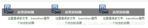
上图下文(新版div)
1.基本布局
 <div class="tr">
        <img src="image/9.4.jpg">
        <div class="text">
            <h3>这里是标题</h3>
            <p>这里是很多文字,transition是两个状态的动画</p>
        </div>
    </div>
注意:在有a超链接的时候、指定图片的时候,宽高不用设定。img——display: block;
源代码
<!DOCTYPE html>
<html lang="en">
<head>
    <meta charset="UTF-8">
    <title>Title</title>
    <!--用div上图下文-->
    <style type="text/css">
        h3,p{
            margin: 0;
            padding: 0;
        }
        img{
            /*在有a超链接的时候、*/
            /*指定图片的时候,宽高不用设定*/
            display: block;
            border: none;
        }
        .tr{
            width: 200px;
            height: 200px;
            /*溢出隐藏不是清浮*/
            overflow: hidden;
            float: left;
        }
        .text{
            height: 32px;
            background-color: rgba(0,0,0,0.5);
            transition: all 2s;
            margin-top: -32px;
            position: relative;
            z-index: 1;
        }
        .text>h3{
            height: 32px;
            color: #f0f0f0;
            font-size: 14px;
            text-align: center;
            line-height: 32px;
        }
        .text>p{
            color: #255625;
            font-size: 12px;
            text-align: center;
            line-height: 20px;
            overflow: hidden;
            height: 40px;
            text-indent: 2em;
        }
    </style>
</head>
<body>
    <div class="tr">
        <img src="image/9.4.jpg">
        <div class="text">
            <h3>这里是标题</h3>
            <p>这里是很多文字,transition是两个状态的动画</p>
        </div>
    </div>
    <div class="tr">
        <img src="image/9.4.jpg">
        <div class="text">
            <h3>这里是标题</h3>
            <p>这里是很多文字,transition是两个状态的动画</p>
        </div>
    </div>
    <div class="tr">
        <img src="image/9.4.jpg">
        <div class="text">
            <h3>这里是标题</h3>
            <p>这里是很多文字,transition是两个状态的动画</p>
        </div>
    </div>
</body>
</html>
效果:
这里看出两段文字在text的盒子内但是只要h3继承bg的特点所以p标签没有渲染成功,可以在p的样式中增加bg
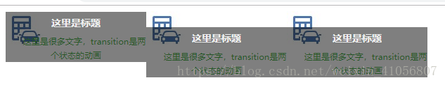
- 还可以给图片增加缩放的属性
 .tr:hover img{
            transform: scale(1.8);
        }
- 让文字在图片上移动
<!DOCTYPE html>
<html lang="en">
<head>
    <meta charset="UTF-8">
    <title>Title</title>
    <!--用div上图下文-->
    <style type="text/css">
        h3,p{
            margin: 0;
            padding: 0;
        }
        img{
            /*在有a超链接的时候、*/
            /*指定图片的时候,宽高不用设定*/
            display: block;
            border: none;
        }
        .tr{
            width: 200px;
            height: 200px;
            /*溢出隐藏不是清浮*/
            overflow: hidden;
            float: left;
        }
        .text{
            height: 32px;
            background-color: rgba(0,0,0,0.5);
            transition: all 2s;
            margin-top: -32px;
            position: relative;
            z-index: 1;
        }
        .text>h3{
            height: 32px;
            color: #f0f0f0;
            font-size: 14px;
            text-align: center;
            line-height: 32px;
        }
        .text>p{
            color: #255625;
            font-size: 12px;
            text-align: center;
            line-height: 20px;
            overflow: hidden;
            height: 40px;
            text-indent: 2em;
            /*p的背景在text没生效所以在这里要加*/
            background-color: rgba(0,0,0,0.5);
        }
        .tr:hover .text{
            margin-top: -72px;
        }

    </style>
</head>
<body>
    <div class="tr">
        <img src="../image/9.4.jpg">
        <div class="text">
            <h3>这里是标题</h3>
            <p>这里是很多文字,transition是两个状态的动画</p>
        </div>
    </div>
    <div class="tr">
        <img src="../image/9.4.jpg">
        <div class="text">
            <h3>这里是标题</h3>
            <p>这里是很多文字,transition是两个状态的动画</p>
        </div>
    </div>
    <div class="tr">
        <img src="../image/9.4.jpg">
        <div class="text">
            <h3>这里是标题</h3>
            <p>这里是很多文字,transition是两个状态的动画</p>
        </div>
    </div>
</body>
</html>
2018-10-23
还是学习css3属性(animation&&flex)
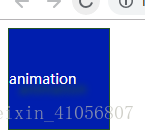
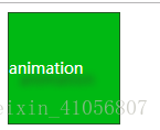
一.animation 多状态动画
参照手册了解animation属性
写法一:from——to(animation参数三个:动画名称+时长+ 循环是infinite无限)
<!DOCTYPE html>
<html lang="en">
<head>
    <meta charset="UTF-8">
    <title>Title</title>
    <style type="text/css">
        /*animation多状态动画*/
        .box{
            width: 100px;
            height: 100px;
            color: #fff;
            text-shadow: 10px 10px 10px #255625;
            font-size: 14px;
            line-height: 100px;
            border: 1px solid #255625;
            background-color: #666666;
        }
        .box{
            /*动画名称+时长+ 循环是infinite无限*/
            animation: yuan 3s infinite;
        }
        @keyframes yuan {
            /*from_to*/
            from{background-color: #00c}
            to{background-color: #0c0;}
        }
    </style>
</head>
<body>
    <div class="box">animation</div>
</body>
</html>
颜色从蓝色渐变3s到绿色
写法二:百分数%(%多少可以改变)
<!DOCTYPE html>
<html lang="en">
<head>
    <meta charset="UTF-8">
    <title>Title</title>
    <style type="text/css">
        /*animation多状态动画*/
        .box{
            width: 100px;
            height: 100px;
            color: #fff;
            text-shadow: 10px 10px 10px #255625;
            font-size: 14px;
            line-height: 100px;
            border: 1px solid #255625;
            background-color: #666666;
        }
        .box{
            /*动画名称+时长+ 循环是infinite无限*/
            animation: yuan 3s infinite;
        }
        @keyframes yuan {
            /*from_to*/
            20%{background-color: #00c}
            60%{background-color: #0c0;
            color: yellow;}
            100%{background-color:#255625}
        }
    </style>
</head>
<body>
    <div class="box">animation</div>
</body>
</html>
二.animation全屏自适应宽度类似幻灯片效果但是不支持跳转 (跳转还是要jQuery)
源码
<!DOCTYPE html>
<html lang="en">
<head>
    <meta charset="UTF-8">
    <title>Title</title>
    <!--animation实例-->
    <!--全屏宽度自适应宽度——幻灯片但是不支持跳转-->
    <style type="text/css">
        /*全局*/
        ul,p{
            margin: 0;
            padding: 0;
        }
        ul{
            list-style: none;
        }
        a img{
            border: none;
            display: block;
        }
        .slide{
            overflow: hidden;//溢出隐藏
            height: 250px;
            /*宽度没设置就是100% */
        }
        .slide>ul{
            /*有5个占100%的子元素*/
            width: 500%;
            height: 250px;
            /*每个元素动2s*/
            animation: donghua 10s infinite;
        }
        /*left或margin-left可以动起来*/
        .slide>ul>li{
            /*width: 20%;//是屏幕的100%。父元素是500%*/
            float: left;
            position: relative;
            width: 20%;
        }
        .slide>ul>li img{
            width: 100%;
            height: 250px;
            /*相同图片不要设置高度,而是每张图格式相同?*/
        }
        .slide>ul>li p{
            position: absolute;
            width: 100%;
            height: 33px;
            line-height: 33px;
            text-align: center;
            color: #255625;
            font-weight: bold;
            background-color: rgba(0,0,0,0.5);
            left: 0;
            bottom: 0;
        }
        @keyframes donghua {
            /*10-20是为了让内容可读,停止点时间*/
            10%{margin-left: -100%}
            20%{margin-left: -100%}
            30%{margin-left: -100%}
            40%{margin-left: -200%}
            50%{margin-left: -200%}
            60%{margin-left: -300%}
            70%{margin-left: -300%}
            80%{margin-left: -400%}
            90%{margin-left: -400%}
            100%{margin-left: -400%}
        }
    </style>
</head>
<body>
    <div class="slide">
        <ul>
            <li>
                <a href="#">
                    <img src="image/flower1.jpg" alt="">
                </a>
                <p>这里是文字</p>
            </li>
            <li>
                <a href="#">
                    <img src="image/flower6.jpg" alt="">
                </a>
                <p>这里是文字</p>
            </li>
            <li>
                <a href="#">
                    <img src="image/flower2.jpg" alt="">
                </a>
                <p>这里是文字</p>
            </li>
            <li>
                <a href="#">
                    <img src="image/flower4.jpeg" alt="">
                </a>
                <p>这里是文字</p>
            </li>
            <li>
                <a href="#">
                    <img src="image/flower5.jpg" alt="">
                </a>
                <p>这里是文字</p>
            </li>
        </ul>
    </div>
</body>
</html>
注意
- .slide>ul设置宽度500%是给里面5个li,每个li为100%。
- .slide>ul>li是屏幕的100%。父元素是500%
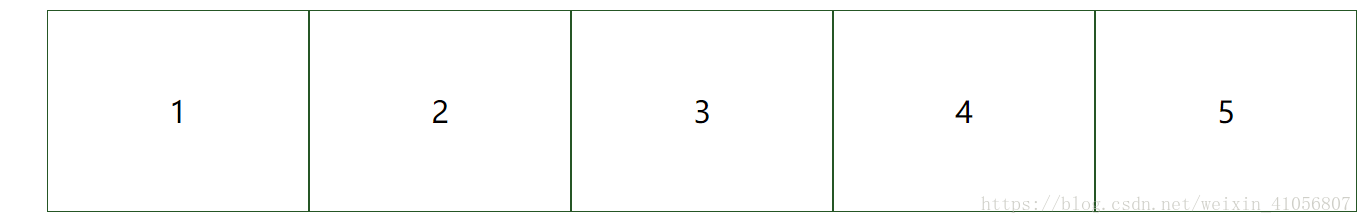
<!DOCTYPE html>
<html lang="en">
<head>
    <meta charset="UTF-8">
    <title>Title</title>
    <style type="text/css">
        /*父元素display:flex,子元素继承父元素,bootstrap4都用flex不考虑清浮*/
        ul{
            list-style: none;
        }
        .flex{
            display: flex;
            /*翻转*/
            /*flex-direction: row-reverse;*/
            /*换行,默认不换行*/
            /*flex-wrap: wrap;*/
            justify-content: center;
        }
        .flex>li{
            border: 1px solid #255625;
            /*w=10%不满一行会压缩,width: >20%会达到最大界限;*/
            width: 20%;
            height: 200px;
            font-size: 30px;
            line-height: 200px;
            text-align: center;
        }
    </style>
</head>
<body>
    <ul class="flex">
        <li>1</li>
        <li>2</li>
        <li>3</li>
        <li>4</li>
        <li>5</li>
    </ul>
</body>
</html>
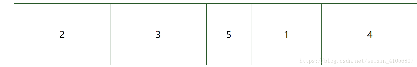
四.flex优先级
源码:
<!DOCTYPE html>
<html lang="en">
<head>
    <meta charset="UTF-8">
    <title>Title</title>
    <style type="text/css">
        /*父元素display:flex,子元素继承父元素,bootstrap4都用flex不考虑清浮*/
        ul{
            list-style: none;
        }
        .flex{
            display: flex;
            /*翻转*/
            /*flex-direction: row-reverse;*/
            /*换行,默认不换行*/
            /*flex-wrap: wrap;*/
            justify-content: center;
        }
        /*改变顺序order从小到大排序*/
        .flex>li{
            order: 1;
        }
        .flex>li:first-child{
            order: 2;
            /*屏幕宽度大于内容宽度,则多用宽度给这个*/
            flex-grow:1 ;
            /*收缩*/
            flex-shrink: 2;
        }
        .flex>li:last-child{
            order: 1;
            flex-shrink: 3;
        }
        /*order相同按他们出现的顺序来排序*/
        /*第四个元素*/
        .flex>li:nth-child(4){
            order: 3;
        }
        .flex>li{
            border: 1px solid #255625;
            /*w=10%不满一行会压缩,width: >20%会达到最大界限;*/
            width: 30%;
            height: 200px;
            font-size: 30px;
            line-height: 200px;
            text-align: center;
        }
    </style>
</head>
<body>
<ul class="flex">
    <li>1</li>
    <li>2</li>
    <li>3</li>
    <li>4</li>
    <li>5</li>
</ul>
</body>
</html>