前言:最近也是忙的够呛,但要总结还是要总结出来,不然过段时间就不想写博客了,坚持每月至少出四篇博客的节奏,无论多忙,坚持。任何一个成功人物的背后总是透露着辛酸与不易。
今天看到一篇文章《世界是公平的:你富不过马云,比惨你也未必比的过》,分享给大家,我一直想看到真实的马云过往,而不是被华丽外衣包裹着的外星人,当我开始知道这个人时,当时第一个想法就是他肯定吃过别人不曾吃过的苦,正是由于这些才最终造就现在的神话,无耐,全网铺天盖地都是宣扬与赞美,并没有写出他的创业史,即使有,也只是寥寥几句,直到我看到这篇文章,才让我真正了解马云,才更佩服他,他不是神,他只是一个普通人,他有的,只是别人所有没有毅力与坚持,马总,总是喜欢说坚持,我想,这也是他在最落魄的时候经常对自己说的话吧,坚持。
废话说了一堆,今天跟大家聊聊shape标签的用法,有时,我们为了APP中节省空间,在能用颜色替代的地方就不要用图片,而如何将颜色组织成想要的形状及如何为指定的颜色添加描边、渐变等来模拟图片就显的极为重要了,这些就是靠shape来完成的。
一、简单使用
刚开始,就先不讲一堆标签的意义及用法,先简单看看shape标签怎么用。
1、新建shape文件
首先在res/drawable文件夹下,新建一个文件,命名为:shape_radius.xml
内容是这样的:(先不需要理解,先看shape怎么用)
-
<?xml version="1.0" encoding="utf-8"?>
-
<shape xmlns:android="http://schemas.android.com/apk/res/android" >
-
<corners android:radius="20dip"/>
-
<solid android:color="#ff00ff"/>
-
-
</shape>
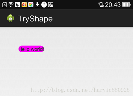
2、添加到控件中
在定义好shape文件后,下一步就是将其添加到控件中,添加到控件中,一般是使用设置background属性,将其为控件背景,下面,我们将其设置为MainActivity对应的布局中(activity_main.xml),将其设为TextView的背景,看显示出来 是什么样子的。
-
<RelativeLayout xmlns:android="http://schemas.android.com/apk/res/android"
-
xmlns:tools=
"http://schemas.android.com/tools"
-
android:layout_width=
"match_parent"
-
android:layout_height=
"match_parent"
-
tools:context=
"com.harvic.tryshape.MainActivity" >
-
-
<TextView
-
android:layout_width=
"wrap_content"
-
android:layout_height=
"wrap_content"
-
android:layout_margin=
"50dip"
-
android:text=
"@string/hello_world"
-
android:background=
"@drawable/shape_radius"/>
-
-
</RelativeLayout>
二、基本属性(corners、gradient、padding、size、solid、stroke)
上面给大家简单的讲了下shape标签组的简单使用方法,下面就具体讲讲shape标签里所具有的几个子标签及所具有的属性。
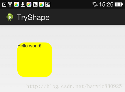
1、Corners
-
<corners //定义圆角
-
android:radius=
"dimension" //全部的圆角半径
-
android:topLeftRadius=
"dimension" //左上角的圆角半径
-
android:topRightRadius=
"dimension" //右上角的圆角半径
-
android:bottomLeftRadius=
"dimension" //左下角的圆角半径
-
android:bottomRightRadius=
"dimension" /> //右下角的圆角半径
android:radius:定义四个角的的圆角半径。
其它四个是逐个字义每个角的圆角半径。
使用:
控件布局:
-
<RelativeLayout xmlns:android="http://schemas.android.com/apk/res/android"
-
android:layout_width=
"match_parent"
-
android:layout_height=
"match_parent" >
-
-
<TextView
-
android:layout_width=
"100dp"
-
android:layout_height=
"100dp"
-
android:layout_margin=
"50dip"
-
android:text=
"@string/hello_world"
-
android:background=
"@drawable/shape_radius"/>
-
</RelativeLayout>
-
<?xml version="1.0" encoding="utf-8"?>
-
<shape xmlns:android="http://schemas.android.com/apk/res/android" >
-
<corners android:radius="20dip"/>
-
<solid android:color="#ffff00"/>
-
</shape>
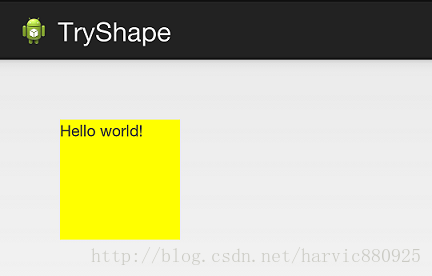
2、solid
solid用以指定内部填充色
只有一个属性:
<solid android:color="color" />
-
<?xml version="1.0" encoding="utf-8"?>
-
<shape xmlns:android="http://schemas.android.com/apk/res/android" >
-
<solid android:color="#ffff00"/>
-
</shape>
3、gradient
gradient用以定义渐变色,可以定义两色渐变和三色渐变,及渐变样式,它的属性有下面几个:
-
<gradient
-
android:type=
["
linear" | "
radial" | "
sweep"] //共有
3中渐变类型,线性渐变(默认)/放射渐变/扫描式渐变
-
android:angle=
"integer" //渐变角度,必须为
45的倍数,
0为从左到右,
90为从上到下
-
android:centerX=
"float" //渐变中心
X的相当位置,范围为
0~
1
-
android:centerY=
"float" //渐变中心
Y的相当位置,范围为
0~
1
-
android:startColor=
"color" //渐变开始点的颜色
-
android:centerColor=
"color" //渐变中间点的颜色,在开始与结束点之间
-
android:endColor=
"color" //渐变结束点的颜色
-
android:gradientRadius=
"float" //渐变的半径,只有当渐变类型为
radial时才能使用
-
android:useLevel=
["
true" | "
false"] /> //使用LevelListDrawable时就要设置为true。设为false时才有渐变效果
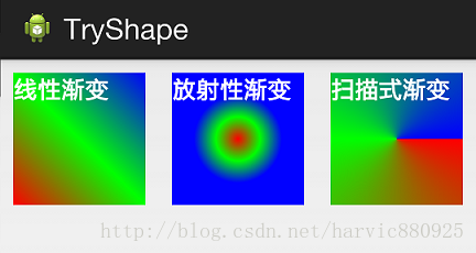
首先有三种渐变类型,分别是:linear(线性渐变)、radial(放射性渐变)、sweep(扫描式渐变)
(1)先看看这几个属性的使用方法:
下面我们使用三色渐变来看看这三种渐变方式都是怎么显示的:(如果不使用centerColor属性就是双色渐变,这个属性是可选的)
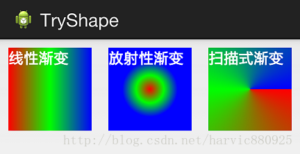
需要注意的一点是,在构造放射性渐变时,要加上android:gradientRadius属性(渐变半径),即必须指定渐变半径的大小才会起作用,下面列出这三个渐变方式的shape代码,供大家参考:
线性渐变:
-
<?xml version="1.0" encoding="utf-8"?>
-
<shape xmlns:android="http://schemas.android.com/apk/res/android" >
-
<gradient
-
android:type=
"linear"
-
android:startColor=
"#ff0000"
-
android:centerColor=
"#00ff00"
-
android:endColor=
"#0000ff"/>
-
</shape>
-
<?xml version="1.0" encoding="utf-8"?>
-
<shape xmlns:android="http://schemas.android.com/apk/res/android" >
-
<gradient
-
android:type=
"radial"
-
android:startColor=
"#ff0000"
-
android:centerColor=
"#00ff00"
-
android:endColor=
"#0000ff"
-
android:gradientRadius=
"100"/>
-
</shape>
-
<?xml version="1.0" encoding="utf-8"?>
-
<shape xmlns:android="http://schemas.android.com/apk/res/android" >
-
<gradient
-
android:type=
"sweep"
-
android:startColor=
"#ff0000"
-
android:centerColor=
"#00ff00"
-
android:endColor=
"#0000ff"/>
-
</shape>
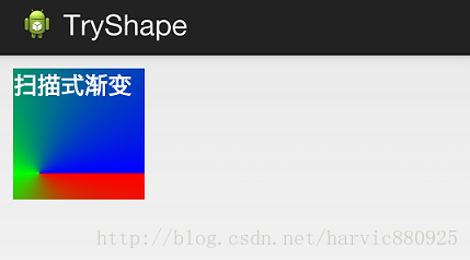
(2)、android:angle属性(仅对线性渐变有效)
android:angle="integer" //渐变角度,必须为45的倍数,0为从左到右,90为从上到下
我们在上面的三种渐变上都加上angle属性,看看效果如何:
能过跟上一个图对比可以发现,angle属性确实只对线性渐变有效,其它两种渐变方式都没有任何动静,下面是此时的线性渐变shape代码:
-
<?xml version="1.0" encoding="utf-8"?>
-
<shape xmlns:android="http://schemas.android.com/apk/res/android" >
-
<gradient
-
android:type=
"linear"
-
android:startColor=
"#ff0000"
-
android:centerColor=
"#00ff00"
-
android:endColor=
"#0000ff"
-
android:angle=
"45"/>
-
</shape>
(3)、android:centerX与android:centerY
centerX、centerY两个属性用于设置渐变的中心点位置,仅当渐变类型为放射渐变时有效,类型为分数或小数,不接受Dimension。默认值是0.5,有效值是0.0~1.0,超出该范围后会看不出渐变效果。centerX、centerY的取值其实是宽和高的百分比;不难理解,下面看代码:
-
<?xml version="1.0" encoding="utf-8"?>
-
<shape xmlns:android="http://schemas.android.com/apk/res/android" >
-
<gradient
-
android:type=
"sweep"
-
android:startColor=
"#ff0000"
-
android:centerColor=
"#00ff00"
-
android:endColor=
"#0000ff"
-
android:centerX=
"0.2"
-
android:centerY=
"0.8"/>
-
</shape>
(4)android:useLevel
useLevel属性通常不使用。该属性用于指定是否将该shape当成一个LevelListDrawable来使用,默认值为false。
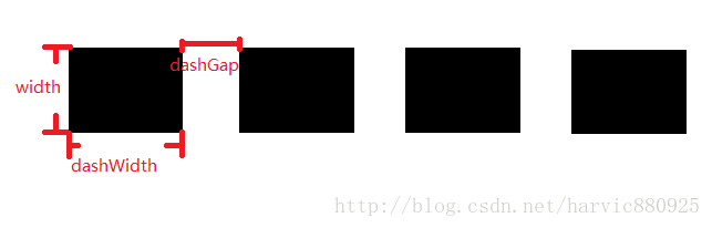
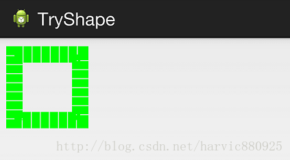
4、stroke
这是描边属性,可以定义描边的宽度,颜色,虚实线等
-
<stroke
-
android:width="dimension" //描边的宽度
-
android:color="color" //描边的颜色
-
// 以下两个属性设置虚线
-
android:dashWidth="dimension" //虚线的宽度,值为0时是实线
-
android:dashGap="dimension" /> //虚线的间隔
上面各个属性的意义如下:
我们使用绿色虚线描边,虚线高度是20dp,虚线宽度为10dp虚线间距为1dp:
-
<?xml version="1.0" encoding="utf-8"?>
-
<shape xmlns:android="http://schemas.android.com/apk/res/android" >
-
<stroke
-
android:width=
"20dp"
-
android:color=
"#00ff00"
-
android:dashWidth=
"10dp"
-
android:dashGap=
"1dp" />
-
</shape>
5、size和padding
这两个基本上不怎么用,因为他们所具有的功能,控件本身也能实现。
size:是用来定义图形的大小的。
-
<size
-
android:width=
"dimension"
-
android:height=
"dimension" />
-
<padding
-
android:left=
"dimension"
-
android:top=
"dimension"
-
android:right=
"dimension"
-
android:bottom=
"dimension" />
三、Shape的属性(rectangle、oval、line、ring)
上面我们讲了Shape的子标签的的作用,但Shape本身还没讲,Shape自已是可以定义当前Shape的形状的,比如上面的矩形,还有椭圆形,线形和环形;这些都是通过Shape标签的 shape属性来定义的,Shape标签总共有下面几个属性,我们一个个讲:
可见,只有第一个shape是可用的,其它五个都是shape等于ring时所特有的。
注意,无论这里shape取什么形状,他的子标签都是可用的,但有时并不会有效果,比如在shape为椭圆时,那corners标签就不会有效果,很显然的道理。下面一个个看看各个形状都是怎么样的;
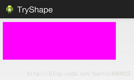
1、rectangle (矩形)
这就是上一节我们使用的形状,当我们不指定shape属性时,默认就是矩形的。
控件代码:
-
<LinearLayout xmlns:android="http://schemas.android.com/apk/res/android"
-
android:layout_width=
"match_parent"
-
android:layout_height=
"match_parent"
-
android:orientation=
"horizontal" >
-
<TextView
-
android:layout_width=
"300dp"
-
android:layout_height=
"100dp"
-
android:layout_margin=
"10dp"
-
android:textColor=
"#ffffff"
-
android:textSize=
"18sp"
-
android:textStyle=
"bold"
-
android:background=
"@drawable/try_shape_3"/>
-
</LinearLayout>
shape代码:
-
<?xml version="1.0" encoding="utf-8"?>
-
<shape xmlns:android="http://schemas.android.com/apk/res/android"
-
android:shape=
"rectangle">
-
<solid android:color="#ff00ff"/>
-
</shape>
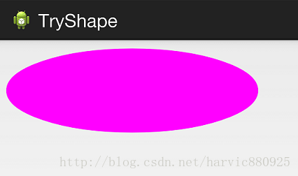
2、oval(椭圆)
控件代码不变,下面是shape代码:
-
<?xml version="1.0" encoding="utf-8"?>
-
<shape xmlns:android="http://schemas.android.com/apk/res/android"
-
android:shape=
"oval">
-
<solid android:color="#ff00ff"/>
-
</shape>
3、line(线形)
没觉得这个能有什么用……,也不讲了,没什么意思
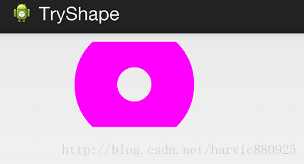
4、ring(环形)
还记得他所特有的几个属性么:
这么几个属性无外乎就是定义环形的内环尺寸和环的宽度。
举个例子:
控件定义:
-
<LinearLayout xmlns:android="http://schemas.android.com/apk/res/android"
-
android:layout_width=
"match_parent"
-
android:layout_height=
"match_parent"
-
android:orientation=
"horizontal" >
-
<TextView
-
android:layout_width=
"300dp"
-
android:layout_height=
"100dp"
-
android:layout_margin=
"10dp"
-
android:textColor=
"#ffffff"
-
android:textSize=
"18sp"
-
android:textStyle=
"bold"
-
android:background=
"@drawable/try_shape_2"/>
-
</LinearLayout>
-
<?xml version="1.0" encoding="utf-8"?>
-
<shape xmlns:android="http://schemas.android.com/apk/res/android"
-
android:shape=
"ring"
-
android:innerRadius=
"20dp"
-
android:thickness=
"50dp"
-
android:useLevel=
"false">
-
-
<solid android:color="#ff00ff"/>
-
-
</shape>
好啦,这部分就到这了,有关Shape的使用最多的还是第二部分,即当shape为矩形时,结合那几个子标签共同使用时,对于其它的三个Shape平时用到的可能性不大,我这里讲的也不太细致,下面给大家第一部分的源码,直接运行,就能出来一个Shape效果。
参考文章:
2、《Android中shape的使用》(与第一个标题一样而已)
如果本文有帮到你,记得加关注哦
源码地址:http://download.csdn.net/detail/harvic880925/8249629
请大家尊重原创者版权,转载请标时出处:http://blog.csdn.net/harvic880925/article/details/41850723 谢谢。
前言:最近也是忙的够呛,但要总结还是要总结出来,不然过段时间就不想写博客了,坚持每月至少出四篇博客的节奏,无论多忙,坚持。任何一个成功人物的背后总是透露着辛酸与不易。
今天看到一篇文章《世界是公平的:你富不过马云,比惨你也未必比的过》,分享给大家,我一直想看到真实的马云过往,而不是被华丽外衣包裹着的外星人,当我开始知道这个人时,当时第一个想法就是他肯定吃过别人不曾吃过的苦,正是由于这些才最终造就现在的神话,无耐,全网铺天盖地都是宣扬与赞美,并没有写出他的创业史,即使有,也只是寥寥几句,直到我看到这篇文章,才让我真正了解马云,才更佩服他,他不是神,他只是一个普通人,他有的,只是别人所有没有毅力与坚持,马总,总是喜欢说坚持,我想,这也是他在最落魄的时候经常对自己说的话吧,坚持。
废话说了一堆,今天跟大家聊聊shape标签的用法,有时,我们为了APP中节省空间,在能用颜色替代的地方就不要用图片,而如何将颜色组织成想要的形状及如何为指定的颜色添加描边、渐变等来模拟图片就显的极为重要了,这些就是靠shape来完成的。
一、简单使用
刚开始,就先不讲一堆标签的意义及用法,先简单看看shape标签怎么用。
1、新建shape文件
首先在res/drawable文件夹下,新建一个文件,命名为:shape_radius.xml
内容是这样的:(先不需要理解,先看shape怎么用)
-
<?xml version="1.0" encoding="utf-8"?>
-
<shape xmlns:android="http://schemas.android.com/apk/res/android" >
-
<corners android:radius="20dip"/>
-
<solid android:color="#ff00ff"/>
-
-
</shape>
2、添加到控件中
在定义好shape文件后,下一步就是将其添加到控件中,添加到控件中,一般是使用设置background属性,将其为控件背景,下面,我们将其设置为MainActivity对应的布局中(activity_main.xml),将其设为TextView的背景,看显示出来 是什么样子的。
-
<RelativeLayout xmlns:android="http://schemas.android.com/apk/res/android"
-
xmlns:tools=
"http://schemas.android.com/tools"
-
android:layout_width=
"match_parent"
-
android:layout_height=
"match_parent"
-
tools:context=
"com.harvic.tryshape.MainActivity" >
-
-
<TextView
-
android:layout_width=
"wrap_content"
-
android:layout_height=
"wrap_content"
-
android:layout_margin=
"50dip"
-
android:text=
"@string/hello_world"
-
android:background=
"@drawable/shape_radius"/>
-
-
</RelativeLayout>
二、基本属性(corners、gradient、padding、size、solid、stroke)
上面给大家简单的讲了下shape标签组的简单使用方法,下面就具体讲讲shape标签里所具有的几个子标签及所具有的属性。
1、Corners
-
<corners //定义圆角
-
android:radius=
"dimension" //全部的圆角半径
-
android:topLeftRadius=
"dimension" //左上角的圆角半径
-
android:topRightRadius=
"dimension" //右上角的圆角半径
-
android:bottomLeftRadius=
"dimension" //左下角的圆角半径
-
android:bottomRightRadius=
"dimension" /> //右下角的圆角半径
android:radius:定义四个角的的圆角半径。
其它四个是逐个字义每个角的圆角半径。
使用:
控件布局:
-
<RelativeLayout xmlns:android="http://schemas.android.com/apk/res/android"
-
android:layout_width=
"match_parent"
-
android:layout_height=
"match_parent" >
-
-
<TextView
-
android:layout_width=
"100dp"
-
android:layout_height=
"100dp"
-
android:layout_margin=
"50dip"
-
android:text=
"@string/hello_world"
-
android:background=
"@drawable/shape_radius"/>
-
</RelativeLayout>
-
<?xml version="1.0" encoding="utf-8"?>
-
<shape xmlns:android="http://schemas.android.com/apk/res/android" >
-
<corners android:radius="20dip"/>
-
<solid android:color="#ffff00"/>
-
</shape>
2、solid
solid用以指定内部填充色
只有一个属性:
<solid android:color="color" />
-
<?xml version="1.0" encoding="utf-8"?>
-
<shape xmlns:android="http://schemas.android.com/apk/res/android" >
-
<solid android:color="#ffff00"/>
-
</shape>
3、gradient
gradient用以定义渐变色,可以定义两色渐变和三色渐变,及渐变样式,它的属性有下面几个:
-
<gradient
-
android:type=
["
linear" | "
radial" | "
sweep"] //共有
3中渐变类型,线性渐变(默认)/放射渐变/扫描式渐变
-
android:angle=
"integer" //渐变角度,必须为
45的倍数,
0为从左到右,
90为从上到下
-
android:centerX=
"float" //渐变中心
X的相当位置,范围为
0~
1
-
android:centerY=
"float" //渐变中心
Y的相当位置,范围为
0~
1
-
android:startColor=
"color" //渐变开始点的颜色
-
android:centerColor=
"color" //渐变中间点的颜色,在开始与结束点之间
-
android:endColor=
"color" //渐变结束点的颜色
-
android:gradientRadius=
"float" //渐变的半径,只有当渐变类型为
radial时才能使用
-
android:useLevel=
["
true" | "
false"] /> //使用LevelListDrawable时就要设置为true。设为false时才有渐变效果
首先有三种渐变类型,分别是:linear(线性渐变)、radial(放射性渐变)、sweep(扫描式渐变)
(1)先看看这几个属性的使用方法:
下面我们使用三色渐变来看看这三种渐变方式都是怎么显示的:(如果不使用centerColor属性就是双色渐变,这个属性是可选的)
需要注意的一点是,在构造放射性渐变时,要加上android:gradientRadius属性(渐变半径),即必须指定渐变半径的大小才会起作用,下面列出这三个渐变方式的shape代码,供大家参考:
线性渐变:
-
<?xml version="1.0" encoding="utf-8"?>
-
<shape xmlns:android="http://schemas.android.com/apk/res/android" >
-
<gradient
-
android:type=
"linear"
-
android:startColor=
"#ff0000"
-
android:centerColor=
"#00ff00"
-
android:endColor=
"#0000ff"/>
-
</shape>
-
<?xml version="1.0" encoding="utf-8"?>
-
<shape xmlns:android="http://schemas.android.com/apk/res/android" >
-
<gradient
-
android:type=
"radial"
-
android:startColor=
"#ff0000"
-
android:centerColor=
"#00ff00"
-
android:endColor=
"#0000ff"
-
android:gradientRadius=
"100"/>
-
</shape>
-
<?xml version="1.0" encoding="utf-8"?>
-
<shape xmlns:android="http://schemas.android.com/apk/res/android" >
-
<gradient
-
android:type=
"sweep"
-
android:startColor=
"#ff0000"
-
android:centerColor=
"#00ff00"
-
android:endColor=
"#0000ff"/>
-
</shape>
(2)、android:angle属性(仅对线性渐变有效)
android:angle="integer" //渐变角度,必须为45的倍数,0为从左到右,90为从上到下
我们在上面的三种渐变上都加上angle属性,看看效果如何:
能过跟上一个图对比可以发现,angle属性确实只对线性渐变有效,其它两种渐变方式都没有任何动静,下面是此时的线性渐变shape代码:
-
<?xml version="1.0" encoding="utf-8"?>
-
<shape xmlns:android="http://schemas.android.com/apk/res/android" >
-
<gradient
-
android:type=
"linear"
-
android:startColor=
"#ff0000"
-
android:centerColor=
"#00ff00"
-
android:endColor=
"#0000ff"
-
android:angle=
"45"/>
-
</shape>
(3)、android:centerX与android:centerY
centerX、centerY两个属性用于设置渐变的中心点位置,仅当渐变类型为放射渐变时有效,类型为分数或小数,不接受Dimension。默认值是0.5,有效值是0.0~1.0,超出该范围后会看不出渐变效果。centerX、centerY的取值其实是宽和高的百分比;不难理解,下面看代码:
-
<?xml version="1.0" encoding="utf-8"?>
-
<shape xmlns:android="http://schemas.android.com/apk/res/android" >
-
<gradient
-
android:type=
"sweep"
-
android:startColor=
"#ff0000"
-
android:centerColor=
"#00ff00"
-
android:endColor=
"#0000ff"
-
android:centerX=
"0.2"
-
android:centerY=
"0.8"/>
-
</shape>
(4)android:useLevel
useLevel属性通常不使用。该属性用于指定是否将该shape当成一个LevelListDrawable来使用,默认值为false。
4、stroke
这是描边属性,可以定义描边的宽度,颜色,虚实线等
-
<stroke
-
android:width="dimension" //描边的宽度
-
android:color="color" //描边的颜色
-
// 以下两个属性设置虚线
-
android:dashWidth="dimension" //虚线的宽度,值为0时是实线
-
android:dashGap="dimension" /> //虚线的间隔
上面各个属性的意义如下:
我们使用绿色虚线描边,虚线高度是20dp,虚线宽度为10dp虚线间距为1dp:
-
<?xml version="1.0" encoding="utf-8"?>
-
<shape xmlns:android="http://schemas.android.com/apk/res/android" >
-
<stroke
-
android:width=
"20dp"
-
android:color=
"#00ff00"
-
android:dashWidth=
"10dp"
-
android:dashGap=
"1dp" />
-
</shape>
5、size和padding
这两个基本上不怎么用,因为他们所具有的功能,控件本身也能实现。
size:是用来定义图形的大小的。
-
<size
-
android:width=
"dimension"
-
android:height=
"dimension" />
-
<padding
-
android:left=
"dimension"
-
android:top=
"dimension"
-
android:right=
"dimension"
-
android:bottom=
"dimension" />
三、Shape的属性(rectangle、oval、line、ring)
上面我们讲了Shape的子标签的的作用,但Shape本身还没讲,Shape自已是可以定义当前Shape的形状的,比如上面的矩形,还有椭圆形,线形和环形;这些都是通过Shape标签的 shape属性来定义的,Shape标签总共有下面几个属性,我们一个个讲:
可见,只有第一个shape是可用的,其它五个都是shape等于ring时所特有的。
注意,无论这里shape取什么形状,他的子标签都是可用的,但有时并不会有效果,比如在shape为椭圆时,那corners标签就不会有效果,很显然的道理。下面一个个看看各个形状都是怎么样的;
1、rectangle (矩形)
这就是上一节我们使用的形状,当我们不指定shape属性时,默认就是矩形的。
控件代码:
-
<LinearLayout xmlns:android="http://schemas.android.com/apk/res/android"
-
android:layout_width=
"match_parent"
-
android:layout_height=
"match_parent"
-
android:orientation=
"horizontal" >
-
<TextView
-
android:layout_width=
"300dp"
-
android:layout_height=
"100dp"
-
android:layout_margin=
"10dp"
-
android:textColor=
"#ffffff"
-
android:textSize=
"18sp"
-
android:textStyle=
"bold"
-
android:background=
"@drawable/try_shape_3"/>
-
</LinearLayout>
shape代码:
-
<?xml version="1.0" encoding="utf-8"?>
-
<shape xmlns:android="http://schemas.android.com/apk/res/android"
-
android:shape=
"rectangle">
-
<solid android:color="#ff00ff"/>
-
</shape>
2、oval(椭圆)
控件代码不变,下面是shape代码:
-
<?xml version="1.0" encoding="utf-8"?>
-
<shape xmlns:android="http://schemas.android.com/apk/res/android"
-
android:shape=
"oval">
-
<solid android:color="#ff00ff"/>
-
</shape>
3、line(线形)
没觉得这个能有什么用……,也不讲了,没什么意思
4、ring(环形)
还记得他所特有的几个属性么:
这么几个属性无外乎就是定义环形的内环尺寸和环的宽度。
举个例子:
控件定义:
-
<LinearLayout xmlns:android="http://schemas.android.com/apk/res/android"
-
android:layout_width=
"match_parent"
-
android:layout_height=
"match_parent"
-
android:orientation=
"horizontal" >
-
<TextView
-
android:layout_width=
"300dp"
-
android:layout_height=
"100dp"
-
android:layout_margin=
"10dp"
-
android:textColor=
"#ffffff"
-
android:textSize=
"18sp"
-
android:textStyle=
"bold"
-
android:background=
"@drawable/try_shape_2"/>
-
</LinearLayout>
-
<?xml version="1.0" encoding="utf-8"?>
-
<shape xmlns:android="http://schemas.android.com/apk/res/android"
-
android:shape=
"ring"
-
android:innerRadius=
"20dp"
-
android:thickness=
"50dp"
-
android:useLevel=
"false">
-
-
<solid android:color="#ff00ff"/>
-
-
</shape>
好啦,这部分就到这了,有关Shape的使用最多的还是第二部分,即当shape为矩形时,结合那几个子标签共同使用时,对于其它的三个Shape平时用到的可能性不大,我这里讲的也不太细致,下面给大家第一部分的源码,直接运行,就能出来一个Shape效果。
参考文章:
2、《Android中shape的使用》(与第一个标题一样而已)
如果本文有帮到你,记得加关注哦
源码地址:http://download.csdn.net/detail/harvic880925/8249629
请大家尊重原创者版权,转载请标时出处:http://blog.csdn.net/harvic880925/article/details/41850723 谢谢。