前言
开发中经常遇到顶部导航栏的需求,5.0 之后Google为了统一设计风格,默认了ToolBar这个控件作为统一顶部栏,并且还支持了不少的动画和各种设置,但是!有关ToolBar 的theme,Menu,click有不少的坑,今天来系统的学习一下。
内容
基于需求来学习。顶部栏通常作用主要是显示标题,回退按钮,多一点的会有副标题,搜索按钮
基础使用
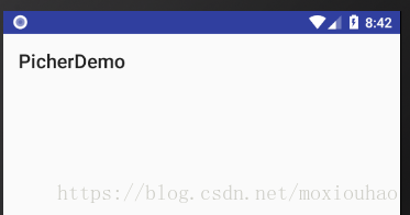
先来看下初始的状态
我们来添加背景和一些文本试试
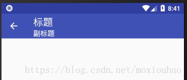
显示标题
修改ToolBar标题颜色、字号
1 在xml里面控制
 <android.support.v7.widget.Toolbar
        android:id="@+id/m_tool_bar"
        android:layout_width="match_parent"
        android:layout_height="?attr/actionBarSize"
        android:background="@color/colorPrimary"
        app:subtitle="副标题"
        app:title="标题"
        android:theme="@style/tool_bar_style"
        app:subtitleTextColor="@android:color/white"  //修改副标题颜色
        app:navigationIcon="@drawable/ic_arrow_back_black_24dp"
        app:titleTextAppearance="?android:textAppearanceLarge"  //修改标题文字样式
        app:titleTextColor="@android:color/white" />   //修改标题颜色
2 通过Theme设置
 <android.support.v7.widget.Toolbar
        android:id="@+id/m_tool_bar"
        android:layout_width="match_parent"
        android:layout_height="?attr/actionBarSize"
        android:background="@color/colorPrimary"
        app:subtitle="副标题"
        app:title="标题"
        android:theme="@style/tool_bar_style"/>
<style name="tool_bar_style" parent="@style/ThemeOverlay.AppCompat.ActionBar">
<item name="titleTextColor">#0094ff</item><!--标题颜色-->
<item name="actionMenuTextColor">#000000</item><!--菜单颜色-->
<item name="android:textSize">18sp</item><!--菜单字体大小-->
</style>如果都设置了还是以XML中设置的为主,因为style初始化的在设置熟悉之前。
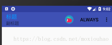
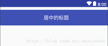
Toolbar标题居中
这个不能用属性了,只能自己写布局,注意ToorBar也是一个ViewGroup!
ToolBar 可以用在任意地方,如图两个Toolbar
 <android.support.v7.widget.Toolbar
            android:layout_marginTop="10dp"
            app:title="第二个!"
            android:theme="@style/tool_bar_style"
            android:background="@color/cardview_dark_background"
            android:layout_width="match_parent"
            android:layout_height="?attr/actionBarSize">

            <RelativeLayout
                android:layout_width="match_parent"
                android:layout_height="match_parent">
                <TextView
                    android:textColor="@android:color/white"
                    android:layout_centerInParent="true"
                    android:text="居中的标题"
                    android:layout_width="wrap_content"
                    android:layout_height="wrap_content" />
            </RelativeLayout>
        </android.support.v7.widget.Toolbar>
可以看到你再ToolBar 设置的app:title 无效了,你可以理解为被遮盖住了。
回退、搜索、菜单点击
生成菜单
/*
* @return You must return true for the menu to be displayed;
* if you return false it will not be shown.
*/
@Override
public boolean onCreateOptionsMenu(Menu menu) {
getMenuInflater().inflate(R.menu.toor_bar_demo, menu);
return true;
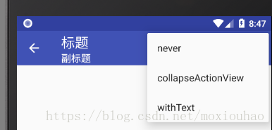
}注意ShowAsAction的几个属性,并且有图标会优先显示图标
<!--
    showAsAction有这几大属性(app命名空间与android命名空间显示有些不同

    ifRoom    会显示在Item中,但是如果已经有4个或者4个以上的Item时会隐藏在溢出列表中。当然个数并不仅仅局限于4个,依据屏幕的宽窄而定
    never    永远不会显示。只会在溢出列表中显示,而且只显示标题,所以在定义item的时候,最好把标题都带上。
    always    无论是否溢出,总会显示。
    withText    withText值示意Action bar要显示文本标题。Action bar会尽可能的显示这个标题,但是,如果图标有效并且受到Action bar空间的限制,文本标题有可能显示不全。
    collapseActionView      声明了这个操作视窗应该被折叠到一个按钮中,当用户选择这个按钮时,这个操作视窗展开。否则,这个操作视窗在默认的情况下是可见的,并且即便在用于不适用的时候,也要占据操作栏的有效空间。
    -->
自定义布局
能自定义的东西灵活度就很高,上面讲过了其实就是在ToolBar里面在嵌一个布局,因为ToolBar就是一个ViewGroup。
总结
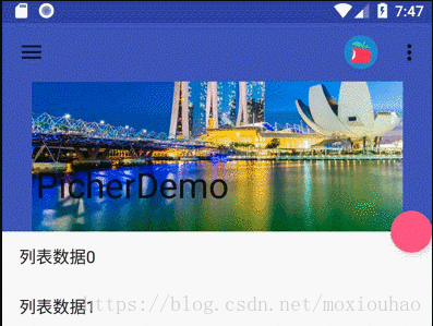
用一个例子来总结下,结合下侧滑菜单,CoordinatorLayout,先看效果。
侧滑用的是DrawerLayout、NavigationView
主布局视察效果用的CoordinatorLayout、CollapsingToolbarLayout
toast 用的SnackBar