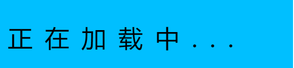
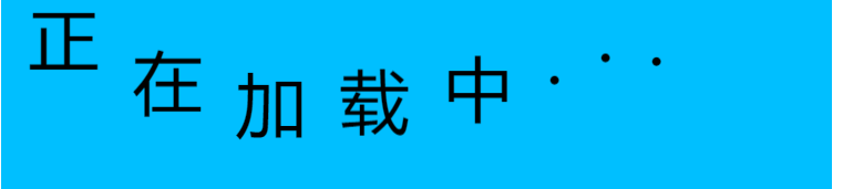
给大家分享一个小案例,让静态的一行字与一个球变为动态跳动
第一个文字动画
<title></title>
		<style>
			.box{
				width: 600px;
				height: 150px;
				margin: auto;
				margin-top: 300px;
				background-color: deepskyblue;
			}
			.box p{
				display: inline-block;
				font-size: 50px;
				text-align: center;
				margin-left: 20px;
				animation: dong 2s infinite; /*设置动画效果,dong与后面的动画设置相连接 完整运动时间为两秒,一直循环*/
			}
			/*选择第二个p标签*/
			.box p:nth-of-type(2){
				animation-delay: 0.5s;
			}
			.box p:nth-of-type(3){
				animation-delay: 0.75s;
			}
			.box p:nth-of-type(4){
				animation-delay: 1s;
			}.box p:nth-of-type(5){
				animation-delay: 1.25s;
			}
			.box p:nth-of-type(6){
				animation-delay: 1.5s;
			}
			.box p:nth-of-type(7){
				animation-delay: 1.75s;
			}
			.box p:nth-of-type(8){
				animation-delay: 2s;
			}
			/*动画设置*/
			@keyframes dong{
				0%{}
				50%{transform: translateY(-50px)}
				100%{}
			}
		</style>
	</head>
	<body>
		<div>
			<div class="box">
				<p>正</p>
				<p>在</p>
				<p>加</p>
				<p>载</p>
				<p>中</p>
				<p>.</p>
				<p>.</p>
				<p>.</p>
			</div>
		</div>
	</body>
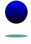
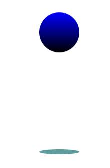
第二个小球跳动动画
<title></title>
		<style>
			.div{
				margin: 0 auto;
				width: 800px;
				height: 700px;
				margin-top: 100px;
			}
			.box1{
				width: 80px;
				height: 80px;
				border-radius: 50%;
				background-image: linear-gradient(blue,black);/*给小球添加一个颜色渐变*/
				margin-top: 500px;
				margin-left: 400px;
				animation:dong 2s infinite;
			}
			.box2{
				width: 80px;
				height: 10px;
				border-radius: 50%;
				background-color: cadetblue;
				margin-left: 400px;
			}
			@keyframes dong{
				0%{}
				50%{ transform: translateY(-300px);}
				100%{}
			}
		</style>
	</head>
	<body>
		<div class="div">
			<div class="box1"></div>
			<div class="box2"></div>
		</div>
	</body>