CSS3 弹性盒模型、盒模型、怪异盒模型
1、弹性盒模型
父级设置的属性有,
display:flex; ------这个代表你把这部分内容设为了一个弹性盒模型
flex-direction: row; ------这个是父级默认的属性,默认就是横向排列,水平几等分时就用这个
flex-direction: column; -----这个就是垂直分了
justify-content: center; ------这个表示设置了子级的div水平居中, 默认 flex-start 还有 flex-end
align-items: center; ------这个表示你让子级的div垂直方向居中, 默认 flex-start 还有 flex-end
flex-wrap: wrap; -----当子级的div总宽度超过屏幕时,默认会挤在一起 nowrap不换行 ,但是设为wrap后,它就会自动的掉下来
子级设置的属性有,
flex-grow: 1;-----这个表示你这个div占几份,随便设,都设一样的就变成等分了
order: -1; -----这个表示你这个div排列的位置,是在前面还是在中间还是在后面,默认值是0 越小的话越靠前
1)水平方向平均分四等分
在父级设 display: flex;
在子级设flex-grow: 1;
<div class="container">
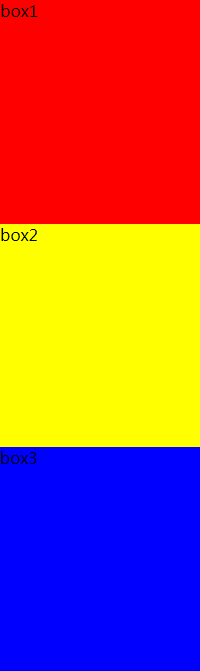
<div class="box1">box1</div>
<div class="box2">box2</div>
<div class="box3">box3</div>
<div class="box4">box4</div>
</div>
    .container {
         display: flex;
         flex-direction: row;    /*默认就是 row 水平 不写就是这个*/
     }
     .container div {
         flex-grow: 1;
        }

2)垂直方向等分
    .container {
         display: flex;
         flex-direction: column; /*垂直分*/
     }
     .container div {
         flex-grow: 1;
        }
3)垂直、水平居中
	.container {
        display: flex;
        flex-direction: row;
        justify-content: center; /*水平居中  默认 flex-start  还有 flex-end*/
        align-items: center; /*垂直居中 默认 flex-start  还有 flex-end*/
        }
     .container div {
            width: 20%;
        }

4)调换位置,越小越靠前
     .container {
         display: flex;
         flex-direction: row;
         justify-content: center;
         align-items: center;
     }
       .container .box2 {
            order: -1;  /*默认值是0  越小越靠前*/
        }

5)宽度超出屏幕后,换行(默认是不换行的)
     .container {
         display: flex;
         flex-direction: row;
         justify-content: center;
         align-items: center;
         flex-wrap: wrap;  /*默认是 nowrap不换行  */
     }

2、盒模型
每一个div都是一个盒子,它有
外边距,margin
边框,border
内边距,padding
内容,content
四部分组成。
标准盒模型设置宽高时,指的就是内容区的宽高,这时候再设置外边距啊、边框啊、内边距啊,会把整个div撑开,看起来就很大。
#box{
	width:200px;
	height:200px;
}

3、怪异盒模型
在div上设置 box-sizing: border-box;
怪异盒模型的宽高时整个
marging+border+padding+content
所以,当你设置边框或者内边距外边距时,会把内容区域的宽高变小(挤的了)
        #box {
            width: 200px;
            height: 200px;
            background-color: #dddddd;
            box-sizing: border-box;
            border: 10px solid red;
        }
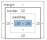
内容只剩180px,被边框挤的了。