前端按钮的效果显示
下边这个是鼠标经过按钮时背景缓慢变换的效果
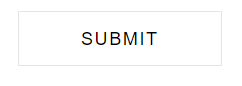
原始效果:
中间变换的效果在这里就不给大家展示了啊,自己尝试尝试就好哇~
完成的效果:

话不多说了,直接来代码:
<!doctype html>
<html>
<head>
	<meta charset="utf-8">
	<title>按钮渐变</title>
	<style>
		 input,*:before, *:after {
		  -webkit-transition: all 1s ease 0s;
		  -ms-transition: all 1s ease 0s;
		  transition: all 1s ease 0s;
		} /*变换的时间*/

		.input-box {
		  width: 100%;
		  padding: 0 10px;
		  margin-bottom: 20px;
		  float: left;
		  display: block;
		}

		.input-box input[type="submit"] {
		    display: block;
		    border: 1px solid rgba(74, 74, 74, 0.15);
		    color: #000;  /*按钮上文字的颜色*/
		    background-color: transparent;
		    height: 40px;
		    line-height: 24px;
		    font-weight: 500;
		    letter-spacing: 1px;
		    padding: 7px 45px;
		    text-transform: uppercase;
		}

		.input-box input[type="submit"]:hover {
		     background-color: #71b100;
		     border-color: #71b100;
		     color: #fff;
		}

		.submit-box {
		  width: auto;
		  margin-bottom: 0;
		}

		.input-box {
		  width: 50%;
		}

		@media only screen and (max-width: 479px) {
		 .input-box {
		     width: 100%;
		 }
		}
	</style>
</head>
<body>
 <div class="input-box submit-box"><input type="submit" value="submit"></div>
</body>
</html>