版权声明:毒牙工作室 https://blog.csdn.net/qq_35023116/article/details/81384200
毒牙的代码世界: css总结
1、阴影位置放置
box-shadow: rgba(250, 140, 22, 0.117647)0px 6px 12px;
2、比较有好的表头样式

CSS:
.dy-header {
    padding: 0;
	width: 100%;
	background: #f2f2f2;
}

.dy-header-ctn {
	display: flex;
	padding-left: 10px;
	justify-content: space-between;
	align-items:center;
	height: 50px;
	border-left: 5px solid #1abc9c;
}

.dy-header-title {
	font-size: 16px;
}

HTML:
<div class="dy-header">
	<div class="dy-header-ctn">
	     <span class="dy-header-title">商户列表</span>
	</div>
</div>
3、(vue + element-ui)查看放大图片
HTML:
<div class="content-main">
    <div>
        {主题内容显示区域}
        etc: <button>查看图片</button>
    </div>
    <div v-if="imageShow" class="imgShowArea">
      <i class="el-icon-close closeBtn"></i>
      <div class="in-area">
        <img :src="showImage" />
      </div>
</div>
</div>

CSS:
.content-main {
  position: relative;
  width: 100%;
  height: 100%;
  .imgShowArea {
    position: absolute;
    top: 0;
    left: 0;
    width: 100%;
    height: 100%;
    background: rgba(0, 0, 0, 0.3);
    z-index: 10000;
    .closeBtn {
      float: right;
      padding: 10px;
      font-size: 20px;
      color: #fff;
      cursor: pointer;
    }
    .in-area {
      display: flex;
      width: 100%;
      height: 100%;
      justify-content: center;
      align-items: center;
      img {
        -webkit-animation-name: fadeIn;
        -webkit-animation-duration: 0.5s;
        -webkit-animation-iteration-count: 1;
        -webkit-animation-delay: 0s;
      }
      @media screen and (min-width: 801px) {
        img {
          width: 60%;
          height: 70%;
        }
      }
      @media screen and (max-width: 800px) {
        img {
          width: 50%;
          height: 20%;
        }
      }
    }
  }
}
界面样式显示:

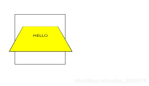
4、perspective css3
perspective 属性定义 3D 元素距视图的距离,以像素计。
perspective: number|none;<!DOCTYPE html>
<html>
<head>
<style>
#div1
{
position: relative;
height: 150px;
width: 150px;
margin: 50px;
padding:10px;
border: 1px solid black;
perspective:150;
-webkit-perspective:150; /* Safari and Chrome */
}
#div2
{
padding:50px;
position: absolute;
border: 1px solid black;
background-color: yellow;
transform: rotateX(45deg);
-webkit-transform: rotateX(45deg); /* Safari and Chrome */
}
</style>
</head>
<body>
<div id="div1">
<div id="div2">HELLO</div>
</div>
</body>
</html>
页面展示: