实现图片上面覆盖半透明纯色图像
有时候,我们为了装饰图像,需要在图像上放置一个透明的纯色图像,有可能还不止一个,这时候我们可以通过绝对定位来实现,效果如下
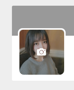
首先看一下html的结构
<div class="content-head-img">
  <img src="./1.jpg" alt="图片" /> // 被装饰的图片
  <div class="img-flow"></div> //透明纯色图像
  <div class="img-text">
      <svg></svg>  // 图片的小相机
  </div>
</div>
css 如下
.content-head-img {
  position: relative;
  width: 150px;
  height: 150px;
  border-radius: 15px;
  border: 5px solid #fff;
  margin-left: 20px;
  margin-top: -25px;
  z-index: 100;
}

.img-flow {
  position: absolute;
  top: 0px;
  left: 0px;
  width: 150px;
  height: 150px;
  background: #444;
  border-radius: 15px;
  /* 透明度 */
  opacity: 0.4;
}

/* 当鼠标放上时透明度减小 */
.img-flow:hover {
  opacity: 0.6;
}

.img-text {
  position: absolute;
  left: 56px;
  top: 56px;
  z-index: 1000;
  opacity: 1;
  color: #fff;
}
上面具体的svg图像如下
<svg class="Zi Zi--Camera UserAvatarEditor-cameraIcon" fill="currentColor" viewBox="0 0 24 24" width="36" height="36"><path d="M20.094 6S22 6 22 8v10.017S22 20 19 20H4.036S2 20 2 18V7.967S2 6 4 6h3s1-2 2-2h6c1 0 2 2 2 2h3.094zM12 16a3.5 3.5 0 1 1 0-7 3.5 3.5 0 0 1 0 7zm0 1.5a5 5 0 1 0-.001-10.001A5 5 0 0 0 12 17.5zm7.5-8a1 1 0 1 0 0-2 1 1 0 0 0 0 2z" fill-rule="evenodd"></path></svg>