


.square{
position: relative;
width: 100%;
height: 0;
padding-bottom: 100%; /* padding百分比是相对 "父元素宽度" 计算的 */
margin-bottom: 30px;
}
.square-inner{
position: absolute;
top: 0;
left: 0;
width: 100%;
height: 100%;
}
.square-inner li{
width: calc(98% / 3);
height: calc(98% / 3);
margin-right: 1%;
margin-bottom: 1%;
overflow: hidden;
}
.flex{
display: flex;
flex-wrap: wrap; /*规定flex容器是单行或者多行*/
}
.flex li{
flex-grow: 1;
background-color: #4d839c;
text-align: center;
color: #fff;
font-size: 50px;
line-height: 2;
}
.flex li:nth-of-type(3n){
margin-right: 0;
}
.flex li:nth-of-type(n+7){
margin-bottom: 0;
}
----------------------------------------------------------------------------------
flex相关

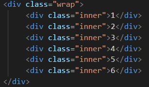
html结构同上例
.wrap{
width: 98%;
margin: 0 1%;
padding-bottom: 100%;
position: relative;
}
.main{
display: flex;
flex-direction: row;
flex-wrap: wrap; /*伸缩行换行*/
width: 100%;
height: 100%;
position: absolute;
left: 0;
top: 0;
}
.inner{
/* flex-grow: 1; */
width: calc( 99% / 2);
height: calc( 99% / 2);
font-size: .5rem;
color: #fff;
text-align: center;
background:#4d839c;
margin-bottom: 1%;
display: flex; /*写在父级*/
align-items: center; /*写在父级 让子级(数字)垂直居中*/
justify-content: center; /*写在父级 让子级(数字)左右居中*/
}
.inner:nth-of-type(2n-1){
margin-right: 1%;
}
.inner:nth-of-type(n + 5){
margin-bottom: 0;
}
-------------------------------------------------------------------------------------------------------------------------
Flex 中 align-content: center;

.wrap{
display: flex;
flex-direction: row; /*设在父级容器 伸缩方向*/
flex-wrap: wrap; /*设在父级容器 是否换行*/
align-content: center; /*设在父级容器 会设置自由盒内部各个项目在垂直方向排列方式 配合上面两属性一起用*/ /*不能在定位里用*/
width: 100%;
height: 200px;
background-color: gray;
}
.wrap .inner{
width: calc(99% / 2);
/* flex-grow: 1; */
height: 30px;
background: #4d839c;
margin-bottom: 1%;
text-align: center; /*居中失效*/
color: #fff;
display: flex; /*为数字左右居中和垂直居中设置*/
align-items: center; /*数字垂直居中*/
justify-content: center; /*数字左右居中生效*/
}
.wrap .inner:nth-of-type(2n-1){
margin-right: 1%;
}
相关原文: