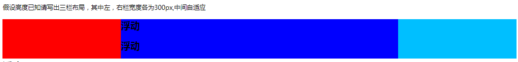
(1)浮动 :
缺点 :浮动是脱离文档流的,有些时候需要清除浮动,需要很好的处理浮动周边元素的关系
优点 :兼容性比较好
浮动一定要有高。但是可以用BFC解决。
 #main .left{
		     width: 300px;
		     float: left;
		     height: 100px;
		     background: red;

		    }
		   #main .right{
		     height: 100px;
		     width: 300px;
		     float:right;
		     background: #00BFFF;
		    }
		   #main .center{
		    height: 100px;
		    background: #0000FF;
		    }
 <div>假设高度已知请写出三栏布局,其中左,右栏宽度各为300px,中间自适应</div>
<div id="main">
<div class="left"></div>
<div class="right"></div>
<div class="center">
	 <h2>浮动</h2>
	 <h2>浮动</h2>
	 <h2>浮动</h2>
	 <h2>浮动</h2>
	 <h2>浮动</h2>
	 <h2>浮动</h2>
</div>
</div>
缺点:因为浮动的原理就是左边有遮挡物,就会避开遮挡物显示文案,当发现左边没有遮挡物的时候,就会紧贴原始的边显示文案,于是就会溢出。
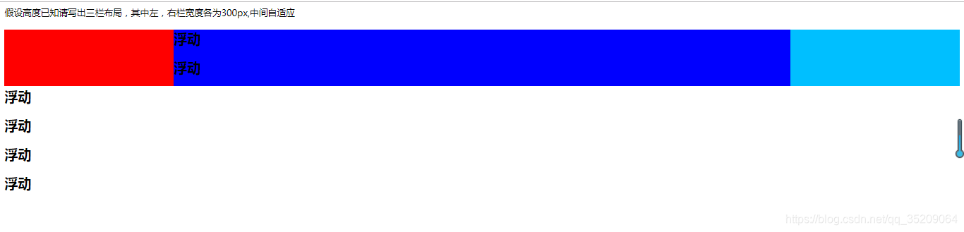
要解决这个问题用BFC。
 #main .center{
		    background: #0000FF;
		    overflow: hidden;
		    }
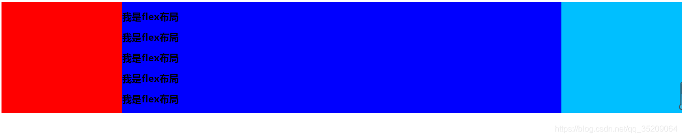
(2)flex :
缺点 :兼容性比较差(css3的属性),不兼容IE8及以下
优点 :非常有效的解决了浮动和绝对定位的问题
.left_center_right {
					display: flex;
				}
				.left_center_right .left{
					width: 300px;
					background: red;
				}
				.left_center_right .center{
					flex: 1;
					// 让所有弹性盒模型对象的子元素都有相同的长度,忽略它们内部的内容
                 background: #0000FF;
				}
				.left_center_right .right{
					width: 300px;
					background: #00BFFF;
				}
<div class="left_center_right">
				<div class="left"></div>
				<div class="center">
					<h2>我是flex布局</h2>
					<h2>我是flex布局</h2>
					<h2>我是flex布局</h2>
					<h2>我是flex布局</h2>
					<h2>我是flex布局</h2>
				</div>
				<div class="right"></div>
</div>
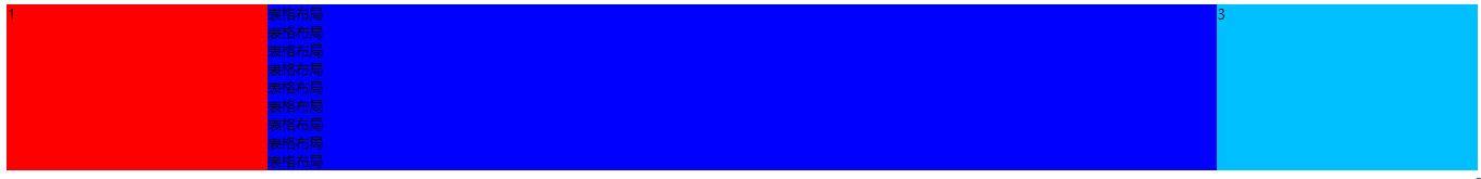
(3)表格布局
nice高度会自动撑开
缺点 :操作繁琐,当三栏中其中某一栏高度超出时,其他两栏的高度也会自动跟着调整(不符合某些场景)
优点 :兼容性非常好,补缺了flex布局兼容的问题
<div class="layout table">
		 	<style type="text/css">
		 	.layout.table .tables{
		 			display: table;
		 			width: 100%;
		 			height: 100px;
		 		}
		 		.layout.table .tables>div{
		 			display:table-cell;
		 		}
		 		.layout.table .tables .left{
		 			height: 100px;
		 			width: 300px;
		 			background: red;
		 		}
		 	.layout.table .tables .center{
		 			height: 100px;
		 			background: #0000FF;
		 		}
		 	.layout.table .tables .right{
		 			height: 100px;
		 			width: 300px;
		 			background: #00BFFF;
		 		}
		 	</style>
		 	<div class="tables">
		 		<div class="left">1</div>
		 		<div class="center">
		 			<div>表格布局</div>
		 			<div>表格布局</div>
		 			<div>表格布局</div>
		 			<div>表格布局</div>
		 			<div>表格布局</div>
		 			<div>表格布局</div>
		 			<div>表格布局</div>
		 			<div>表格布局</div>
		 			<div>表格布局</div>

		 		</div>
		 		<div class="right">3</div>
		 	</div>
		 </div>
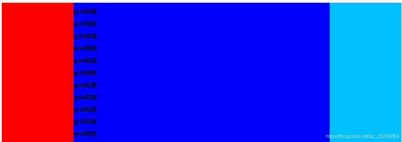
(4)layout grid
/grid-template-rows:100px;/ //宽度没有定死
宽度不能定死
<div class="layout grid">
		 	<style>
		 		.layout.grid .box{
		 			display: grid;
		 			width:100%;
		 			/*grid-template-rows:100px;*/  //宽度没有定死
		 			grid-template-columns:300px auto 300px;
		 		}
		 		.layout.grid .left{
		 			background: red;
		 		}
		 		.layout.grid .center{
		 			background: #0000FF;
		 		}
		 		.layout.grid .right{
		 			background: #00BFFF;
		 		}
		 	</style>
		 	<br />
		 	<div class="box">
		 		<div class="left"></div>
		 		<div class="center">
		 			<h2>grid布局</h2>
		 			<h2>grid布局</h2>
		 			<h2>grid布局</h2>
		 			<h2>grid布局</h2>
		 			<h2>grid布局</h2>
		 			<h2>grid布局</h2>
		 			<h2>grid布局</h2>
		 			<h2>grid布局</h2>
		 			<h2>grid布局</h2>
		 			<h2>grid布局</h2>
		 			<h2>grid布局</h2>
		 		</div>
		 		<div class="right"></div>
		 	</div>
		 </div>
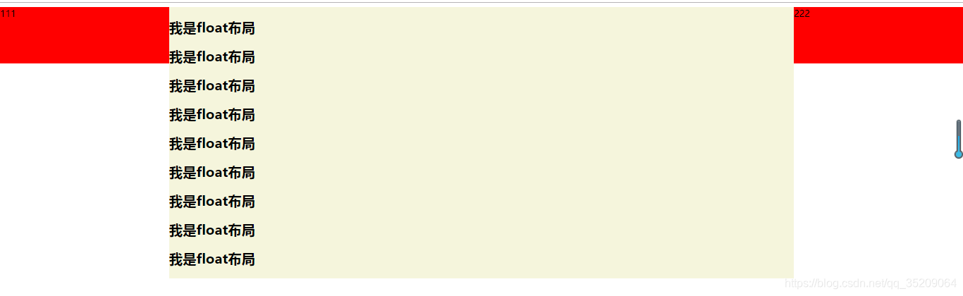
(5)定位
缺点 :该布局脱离文档流,所以子元素也必须脱离文档流,因此可使用性比较差
优点 :快捷,比较不容易出问题
<style type="text/css">
				.layout .float{
					margin-top: 20px;
				}
				.layout .float .left_center_right {
					position: relative;
					height: 100px;
				}
				.left{
					position: absolute;
					left: 0;
					width: 300px;
					height: 100px;
					background: red;
				}
				.center{
					position: absolute;
					left: 300px;
					right: 300px;
					background: beige;
				}
				.right{
					position: absolute;
					right: 0;
					width: 300px;
					height: 100px;
					background: red;
				}
			</style>
		 	<div class="layout float">
			<div class="left_center_right">
				<div class="left">111</div>
				<div class="center">
					<h2>我是float布局</h2>
					<h2>我是float布局</h2>
					<h2>我是float布局</h2>
					<h2>我是float布局</h2>
					<h2>我是float布局</h2>
					<h2>我是float布局</h2>
					<h2>我是float布局</h2>
					<h2>我是float布局</h2>
					<h2>我是float布局</h2>

				</div>
				<div class="right">222</div>
			</div>
		</div>
内容超出了
如果去掉"高度已知", 以上哪种方案同样适用?
只有 flex布局 和 表格布局,网格布局 同样适用