::after和::before的使用很简单,可以认为其所在元素上存在一前一后的两个的元素,这两个元素默认是内联元素,但我们可以为其增添样式。::after和::before使用的时候一定要注意,必须设置content,否则这两个伪元素是无法显示出来的。而content属性,会作为这两个伪元素的内容嵌入他们中。如:
<style>
    p:before{
        content: "H";
    p:after{
        content: "d";
    }
  </style>
  <p>ello Worl</p>
展示为:Hello world
分享一些::after和::before使用的经验:
1.间隔符用法
<style>
    ul{
        list-style: none;
    }
    li{
        display: inline;
    }
    li:not(:last-child)::after{
        content: "|";
    }
</style>
<nav>
    <ul>
        <li>HTML 5</li>
        <li>CSS3</li>
        <li>JavaScript</li>
    </ul>
</nav>
展示:
2.做border三角图标
<!DOCTYPE html>
<html lang="en">

<head>
    <meta charset="UTF-8">
    <meta name="viewport" content="width=device-width, initial-scale=1.0">
    <meta http-equiv="X-UA-Compatible" content="ie=edge">
    <title>Document</title>
    <style>
        p {
            width: 200px;
            height: 50px;
            line-height: 50px;
            background: red;
        }

        p::before {
            display: inline-block;
            border: 5px solid transparent;
            border-right-color: red;
            content: "";
            position: relative;
            left: -10px;
        }
    </style>
</head>

<body>
    <p></p>
</body>

</html>
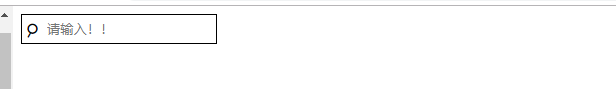
3.字符图标
<!DOCTYPE html>
<html lang="en">

<head>
    <meta charset="UTF-8">
    <meta name="viewport" content="width=device-width, initial-scale=1.0">
    <meta http-equiv="X-UA-Compatible" content="ie=edge">
    <title>Document</title>
    <style>
        .search {
            position: relative;
        }

        .search::before {
            content: "☌";
            transform: rotate(180deg);
            float: left;
            font-size: 25px;
            position: absolute;
            line-height: 30px;
            left: 5px;
        }

        .search input {
            display: block;
            padding-left: 25px;
            height: 30px;
            box-sizing: border-box;
        }
    </style>
</head>

<body>
    <div class="search">
        <input type="text" name="" id="" placeholder="请输入!! ">
    </div>
</body>

</html>