小菜鸡的第五篇博客
本系列文章仅仅是对基础的HTML5以及CSS进行讲解,更加详细的内容均会附上链接,以便查阅和版权保护。
嗯。。。。。昨天是在思修上,今天是在马原上,永远拥护共产党的我。

这一章讲了什么呢,主要就是,给你的文段边缘添加圆角,给你的文字添加阴影,然后叠加你的图层,依旧是花里胡哨的一个章节。
- 浏览器兼容性,渐进增和poly fill
- 理解厂商前缀
- 为元素创建圆角
- 为文本添加阴影
- 为其他元素添加阴影
- 应用多重背景
- 使用渐变背景
- 为元素设置不透明度
- 生成内容的效果
- 使用sprite拼合图像
1.浏览器兼容性,渐进增和poly fill
渐进增强意味着网站在不同Web浏览器中的外观和行为是不一样是完全可以接受的,只要内容是可访问的。
如果要弥合较弱的浏览器和较强的浏览器之间的功能差异,可以使用poly fill,poly fill使用JavaScript实现,它可以为较弱的浏览器提供一定程度的对HTML5和CSS3的API和属性支持,同时,如果官方有相应的支持,那么他会自动使用官方的,不过这样的通常会对性能产生一定的影响。
2.理解厂商前缀
这个的意思就是,因为互联网上的浏览器众多,而各个浏览器都会想使自己的特性来吸引用户,从而与统一制定的浏览器标准会有一定的差异。所以这个时候就会使用厂商前缀来实现这个特性,而标准一旦产生改变也不会对原网页产生影响。
div{
	-webkit-border-top-left-radius:10px;
	border-bottom-left-radius:10px;
	}
如上述代码,第一行添加了-webkit-这个便是厂商前缀,不需要特别掌握,因为他是使用情况比较特殊,不做要求
3.为元素创建圆角
div{
	background:#999;
	float:left;
	height:150px;
	margin:10px;
	width:150px;
}
.all-corners{
	border-radius:20px;
	}
.one-corner{
	border-top-left-radius:75px;
}
.elliptical-corners{
	border-radius:50px/20px;
	}
.circle{
	border-radius:50%;
}
<div class="all-corners"></div>
<div class="one-corner"></div>
<div class="elliptical-corners"></div>
<div class="circle"></div>

如上所示,当我为div添加了border-radius和背景色之后,他就生成了可见的圆角边框。其中,对于格式.circle,使用50%和使用75px的效果是一样的,因为该元素的大小是150px*150px;
.all-corners{
	border-radius:60px;
	}
.one-corner{
	border-top-left-radius:750px;
}
.elliptical-corners{
	border-radius:25px/20px;
	}
.circle{
	border-radius:90%;
}

为了能够更加清晰的表现出他们的作用,我修改了一些数据,然后对应的实际图如上所示,其中添加111111是为了体现出文本框原本的位置
border-radius:60px这个是为每一边都添加圆角。并且当设值到了75px或者50% 的时候就为纯圆,50% 能够理解,那么75px哪里来的呢,它在上面的div格式中,因为我设置了height:150px;
width:150px;所以当我设置75px时,他就相当于50%。
border-top-left-radius:750px显而易见,这个是单纯只设置左上的圆角,并且当到达150px时(即设定的边框值)之后,不论设置为多大,形状都不会改变。都为四分之一圆
border-radius:25px/20px这个是设置椭圆专用,为椭圆的上下半径/左右半径(我忘了怎么称呼这俩半径来着,哭了)
此外,如果对border-radius设置为10px 10px 则前面为设置左上,右下半径,后面为设置右上和左下半径;设置为20px 0 0则为左上设置半径,其他的半径为0;如果是 20px 20px 0 10px 则为四角都设置半径。
4. 为文本添加阴影
p{
	color:#222;
	font-size:4.5em;
	font-weight:bold;
	}
.basic{
	text-shadow:30px 30px #aaa;
}
.basic-negative{
	text-shadow:-30px -30px #ccc;
}
.blur{
	text-shadow:20px 20px 40px grey;
}
.blur-inversed{
	color:white;
	text-shadow:20px 20px 40px #000;
}
.multiple{
	text-shadow:
	20px 20px white,
	60px 60px rgba(50,50,50,.25);
}
<p class="basic">basic shadow</p>
<p class="basic-negative">basic-negative</p>
<p class="blur">blur</p>
<p class="blur-inversed">blur-inversed</p>
<p class="multiple">multiple</p>

为了效果,我将每个的数据都加大了,所以你们看到的就是这样的带点精神污染的图片text-shadow数值为正时向下添加阴影,数值为负时向上添加阴影。blurblur-inversed这俩的区别在于一个加了color:white;,而加了的那个,文本显示为白色。
对于text-shadow:
20px 20px white,
60px 60px rgba(50,50,50,.25);我本来也没弄清楚这是啥,直到我修改了属性为
.multiple{
	text-shadow:
	20px 20px green,
	60px 60px rgba(50,50,50,.25);
}
然后。。。。。。。。。。。。。
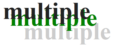
好的,简洁明了(哭了)就是这样的,有几行就添加几个阴影。。。。
5. 为其他元素添加阴影
上面讲的是为文本添加阴影,那么现在要讲的就是为元素本身添加阴影
div{
	background:#fff;
height:100px;
width:100px;
margin:20px;
float:left;}
.shadow{
	box-shadow:4px 4px 5px #999;
}
.shadow-negative{
	box-shadow:-4px -4px 5px #999;
}
.shadow-spread{
	box-shadow:4px 4px 5px 3px #999;
}
.shadow-offsets-0{
	box-shadow:0 0 9px 3px #999;
}
.inset-shadow{
	box-shadow:2px 2px 10px #666 inset;
}
.multiple{
	box-shadow:2px 2px 10px rgba(255,0,0,.75),
	5px 5px 20px blue;
}
<div class="shadow">
<p>shadow with blur</p>
</div>
<div class="shadow-negative">
<p>shadow with negative offsets and blur</p>
</div>
<div class="shadow-spread">
<p>shadow with blur and spread</p>
</div>
<div class="shadow-offsets-0">
<p>shadow with offsets and zero,blur,and spread</p>
</div>
<div class="inset-shadow">
<p>inset shadow</p>
</div>
<div class="multiple">
<p>multiple shadow</p>
</div>
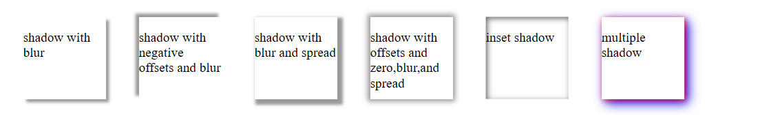
负的spread值会让阴影进行收缩,为0的元素值则不会产生偏离,其中上面的阴影分别为单边添加阴影,全边添加阴影,使元素内嵌,使阴影进行覆盖。
6. 应用多重背景
.night{
	background-color:navy;
	background-image:
	url(1.jpg),url(2.jpg),url(3.jpg),url(4.jpg);
	background-position:
	50% 102% ,100% -150px,
	0 -150px,50% 100%;
	background-repeat:
	no-repeat,no-repeat,
	no-repeat,repeat-x;
	height:300px;
	margin:0 auto;
	padding-top:36px;
	width:75%;}
这个呢就是叠加图片,使其能够重叠呈现出来,使用方法更加类似于简写。

7. 使用渐变背景
div{
height:100px;
width:100px;
margin:20px;
float:left;}
	.ver-down{
		background:silver;
		background:linear-gradient(silver,black);
}
.ver-up{
		background:silver;
		background:linear-gradient(to top,silver,black);
}
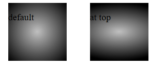
<div class="ver-down"><p>default</p></div>
<div class="ver-up"><p>to top</p></div>
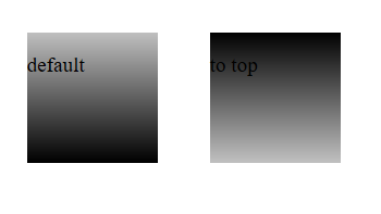
对于background:linear-gradient(to top,silver,black)关于linear-gradient,这个是特定格式,括号里面的,silver为起始颜色,black为最终颜色,to top为从下向上渐变,如果不设置的话,就是默认从上向下渐变,top 还可以更改为 bottom right ,bottom left ,top right,top left。如果设置为具体数值,比如120deg则为角度,left相当于90deg,to top 相当于0deg。
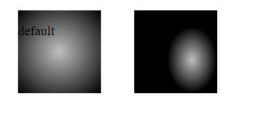
然后,还有另外一种渐变,当我们把background:linear-gradient改成background:radial-gradient
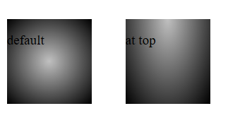
现在它就开始从中心进行渐变了,除非我在background:radial-gradient 中加入 at top,那么它会从上部开始渐变。然后值也可以设置为100px 50px这样的话设置的就是他的渐变的尺寸
右图为设置了具体值的形状。
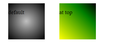
它还可以设置渐变距离边的位置
.ver-top{
		background:silver;
		background:radial-gradient(closest-side at 70px 60px,silver,black);
它还可以设置某种特定的颜色停止的位置
.ver-top{
		background:silver;
		background:linear-gradient(to top right,yellow,green 70%,black);
}
嗯,就是这样,花里胡哨。。。。。
8. 为元素设置不透明度
这个是啥呢
img{
	opacity:.75
	}
大功告成,这样子你的图片将会有75%的透明度。。。。。。。。。。。。。。。。。。。。。.。。。。。。。。。。。。。。。。。。。。。。。。。。。。。。。。。。。。。。。。。。。。。。。。。。。。(太敷衍了)
9. 生成内容的效果
先来看一个简单的
.more:after {
    content: " »";
}
p>This area is one of the most tranquil spaces at the Villa. As I wandered around, enjoying shade provided by sycamore and laurel trees and serenaded by splashing water from two sculptural fountains, I couldn't help but think … <a href="victoria.html" class="more">Read More</a></p>
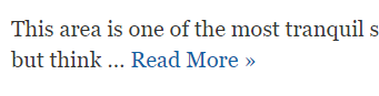
这个时候的read more就会在最后生成 »。
.cities {
	left: -999em; /* hide by default by positioning off screen */
}

.map:focus + .cities,
.map:hover + .cities {
	left: 50%;
}
.clearfix:before,
.clearfix:after {
  content: " ";
  display: table;
}
.clearfix:after {
  clear: both;
}
.clearfix {
  *zoom: 1;
}
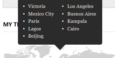
<ul class="cities clearfix">
			<li>Victoria</li>
			<li>Los Angeles</li>
			<li>Mexico City</li>
			<li>Buenos Aires</li>
			<li>Paris</li>
			<li>Kampala</li>
			<li>Lagos</li>
			<li>Cairo</li>
			<li>Beijing</li>
		</ul>
10. 使用sprite拼合图像
想了解的可以看看这个网站
css sprite讲解与使用实例
css sprites直译过来就是CSS精灵。通常被解释为“CSS图像拼合”或“CSS贴图定位”。其实就是通过将多个图片融合到一张图里面,然后通过CSS background背景定位技术技巧布局网页背景。这样做的好处也是显而易见的,因为图片多的话,会增加http的请求,无疑促使了网站性能的减低,特别是图片特别多的网站,如果能用css sprites降低图片数量,带来的将是速度的提升。
css sprites是什么通俗解释:CSS Sprites其实就是把网页中一些背景图片整合拼合成一张图片中,再利用CSS的“background-image”,“background- repeat”,“background-position”的组合进行背景定位,background-position可以用数字能精确的定位出背景图片在布局盒子对象位置。
编者话痨环节
这一章是一个内容众多且容易混乱的章节,我尝试尽量清晰的讲清楚本章节的内容,但是有些东西对于初学者不要求掌握,除非是准备实实在在的设计一个大型网站那么可以深入了解,如果只是为了应负期末考试或者只是为了看懂基础的html代码者,便不需要深入了解。