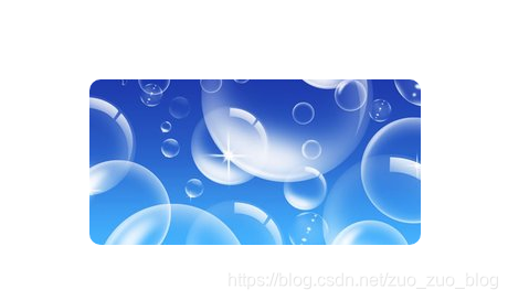
1气泡效果
原理:
a)首先设置多背景图片
background: url(“2.jpg”) no-repeat left top
,url(“2.jpg”) no-repeat right bottom;
b) 然后添加变换之后效果
.box:hover{
background-position: left bottom,right top;
}
c)最后设置过渡 transition: all 2s;
    .box{
        width:300px;
        height:150px;
        border: 1px ;
        margin: 100px auto;

        border-radius: 10px;
        background: url("2.jpg") no-repeat left top
    ,url("2.jpg") no-repeat right bottom;
        background-color: blue;
        /*添加过渡*/
        transition: all 2s;
    }
    .box:hover{
        background-position: left bottom,right top;
    }
</style>
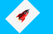
2.小火箭发射练习
<style>
    html,body{
        height:100%;
    }
    body{
        background-color: deepskyblue;
    }
    .rocket{
        width:80px;
        position: absolute;
        left:0;
        bottom:0;
        /*45度旋转*/
        transform:translate(-100px,100px) rotate(45deg);
        transition:all 1s;

    }
    body:hover .rocket{
        transform: translate(500px ,-500px) rotate(45deg);
    }
</style>
3.仿小米练习
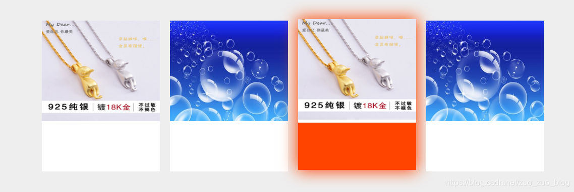
代码
    <style>
         body{
            background-color: #eeeeee;
        }
        .items{
            width:1100px;
            margin: 100px auto;
        }
        .item{
            float: left;
            width:234px;
            height:300px;
            background-color: #ffffff;
            margin-right: 20px;
            text-align: center;
            position: relative;
            overflow: hidden;
            transition: all 0.7s;
        }
        .item:hover{
            box-shadow: 0 0 30px 2px #ff4400;
            margin-top: -3px;
        }
        .item img{
            width:234px;
            height:200px;
        }
        .item span{
            position: absolute;
            width:100%;
            height:100px;
            background-color: #f40;
            left:0;
            bottom: -100px;
            /*过渡*/
            transition:all 2s;
        }
        .item:hover span{
            bottom:0;
        }
    </style>
</head>
<body>
<div class="items">
    <div class="item">
        <img src="1.jpg">

    </div>
    <div class="item">
        <img src="2.jpg">
        <span></span>
    </div>
    <div class="item">
        <img src="1.jpg">
        <span></span>
    </div>
    <div class="item">
        <img src="2.jpg">
        <span></span>
    </div>
</div>
</div>